Props (Properties) are used to pass data from one component to another in React Native. They allow components to be customized and reused with different values, making the UI more dynamic and flexible.
- Props are passed to components when they are created to modify their behaviour or appearance.
- They are used in both user-defined and built-in components to extend functionality.
- Props are immutable, meaning they cannot be changed after the component is created.
import React from 'react';
import { Text, View } from 'react-native';

// Child component receiving props
const Greeting = (props) => {
  return (
    <Text>Hello, {props.name}!</Text>
  );
};

// Parent component passing props
export default function App() {
  return (
    <View>
      <Greeting name="Rahul" />
      <Greeting name="Priya" />
    </View>
  );
}
- The Greeting component receives name as a prop.
- The App component passes different names as props.
Syntax
<View>
    {/* Remaining application code */}

    <Component
        prop1={someValue}
        prop2={someValue}
        propn={someValue}
    />

    {/* Remaining application code */}
</View>
The value of the props of the component is enclosed in braces to embed the expression in JSX.
Step-by-Step Implementation
Step 1: Create a React Native Project
Now, create a project with the following command.
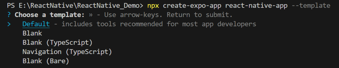
npx create-expo-app app-name --templateNote: Replace the app-name with your app name for example : react-native-demo-app
Next, you might be asked to choose a template. Select one based on your preference as shown in the image below. I am selecting the blank template because it will generate a minimal app, as clean as an empty canvas in JavaScript.
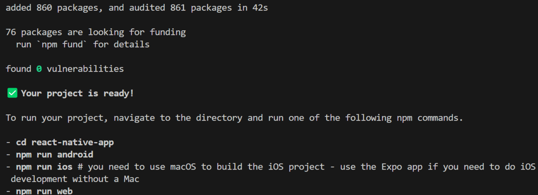
It completes the project creation and displays a message: "Your Project is ready!" as shown in the image below.
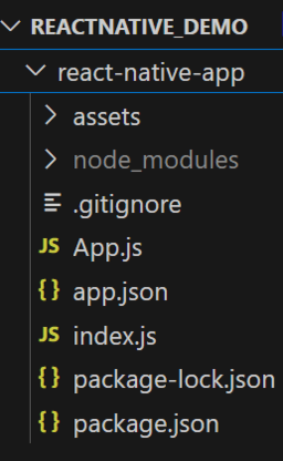
Now go into your project folder, i.e., react-native-demo
cd app-nameProject Structure
Step 2: Run Application
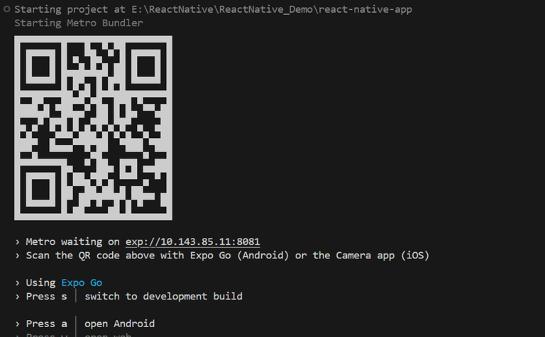
Start the server by using the following command.
npx expo startThen, the application will display a QR code.
1. For the Android users,
- For the Android Emulator, press "a" as mentioned in the image below.
- For the Physical Device, download the "Expo Go" app from the Play Store. Open the app, and you will see a button labeled "Scan QR Code." Click that button and scan the QR code; it will automatically build the Android app on your device.
2. For iOS users, simply scan the QR code using the Camera app.
3. If you're using a web browser, it will provide a local host link that you can use as mentioned in the image below.
Step 3: Start Coding
Props in Default Component
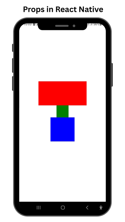
Example 1: In this, we will see the usage of props inside a component that is available to us by default.
Implementation: Write down the following code in App.js to show the functionality of Props. Here we will display several views where each will be having different properties.
// Importing necessary components from the 'react-native' library
import { StyleSheet, View } from 'react-native';

// Exporting the default functional component named 'App'
export default function App() {
  return (
    // Main container view with applied styles
    <View style={styles.container}>
      {/* First child view with red background */}
      <View style={styles.style1} />
      {/* Second child view with green background */}
      <View style={styles.style2}/>
      {/* Third child view with blue background */}
      <View style={styles.style3}/>
    </View>
  );
}

// Creating styles for the components
const styles = StyleSheet.create({
  // Style for the main container
  container: {
    flex: 1, // Makes the container take up the full screen
    backgroundColor: '#fff', // Sets the background color to white
    alignItems: 'center', // Aligns child components horizontally to the center
    justifyContent: 'center', // Aligns child components vertically to the center
  },
  // Style for the first child view
  style1: {
    backgroundColor: "red", // Sets the background color to red
    height: 100, // Sets the height to 100 units
    width: 200 // Sets the width to 200 units
  },
  // Style for the second child view
  style2: {
    backgroundColor: "green", // Sets the background color to green
    height: 50, // Sets the height to 50 units
    width: 50 // Sets the width to 50 units
  },
  // Style for the third child view
  style3: {
    backgroundColor: "blue", // Sets the background color to blue
    height: 100, // Sets the height to 100 units
    width: 100 // Sets the width to 100 units
  }
});
Output:
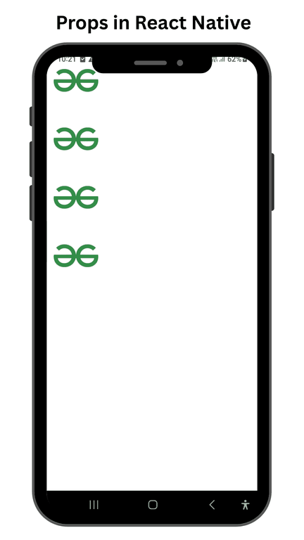
Props in User Component
Example 2: In this section, we will see the usage of props inside a component that is user-defined.
Implementation: Create a new component file called ImageFill.js that will display an image specified as a prop a specified number of times in a prop called count.
// Importing necessary components from React Native
import { View, Image, StyleSheet, ScrollView } from 'react-native';

// Defining a functional component named ImageFill
function ImageFill(props) {
  return (
    // A container View with styles applied
    <View style={styles.contStyle}>
      {/* Creating an array of images based on the count prop */}
      {[...Array(props.count)].map(
        () => (
          // Rendering an Image component with the provided source and styles
          <Image
            source={props.image}
            style={{
              height: 100, // Setting the height of the image
              width: 100,  // Setting the width of the image
              flex: 1,     // Allowing the image to grow and shrink
              flexWrap: 'wrap' // Wrapping content if needed (though not applicable to Image)
            }}
          />
        )
      )}
    </View>
  );
}

// Exporting the default App component
export default function App() {
  return (
    // Wrapping the content in a ScrollView to allow scrolling
    <ScrollView style={styles.container}>
      {/* Rendering the ImageFill component with an image and count */}
      <ImageFill
        image={require('./assets/gfg.png')} // Providing the image source
        count={4} // Number of images to render
      />
    </ScrollView>
  );
}

// Creating styles for the components
const styles = StyleSheet.create({
  container: {
    flex: 1, // Allowing the container to expand to fill available space
    backgroundColor: '#fff', // Setting the background color to white
    flexDirection: 'column', // Arranging children in a column
    flexWrap: 'wrap', // Allowing wrapping of children (though not applicable here)
  },
  contStyle: {
    flex: 1, // Allowing the container to expand to fill available space
    alignItems: 'center', // Centering children horizontally
    justifyContent: 'center', // Centering children vertically
    width: "100%" // Setting the width of the container to 100% of the parent
  }
});
Output: