A Floating Action Button (FAB) in React Native is a button that appears above other content and remains fixed on the screen. It is commonly used for primary actions like add, edit, or create.
- FAB stays in a fixed position even when the user scrolls the screen.
- It can be customized with icons, text, and different shapes like circle or square.
- FAB can be created using libraries or built manually for full customization.
Approach
We will create a custom component called FAB which we can reuse everywhere we want to display FAB on the screen. This custom component FAB will take some props so that we can customize it any way we want.
Step-by-Step Implementation
Step 1: Create a React Native Project
Now, create a project with the following command.
npx create-expo-app app-name --templateNote: Replace the app-name with your app name for example : react-native-demo-app
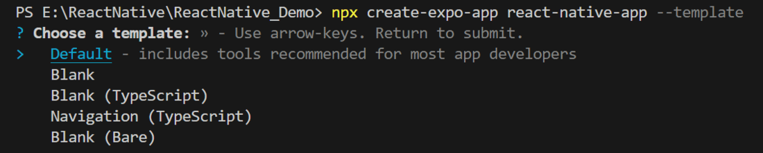
Next, you might be asked to choose a template. Select one based on your preference as shown in the image below. I am selecting the blank template because it will generate a minimal app, as clean as an empty canvas in JavaScript.
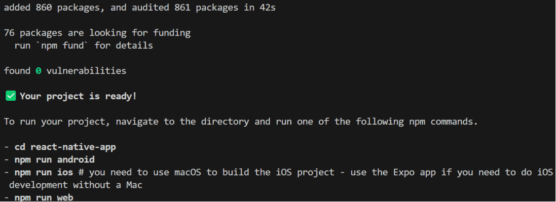
It completes the project creation and displays a message: "Your Project is ready!" as shown in the image below.
Now go into your project folder, i.e., react-native-demo
cd app-nameProject Structure
Step 2: Run Application
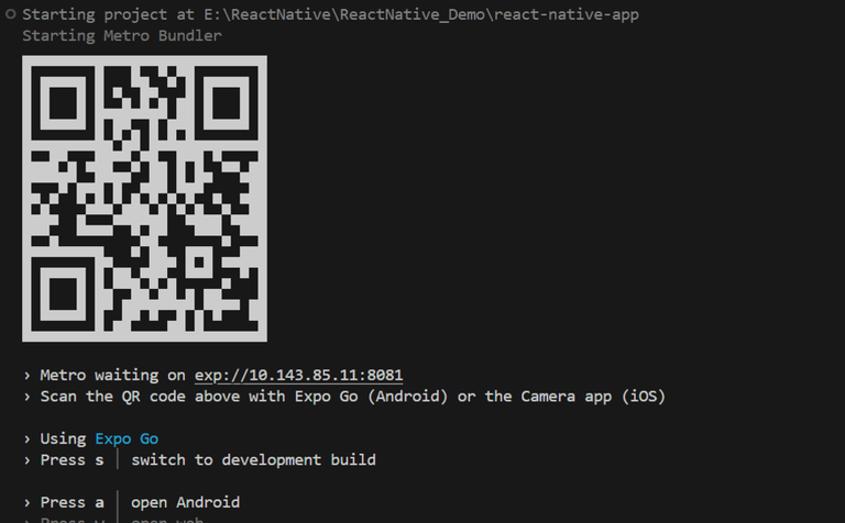
Start the server by using the following command.
npx expo startThen, the application will display a QR code.
1. For the Android users,
- For the Android Emulator, press "a" as mentioned in the image below.
- For Physical Device, Download the "Expo Go" app from the Play Store. Open the app, and you will see a button labeled "Scan QR Code." Click that button and scan the QR code; it will automatically build the Android app on your device.
2. For iOS users, simply scan the QR code using the Camera app.
3. If you're using a web browser, it will provide a local host link that you can use as mentioned in the image below.
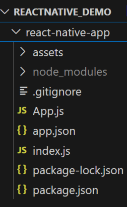
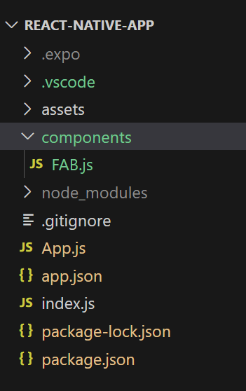
Step 3: Create a new component folder (optional)
You can create a new folder called "components" to organize all component files better, as mentioned in the image below. Alternatively, you can write the component code directly in App.js.
Step 4: Working with FAB.js
- Import libraries: Import required libraries at the top of the file.
import {
  Pressable,   // Pressable component for handling touch events
  StyleSheet,  // StyleSheet for styling components
  Text         //  Text component for displaying text
} from "react-native";   // Import necessary components from React Native
import React from "react"; // Import React library
- StyleSheet: Create a StyleSheet to style components like the container and title.
// Styles for the FAB component
const styles = StyleSheet.create({
  container: {
    justifyContent: "center", // Center content vertically
    alignItems: "center", // Center content horizontally
    borderRadius: 10, // Rounded corners
    position: "absolute", // Position the button absolutely
    bottom: 70, // Distance from the bottom of the screen
    right: 40, // Distance from the right of the screen
    backgroundColor: "#26653A", // Background color of the button
    paddingHorizontal: 20, // Horizontal padding
    paddingVertical: 10, // Vertical padding
  },
  title: {
    fontSize: 18, // Font size of the title
    color: "#fff", // Text color
    fontWeight: "bold", // Bold font weight
  },
});
- FAB Component: Create a FAB Component with a Text Component wrapped with Pressable Component, also make sure to export it.
// Floating Action Button (FAB) component
export const FAB = (props) => {
  return (
    // Pressable component to handle user interactions
    <Pressable
      style={styles.container} // Apply container styles
      onPress={props.onPress} // Trigger the onPress function passed via props
    >
      {/* Display the button title */}
      <Text style={styles.title}>{props.title}</Text>
    </Pressable>
  );
};
FAB.js:
import {
  Pressable,   // Pressable component for handling touch events
  StyleSheet,  // StyleSheet for styling components
  Text         //  Text component for displaying text
} from "react-native";   // Import necessary components from React Native
import React from "react"; // Import React library

// Floating Action Button (FAB) component
export const FAB = (props) => {
  return (
    // Pressable component to handle user interactions
    <Pressable
      style={styles.container} // Apply container styles
      onPress={props.onPress} // Trigger the onPress function passed via props
    >
      {/* Display the button title */}
      <Text style={styles.title}>{props.title}</Text>
    </Pressable>
  );
};


// Styles for the FAB component
const styles = StyleSheet.create({
  container: {
    justifyContent: "center", // Center content vertically
    alignItems: "center", // Center content horizontally
    borderRadius: 10, // Rounded corners
    position: "absolute", // Position the button absolutely
    bottom: 70, // Distance from the bottom of the screen
    right: 40, // Distance from the right of the screen
    backgroundColor: "#26653A", // Background color of the button
    paddingHorizontal: 20, // Horizontal padding
    paddingVertical: 10, // Vertical padding
  },
  title: {
    fontSize: 18, // Font size of the title
    color: "#fff", // Text color
    fontWeight: "bold", // Bold font weight
  },
});
This file contains the code for the custom FAB component. It will take 2 props, text for the FAB button, and a function that will be called when the user presses the button. This component will have a background color and a text at the center. You can also add icons according to your requirement. The function which is received as a prop will be assigned to the onPress event of the Pressable component.
Step 5: Working with App.js
Now call this FAB Component in the main "App" Component in App.js.
App.js:
// Import necessary components from React Native
import { StyleSheet, View } from "react-native";
// Import the custom Floating Action Button (FAB) component
import FAB from "./components/FAB";

// Main App component
export default function App() {
  // Function to display an alert message
  const displayAlert = () => {
    alert("Welcome to GeeksforGeeks");
  };

  return (
    // Main container view with styling
    <View style={styles.container}>
      {/* Floating Action Button with an onPress handler */}
      <FAB onPress={displayAlert} title="Add" />
    </View>
  );
}

// Styles for the App component
const styles = StyleSheet.create({
  container: {
    flex: 1, // Take up the full screen
    backgroundColor: "#fff", // Set background color to white
  },
});
Or
You can write the whole code in one file, i.e, App.js.
Complete Source Code
App.js:
// Import the custom Floating Action Button (FAB) component
import {
  StyleSheet, View,
  Pressable,   // Pressable component for handling touch events
  Text         //  Text component for displaying text
} from "react-native";   // Import necessary components from React Native
import React from "react"; // Import React library

// Floating Action Button (FAB) component
 const FAB = (props) => {
  return (
    // Pressable component to handle user interactions
    <Pressable
      style={styles.container} // Apply container styles
      onPress={props.onPress} // Trigger the onPress function passed via props
    >
      {/* Display the button title */}
      <Text style={styles.title}>{props.title}</Text>
    </Pressable>
  );
};


// Main App component
export default function App() {
  // Function to display an alert message
  const displayAlert = () => {
    alert("Welcome to GeeksforGeeks");
  };

  return (
    // Main container view with styling
    <View style={styles.containermain}>
      {/* Floating Action Button with an onPress handler */}
      <FAB onPress={displayAlert} title="Add" />
    </View>
  );
}

// Styles for the App component
const styles = StyleSheet.create({
  containermain: {
    flex: 1, // Take up the full screen
    backgroundColor: "#fff", // Set background color to white
  },
  container: {
    justifyContent: "center", // Center content vertically
    alignItems: "center", // Center content horizontally
    borderRadius: 10, // Rounded corners
    position: "absolute", // Position the button absolutely
    bottom: 70, // Distance from the bottom of the screen
    right: 40, // Distance from the right of the screen
    backgroundColor: "#26653A", // Background color of the button
    paddingHorizontal: 20, // Horizontal padding
    paddingVertical: 10, // Vertical padding
  },
  title: {
    fontSize: 18, // Font size of the title
    color: "#fff", // Text color
    fontWeight: "bold", // Bold font weight
  },
});
Output :
This is how you can create a custom FAB button on your own in React Native, it will provide you much more flexibility than a third-party pre-build component.