Now, we will add search functionality in React Native to make a FlatList searchable. We will use the SearchBar component to filter and display matching items from the list.
- Search functionality helps users quickly find specific items from a FlatList.
- The SearchBar component is used to capture user input for filtering data.
- The FlatList updates dynamically based on the search query entered by the user.
import React, { useState } from 'react';
import { View, Text, FlatList, TextInput, StyleSheet } from 'react-native';

const App = () => {
  const data = [
    { id: '1', name: 'Apple' },
    { id: '2', name: 'Banana' },
    { id: '3', name: 'Mango' },
    { id: '4', name: 'Orange' },
    { id: '5', name: 'Grapes' },
  ];

  const [search, setSearch] = useState('');
  const [filteredData, setFilteredData] = useState(data);

  const handleSearch = (text) => {
    setSearch(text);
    const filtered = data.filter(item =>
      item.name.toLowerCase().includes(text.toLowerCase())
    );
    setFilteredData(filtered);
  };

  return (
    <View style={styles.container}>

      {/* Search Bar */}
      <TextInput
        style={styles.searchBar}
        placeholder="Search here..."
        value={search}
        onChangeText={handleSearch}
      />

      {/* FlatList */}
      <FlatList
        data={filteredData}
        keyExtractor={(item) => item.id}
        renderItem={({ item }) => (
          <Text style={styles.item}>{item.name}</Text>
        )}
      />

    </View>
  );
};

const styles = StyleSheet.create({
  container: {
    flex: 1,
    padding: 20,
  },
  searchBar: {
    height: 40,
    borderWidth: 1,
    marginBottom: 10,
    paddingHorizontal: 10,
    borderRadius: 5,
  },
  item: {
    fontSize: 18,
    padding: 10,
  },
});

export default App;
- TextInput acts as the search bar.
- useState stores search text and filtered data.
- FlatList displays filtered results based on search input.
Syntax
<SearchBar
    placeholder="Type Here..."
    onChangeText={this.updateSearch}
    value={search}
/>
Approach
- The SearchBar adds a platform-specific search input box for entering search text.
- The placeholder prop shows default text when the search bar is empty.
- Styling props are used to make the search bar light-themed with rounded edges.
- The search state stores the current text entered by the user and updates dynamically.
- The autoCorrect option is disabled, and the search function is triggered whenever text is entered.
Props in SearchBar
The SearchBar component provides various props to customize its appearance, behavior, and functionality in a React Native application.
- placeholder – Sets the default text displayed when the search bar is empty.
- value – Stores and controls the current text entered in the search bar.
- onChangeText – Function called whenever the user types text.
- onClear – Function triggered when the clear button is pressed.
- autoCorrect – Enables or disables automatic spelling correction.
- autoCapitalize – Controls automatic capitalization of characters.
- lightTheme – Applies a light theme style to the search bar.
- round – Makes the search bar corners rounded.
- showCancel – Displays a cancel button in the search bar (mainly on iOS).
- platform – Specifies the platform style (android, ios, or default).
- containerStyle – Applies custom styling to the search bar container.
- inputStyle – Applies custom styling to the text input field.
- inputContainerStyle – Styles the input container inside the search bar.
- placeholderTextColor – Changes the color of the placeholder text.
- clearIcon – Customizes the clear icon.
- searchIcon – Customizes the search icon.
Step-by-Step Implementation
Step 1: Create a React Native Project
Now, create a project with the following command.
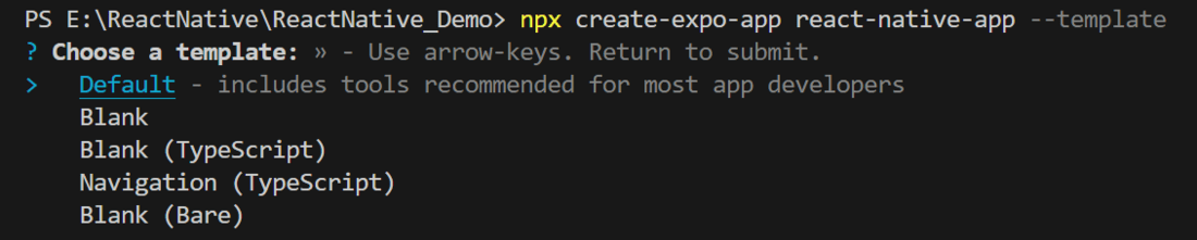
npx create-expo-app app-name --templateNote: Replace the app-name with your app name for example : react-native-demo-app
Next, you might be asked to choose a template. Select one based on your preference as shown in the image below. I am selecting the blank template because it will generate a minimal app, as clean as an empty canvas in JavaScript.
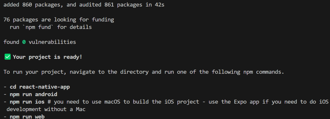
It completes the project creation and displays a message: "Your Project is ready!" as shown in the image below.
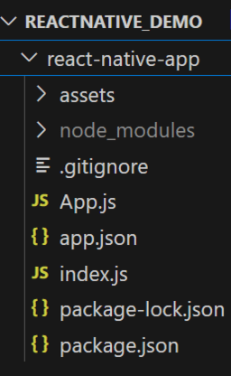
Now go into your project folder, i.e., react-native-demo
cd app-nameProject Structure
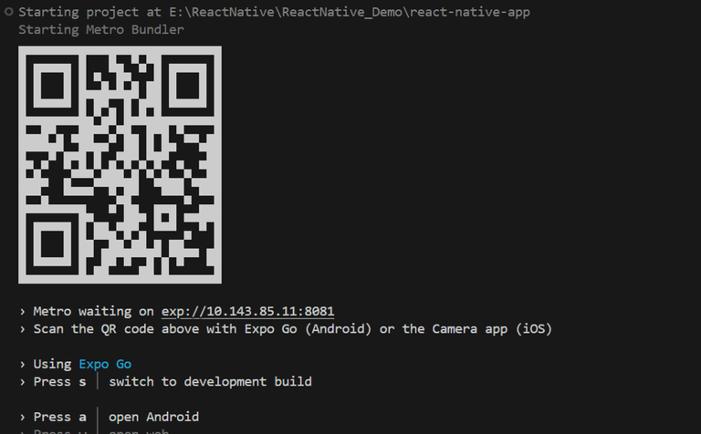
Step 2: Run Application
Start the server by using the following command.
npx expo startThen, the application will display a QR code.
1. For the Android users,
- For the Android Emulator, press "a" as mentioned in the image below.
- For the Physical Device, download the "Expo Go" app from the Play Store. Open the app, and you will see a button labeled "Scan QR Code." Click that button and scan the QR code; it will automatically build the Android app on your device.
2. For iOS users, simply scan the QR code using the Camera app.
3. If you're using a web browser, it will provide a local host link that you can use as mentioned in the image below.
Step 3: Start Coding
Now let's see the implementation of how to add a search bar using the above approach.
- Import libraries: Import required libraries at the top of the file.
// Import React and Component from react library
import React from "react";
// Import necessary components from react-native
import { StyleSheet, Text, View, FlatList } from "react-native";
// Import SearchBar component from react-native-elements library
import { SearchBar } from "react-native-elements";
- StyleSheet: Create a StyleSheet to style components like container, item, and itemText.
// Styles for the components
const styles = StyleSheet.create({
  container: {
    flex: 1, // Take up the full screen
    marginTop: 30, // Margin from the top
    padding: 10, // Padding inside the container
  },
  item: {
    backgroundColor: "green", // Background color for each item
    padding: 20, // Padding inside each item
    marginVertical: 8, // Vertical margin between items
    marginHorizontal: 16, // Horizontal margin between items
    borderRadius: 8, // Rounded corners for each item
  },
  itemText: {
    color: "white", // Text color
    fontSize: 18, // Font size for the text
  },
});
- Sample Data: This is the list of data that is displayed on the screen using FlatList.
// Sample data to display in the FlatList
const DATA = [
  { id: "1", title: "Data Structures" },
  { id: "2", title: "STL" },
  { id: "3", title: "C++" },
  { id: "4", title: "Java" },
  { id: "5", title: "Python" },
  { id: "6", title: "CP" },
  { id: "7", title: "ReactJs" },
  { id: "8", title: "NodeJs" },
  { id: "9", title: "MongoDb" },
  { id: "10", title: "ExpressJs" },
  { id: "11", title: "PHP" },
  { id: "12", title: "MySql" },
];
- SearchBar: This Component is used to take input from the user and search for the user's requested item in the list.
{/* SearchBar component for user input */}
<SearchBar
    placeholder="Search Here..." // Placeholder text for the search bar
    lightTheme // Use light theme for the search bar
    round // Make the search bar round
    value={searchValue} // Bind the search value to the state
    onChangeText={searchFunction} // Call searchFunction on text change
    autoCorrect={false} // Disable auto-correct
    backgroundColor="white" // Background color of the search bar
    containerStyle={{
        backgroundColor: "white", // Background color of the container
        borderTopWidth: 0, // Remove top border
        borderBottomWidth: 0, // Remove bottom border
        padding: 10, // Padding around the container
        borderColor: "black", // Border color
    }}
    inputContainerStyle={{
        backgroundColor: "lightgrey", // Background color of the input container
        borderRadius: 10, // Rounded corners for the input container
    }}
    inputStyle={{
        backgroundColor: "white", // Background color of the input field
        borderRadius: 10, // Rounded corners for the input field
        padding: 10, // Padding inside the input field
    }}
    searchIcon={{ size: 24, color: "black" }} // Style for the search icon
    clearIcon={{ size: 24, color: "black" }} // Style for the clear icon
    cancelIcon={{ size: 24, color: "black" }} // Style for the cancel icon
/>
- FlatList: This Component is used to display a list of data in a vertically or horizontal scrollable list.
{/* FlatList to display the filtered data */}
<FlatList
    data={data} // Data to display in the list
    renderItem={({ item }) => <Item title={item.title} />} // Render each item using the Item component
    keyExtractor={(item) => item.id} // Unique key for each item
/>
- Item: This functional component is used to render each item in Flatlist with respective style like background color, padding, border radius ,text color, etc.
// Functional component to render each item in the FlatList
const Item = ({ title }) => (
  <View style={styles.item}> {/* Style for each item */}
    <Text style={styles.itemText}>{title}</Text> {/* Display the title */}
  </View>
);
- arrayholder: It holds the original data so that we can filter it based on the search input.
const arrayholder = React.useRef(DATA);
- searchFunction: This function is the business logic for search functionality.
// Function to handle search functionality
const searchFunction = (text) => {
    const updatedData = arrayholder.current.filter((item) => {
        const itemData = item.title.toUpperCase(); // Convert item title to uppercase
        const textData = text.toUpperCase(); // Convert search text to uppercase
        return itemData.includes(textData); // Check if item title includes the search text
    });
    setData(updatedData); // Update the filtered data
    setSearchValue(text); // Update the search value
};
- useState: This is used to manage the state of the filter Data and the search input value.
// State to manage the filtered data and search input
const [data, setData] = React.useState(DATA);
// State to manage the search input value
const [searchValue, setSearchValue] = React.useState("");
- App Component: Wrap the SearchBar and FlatList with a View and return that inside the App function to render and place the useState, arrayholder inside the App function, also make sure to export the App.
export default Search = () => {
  // State to manage the filtered data and search input
  const [data, setData] = React.useState(DATA);
  // State to manage the search input value
  const [searchValue, setSearchValue] = React.useState("");
  // Ref to hold the original data
  const arrayholder = React.useRef(DATA);

  // Function to handle search functionality
  const searchFunction = (text) => {
    const updatedData = arrayholder.current.filter((item) => {
      const itemData = item.title.toUpperCase(); // Convert item title to uppercase
      const textData = text.toUpperCase(); // Convert search text to uppercase
      return itemData.includes(textData); // Check if item title includes the search text
    });
    setData(updatedData); // Update the filtered data
    setSearchValue(text); // Update the search value
  };

  return (
    <View style={styles.container}> {/* Main container style */}
      {/* SearchBar component for user input */}
      <SearchBar
        placeholder="Search Here..." // Placeholder text for the search bar
        lightTheme // Use light theme for the search bar
        round // Make the search bar round
        value={searchValue} // Bind the search value to the state
        onChangeText={searchFunction} // Call searchFunction on text change
        autoCorrect={false} // Disable auto-correct
        backgroundColor="white" // Background color of the search bar
        containerStyle={{
          backgroundColor: "white", // Background color of the container
          borderTopWidth: 0, // Remove top border
          borderBottomWidth: 0, // Remove bottom border
          padding: 10, // Padding around the container
          borderColor: "black", // Border color
        }}
        inputContainerStyle={{
          backgroundColor: "lightgrey", // Background color of the input container
          borderRadius: 10, // Rounded corners for the input container
        }}
        inputStyle={{
          backgroundColor: "white", // Background color of the input field
          borderRadius: 10, // Rounded corners for the input field
          padding: 10, // Padding inside the input field
        }}
        searchIcon={{ size: 24, color: "black" }} // Style for the search icon
        clearIcon={{ size: 24, color: "black" }} // Style for the clear icon
        cancelIcon={{ size: 24, color: "black" }} // Style for the cancel icon
      />
      {/* FlatList to display the filtered data */}
      <FlatList
        data={data} // Data to display in the list
        renderItem={({ item }) => <Item title={item.title} />} // Render each item using the Item component
        keyExtractor={(item) => item.id} // Unique key for each item
      />
    </View>
  );
};
Complete Source Code
App.js
// Import React and Component from react library
import React from "react";
// Import necessary components from react-native
import { StyleSheet, Text, View, FlatList } from "react-native";
// Import SearchBar component from react-native-elements library
import { SearchBar } from "react-native-elements";

// Sample data to display in the FlatList
const DATA = [
  { id: "1", title: "Data Structures" },
  { id: "2", title: "STL" },
  { id: "3", title: "C++" },
  { id: "4", title: "Java" },
  { id: "5", title: "Python" },
  { id: "6", title: "CP" },
  { id: "7", title: "ReactJs" },
  { id: "8", title: "NodeJs" },
  { id: "9", title: "MongoDb" },
  { id: "10", title: "ExpressJs" },
  { id: "11", title: "PHP" },
  { id: "12", title: "MySql" },
];

// Functional component to render each item in the FlatList
const Item = ({ title }) => (
  <View style={styles.item}> {/* Style for each item */}
    <Text style={styles.itemText}>{title}</Text> {/* Display the title */}
  </View>
);

export default Search = () => {
  // State to manage the filtered data and search input
  const [data, setData] = React.useState(DATA);
  // State to manage the search input value
  const [searchValue, setSearchValue] = React.useState("");
  // Ref to hold the original data
  const arrayholder = React.useRef(DATA);

  // Function to handle search functionality
  const searchFunction = (text) => {
    const updatedData = arrayholder.current.filter((item) => {
      const itemData = item.title.toUpperCase(); // Convert item title to uppercase
      const textData = text.toUpperCase(); // Convert search text to uppercase
      return itemData.includes(textData); // Check if item title includes the search text
    });
    setData(updatedData); // Update the filtered data
    setSearchValue(text); // Update the search value
  };

  return (
    <View style={styles.container}> {/* Main container style */}
      {/* SearchBar component for user input */}
      <SearchBar
        placeholder="Search Here..." // Placeholder text for the search bar
        lightTheme // Use light theme for the search bar
        round // Make the search bar round
        value={searchValue} // Bind the search value to the state
        onChangeText={searchFunction} // Call searchFunction on text change
        autoCorrect={false} // Disable auto-correct
        backgroundColor="white" // Background color of the search bar
        containerStyle={{
          backgroundColor: "white", // Background color of the container
          borderTopWidth: 0, // Remove top border
          borderBottomWidth: 0, // Remove bottom border
          padding: 10, // Padding around the container
          borderColor: "black", // Border color
        }}
        inputContainerStyle={{
          backgroundColor: "lightgrey", // Background color of the input container
          borderRadius: 10, // Rounded corners for the input container
        }}
        inputStyle={{
          backgroundColor: "white", // Background color of the input field
          borderRadius: 10, // Rounded corners for the input field
          padding: 10, // Padding inside the input field
        }}
        searchIcon={{ size: 24, color: "black" }} // Style for the search icon
        clearIcon={{ size: 24, color: "black" }} // Style for the clear icon
        cancelIcon={{ size: 24, color: "black" }} // Style for the cancel icon
      />
      {/* FlatList to display the filtered data */}
      <FlatList
        data={data} // Data to display in the list
        renderItem={({ item }) => <Item title={item.title} />} // Render each item using the Item component
        keyExtractor={(item) => item.id} // Unique key for each item
      />
    </View>
  );
};


// Styles for the components
const styles = StyleSheet.create({
  container: {
    flex: 1, // Take up the full screen
    marginTop: 30, // Margin from the top
    padding: 10, // Padding inside the container
  },
  item: {
    backgroundColor: "green", // Background color for each item
    padding: 20, // Padding inside each item
    marginVertical: 8, // Vertical margin between items
    marginHorizontal: 16, // Horizontal margin between items
    borderRadius: 8, // Rounded corners for each item
  },
  itemText: {
    color: "white", // Text color
    fontSize: 18, // Font size for the text
  },
});