In React Native, obtaining the screen width and height is essential for creating responsive and adaptive user interfaces. It helps developers design layouts that adjust properly across different devices and screen orientations.
- Screen dimensions allow developers to create responsive layouts that fit various device sizes.
- They help ensure a consistent user experience across different screen resolutions and orientations.
- React Native provides different approaches, such as using the Dimensions API and useWindowDimensions hook, to access screen width and height.
Step-by-Step Implementation
Step 1: Create a React Native Project
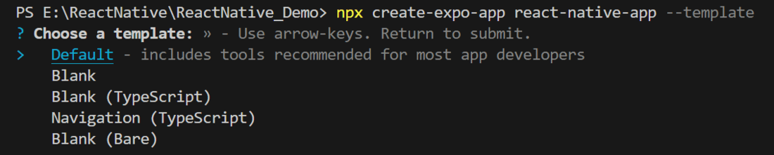
Now, create a project with the following command.
npx create-expo-app app-name --templateNote: Replace the app-name with your app name for example : react-native-demo-app
Next, you might be asked to choose a template. Select one based on your preference as shown in the image below. I am selecting the blank template because it will generate a minimal app, as clean as an empty canvas in JavaScript.
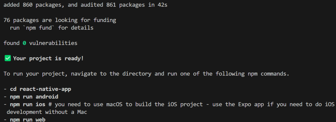
It completes the project creation and displays a message: "Your Project is ready!" as shown in the image below.
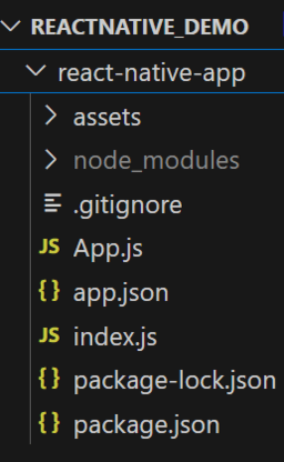
Now go into your project folder, i.e., react-native-demo
cd app-nameProject Structure
Step 2: Run Application
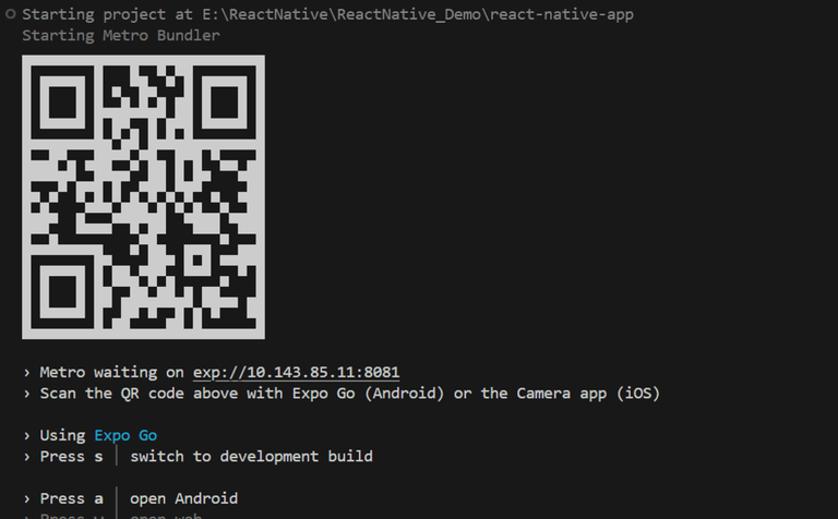
Start the server by using the following command.
npx expo startThen, the application will display a QR code.
1. For the Android users,
- For the Android Emulator, press "a" as mentioned in the image below.
- For the Physical Device, download the "Expo Go" app from the Play Store. Open the app, and you will see a button labeled "Scan QR Code." Click that button and scan the QR code; it will automatically build the Android app on your device.
2. For iOS users, simply scan the QR code using the Camera app.
3. If you're using a web browser, it will provide a local host link that you can use as mentioned in the image below.
Step 3: Start Coding
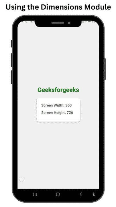
Approach 1: Using the Dimensions Module
In this approach, the Dimensions module is utilized to retrieve the screen width and height. By invoking Dimensions.get('window'), the dimensions are accessed and displayed using the Text component.
import {
  View, // Importing the View component for creating container-like elements
  Text, // Importing the Text component for displaying text
  Dimensions, // Importing Dimensions to get the screen width and height
  StyleSheet, // Importing StyleSheet to create styles for the components
} from "react-native";

const App = () => {
  // Destructuring width and height from the Dimensions API
  const { width, height } = Dimensions.get("window");

  return (
    <View style={styles.container}> {/* Main container with styling */}
      <Text style={styles.heading}> {/* Heading text */}
        Geeksforgeeks
      </Text>
      <View style={styles.dimensionContainer}> {/* Container for displaying dimensions */}
        <Text style={styles.dimensionText}> {/* Text to display screen width */}
          Screen Width: {width}
        </Text>
        <Text style={styles.dimensionText}> {/* Text to display screen height */}
          Screen Height: {height}
        </Text>
      </View>
    </View>
  );
};

// Defining styles for the components
const styles = StyleSheet.create({
  container: {
    flex: 1, // Makes the container take up the full screen
    justifyContent: "center", // Centers content vertically
    alignItems: "center", // Centers content horizontally
    backgroundColor: "#f0f0f0", // Light gray background color
  },
  heading: {
    fontSize: 30, // Large font size for the heading
    fontWeight: "bold", // Bold font weight
    marginBottom: 30, // Space below the heading
    color: "green", // Green text color
  },
  dimensionContainer: {
    backgroundColor: "white", // White background for the dimensions container
    borderRadius: 10, // Rounded corners
    padding: 20, // Padding inside the container
    shadowColor: "#000", // Shadow color
    shadowOffset: { // Shadow offset for iOS
      width: 0,
      height: 2,
    },
    shadowOpacity: 0.25, // Shadow opacity for iOS
    shadowRadius: 3.84, // Shadow radius for iOS
    elevation: 5, // Shadow elevation for Android
  },
  dimensionText: {
    fontSize: 18, // Font size for dimension text
    marginBottom: 10, // Space below each dimension text
    color: "#666", // Gray text color
  },
});

export default App; // Exporting the App component as the default export
Output:
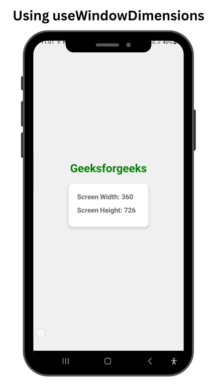
Approach 2: Using useWindowDimensions
In this approach, we'll use the useWindowDimensions hook to effortlessly access the width and height of the screen.
Example: The code defines a React Native component named 'App' that showcases the dimensions of the device screen. It imports necessary components from 'react-native' while utilizing the useWindowDimensions hook to obtain both the width and height of the screen.
import {
  View, // Importing the View component for creating container elements
  Text, // Importing the Text component for displaying text
  useWindowDimensions, // Importing the hook to get screen dimensions
  StyleSheet, // Importing StyleSheet for creating styles
} from "react-native"; // Importing from the react-native library

// Main functional component of the app
const App = () => {
  // Destructuring width and height from useWindowDimensions hook
  const { width, height } = useWindowDimensions();

  return (
    // Main container view
    <View style={styles.container}>
      {/* Displaying the title text */}
      <Text style={styles.text}>Geeksforgeeks</Text>
      {/* Container for displaying screen dimensions */}
      <View style={styles.dimensionContainer}>
        {/* Displaying the screen width */}
        <Text style={styles.dimensionText}>
          Screen Width: {width}
        </Text>
        {/* Displaying the screen height */}
        <Text style={styles.dimensionText}>
          Screen Height: {height}
        </Text>
      </View>
    </View>
  );
};

// Defining styles for the components
const styles = StyleSheet.create({
  container: {
    flex: 1, // Makes the container take the full screen
    justifyContent: "center", // Centers content vertically
    alignItems: "center", // Centers content horizontally
    backgroundColor: "#f0f0f0", // Light gray background color
  },
  text: {
    fontSize: 30, // Large font size for the title
    fontWeight: "bold", // Bold font weight
    marginBottom: 20, // Space below the title
    color: "green", // Green text color
  },
  dimensionContainer: {
    backgroundColor: "white", // White background for the dimensions container
    borderRadius: 10, // Rounded corners
    padding: 20, // Padding inside the container
    shadowColor: "#000", // Shadow color
    shadowOffset: {
      width: 0, // Horizontal shadow offset
      height: 2, // Vertical shadow offset
    },
    shadowOpacity: 0.25, // Shadow transparency
    shadowRadius: 3.84, // Shadow blur radius
    elevation: 5, // Elevation for Android shadow
  },
  dimensionText: {
    fontSize: 18, // Font size for dimension text
    marginBottom: 10, // Space below each dimension text
    color: "#666", // Gray text color
  },
});

// Exporting the App component as the default export
export default App;
Output: