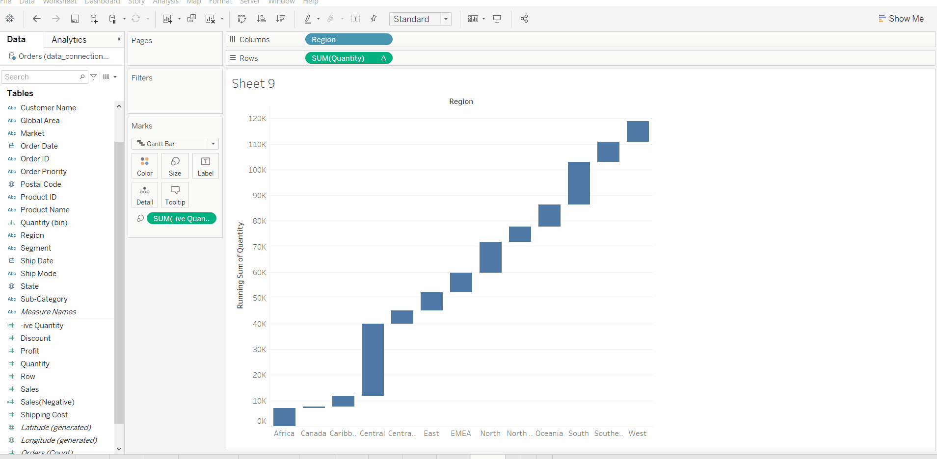
A Waterfall Chart in Tableau is used to visualize how a starting value is affected by a series of positive and negative changes, helping users understand the cumulative impact of individual components on a final total. It is commonly used in financial and performance analysis to show how different factors contribute to growth or decline.
- Displays sequential increases and decreases
- Shows the build-up from start to end value
- Highlights positive and negative contributions
- Useful for profit, revenue and cost analysis
- Makes the overall change easy to interpret
Implementation
Steps to illustrate the Waterfall Chart in Tableau:
- Open Tableau tool and connect a dataset to it.
- Drag and drop the one sheet of the connected dataset.
- Click on Sheet1 to open the Tableau worksheet.
- On clicking Sheet1, you will get the whole dataset attributes on the left side and a worksheet for work.
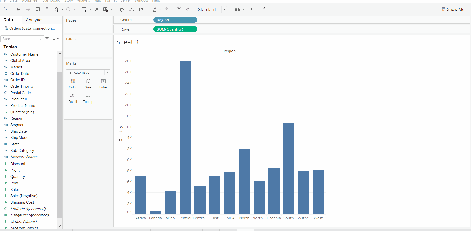
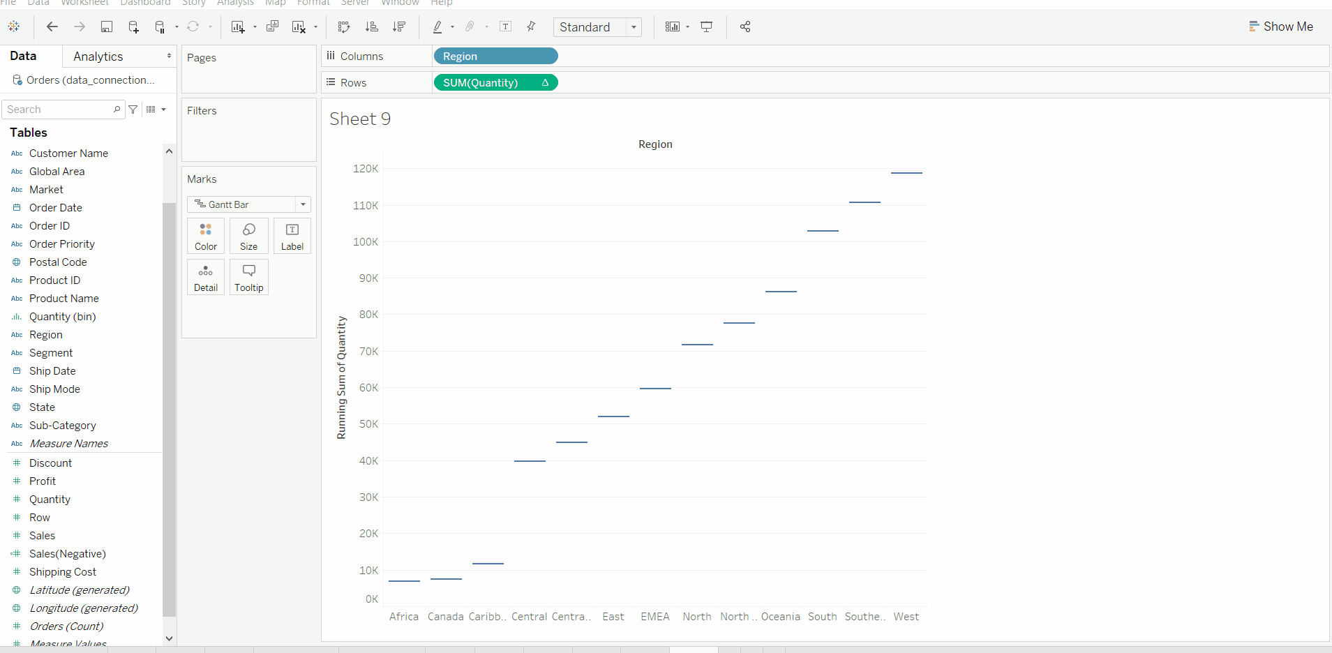
- To draw a waterfall chart we have draw a bar chart, convert to Gantt Chart, form negative axis and apply it to make chart like waterfall.
- Draw a Bar Chart
- Make it running and convert to Gantt Chart
- Form a negative valued new field and apply on size
- Apply other marks for better look (optional)