Bar Chart is a graph that displays categorical data using rectangular bars, where the height (or length) of each bar corresponds to its value. Bars can be displayed vertically (column chart) or horizontally (bar chart). They are one of the most common visualizations used to compare categorical data.
Bar charts are useful for:
- Comparing values across categories.
- Visualizing trends in discrete groups.
- Highlighting differences in magnitude between items.
Creating a Basic Bar Chart
To create a simple bar chart in Tableau, we need to:
- Open Tableau and connect to a dataset.
Note: We can also use in built databases of Tableau
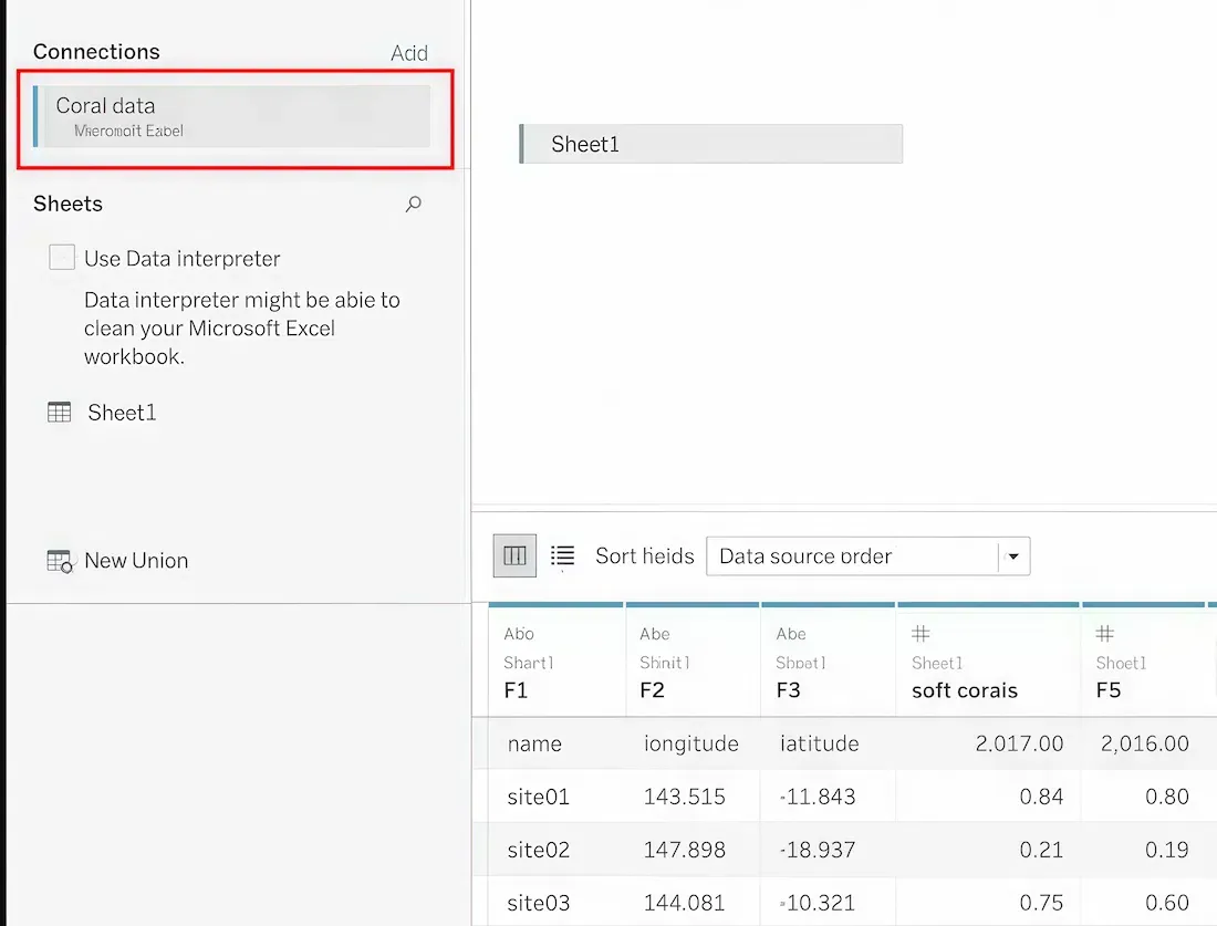
- Drag and drop a sheet from the connected dataset.
- Open a worksheet (for example, Sheet1).
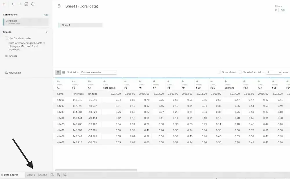
- On the left side, we will see all dataset attributes.
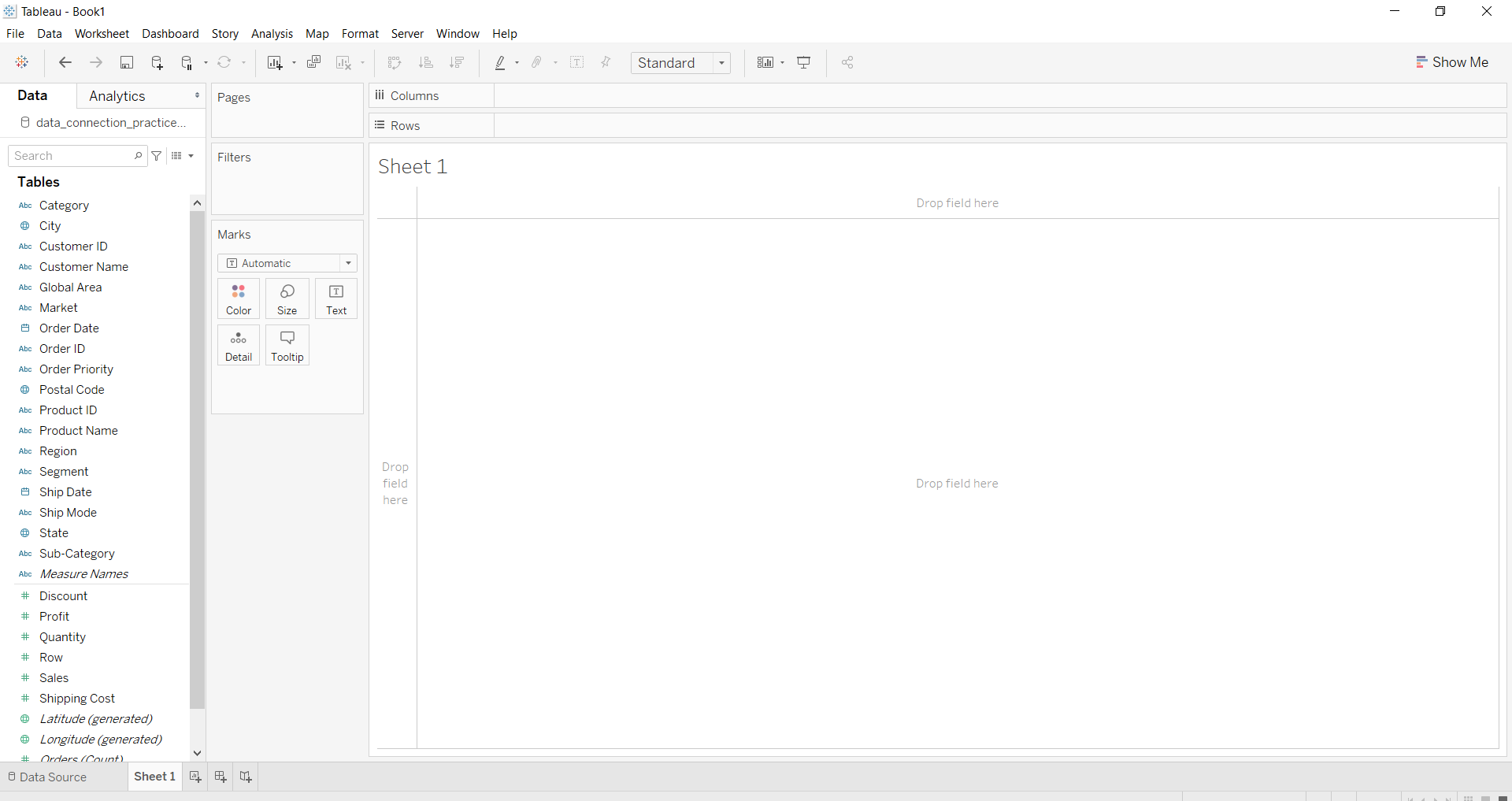
- Select at least two fields: one for Rows and one for Columns. For example, we can use Product Category for Columns and Sales for Rows to visualize how sales differ across categories.
- From the chart options, choose Bar as the chart type.
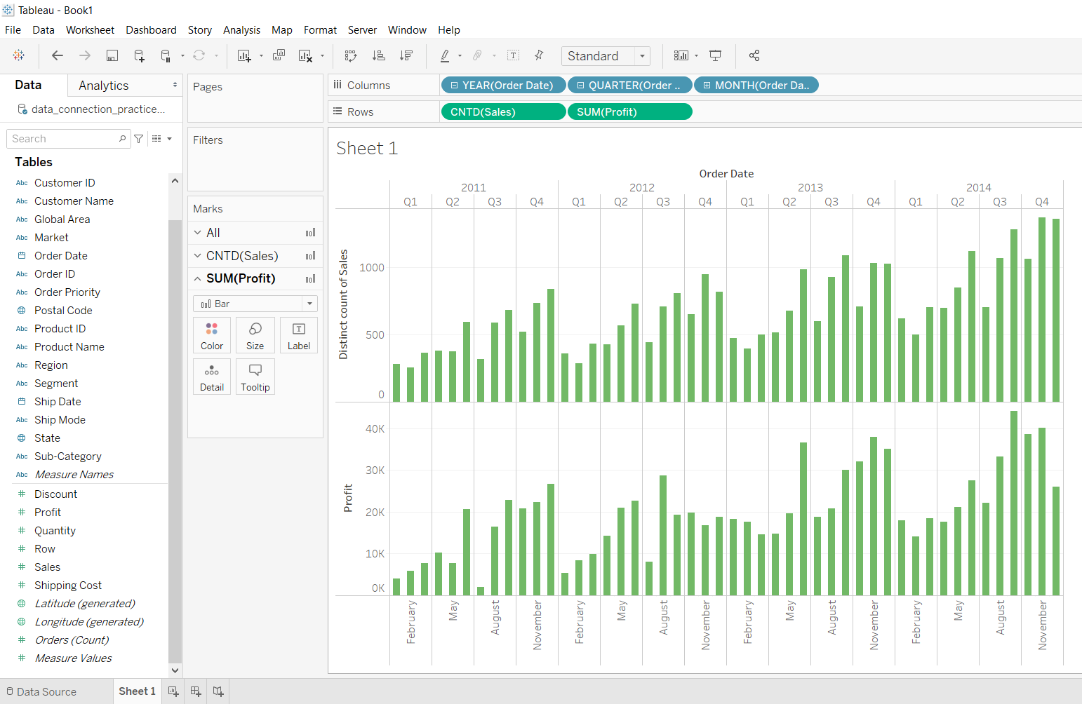
Example 1: Bar Chart by Date and Sales
To visualize trends over time with additional metrics:
- Select a Date field (dimension like Year or Month) for Columns.
- Select Sales and Profit fields for Rows.
- Choose the Bar Chart type from the chart options.
This chart shows how sales and profit vary over time, allowing us to identify high-performing periods.
Example 2: Bar Chart by Region with Custom Marks
To analyze sales across regions and apply additional metrics:
- Select Region for Rows and Sales for Columns.
- Choose Bar Chart as the chart type.
- Drag the Discount field to Color in the Marks section to visualize differences in discount.
- Apply a filter using the SUM(Quantity) field to focus on specific ranges.
This customized bar chart helps us compare sales by region while observing the impact of discounts and filtering for relevant data ranges.
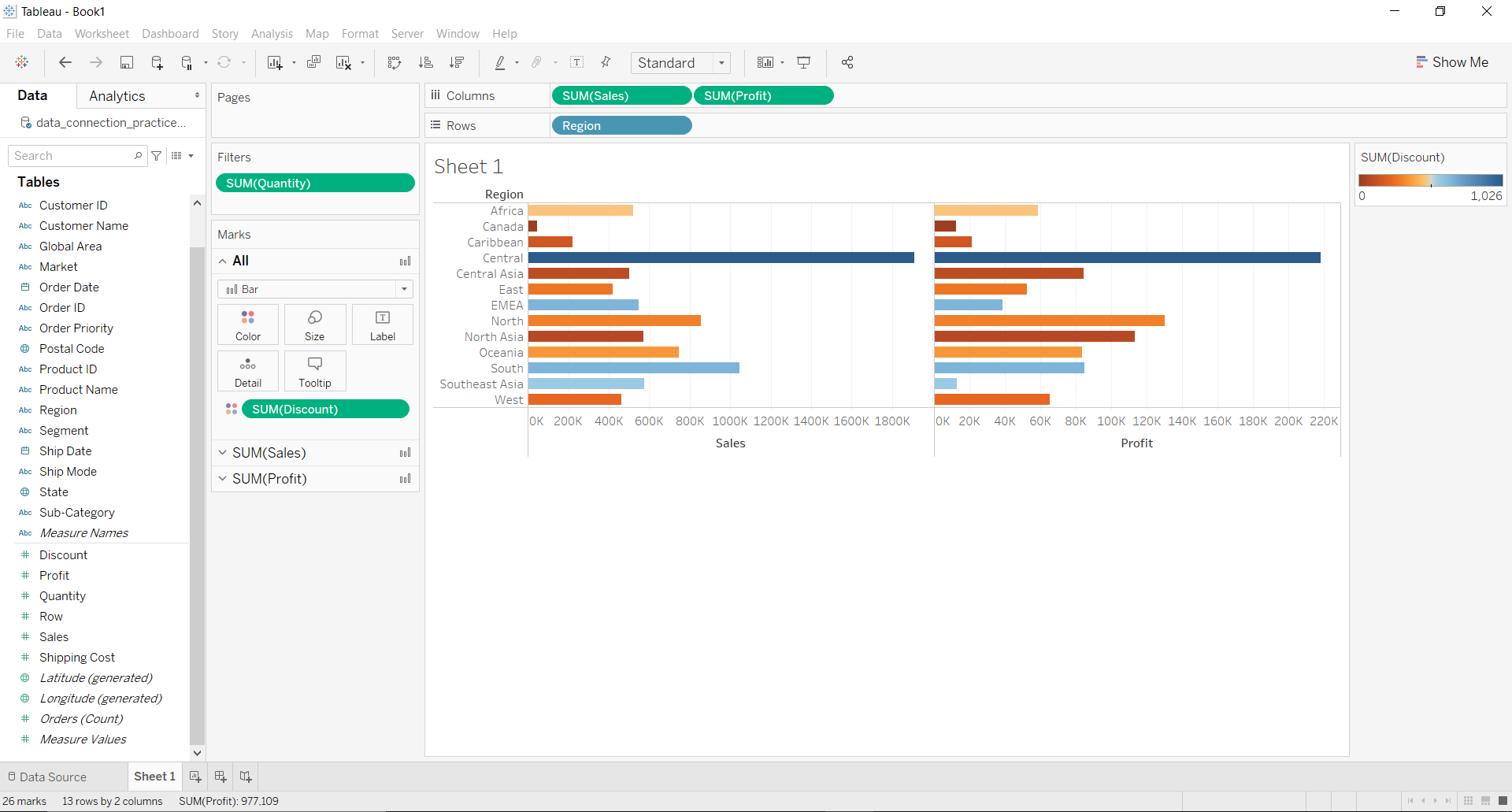
Using multiple fields like Region, Sales, Profit and Discount, we can make our visualizations more informative and interactive.