A Control Chart is a graphical representation used to study how a process changes over time. It plots data points in the time order and helps detect trends or shifts in the process by comparing them to the statistically calculated control limits.
Components of a Control Chart
Center Line (CL): This is the average or mean of the data points being plotted. It represents the target or expected value for the process.
Upper Control Limit (UCL): This is the maximum value a data point can reach before it indicates that the process might be going out of control. It is usually set at 3 standard deviations above the center line.
Lower Control Limit (LCL): This is the minimum value a data point can reach before signaling potential issues with the process. It is typically 3 standard deviations below the center line.
How Control Charts Work?
The Control charts plot data points over time with center line representing the process average and upper and lower control limits acting as thresholds for the variation expected within the process.
If all points lie within the control limits and there is no discernible pattern the process is considered in the control.
If a point falls outside the control limits or there is a non-random pattern it signals that the process may be out of the control and corrective actions should be taken.
A control chart helps differentiate between the common cause variation and special cause variation.
Types of Control Charts
The Control charts are broadly categorized into two types based on the nature of the data:
Variable Control Charts
Attribute Control Charts
Variable Control Charts
These charts are used when the data being monitored is continuous. The most common variable control charts include:
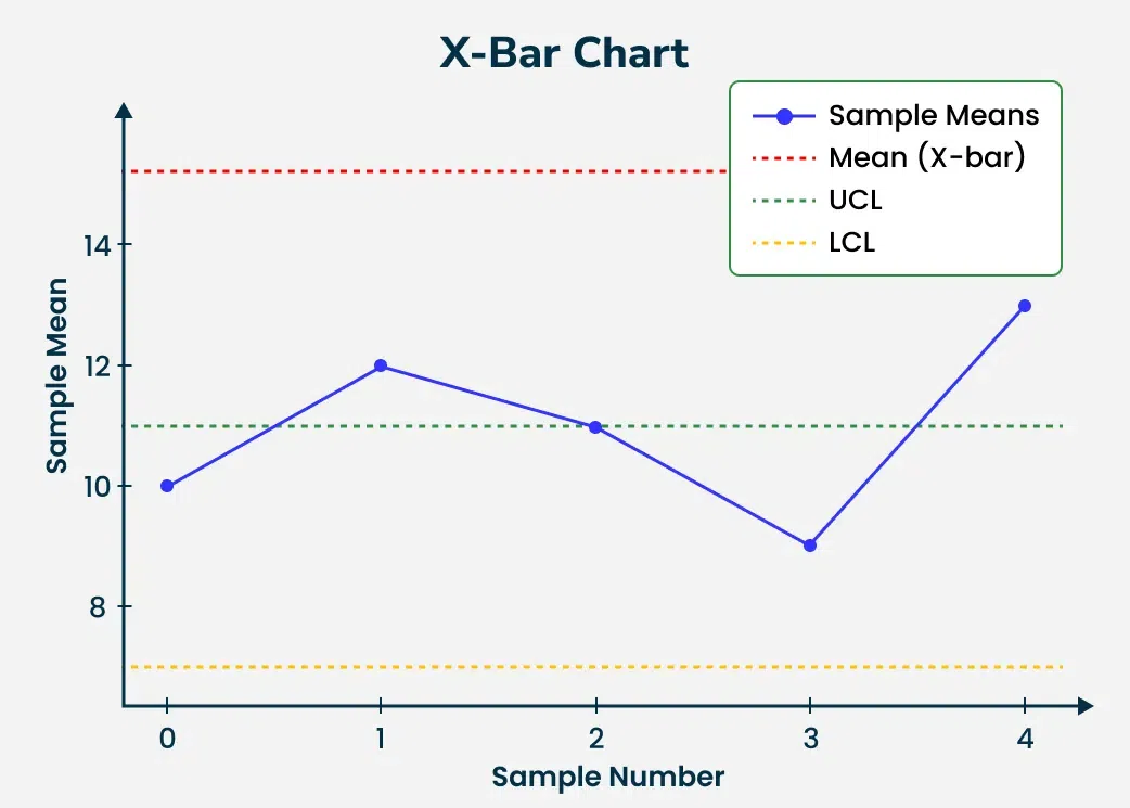
X-bar Chart: Monitors the mean of a process over time.
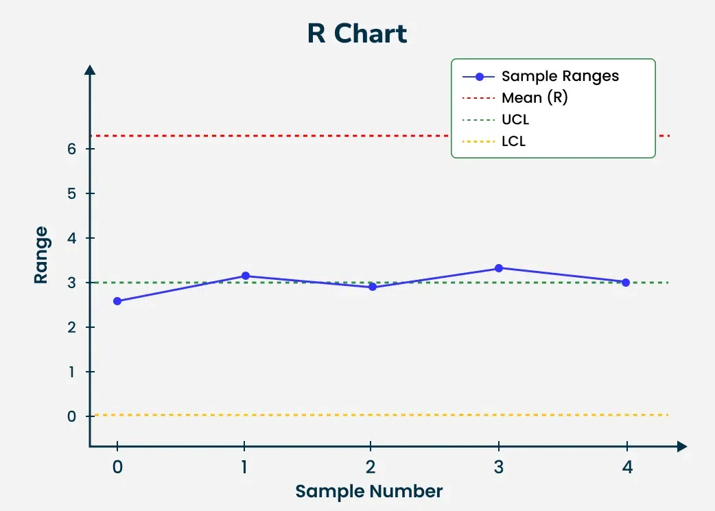
R-chart: Monitors the range of the process.
S-chart: Tracks the standard deviation of the process.
Attribute Control Charts
The Attribute control charts are used for the discrete data such as the counts of defects or defective units. The most common attribute control charts are:
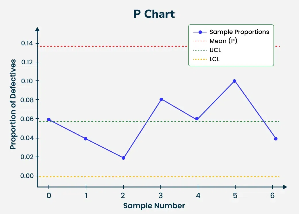
P-chart: Tracks the proportion of defective items in the sample.
NP-chart: Monitors the number of defective items in the fixed-size sample.
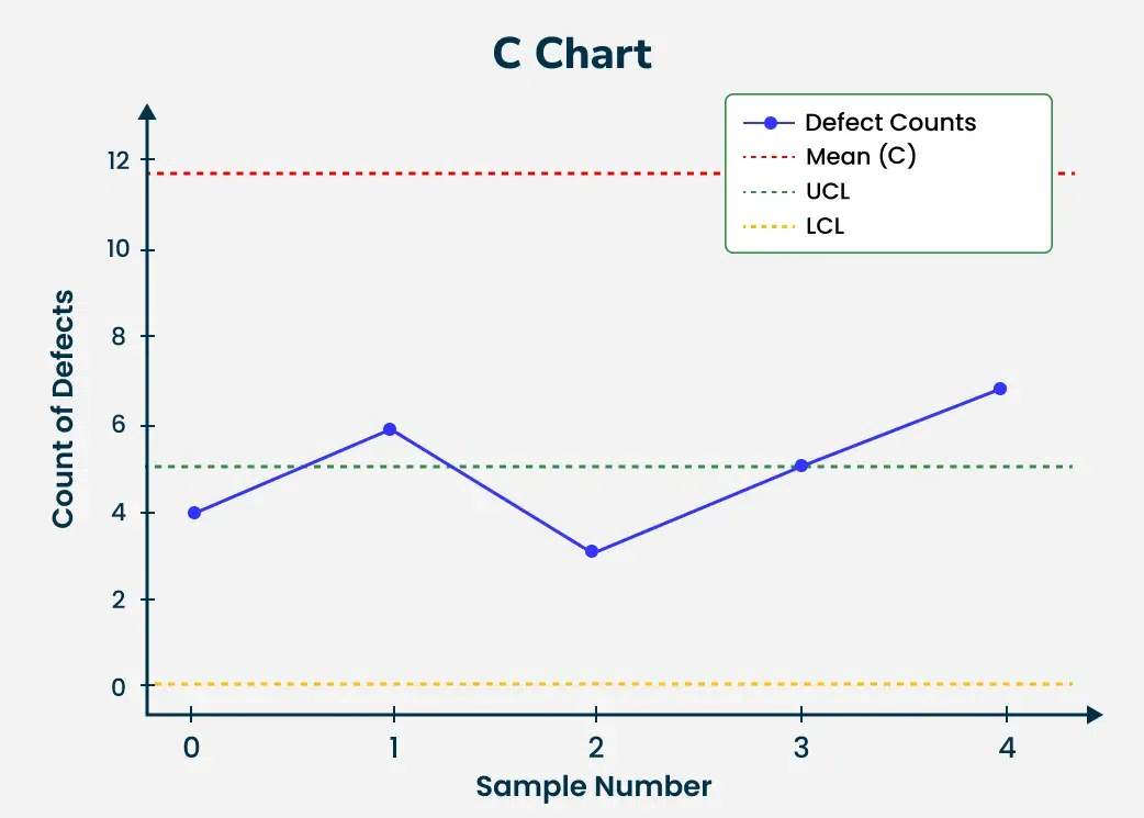
C-chart: Tracks the count of defects in the unit.
U-chart: Monitors the number of defects per unit in the sample of the varying sizes.
Construction of a Control Chart
To create a control chart follow these steps:
Step 1: Data Collection
First, collect data for the process we're monitoring. This data is typically collected over a set period of the time and must be representative of the process in the question.
Step 2: Calculate Process Average
The central line (CL) of the control chart represents the process average in which is calculated by taking the mean of the collected data points.
Step 3: Determine Control Limits
The Control limits are calculated to identify the boundaries for the acceptable variation. These limits are typically set at three standard deviations above and below the process average. The Upper Control Limit (UCL) and Lower Control Limit (LCL) can be calculated as:
UCL = CL + 3σ and LCL = CL − 3σ
where σ is the standard deviation of the data points.
Step 4: Plot the Data
Once the central line and control limits are established the data points are plotted over time. This visual representation helps in the determining if the process is in the control or if corrective action is required.
How to Interpret Control Charts
A control chart provides valuable insights into the process's behavior. The key indicators to monitor are:
In Control Process: If the data points are fluctuating within control limits without forming any specific pattern the process is considered stable or in control.
Out of Control Process: If the data points fall outside the control limits or form recognizable patterns it indicates that the process may be experiencing special causes of the variation requiring further investigation.
Applications of Control Charts
The Control charts have wide applications in the various industries:
Manufacturing: Used to monitor product quality ensuring that the dimensions or specifications of the products remain consistent over time.
Healthcare: The Control charts are used to track patient outcomes or medical treatment efficacy allowing for the early detection of the problems in healthcare processes.
IT and Software Development: They help monitor system performance metrics like response time or error rates enabling the identification of the trends that might affect system reliability.
Financial Services: The Control charts can track key financial metrics over time such as the transaction volumes or fraud detection rates to the ensure the processes are under control.
Solved Questions on Control Charts
Question 1: A factory produces 100 units daily and following samples are taken over 5 days: [10, 12, 11, 9, 13]. Calculate the control limits for the X-bar chart.
Solution:
Calculate the mean: Mean = \frac{10 + 12 + 11 + 9 + 13}{5} = 11
Question 2: A sample of 50 products is taken every day for 7 days. The number of defective products recorded over 7 days is: [3, 2, 1, 4, 3, 5, 2]. Construct a P-chart.
Solution:
Proportion of defective products per sample: p_1 = \frac{3}{50} = 0.06, \quad p_2 = \frac{2}{50} = 0.04, \ldots
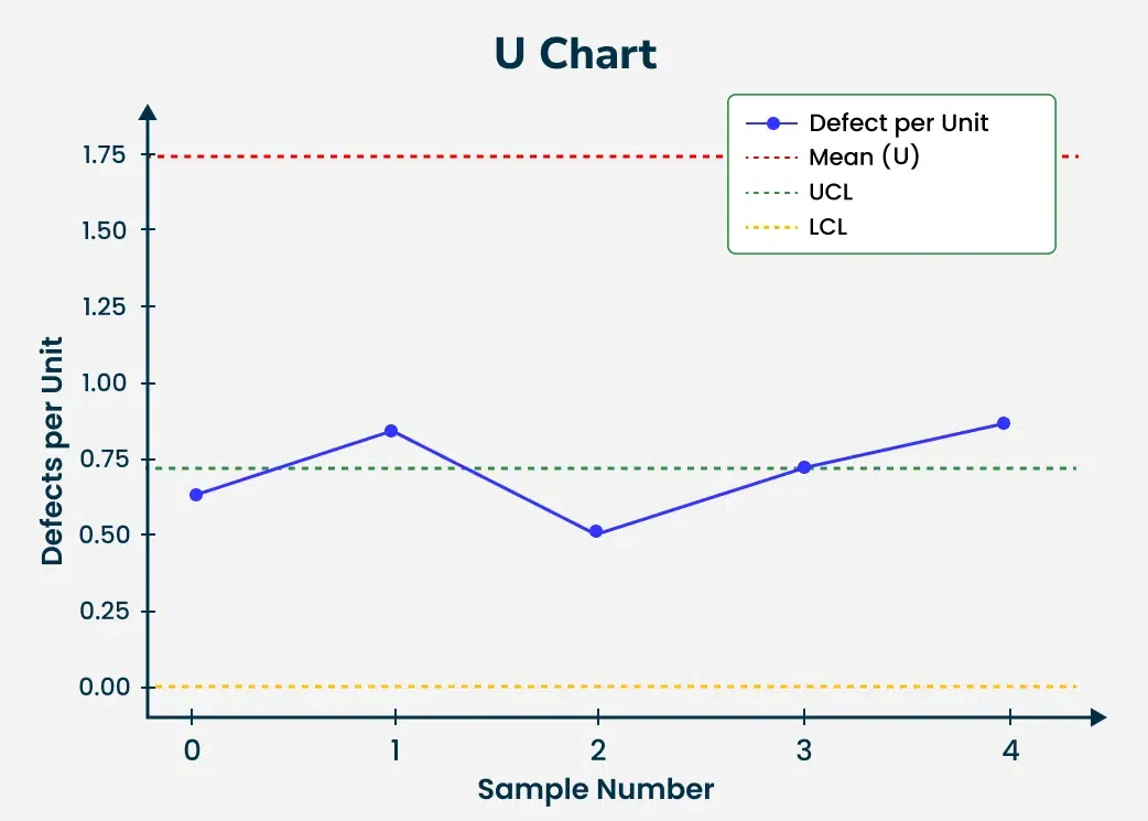
Question 5: In a process, 6 samples are taken and number of defects per unit across 5 samples is: [0.6, 0.8, 0.5, 0.7, 0.9]. Calculate the control limits for the U-chart.
Solution:
Calculate the average defects per unit (\bar{u}): \bar{u} = \frac{0.6 + 0.8 + 0.5 + 0.7 + 0.9}{5} = 0.7
Q 1. A process records 10 samples with the following averages: [15.2, 14.8, 15.0, 15.1, 14.9, 15.2, 15.3, 15.0, 15.1, 15.4]. Calculate the control limits for an X-bar chart with the standard deviation of 0.5.
Q 2. A sample size of 200 is inspected every day and number of defective items is recorded for 5 days as [3, 5, 4, 2, 6]. Construct a P-chart.
Q 3. In a quality control process, the range of samples taken on 6 days is: [3.0, 3.5, 2.8, 3.2, 3.1, 2.9]. Construct an R-chart and calculate the control limits.
Q 4. A process measures the number of defects per unit over 7 samples. The defect counts per unit are: [4, 5, 3, 6, 4, 7, 3]. Create a C-chart for this process and determine the control limits.
Q 5. We are monitoring a process where the proportion of defective items over 5 days is: [0.05, 0.07, 0.06, 0.04, 0.08]. Construct a P-chart and calculate the control limits.
Q 6. A factory records the number of defects per unit in 4 units over 5 days: [1, 2, 0, 3, 1]. Calculate the U-chart control limits.
Q 7. Over 5 samples, a production process records the following averages: [20, 21, 22, 19, 21]. The sample range for the each is: [3, 4, 2, 5, 4]. Construct both X-bar and R-charts.
Q 8. The number of defective units in a daily sample of 100 items is recorded over 8 days as: [5, 3, 4, 7, 6, 5, 3, 4]. Calculate the P-chart control limits.
Q 9. A process measures the time taken for tasks over 6 days with following ranges: [5, 6, 4, 7, 6, 5]. Calculate the control limits for an R-chart.
Q 10. Over 10 days, the number of errors per transaction in an IT system is recorded as: [1, 2, 0, 3, 1, 2, 1, 0, 2, 3]. Construct a C-chart and determine if the process is in control.
Conclusion
In conclusion, control charts are valuable tools used to monitor and improve processes in various fields, such as manufacturing and healthcare. They help us visually track performance over time, allowing us to identify trends, variations, and potential problems early on.