MUI Breakpoints are based on the standard CSS breakpoints and are used to adjust the layout and design of a website or application when viewed on different devices. React MUI Breakpoints, from the Material-UI library, are used to define different styles for different screen sizes. Each breakpoint corresponds to a specific screen width range and allows developers to create responsive designs that adapt to different screen sizes.
Syntax:
[theme.breakpoints.style(key)]: {
    cssProperty: value,
}
Default Values
- xs (extra-small): Gets triggered when the screen size is above 0px.
- sm (small): Gets triggered when the screen size is above or equal to 600px.
- md (medium): Gets triggered when the screen size is above or equal to 900px.
- lg (large): Gets triggered when the screen size is above or equal to 1200px.
- xl: (extra-large): Gets triggered when the screen size is above or equal to 1536px.
CSS Media Queries
Media queries in CSS are used to apply different styles to a webpage based on the characteristics of the device displaying it. They allow developers to create responsive designs that adapt to different screen sizes, orientations, and other features of the device. To that end, the theme includes five style assistants:
- theme.breakpoints.up(key): Gets triggered at any value above or equal to the 'key' provided.
- theme.breakpoints.down(key): Gets triggered at any value below or equal to the 'key' provided.
- theme.breakpoints.only(key): Gets triggered only at the value of the 'key' provided.
- theme.breakpoints.not(key): Gets triggered at any value above or below the 'key' provided but not at the exact value of the key.
- theme.breakpoints.between(start, end): Gets triggered in between the range of the keys ( start and end ) provided.
MUI Breakpoints with JavaScript Media Queries
A JavaScript media query is a way to use JavaScript to check the characteristics of the device displaying a webpage, such as its screen size or resolution. This allows developers to create responsive designs that adapt to different devices by applying different styles or behavior to elements on the page based on the characteristics of the device.
JavaScript Media Queries Syntax:
const Breakpoint = useMediaQuery('(cssProperty: value)');The above syntax gives 'true' when the 'MediaQuery' gets a match and 'false' otherwise.
Custom Breakpoints
Custom breakpoints are additional breakpoints that are defined and used in addition to the default breakpoints provided by Material-UI. These breakpoints are used to create more specific styles or layouts based on the screen size.
- theme.breakpoints.values: Refers to the minimum width value of for the given screen name keys.
- theme.breakpoints.unit: Refers to the unit like "px", "rem" etc.
- theme.breakpoint.step: Its value divided by 100 is used to implements the exclusive breakpoints
Custom breakpoints can be defined using the createTheme() function, which allows developers to specify their own values for the breakpoints.
React MUI Custom Breakpoints Syntax:
const theme = createTheme({
    breakpoints: {
        values: {
            key1: value,
            // for example
            sm: 400,
            //or
            mobile: 200,
            laptop: 1000,
        },
    },
});
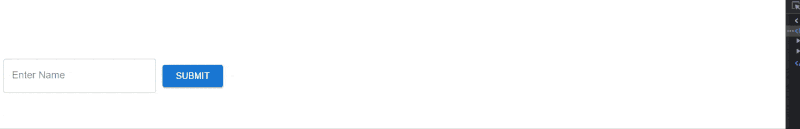
Example 1: JavaScript Media Queries with custom breakpoints
// Filename - App.js
import * as React from 'react';
import useMediaQuery from '@mui/material/useMediaQuery';
import { Button, TextField, Box, Snackbar } from '@mui/material';

const SimpleMediaQuery = () => {
    const Desktop = useMediaQuery('(min-width:1200px)');
    const Ipad = useMediaQuery('(min-width:1000px)');
    const Mobile = useMediaQuery('(min-width:800px)');

    return (
        <Box sx={{
            margin: '25px', marginTop: '100px',
            display: 'flex', flexDirection: Mobile ? 'row' : 'column'
        }}>
            <TextField label='Enter Name' sx={{ width: '250px' }} />
            <Button variant='contained'
                sx={{ margin: '10px', width: '100px' }}>
                Submit
            </Button>
            <Snackbar
                anchorOrigin={{ vertical: 'top', horizontal: 'left' }}
                open={!Desktop}
                onClose={Desktop}
                autoHideDuration={2000}
                message={!Desktop ? 'This is Desktop Screen' : ''}
                key='1'
            />
            <Snackbar
                anchorOrigin={{ vertical: 'top', horizontal: 'left' }}
                open={!Ipad}
                onClose={Ipad}
                autoHideDuration={2000}
                message={!Ipad ? 'This is Ipad Screen' : ''}
                key='2'
            />
            <Snackbar
                anchorOrigin={{ vertical: 'top', horizontal: 'left' }}
                open={!Mobile}
                onClose={Mobile}
                autoHideDuration={2000}
                message={!Mobile ? 'This is Mobile Screen' : ''}
                key='3'
            />
        </Box>
    )
};

export default SimpleMediaQuery;
Output:
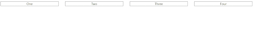
Example 2: React MUI Breakpoints with default values. In the below example, we will be using the 'sx' props and default breakpoints in a different way with 'flex' property.
// Filename - App.js

import { Box } from '@mui/material';

const breakpoints = {
   border: "1px solid black",
   margin: 2,
   flex: { xs: "100%", sm: "calc(50% - 50px)",
    md: "calc(33% - 50px)", lg: "calc(25% - 50px)" },
};

const Break = () => {
   return (
       <Box sx={{ display: "flex", flexWrap: "wrap",
        textAlign: 'center' }}>
           <Box sx={breakpoints}>One</Box>
           <Box sx={breakpoints}>Two</Box>
           <Box sx={breakpoints}>Three</Box>
           <Box sx={breakpoints}>Four</Box>
       </Box>
   );
}

export default Break;
Output: