ggplot2 is a open-source data visualization package in R based on the concept of the Grammar of Graphics. It allows users to build complex and elegant visualizations by combining multiple layers in a structured way. Instead of writing long plotting code ggplot2 lets you construct graphs step by step using clear components.
- Based on the layered approach.
- Helps create clear, customizable and publication-quality visualizations.
- Widely used in data analysis, statistics and data science.
Layers of the Grammar of Graphics in ggplot2
ggplot2 builds every plot using multiple layers. Each layer has a specific role in defining how the data is displayed.
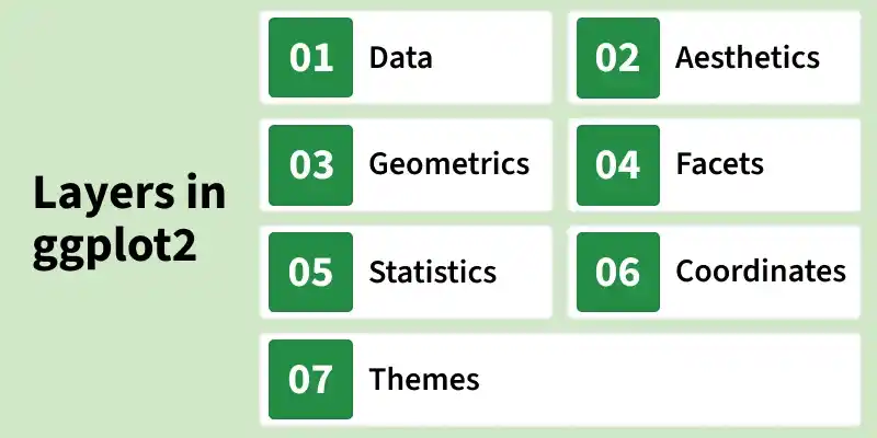
1. Data
The data layer represents the dataset used to create the visualization. It can be a data frame or any structured dataset in R.
- Specifies the source of the data.
- Can be defined globally or separately for each layer.
2. Aesthetics (aes)
The aesthetic layer maps variables in the dataset to visual properties of the plot.
- Common aesthetics: x, y, color, fill, size, shape, alpha, linetype.
- Controls how data values appear visually.
3. Geometric Objects(Geoms)
Geoms define how the data is displayed on the plot. Each geom represents a different visual representation of the data.
- geom_point(): Scatter plot
- geom_line(): Line plot
- geom_bar(): Bar chart
- geom_histogram(): Histogram
- geom_boxplot(): Boxplot
4. Facets
Faceting divides data into subsets and displays multiple plots based on categories. Useful for comparing groups within the same dataset.
- facet_wrap(): Wraps plots into multiple panels
- facet_grid(): Arranges plots in rows and columns
5. Statistics (Stats)
The statistical layer performs transformations on the data before plotting.
- Binning (used in histograms)
- Smoothing (e.g., regression lines using geom_smooth())
- Summary statistics (mean, count, etc.)
Some geoms automatically apply statistical transformations.
6. Coordinates
The coordinate system controls how data points are positioned in space. Coordinates determine the relationship between data and the display area.
- coord_cartesian(): Cartesian coordinates
- coord_fixed(): Fixed aspect ratio
- coord_polar(): Polar coordinates
7. Themes
The theme layer controls the non-data elements of the plot (appearance). Themes improve readability and presentation quality.
- Background style
- Grid lines
- Fonts and text size
- Legend position
Examples: theme_minimal(), theme_classic(), theme_bw()
Step by Step Implementation
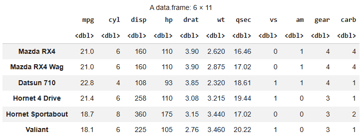
We will use the mtcars(motor trend car road test) dataset which is a built in dataset in R. It comprise fuel consumption and 10 aspects of automobile design and performance for 32 automobiles.
Step 1: Install and Load Required Packages
Install and load the necessary libraries. These packages provide tools for data manipulation and visualization. The head() function displays the first six rows of the dataset.
install.packages("vctrs")
install.packages("dplyr")

library(dplyr)
library(ggplot2)

head(mtcars)
Output:
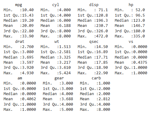
Now we print the summary of mtcars dataset using summary function.
summary(mtcars)
Output:
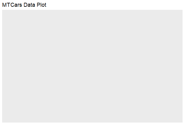
Step 2: Data Layer
The data layer we define the source of the information to be visualize, let’s use the mtcars dataset in the ggplot2 package.
ggplot(data = mtcars) +
  labs(title = "MTCars Data Plot")
Output:
Step 3: Aesthetic Layer
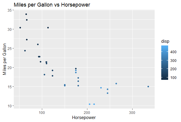
Here we will display and map dataset into certain aesthetics. Map horsepower (hp) to the x-axis, miles per gallon (mpg) to the y-axis and displacement (disp) to color.
ggplot(data = mtcars, aes(x = hp, y = mpg, col = disp))+
 labs(title = "MTCars Data Plot")
Output:
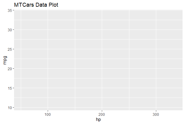
The plot area is prepared with mapped aesthetics, but no points appear because no geometry layer is added.
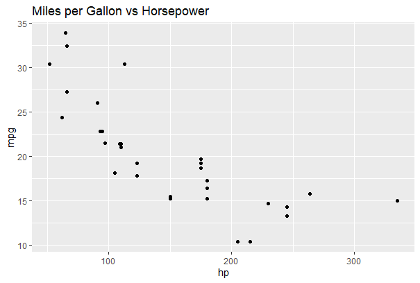
Step 4: Geometric layer
The geometric layer control the essential elements, see how our data being displayed using point, line, histogram, bar, boxplot.
ggplot(data = mtcars, aes(x = hp, y = mpg, col = disp)) +
  geom_point() +
  labs(title = "Miles per Gallon vs Horsepower",
       x = "Horsepower",
       y = "Miles per Gallon")
Output:
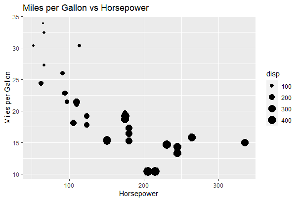
Add Size Aesthetic: Maps engine displacement (disp) to point size, so cars with larger engines appear as bigger dots in the scatter plot.
ggplot(data = mtcars, aes(x = hp, y = mpg, size = disp)) +
  geom_point() +
  labs(title = "Miles per Gallon vs Horsepower",
       x = "Horsepower",
       y = "Miles per Gallon")
Output:
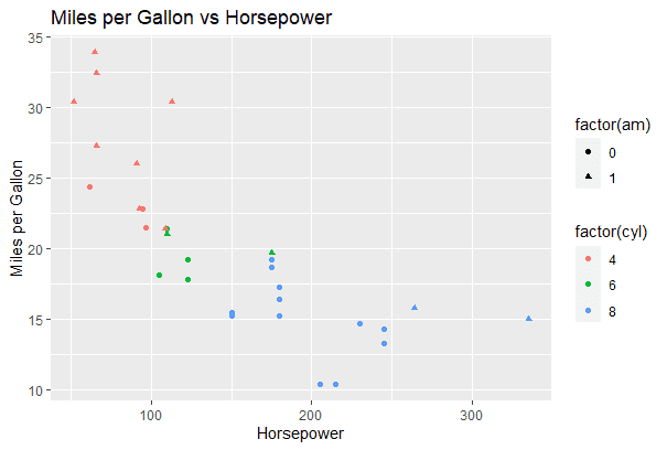
Add Shape and Color Categories: Uses color for cylinder count and shape for transmission type to visually differentiate car categories in one plot.
ggplot(data = mtcars, aes(x = hp, y = mpg, col = factor(cyl),
       shape = factor(am))) +
  geom_point() +
  labs(title = "Miles per Gallon vs Horsepower",
       x = "Horsepower",
       y = "Miles per Gallon")
Output:
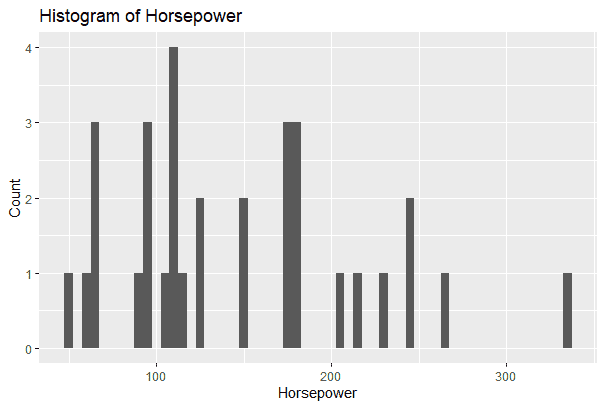
Histogram: Creates a histogram of horsepower to show its frequency distribution across different value ranges.
ggplot(data = mtcars, aes(x = hp)) +
  geom_histogram(binwidth = 5) +
  labs(title = "Histogram of Horsepower",
       x = "Horsepower",
       y = "Count")
Output:
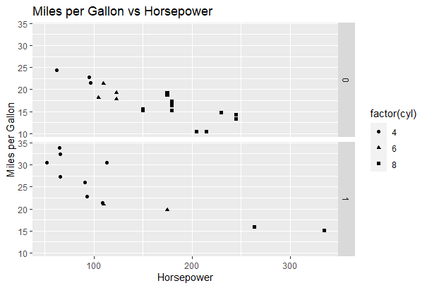
Step 5: Facet Layer
The facet layer is used to split the data up into subsets of the entire dataset and it allows the subsets to be visualized on the same plot. Here we separate rows according to transmission type and Separate columns according to cylinders.
Apply Faceting (Row-wise): Here we split the scatter plot by transmission type.
p <- ggplot(data = mtcars, aes(x = hp, y = mpg, shape = factor(cyl))) +
  geom_point()

p + facet_grid(am ~ .) +
  labs(title = "Miles per Gallon vs Horsepower",
       x = "Horsepower",
       y = "Miles per Gallon")
Output:
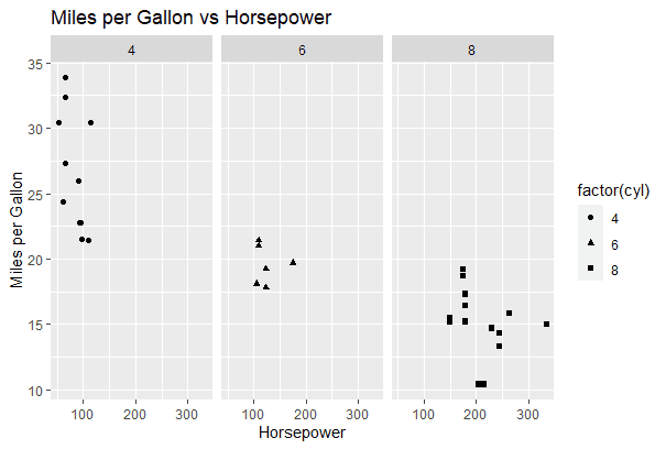
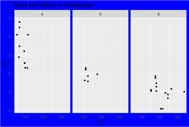
Apply Faceting (Column-wise): Now we split the scatter plot by cylinder count.
p <- ggplot(data = mtcars, aes(x = hp, y = mpg, shape = factor(cyl))) +
  geom_point()

p + facet_grid(. ~ cyl) +
  labs(title = "Miles per Gallon vs Horsepower",
       x = "Horsepower",
       y = "Miles per Gallon")
Output:
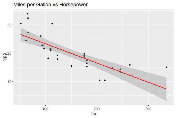
Step 6: Statistics layer
This layer transforms our data using binning, smoothing, descriptive statistics and intermediate summaries. It also adds a linear regression line to show the trend.
ggplot(data = mtcars, aes(x = hp, y = mpg)) +
  geom_point() +
  stat_smooth(method = lm, col = "red") +
  labs(title = "Miles per Gallon vs Horsepower")
Output:
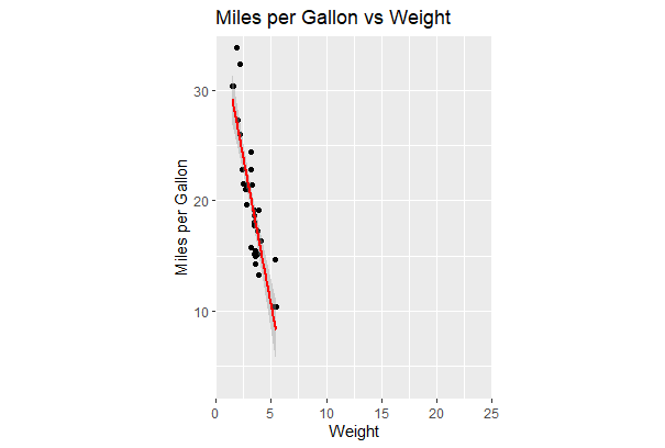
Step 7: Coordinates layer
In these layers, data coordinates are mapped together to the mentioned plane of the graphic and we adjust the axis and changes the spacing of displayed data with Control plot dimensions.
ggplot(data = mtcars, aes(x = wt, y = mpg)) +
  geom_point() +
  stat_smooth(method = lm, col = "red") +
  scale_y_continuous("Miles per Gallon", limits = c(2, 35), expand = c(0, 0)) +
  scale_x_continuous("Weight", limits = c(0, 25), expand = c(0, 0)) +
  coord_equal() +
  labs(title = "Miles per Gallon vs Weight",
       x = "Weight",
       y = "Miles per Gallon")
Output:
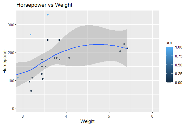
Zoom Using coord_cartesian():
ggplot(data = mtcars, aes(x = wt, y = hp, col = am)) +
  geom_point() +
  geom_smooth() +
  coord_cartesian(xlim = c(3, 6))
Output:
Step 8: Theme Layer
This layer controls the finer points of display like the font size and background color properties.
Apply Custom Theme: Modify plot appearance using theme elements.
ggplot(data = mtcars, aes(x = hp, y = mpg)) +
  geom_point() +
  facet_grid(. ~ cyl) +
  theme(plot.background = element_rect(fill = "blue", colour = "gray")) +
  labs(title = "Miles per Gallon vs Horsepower")
Output:
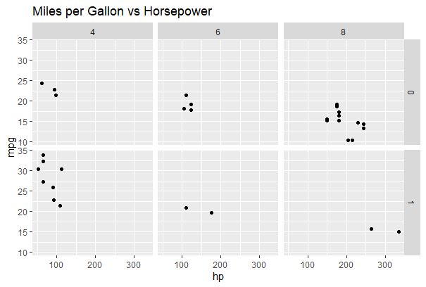
Apply Built-in Theme: Here we use a predefined ggplot2 theme.
ggplot(data = mtcars, aes(x = hp, y = mpg)) +
  geom_point() +
  facet_grid(am ~ cyl) +
  theme_gray() +
  labs(title = "Miles per Gallon vs Horsepower")
Output:
Advanced Visualization Techniques in ggplot2
Advanced plotting features in ggplot2, including density contours, multi-plot panels and methods for saving and managing visualizations.
1. Contour plot for the mtcars dataset
A contour plot visualizes the density distribution of two continuous variables. In ggplot2 stat_density_2d() is used to create 2D density contours that highlight areas where data points are more concentrated.
- Displays density levels instead of individual points.
- Helps identify clusters and patterns between two numeric variables.
- Uses color gradients to represent different density intensities.
Here we code generates a 2D density contour plot for weight (wt) and miles per gallon (mpg) from the mtcars dataset.
install.packages("ggplot2")
library(ggplot2)

ggplot(mtcars, aes(x = wt, y = mpg)) +
  stat_density_2d(aes(fill = ..level..), geom = "polygon", color = "white") +
  scale_fill_viridis_c() +
  labs(title = "2D Density Contour Plot of mtcars Dataset",
       x = "Weight (wt)",
       y = "Miles per Gallon (mpg)",
       fill = "Density") +
  theme_minimal()
Output:

2. Creating a panel of different plots
Creating a panel of plots allows multiple visualizations to be displayed together for easy comparison. The gridExtra package helps arrange multiple ggplot objects into a structured grid layout.
- Combines multiple plots into a single display.
- Helps compare distributions of different variables simultaneously.
- Improves visual analysis by organizing plots in rows and columns.
Here we creates four histograms for selected variables from the mtcars dataset and arranges them in a 2-column grid.
library(ggplot2)
library(gridExtra)

selected_cols <- c("mpg", "disp", "hp", "drat")
selected_data <- mtcars[, selected_cols]

hist_plot_mpg <- ggplot(selected_data, aes(x = mpg)) +
  geom_histogram(binwidth = 2, fill = "blue", color = "white") +
  labs(title = "Histogram: Miles per Gallon", x = "Miles per Gallon", y = "Frequency")

hist_plot_disp <- ggplot(selected_data, aes(x = disp)) +
  geom_histogram(binwidth = 50, fill = "red", color = "white") +
  labs(title = "Histogram: Displacement", x = "Displacement", y = "Frequency")

hist_plot_hp <- ggplot(selected_data, aes(x = hp)) +
  geom_histogram(binwidth = 20, fill = "green", color = "white") +
  labs(title = "Histogram: Horsepower", x = "Horsepower", y = "Frequency")

hist_plot_drat <- ggplot(selected_data, aes(x = drat)) +
  geom_histogram(binwidth = 0.5, fill = "orange", color = "white") +
  labs(title = "Histogram: Drat", x = "Drat", y = "Frequency")

grid.arrange(hist_plot_mpg, hist_plot_disp, hist_plot_hp, hist_plot_drat,
             ncol = 2)
Output:

3. Save and extract R plots
Saving plots allows you to export visualizations for reports, presentations or publications. In ggplot2, the ggsave() function is used to store plots in different file formats such as PNG and PDF.
- Saves plots in various formats (PNG, PDF, JPEG, etc.).
- File format is determined by the file extension.
- Plots can also be assigned to objects and reused later.
In this code we creates a scatter plot and saves it as both PNG and PDF files, while also storing it in a variable for later use.
plot <- ggplot(data = mtcars, aes(x = hp, y = mpg)) +
  geom_point() +
  labs(title = "Miles per Gallon vs Horsepower")

# Save the plot as an image file (e.g., PNG or PDF)
ggsave("plot.png", plot)
ggsave("plot.pdf", plot)

extracted_plot <- plot
plot
Output:
Download full code from here.