A box plot (box-and-whisker plot) is a graphical tool used to summarize the distribution, central tendency and variability of a dataset. It helps quickly identify how data is spread and detect outliers.
- Box (IQR) represents the middle 50% of data (Q1 to Q3), showing where most values lie.
- Median (Q2) is a line inside the box indicating the central value.
- Whiskers extend from the box to show the range of data within 1.5 × IQR.
- Outliers are points beyond the whiskers representing unusually high or low values.
Use of Box Plot
- Central Tendency: Shows the typical value using the median.
- Spread & Variability: Displays how widely the data is distributed.
- Skewness Detection: Median position indicates if data is skewed.
- Outlier Detection: Easily identifies extreme values.
Creating Box Plot in R (ggplot2)
We can plot a box plot in R using the ggplot2 library.
Syntax
geom_boxplot(mapping = NULL, outlier.colour = NULL, outlier.shape = 19, outlier.size = 1.5, notch = FALSE)
Parameters:
- mapping: Used to define aesthetic mappings like x, y, fill or color using aes().
- outlier.colour: Sets the color of the outlier points (if not specified, default color is used).
- outlier.shape: Specifies the shape of the outlier points (e.g.,
19for solid circle). - outlier.size: Sets the size of the outlier points.
- notch: If
TRUE, adds a notch to the box to show a confidence interval around the median.
Basic Box Plot
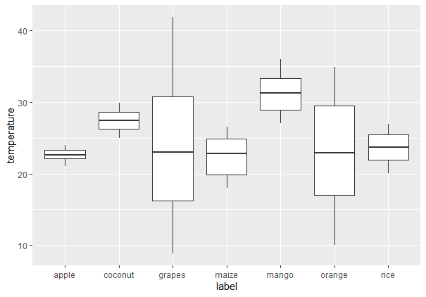
To create a regular boxplot, we first have to import all the required libraries and datasets in use. Then put all the attributes to plot in ggplot() function along with geom_boxplot.
You can download the dataset from here: Crop_recommendation
- ggplot: Initializes a ggplot2 plot object with dataset and aesthetic mapping.
- aes: Sets aesthetic mappings for x and y axes.
- geom_boxplot: Adds the box plot layer to the chart.
install.packages("ggplot2")
library(ggplot2)

ds <- read.csv("/content/Crop_recommendation.csv", header = TRUE)

ggplot(data=ds, mapping=aes(x=label, y=temperature))+
        geom_boxplot()
Output:
Add Mean to Box Plot
To add the mean value on the box plot, we can make use of the stat_summary() function. It enables us to add summary statistics such as the mean, which will be included directly in the plot.
Syntax
stat_summary( fun, geom)
- fill: Fills the interior of each box according to group.
- stat_summary: Adds summary statistics like mean or median.
- fun: Function to apply mean.
- geom (in stat_summary): Defines how the summary is displayed.
- shape: Shape of the mean point (e.g., 8 = star).
- size: Size of the point.
- color: Color of the point.
library(ggplot2)

ds <- read.csv("Crop_recommendation.csv", header = TRUE)

ggplot(ds, aes(x = label, y = temperature, fill = label)) +
  geom_boxplot() +
  stat_summary(fun = mean, geom = "point", shape = 8,
               size = 2, color = "white")
Output:

Change Legend Position
The position of the legend on the plot is easy to customize with the use of the theme() function. For instance, we can include the legend on top, at the bottom or suppress it altogether.
- theme: Customizes non-data parts of the plot like background, title, legend.
- legend.position: Changes the position of the legend.
library(ggplot2)
ds <- read.csv("Crop_recommendation.csv", header = TRUE)

ggplot(ds, aes(x = label, y = temperature, fill = label)) +
  geom_boxplot() +
  theme(legend.position = "top")
Output:
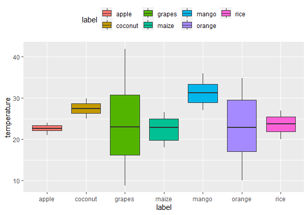
Explanation: This will put the legend in the top of the plot. The theme() function offers further customizations of plot titles, axes and background.
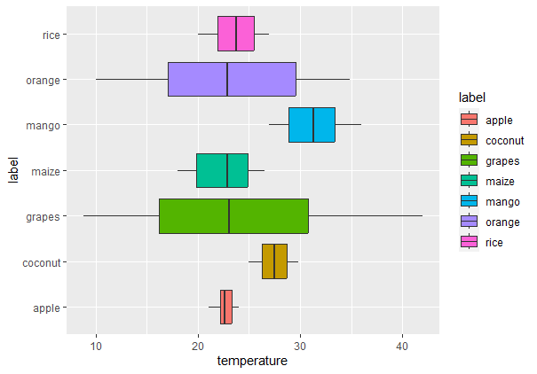
Horizontal Box Plot
Box plots can also be placed horizontally using coord_flip() function. This function just switches the x and y-axis.
- coord_flip: Flips the axes.
library(ggplot2)
ds <- read.csv("c://crop//archive//Crop_recommendation.csv", header = TRUE)

# Creating a Horizontal Boxplot using ggplot2 in R
ggplot(ds, aes(x = label, y = temperature, fill = label)) +
  geom_boxplot() +
  coord_flip()
Output:
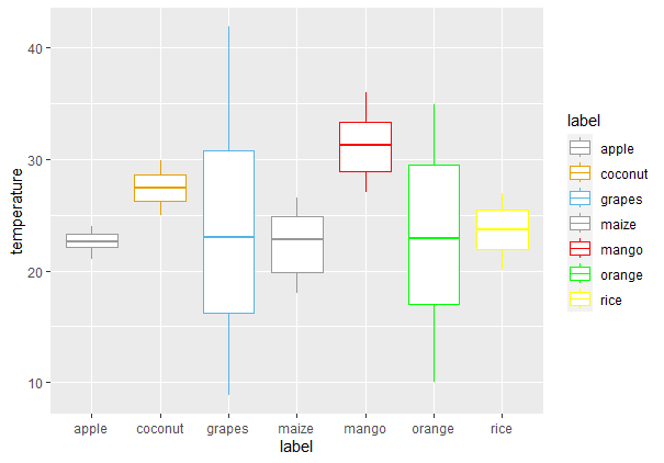
Customize Box Outline Colors
We can change the outline colors of box plots in different ways depending on how we want to represent the grouping variable.
Default Line Colors by Groups
We can reverse the outline color of the boxes according to a grouping variable. This can be achieved by mapping the color aesthetic onto a variable.
- color: Changes the outline color of each box by group.
crop2<-ggplot(ds, aes(x=label, y=temperature, color=label)) +
  geom_boxplot()
crop2
Output:

Custom Line Colors
We will use the scale_color_manual() function to specify certain colors for each group to have greater control over the box outline colors.
- scale_color_manual: defines specific colors for each group manually.
ggplot(ds, aes(x = label, y = temperature, color = label)) +
  geom_boxplot() +
  scale_fill_manual(values = c(
  "#999999", "#E69F00", "#56B4E9",
  "red", "green", "blue", "purple"
))
Output:
Using Brewer Color Palettes
We can change the outline color of the box plot with brewer color palettes. For doing so we just need to use the scale_color_brewer() function and set the palette argument within this function.
- scale_color_brewer: Applies a predefined ColorBrewer palette to line colors.
- palette: The name of the palette used (e.g., "Dark2").
ggplot(ds, aes(x = label, y = temperature, color = label)) +
  geom_boxplot() +
  scale_color_brewer(palette = "Dark2")
Output:

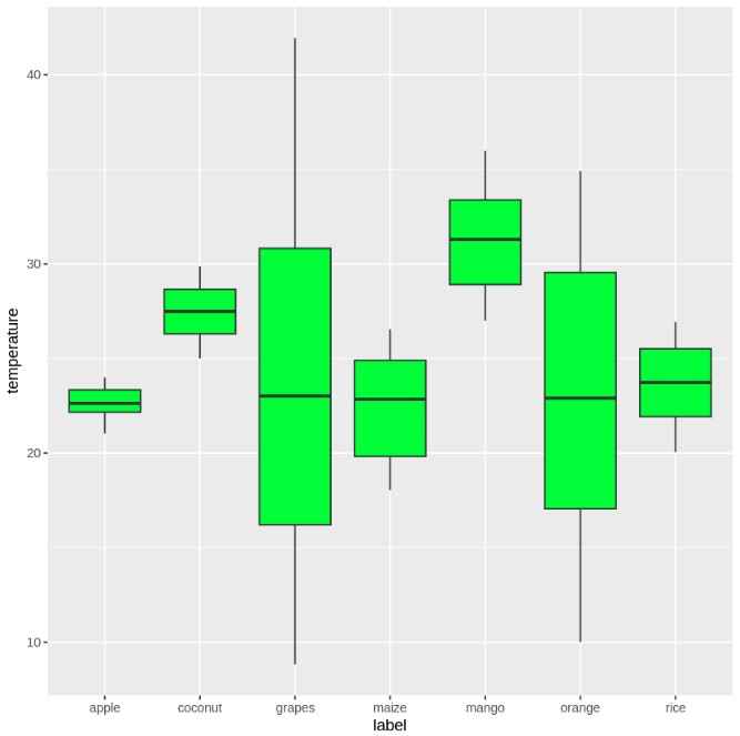
Fill the Box Plot with color
We can fill the interior of box plots using solid colors, grouped fills or custom palettes to improve visual clarity or aesthetics.
Default Filling
To fill the boxes with color, we can use the fill attribute inside the geom_boxplot() function.
ggplot(data = ds, aes(x = label, y = temperature)) +
  geom_boxplot(fill = 'green')
Output:
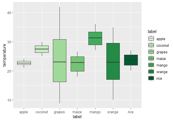
Fill by Group
If we want to fill the boxes with different colors based on the label variable, we can map the fill aesthetic to this variable.
ggplot(ds, aes(x = label, y = temperature, fill = label)) +
  geom_boxplot(outlier.colour = "black", outlier.shape = 16, outlier.size = 2)
Output:

Custom Fill Colors
To manually specify colors for the fills, use scale_fill_manual().
- scale_fill_manual:Allow us to assign custom fill colors to groups.
ggplot(ds, aes(x = label, y = temperature, color = label)) +
  geom_boxplot() +
  scale_color_manual(values = c(
    "#999999", "#E69F00", "#56B4E9",
    "red", "green", "blue", "purple"
  ))
Output:

Using Brewer Color Palettes for Filling
Similar to the outline color, we can use scale_fill_brewer() to apply a color palette to the fill.
ggplot(ds, aes(x = label, y = temperature, fill = label)) +
  geom_boxplot(outlier.colour = "black", outlier.shape = 16, outlier.size = 2) +
  scale_fill_brewer(palette = "Dark1")
Output:
Using Grayscale
To fill color of box plots with grayscale use scale_fill_grey() with theme_classic().
- scale_fill_grey: Applies a grayscale color scheme.
- theme_classic: Uses a clean white background with no grid.
crop3<-ggplot(ds, aes(x = label, y = temperature, fill = label)) +
  geom_boxplot(outlier.colour="black", outlier.shape=16, outlier.size=2)

crop3 + scale_fill_grey() + theme_classic()
Output:

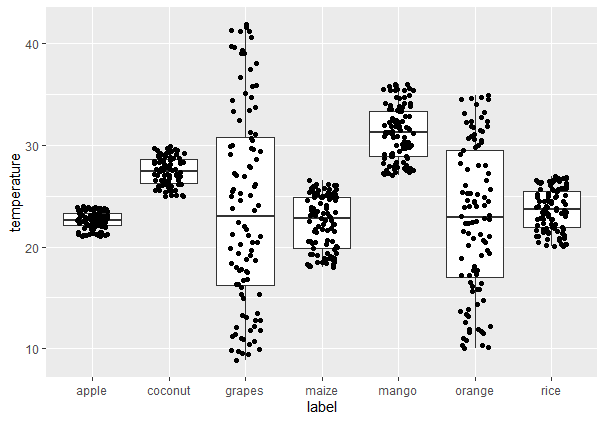
Adding Jitters in Box Plots
Jitters assist in minimizing over plotting when data points coincide. We can control the location of jittered points using the position_jitter() function.
- geom_jitter: Adds random noise to the data points to avoid overlap.
- position_jitter: Controls how much noise to add (e.g., 0.2 on x-axis).
ggplot(ds, aes(x = label, y = temperature)) +
  geom_boxplot() +
  geom_jitter(position = position_jitter(0.2))
Output:
Notched Box Plot
A notched box plot gives the added information of emphasizing the confidence interval of the median. To plot a notched box plot, use the notch parameter as TRUE.
ggplot(ds, aes(x = label, y = temperature)) +
  geom_boxplot(notch = TRUE) +
  geom_jitter(position = position_jitter(0.2))
Output:

You can download the source code from here.