The media attribute shows a media query that must be matched for a style sheet to apply. Only <style> element is using this attribute.
Syntax:
<style media="media-query-list">
    // Styling the element
</style>
Attribute Values: The media attribute accepts the values mentioned above and described below:
- media-query-list: This value holds a media query which lets the stylesheet to be applied on the element.
Below examples illustrate the use of media attribute.
Example 1:
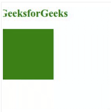
<!DOCTYPE html>
<html>

<body>
    <h1 style="margin-left: -8px;
        font-size: 25px; color: green;">
        GeeksforGeeks
    </h1>

    <svg viewBox="0 10 1440 220"
        xmlns="https://www.w3.org/2000/svg">

        <!-- Styling rect element when screen
            size is greater than 800px -->
        <style>
            rect {
                fill: yellowgreen;
            }
        </style>

        <!-- Styling rect element when screen
            size is greater than 800px and
            using media attribute-->
        <style media="all and (min-width: 800px)">
            rect {
                fill: green;
            }
        </style>

        <!-- Defining rectangular shape SVG -->
        <rect y="20" width="200" height="200" />
    </svg>
</body>

</html>
Output:
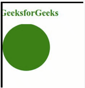
Example 2:
<!DOCTYPE html>
<html>

<body>
    <h1 style="margin-left: -8px;
        color: green; font-size: 25px;">
        GeeksforGeeks
    </h1>

    <svg viewBox="0 2 1440 220"
        xmlns="https://www.w3.org/2000/svg">

        <!-- Styling rect element when screen
            size is greater than 800px -->
        <style>
            circle {
                fill: yellowgreen;
            }
        </style>

        <!-- Styling rect element when screen
            size is greater than 800px and
            using media attribute-->
        <style media="all and (min-width: 800px)">
            circle {
                fill: green;
            }
        </style>

        <!-- Defining circular shape SVG -->
        <circle r="100" cx="100" cy="100" />
    </svg>
</body>

</html>
Output: