Tiles Visualization in Excel Power View is a feature that organizes data into interactive tiles, where each tile represents a field value and filters the view to show related data. It helps users quickly explore and analyze large datasets in a clear, visual, and easy-to-navigate format.
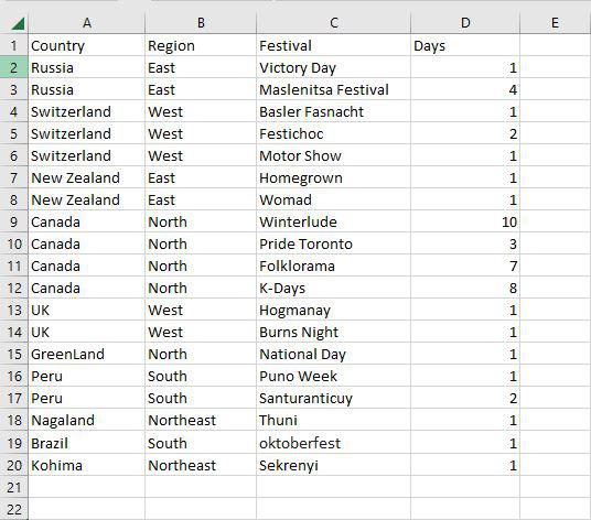
Let's take a dataset as an example in order to understand Tiles visualization. This is the major dataset that will be used in this case.
Steps to Create a Tiles Visualization
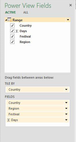
Step 1: To make Tiles, begin with a table. Choose the following options: Country, Region, Festival, and Days. In Power View, a table with these fields is displayed.

Step 2: Drag the Country field from the Fields pane to the Tile By area. This automatically displays the Tab Strip at the top of Power View.
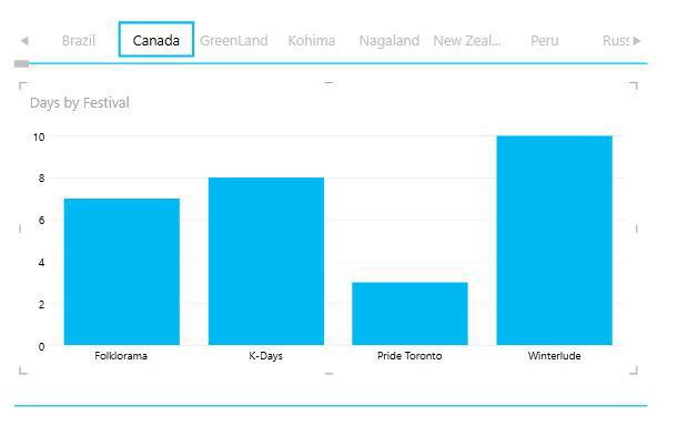
Step 3: Now as you can see the values are shown according to the selected tile. Here we have selected Canada Country.

A scroll bar is present below the Navigation Strip. The left and right borders of the Navigation Strip have arrow buttons that allow scrolling.
Tile Navigation Strip-Tile Flow
As seen below, you may change the Navigation Strip from Tab Strip to Tile Flow:
Step 1: Click on a tile. Navigate to the design tab on the top of the ribbon, then in the tiles group select tile type and choose the Tile flow option.

Step 2: Now as you can see in the tile flow the navigation strip is shifted to the bottom of the Power View.

By default, the first Tile is selected. It will be visible in the Tile Flow's center. No scrolling arrow buttons are present. By clicking on any of the tiles to the left or right of the middle tile, you can scroll to the left or right. Now we are again going to switch to Tab Strip.
Matrix Tiles Visualization
Step 1: First click on the table then go to the design tab on the top of the ribbon and then in the switch visualization group click table and then choose Matrix.
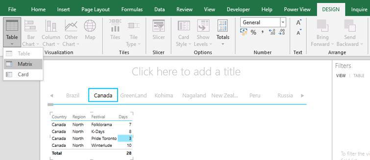
Step 2: Now as you can see it converts the selected tile to a matrix.

Cards Tiles Visualization
Step 1: First click on the table then go to the design tab on the top of the ribbon and then in the switch visualization group click table and then choose Card.

Step 2: Now as you can see it converts the selected tile to a card.

Column Chart Tiles Visualization
Step 1: Select the fields Country, Days, and festivals. Then go to the design tab on the top of the ribbon and then in the switch visualization group click column chart and then stacked column.

Step 2: Now drag the country field to the Tile by area, days field in the value area, and festival field in the axis area.

Step 3: Now you can see the chart shows the data according to the selection of the tile.