Showing percentages in a stacked column chart in Excel helps display how much each category contributes to the total. Instead of showing default values, Excel allows users to display percentages by linking data labels to a custom range using the “Value From Cells” option, making the chart easier to understand.

Implementation:
Follow the below steps to show percentages in stacked column chart In Excel:
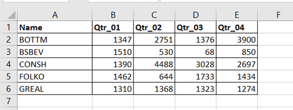
Step 1: Open excel and create a data table as below
Step 2: Select the entire data table.
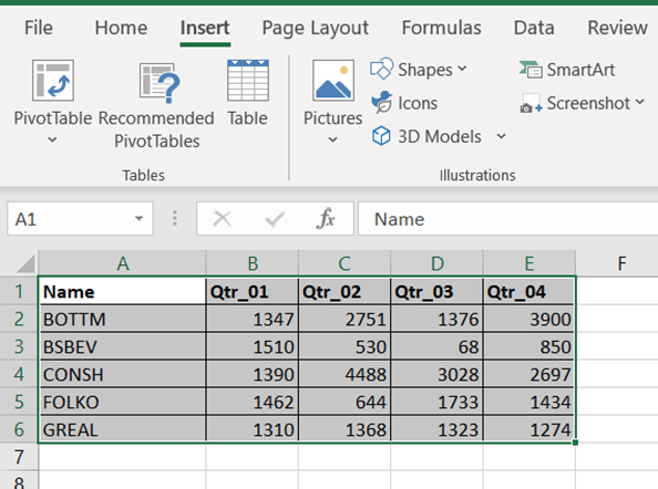
Step 3: To create a column chart in excel for your data table. Go to “Insert” >> “Column or Bar Chart” >> Select Stacked Column Chart

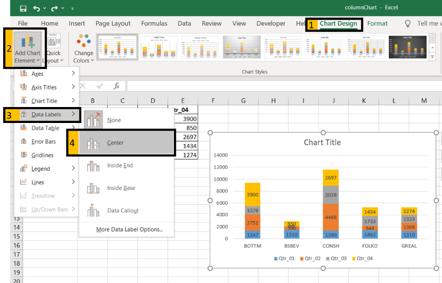
Step 4: Add Data labels to the chart. Goto “Chart Design” >> “Add Chart Element” >> “Data Labels” >> “Center”. You can see all your chart data are in Columns stacked bar.
Step 5: Steps to add percentages/custom values in Chart.
- Create a percentage table for your chart data. Copy header text in cells “b1 to E1” to cells “G1 to J1”.
- Insert below formula in cell “G2”.
=B2/SUM($B2:$E2)– make sure the “$” symbol are placed in-front of the characters (B and E) in formula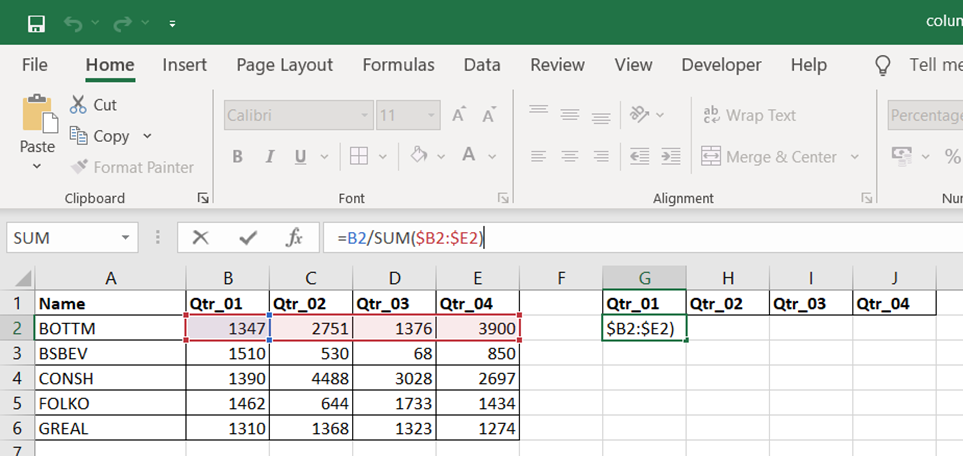
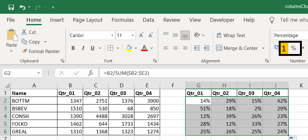
Step 6: Drag down/across the formula to fill cells G2:J6. Click Percent style (1) to convert your new table to show number with Percentage Symbol
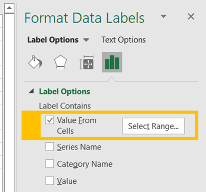
Step 7: Select chart data labels and right-click, then choose “Format Data Labels”.
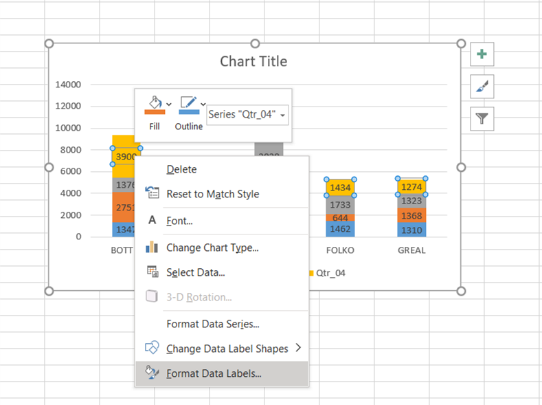
Step 8: Check “Values From Cells”.
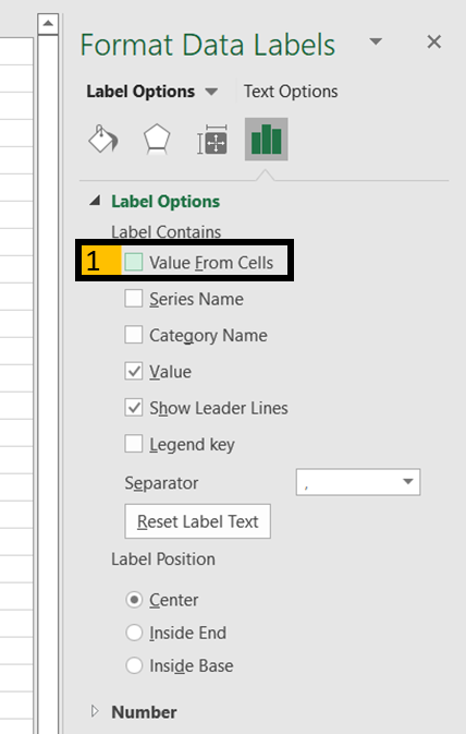
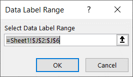
Step 9: Above step popup an input box for the user to select a range of cells to display on the chart instead of default values.
- In our example, Qtr_04 series default values are in E2:E6. But we select range J2:J6 to show respective percentages. Press “OK"
Step 10: Un-check “Value” to hide the actual value from the chart.
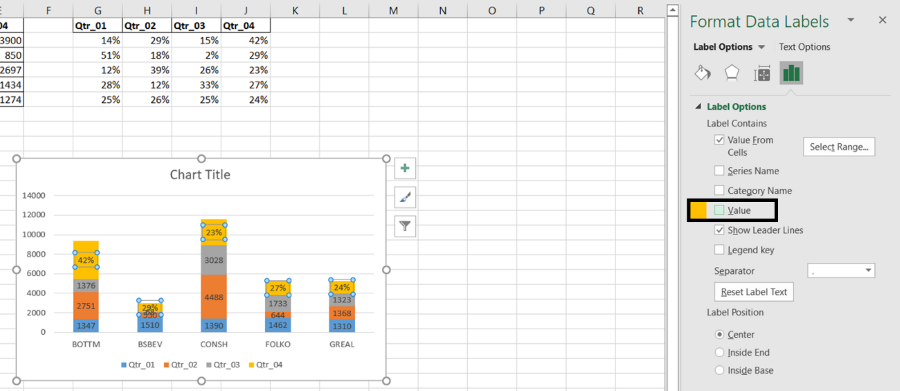
Step 11: Repeat steps 7 to 10 for each series of our data.
| Series | Respective Range |
|---|---|
| Qtr_01 | =Sheet1!$G$2:$G$3 |
| Qtr_02 | =Sheet1!$H$2:$H$4 |
| Qtr_03 | =Sheet1!$I$2:$I$5 |
| Qtr_04 | =Sheet1!$J$2:$J$6 |
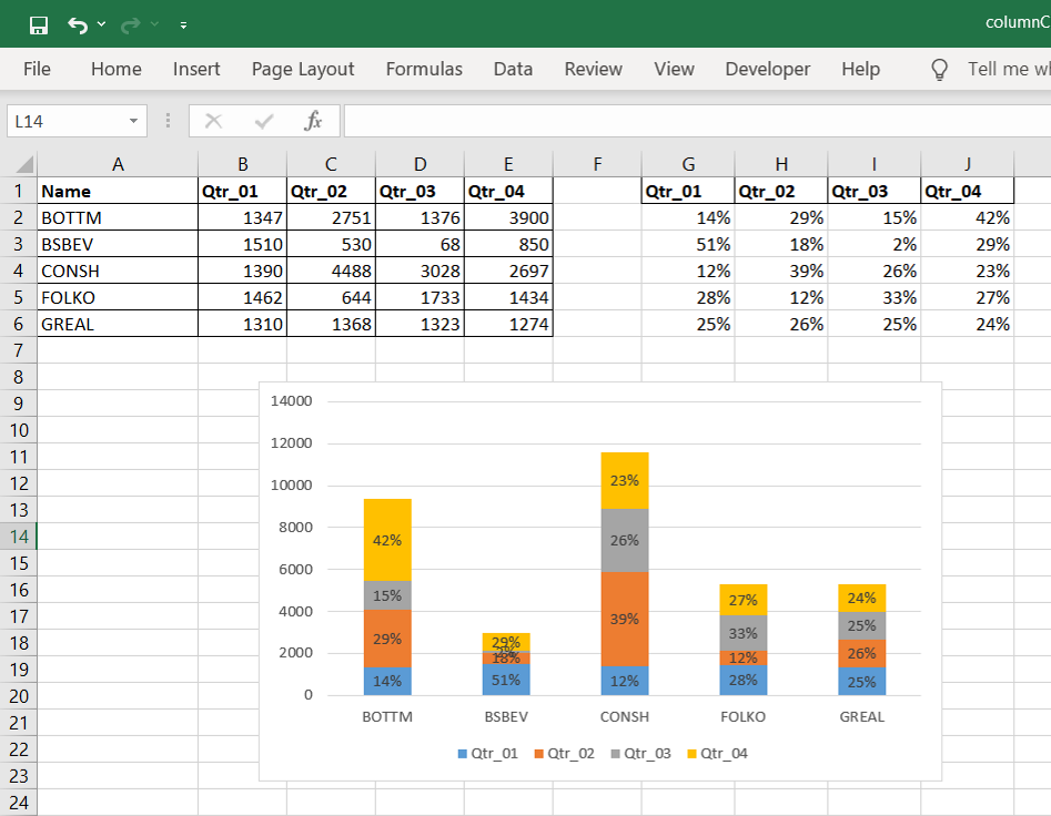
Output: