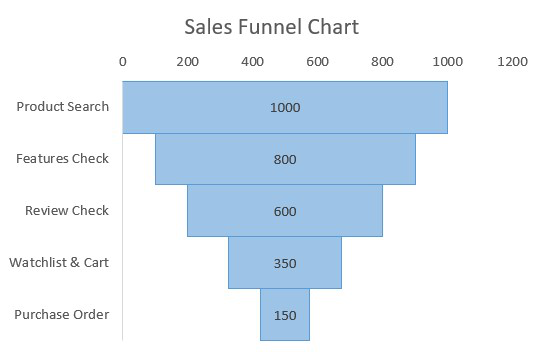
A Funnel Chart in Excel is a visual tool used to represent how data moves through different stages of a process, typically showing a gradual decrease at each step. It is commonly used in sales pipelines, marketing conversions, and recruitment processes to illustrate how many items or users remain at each stage.
How To Create a Sales Funnel Chart in Excel
Step 1: Create a Dataset
In this step, we will create our dataset for preparing a random sales funnel chart. For this, we will be adding the following columns Sales Stage, Spacer, and Number Of Customer. The spacer will center each of the horizontal bars of the chart depending on the largest data value.
Note: Spacer will simply align the data bars in centre alignment. For this we need to find the maximum data value in the dataset and we will subtract the current data value then we will divide it by 2.
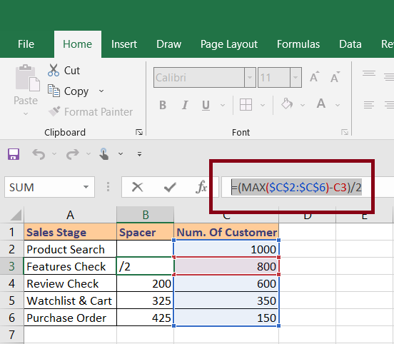
Above, we can see the spacer formula. (You will need to change the column and rows according to your own data). After that, we need to put the same formula for all the rows for which we will hold and drag it below to all rows.
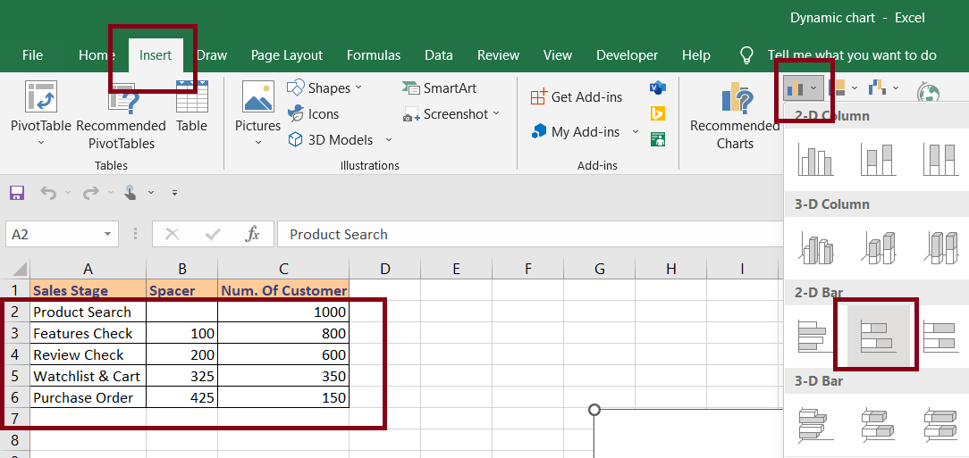
Step 2: Create Stacked Bar Chart
In this step, we will select our data and insert a stacked bar chart. For this , Select Data > Insert > Charts > Stacked Bar Chart.
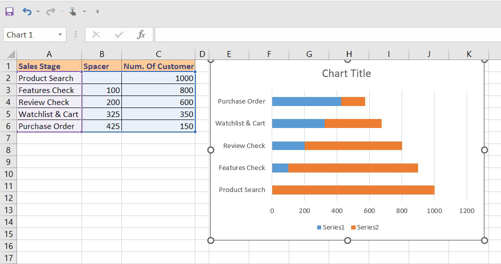
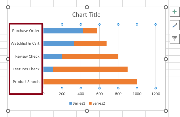
Step 3: Once we insert the stacked bar it will look something like this.
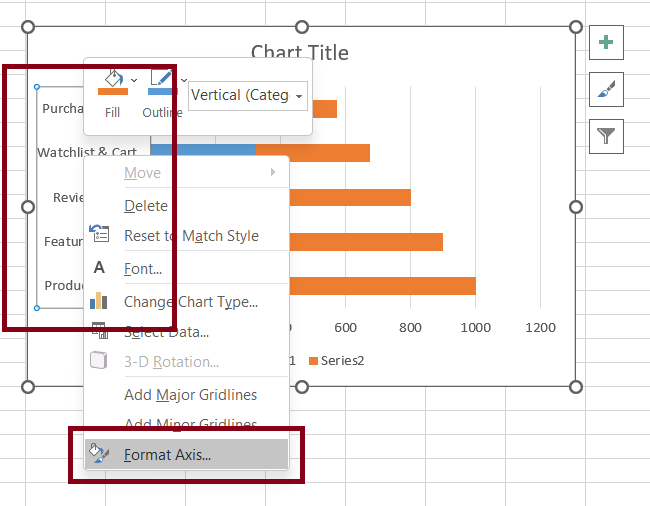
Step 4: Reverse the Chart Categories
Once we will insert our chart, it shows the categories in reverse order from the one which is present in our dataset. So, we will reverse the order once. In order to reverse the chart categories, we need to select the vertical axis (the one with category names).
Step 5: Perform Right Click and Choose Format Axis
After we click on the vertical axis we need to do a right-click and choose Format Axis.
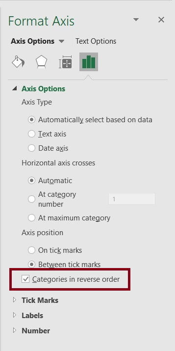
Step 6: Click on the Check Box
Once we click on the Format axis option, it will open a right-side pane for axis formatting. We need to click on the checkbox for "Categories in reverse order".
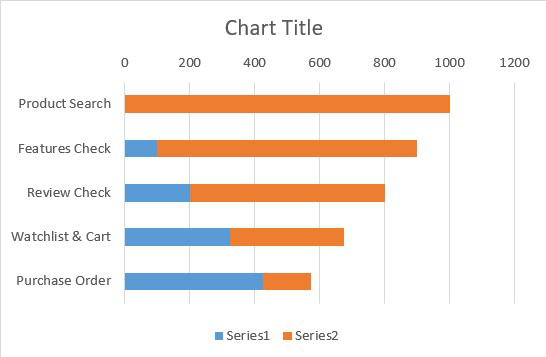
Step 7: Stack Bar Reversed
This will reverse the stacked bar graph depending on categories order and it will match to same as the one present in dataset.
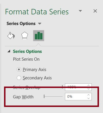
Step 8: Reduce Bars Gap Width To Zero
In this step, we will reduce the gap between each bar to zero. For this, we need to select any bar and do a right-click and choose Format Data Series.
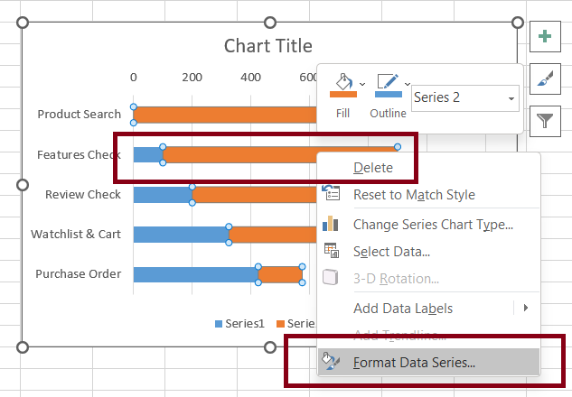
Step 9: Once we click on Format Data Series, the excel will open a side pane where we need to reduce the Gap Width to 0%.
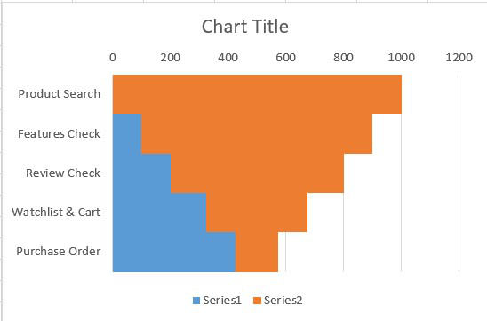
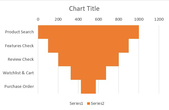
Step 10: Gap Reduced
The above option will reduce the gap between each bar to 0 and our graph will look something like this.
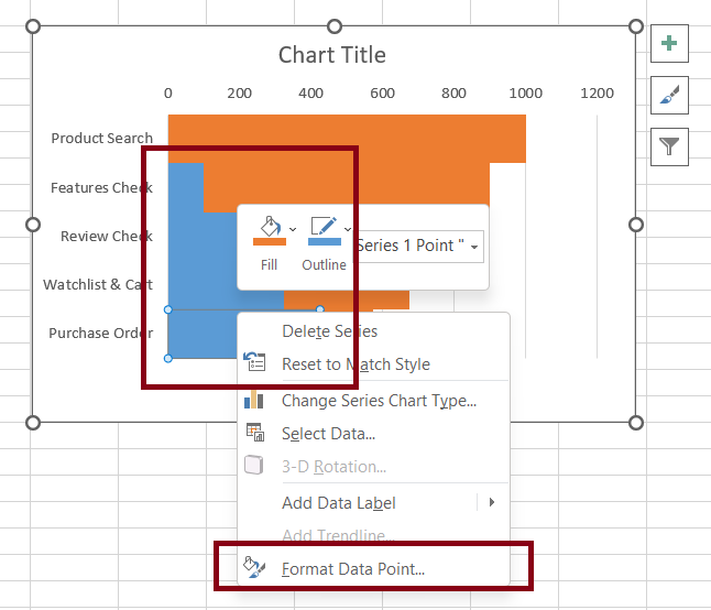
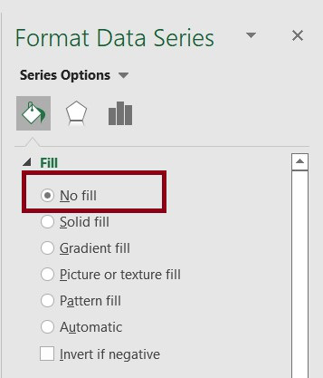
Step 11: Change The Spacer Bar Color
In this step, we will change the spacer(blue) color to the chart background color. For this, Select Region (blue color region) > Right-Click > Format Data Series.
Step 12: Remove Background
It will open a side pane where we are required to choose No Fill. It will remove the background color.
Step 13: Review Chart
After all the above steps, our chart now looks something like this.
How to Format Sales Funnel Chart in Excel
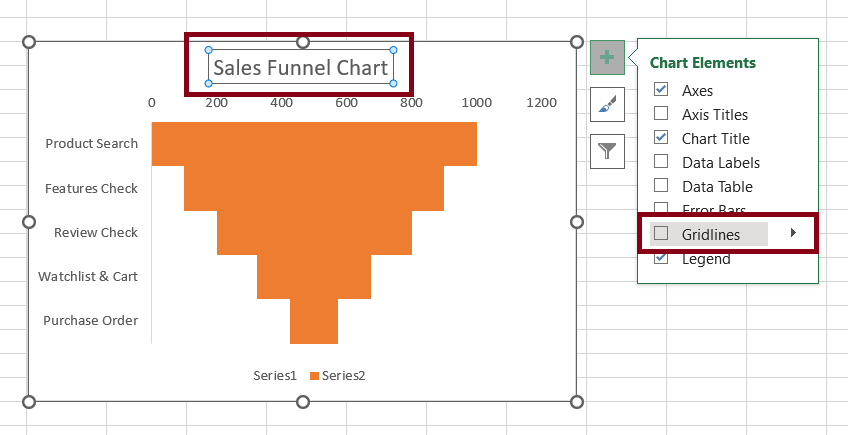
Step 1: Formatting Chart
In this step, we will format the chart to enhance its representational view. For this, we will do the following operations (You can update your chart depending upon your own needs).
- Add title to the chart.
- Remove the vertical grid lines from the chart area.
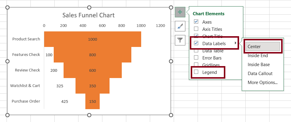
Step 2: Remove background and Add data labels
Remove the legends.
Add data labels to the funnel bars and center them.
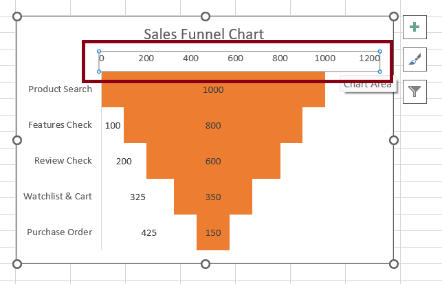
Step 3: Remove the horizontal value axis.
Select the horizontal value axis and deleted
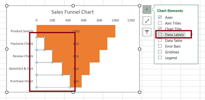
Step 4: Data Labels
Now, we are required to remove the data labels for the spacer region and remove the data labels by clicking plus icon beside the chart.
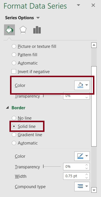
Step 5: Change Borders
Once we are done with all the above steps, we will finally Select Chart Region > Right-Click > Format Data Series and add borders, and change color accordingly.
Output: