Creating a dashboard in Excel helps convert raw data into meaningful insights, making it easier to track performance and make informed decisions. Excel dashboards present complex data in a simple and visual way, which is why many business professionals and analysts use them to monitor project metrics and KPIs.
Steps to Create an Excel Dashboard
Creating a dashboard in Excel involves organizing data, using pivot tables and charts, and adding interactive elements like slicers to visualize key metrics. Follow the steps below to create a dashboard in Excel:
Step 1: Prepare Your Data
The foundation of any dashboard is clean and well-organized data. Without accurate and structured data, your dashboard will not provide meaningful insights.
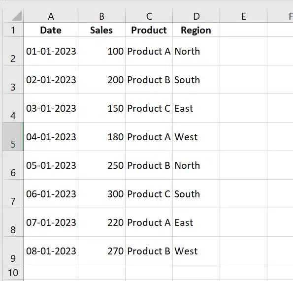
1. Organize Data in a Table
- Structure your data in rows and columns with clear headers (e.g., Date, Sales, Product, Region).
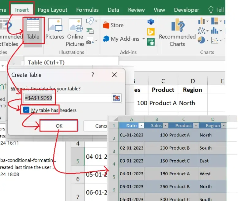
2. Convert Data to a Table
- Select your data, go to Insert > Table, and check My table has headers.
- This makes your data dynamic and easier to manage.
3. Remove Errors and Duplicates
- Use Data > Remove Duplicates to eliminate duplicate entries.
- Review data for errors and use
IFERROR()to handle formula errors.
Step 2: Plan Your Dashboard Layout
Before you start building, outline what your dashboard will look like.
Key Elements to Include:
- KPIs: Highlight key metrics like total sales, average revenue, or growth percentages.
- Charts: Use bar, line, or pie charts to visualize trends.
- Interactive Filters: Add slicers or dropdowns for dynamic filtering.
Tips:
- Divide Sections: Place KPIs at the top, charts in the middle, and filters at the side.
- Use White Space: Avoid clutter by leaving space between elements.
- Consistency: Use uniform fonts, colors, and chart styles for a polished look.
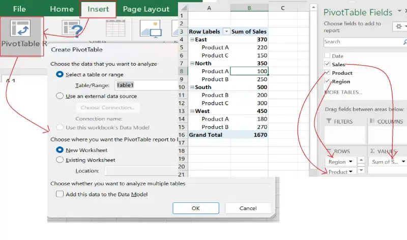
Step 3: Insert Pivot Tables
Pivot Tables are the backbone of most dashboards. They allow you to summarize and analyze large datasets quickly.
- Select your data table and go to Insert > PivotTable.
- Choose to place the PivotTable in a new or existing worksheet.
- Drag fields into the PivotTable sections:
- Rows: Add categories (e.g., Region, Product).
- Values: Add metrics (e.g., Sum of Sales).
- Filters/Columns: Add fields for advanced filtering.
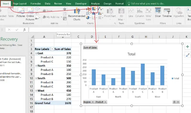
Step 4: Add Charts to Visualize Data
Charts convert raw data into visual insights, making trends and patterns easier to understand.
- Select your PivotTable or data range.
- Go to Insert > Charts and choose a chart type (e.g., Column, Line, Pie).
- Format the chart:
- Add data labels for clarity.
- Use consistent colors to align with your dashboard theme.
- Place the chart on your dashboard worksheet.
Popular Chart Types for Dashboards
- Bar Chart: Compare data across categories.
- Line Chart: Show trends over time.
- Pie Chart: Visualize proportions.
- Combo Chart: Combine bar and line charts for dual-axis data.
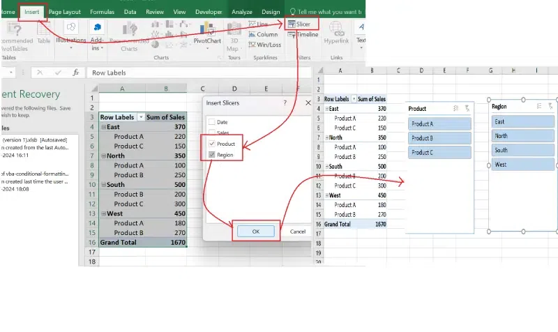
Step 5: Add Interactive Filters (Slicers)
Interactive filters make dashboards user-friendly by allowing viewers to focus on specific data points.
- Select your PivotTable and go to Insert > Slicer.
- Choose fields to filter (e.g., Product, Region).
- Resize and position slicers on the dashboard.
- Test the slicers to ensure they dynamically update your charts and tables.
Step 6: Format and Design Your Dashboard
A visually appealing dashboard is easier to understand and navigate.
Tips for Formatting:
- Consistent Colors: Use a uniform color palette for charts, shapes, and text.
- Grid Alignment: Use Excel’s gridlines or alignment tools to position elements neatly.
- Minimalist Design: Avoid clutter by keeping only essential elements.
- Add Titles and Labels: Clearly label each section and chart.

Step 7: Test and Finalize Your Dashboard
Before sharing your dashboard, test its functionality.
- Verify that all charts and KPIs update dynamically when slicers or filters are applied.
- Ensure formulas and calculations are correct.
- Protect the dashboard:
- Go to Review > Protect Sheet to lock critical elements.
- Set a password to prevent accidental edits.

Practical Applications
- Sales Dashboards: Track sales performance by product, region, or salesperson.
- Financial Dashboards: Monitor expenses, revenue, and profit margins.
- Project Management Dashboards: Visualize task progress, timelines, and resource allocation.
- Marketing Dashboards: Analyze campaign performance, leads, and ROI.