A Doughnut Chart in Excel is a circular chart used to represent data as parts of a whole, similar to a pie chart. The key difference is that a doughnut chart can display multiple data series in concentric rings, allowing comparison of several datasets in a single chart. It is commonly used to visualize proportional data and percentage distribution in an easy-to-understand format.
Inserting Charts in Excel
To insert a chart in Excel follow the below steps:
- Insert the data in the spreadsheet. We will take an example of data showing the sales between January – June.
- Select the data (A2:A7, B2: B7).

- Click on the Insert tab on the ribbon.

- Select our desired chart under the Charts.We are inserting the Bar chart.

- Select our desiredchart type.

- The chart will be inserted into the worksheet.


A doughnut chart is the same as a pie chart, i.e., it represents the data as part of a whole, where the sum of parts is equal to 100%. The difference between a Doughnut chart and a Pie chart is that multiple datasets can be represented in a doughnut chart but only one dataset can be represented in a pie chart. we can find the doughnut chart under Insert tab>>Other charts.
A doughnut chart can be used only when:
- We want to represent multiple datasets on a single chart.
- Each dataset has a maximum of 6-7 data, otherwise, the chart becomes very dense.
- None of the values in the dataset is either zero or negative.
Types of doughnut chart
- Doughnut: In this chart, the slices are attached together and are not pulled apart.
- Exploded Doughnut: In this, the slices of charts are pulled apart.
Inserting Doughnut chart with Single data series
Follow the below steps to insert a doughnut chart with single data series:
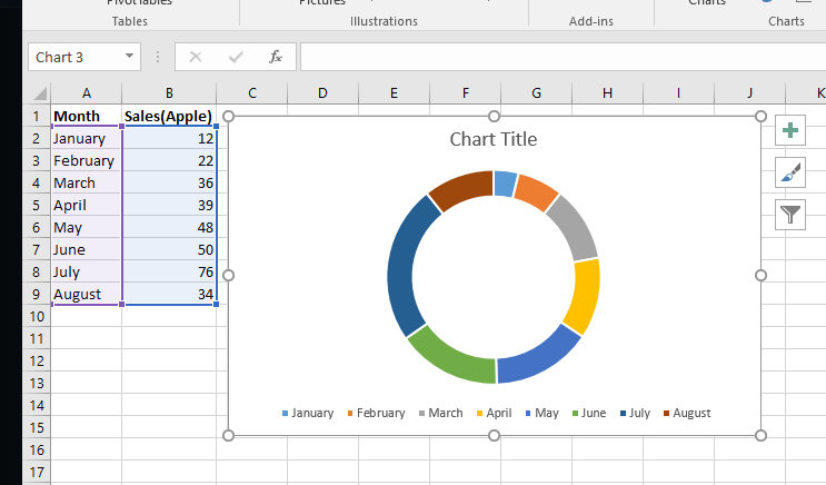
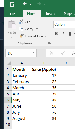
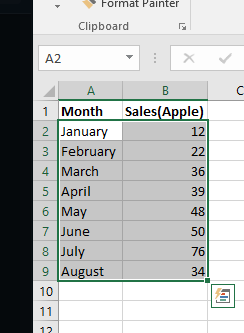
- Insert the data in the spreadsheet. We will take the example of data showing the sales of apple between January – August.
- Select the data(A2:A9, B2:B9).
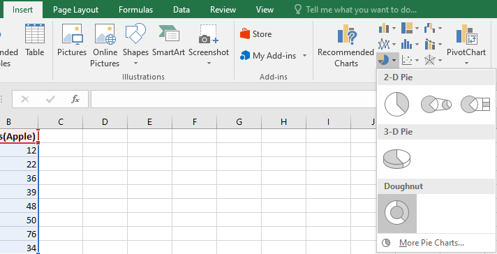
- Click on Insert Tab.
- Select our desired Doughnut chart(Doughnut, Exploded doughnut), under the Other charts.
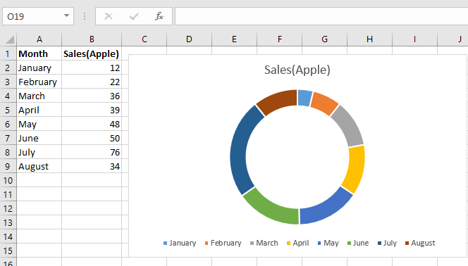
- Our desired chart will be inserted into the spreadsheet.
- Doughnut chart for the above example.
Inserting doughnut chart with two data series
Follow the below steps to insert a doughnut chart with two data series:
- Insert the data in the spreadsheet. We will take the example of data showing the sales of apple and orange between January – August.
- Select the data(A2:A9, B2:B9, C2:C9).
- Click on Insert Tab.
- Select our desired Doughnut chart, under the Other charts.
- Our desired chart will be inserted into the spreadsheet.
- Doughnut chart for the above example.