Bootstrap 5 Toasts Custom content is used to add your own markup by removing sub-components. Users can easily Customize toasts by adding their own content or by adding other bootstrap components inside toast. There are no predefined classes for toast custom content. You can custom-create them by giving additional controls and adding components like cards, icons, etc inside the toast.
Pre-requisite: Bootstrap 5 Toast knowledge required.
Bootstrap 5 Toasts Custom content Class: There is no predefined class to create custom content on the toast, we can use any Bootstrap 5 utilities, flex-box utilities, or Bootstrap 5 Icons.
Syntax:
<div class="toast" role="alert">
    <div class="toast-header">
        Toast Header
    </div>
    <div class="toast-body">
        <!-- Custom Content for toast body-->
    </div>
</div>
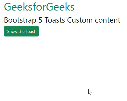
Example 1: In this example, we customize the toast content by adding two bootstrap buttons inside it.
<!DOCTYPE html>
<html lang="en">

<head>
    <meta charset="UTF-8">
    <meta http-equiv="X-UA-Compatible" content="IE=edge">
    <meta name="viewport" content="width=device-width, initial-scale=1.0">
    <link href=
"https://cdn.jsdelivr.net/npm/bootstrap@5.2.2/dist/css/bootstrap.min.css"
          rel="stylesheet">
    <script src=
"https://cdn.jsdelivr.net/npm/@popperjs/core@2.11.6/dist/umd/popper.min.js">
    </script>
    <script src=
"https://cdn.jsdelivr.net/npm/bootstrap@5.2.2/dist/js/bootstrap.min.js">
    </script>

</head>

<body>
    <div class="container">
        <div>
            <h1 class="text-success">GeeksforGeeks</h1>
            <h3> Bootstrap 5 Toasts Custom content</h3>
        </div>

        <div>
            <button type="button"
                    class="btn btn-success"
                    id="toastBtn"
                    onclick="showToast()">
                Show the Toast
            </button>

            <div id="gfg" class="toast mt-5" role="alert">
                <div class="toast-header">
                    GeeksforGeeks.
                </div>
                <div class="toast-body">
                    <p class="border-bottom mb-3 pb-2">
                        Accept Privacy Policy?
                    </p>
                    <button type="button"
                            class="btn btn-success btn-sm">
                        Yes
                    </button>
                    <button type="button"
                            class="btn btn-danger btn-sm"
                            data-bs-dismiss="toast"> No
                    </button>
                </div>
            </div>
        </div>
    </div>

    <script>
        // Initialize the Toasts
        let myToast = new bootstrap.Toast(document.getElementById('gfg'));

        function showToast() {
            myToast.show();
        }
    </script>
</body>

</html>
Output:
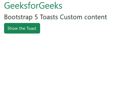
Example 2: In this example, we added a card inside the toast component. The card has some text and a button inside it.
<!DOCTYPE html>
<html lang="en">

<head>
    <meta charset="UTF-8">
    <meta http-equiv="X-UA-Compatible" content="IE=edge">
    <meta name="viewport" content="width=device-width, initial-scale=1.0">
    <link href=
"https://cdn.jsdelivr.net/npm/bootstrap@5.2.2/dist/css/bootstrap.min.css"
          rel="stylesheet">
    <script src=
"https://cdn.jsdelivr.net/npm/@popperjs/core@2.11.6/dist/umd/popper.min.js">
    </script>
    <script src=
"https://cdn.jsdelivr.net/npm/bootstrap@5.2.2/dist/js/bootstrap.min.js">
    </script>

</head>

<body>
    <div class="container">
        <div>
            <h2 class="text-success">GeeksforGeeks</h2>
            <h4> Bootstrap 5 Toasts Custom content</h4>
        </div>

        <div>
            <button type="button"
                    class="btn btn-success"
                    id="toastBtn"
                    onclick="showToast()">
                Show the Toast
            </button>

            <div id="gfg" class="toast mt-5" role="alert">
                <div class="toast-header">
                    GeeksforGeeks.
                </div>
                <div class="toast-body">
                    <div class="card">
                        <div class="card-body">
                            <h6 class="card-title">New Message!</h6>
                            <p class="card-text"><span class="user">
                                    GeeksforGeeks
                                </span> sent you a message.</p>
                            <button class="btn btn-warning btn-sm">
                                Open Message
                            </button>
                        </div>
                    </div>
                </div>
            </div>
        </div>
    </div>

    <script>
        // Initialize the Toasts
        let myToast = new bootstrap.Toast(document.getElementById('gfg'));

        function showToast() {
            myToast.show();
        }
    </script>
</body>

</html>
Output:
Reference: https://getbootstrap.com/docs/5.0/components/toasts/#custom-content