Bootstrap 5, Bootstrap Scrollspy is a feature that automatically updates navigation links based on scroll position. It's particularly useful for long content-heavy pages where we want to keep the user informed about their current section in the document.
Bootstrap 5 Scrollspy with list-group classes: There is no specific class used to scrollspy with list-group. To create a list, we use the .list-group, and to create a list of items, we use the list-group-item.
Syntax:
<div id="list-example" class="list-group ">
    <a class="list-group-item
        list-group-item-action" href="#list-item-1">
        ....
    </a>
    <a class="list-group-item list-group-item-action"
        href="#list-item-2">
        ....
    </a>
</div>
<div class="col-*">
    <div data-bs-spy="scroll" data-bs-target="#list-example"
         data-bs-smooth-scroll="true" class="scrollspy-example"
         tabindex="0">
        <h4 id="list-item-1">....</h4>
        <p>.....</p>
    </div>
</div>
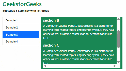
Example 1: In this example, we set the items that automatically highlight the links based on the scroll using the .list-groups classes.
<!DOCTYPE html>
<html lang="en">

<head>
    <meta charset="UTF-8">
    <meta http-equiv="X-UA-Compatible"
        content="IE=edge">
    <meta name="viewport" content=
        "width=device-width, initial-scale=1.0">
    <title>Bootstrap 5 - GeeksforGeeks</title>

    <!-- Bootstrap CSS -->
    <link rel="stylesheet" href=
"https://cdn.jsdelivr.net/npm/bootstrap@5.2.2/dist/css/bootstrap.min.css" />

    <!-- Bootstrap Javascript -->
    <script src=
"https://cdn.jsdelivr.net/npm/@popperjs/core@2.11.6/dist/umd/popper.min.js">
    </script>
    <script src=
"https://cdn.jsdelivr.net/npm/bootstrap@5.2.2/dist/js/bootstrap.min.js">
    </script>

    <style>
        .scrollspy-example {
            max-height: 300px;
            margin-bottom: 10px;
            overflow: scroll;
        }
    </style>
</head>

<body>
    <div class="container">
        <div class="my-4">
            <h1 class="text-success">GeeksforGeeks</h1>
            <strong>
                Bootstrap 5 Scrollspy with list-group
            </strong>
        </div>

        <div class="row">
            <div class="col-4">
                <div id="list-example" class="list-group ">
                    <a class="list-group-item
                        list-group-item-action" href="#list-item-1">
                        Example 1
                    </a>
                    <a class="list-group-item
                        list-group-item-action" href="#list-item-2">
                        Example 2
                    </a>
                    <a class="list-group-item
                        list-group-item-action" href="#list-item-3">
                        Example 3
                    </a>
                    <a class="list-group-item list-group-item-action"
                        href="#list-item-4">
                        Example 4
                    </a>
                </div>
            </div>
            <div class="col-8 text-bg-success">
                <div data-bs-spy="scroll"
                    data-bs-target="#list-example"
                    data-bs-smooth-scroll="true"
                    class="scrollspy-example" tabindex="0">
                    <h4 id="list-item-1">Section A</h4>
                    <p>A Computer Science Portal.Geeksforgeeks is a
                        platform for learning tech related topics,
                        engineering syllabus, they have online as
                        well as offline courses for on-demand
                        topics like C++.
                    </p>
                    <h4 id="list-item-2">section B</h4>
                    <p>A Computer Science Portal.Geeksforgeeks is a
                        platform for learning tech related topics,
                        engineering syllabus, they have online as
                        well as offline courses for on-demand topics like
                        C++.
                    </p>
                    <h4 id="list-item-3">section C</h4>
                    <p>A Computer Science Portal.Geeksforgeeks is
                        a platform for learning tech related topics,
                        engineering syllabus, they have online as well
                        as offline courses for on-demand topics like
                        C++.
                    </p>
                    <h4 id="list-item-4">section D</h4>
                    <p>A Computer Science Portal.Geeksforgeeks is a
                        platform for learning tech related topics,
                        engineering syllabus, they have online as well
                        as offline courses for on-demand topics like
                        C++.
                    </p>
                </div>
            </div>
        </div>
    </div>
</body>
</html>
Output:
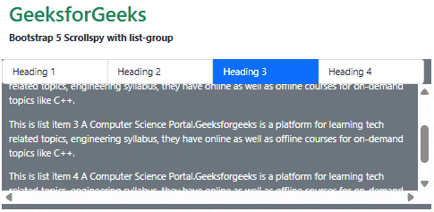
Example 2: In this example, we set the items horizontally that automatically highlight the links based on the scroll position.
<!DOCTYPE html>
<html lang="en">

<head>
    <meta charset="UTF-8">
    <meta http-equiv="X-UA-Compatible"
            content="IE=edge">
    <meta name="viewport" content=
        "width=device-width, initial-scale=1.0">
    <title>Bootstrap 5 - GeeksforGeeks</title>

    <!-- Bootstrap CSS -->
    <link rel="stylesheet" href=
"https://cdn.jsdelivr.net/npm/bootstrap@5.2.2/dist/css/bootstrap.min.css" />

    <!-- Bootstrap Javascript -->
    <script src=
"https://cdn.jsdelivr.net/npm/@popperjs/core@2.11.6/dist/umd/popper.min.js">
    </script>
    <script src=
"https://cdn.jsdelivr.net/npm/bootstrap@5.2.2/dist/js/bootstrap.min.js">
    </script>

    <style>
        .scrollspy-example {
            max-height: 200px;
            margin-bottom: 10px;
            overflow: scroll;
        }
    </style>
</head>

<body>
    <div class="container">
        <div class="my-4">
            <h1 class="text-success">
                GeeksforGeeks
            </h1>
            <strong>
                Bootstrap 5 Scrollspy with list-group
            </strong>
        </div>

        <div class="row text-bg-secondary">
            <div id="list-example"
                class="list-group list-group-horizontal">
                <a class="list-group-item list-group-item-action"
                    href="#list-item-1">Heading 1</a>
                <a class="list-group-item list-group-item-action"
                    href="#list-item-2">Heading 2</a>
                <a class="list-group-item list-group-item-action"
                    href="#list-item-3">Heading 3</a>
                <a class="list-group-item list-group-item-action"
                    href="#list-item-4">Heading 4</a>
            </div>
            <div data-bs-spy="scroll" data-bs-target="#list-example"
                data-bs-smooth-scroll="true"
                class="scrollspy-example" tabindex="0">
                <div id="list-item-1">
                    <p>This is list item 1
                       A Computer Science Portal.Geeksforgeeks is a
                        platform for learning tech related topics,
                        engineering syllabus, they have online as well
                        as offline courses for on-demand topics like
                        C++.
                    </p>
                </div>

                <div id="list-item-2">
                    <p>This is list item 2
                        A Computer Science Portal.Geeksforgeeks is a
                        platform for learning tech related topics,
                        engineering syllabus, they have online as well
                        as offline courses for on-demand topics like
                        C++.
                    </p>
                </div>
                <div id="list-item-3">
                    <p>This is list item 3
                        A Computer Science Portal.Geeksforgeeks
                        is a platform for learning tech related topics,
                        engineering syllabus, they have online as well
                        as offline courses for on-demand topics like
                        C++.
                    </p>
                </div>

                <div id="list-item-4">
                    <p>This is list item 4
                        A Computer Science Portal.Geeksforgeeks is a
                        platform for learning tech related topics,
                        engineering syllabus, they have online as well
                        as offline courses for on-demand topics like
                        C++.
                    </p>
                </div>
            </div>
        </div>
    </div>
</body>
</html>
Output:
Reference: https://getbootstrap.com/docs/5.0/components/scrollspy/#example-with-list-group