Bootstrap 5 Dropdown SASS can be used to change the default values provided for the dropdowns by customizing SCSS file.
SASS variables of Dropdown
- $dropdown-min-width: This variable provides the minimum width of the dropdown. By default, it is 10rem.
- $dropdown-padding-x: This variable provides the left and right padding of the dropdown. By default, it is 0.
- $dropdown-padding-y: This variable provides the top and bottom padding of the dropdown. By default, it is 0.5rem.
- $dropdown-spacer: This variable provides the margin and padding of the dropdown. By default, it is 0.125rem.
- $dropdown-font-size: This variable provides the font size of the text in dropdown. By default, it is 1rem.
- $dropdown-color: This variable provides the text color of the dropdown. By default, it is gray color.
- $dropdown-bg: This variable provides the background color of the dropdown. By default, it is white color.
- $dropdown-border-color: This variable provides the border color of the dropdown. By default, it is black color with opacity of 0.15.
- $dropdown-border-radius: This variable provides the border radius of the dropdown. By default, it is 0.375rem.
- $dropdown-border-width: This variable provides the border width of the dropdown. By default, it is 1px.
- $dropdown-inner-border-radius: This variable provides the radius of the inner border of the dropdown. By default, it is 0.31rem.
- $dropdown-divider-bg: This variable provides the background color of the divider in the dropdown. By default, it is black color with opacity of 0.1.
- $dropdown-divider-margin-y: This variable provides the top and bottom margin of the divider in the dropdown. By default, it is 0.0625rem.
- $dropdown-box-shadow: This variable provides the box shadow of the dropdown. By default, the h-offset is 0.5rem, the v-offset is 1rem in black color with opacity of 0.15.
- $dropdown-link-color: This variable provides the text color of the link in dropdown. By default, it is gray color.
- $dropdown-link-hover-color: This variable provides the text color of the link on hover in dropdown. By default, it is gray color with an shade of 10 percentage.
- $dropdown-link-hover-bg: This variable provides the background color of the link in the dropdown on hover. By default, it is gray color.
- $dropdown-link-active-color: This variable provides the text color of the active dropdown item in the dropdown. By default, it is white color.
- $dropdown-link-active-bg: This variable provides the background color of the active dropdown item in the dropdown. By default, it is blue color.
- $dropdown-link-disabled-color: This variable provides the color of the disabled dropdown item in the dropdown. By default, it is gray color.
- $dropdown-item-padding-y: This variable provides the top and bottom padding of the dropdown item in the dropdown. By default, it is 0.25rem.
- $dropdown-item-padding-x: This variable provides the left and right padding of the dropdown item in the dropdown. By default, it is 1rem.
- $dropdown-header-color: This variable provides the color of the dropdown header in the dropdown. By default, it is gray color.
- $dropdown-header-padding: This variable provides the padding of the dropdown header in the dropdown. By default, it is 0.5rem.
- $dropdown-dark-color: This variable provides the text color of the dark dropdown in the dropdown. By default, it is white color with 30 percentage of gray color.
- $dropdown-dark-bg: This variable provides the background color of the dark dropdown in the dropdown. By default, it is white color with 80 percentage of gray color.
- $dropdown-dark-border-color: This variable provides the border color of the dark dropdown. By default, it is black color.
- $dropdown-dark-divider-bg: This variable provides the background color of the dark dropdown. By default, it is black color.
- $dropdown-dark-box-shadow: This variable provides the box shadow of the dark dropdown. By default, it is null.
- $dropdown-dark-link-color: This variable provides the link color in the dark dropdown. By default, it is gray color.
- $dropdown-dark-link-hover-color: This variable provides the link color on hover in the dropdown. By default, it is white.
- $dropdown-dark-link-hover-bg: This variable provides the background color of the link in the dark dropdown on hover. By default, it is white color.
- $dropdown-dark-link-active-color: This variable provides the color of the link which is active in the dark dropdown. By default, it is white color.
- $dropdown-dark-link-active-bg: This variable provides the background color of the link which is active in the dark dropdown. By default, it is blue color.
- $dropdown-dark-link-disabled-color: This variable provides the color of the link which is disabled in the dark dropdown. By default, it is gray color.
- $dropdown-dark-header-color: This variable provides the text color of the header in the dark dropdown. By default, it is gray color.
- $caret-width: This variable provides the width of the caret in the dropdown. By default, it is 0.3em.
- $caret-vertical-align: This variable provides the vertical alignment of the caret in the dropdown. By default, it is 0.25em.
- $caret-spacing: This variable provides the spacing of the caret. By default, it is 0.25em.
Steps to override SCSS of Bootstrap
Step 1: Install bootstrap using following command:
npm i bootstrapStep 2: Create your custom SCSS file and write the variable you want to override. Then include the bootstrap SCSS file using import.
$class_to_override: values;
@import "node_modules/bootstrap/scss/bootstrap"
Step 3: Convert the file to CSS using live server extension.
Step 4: Include the converted SCSS file to your HTML after the link tag of Bootstrap CSS
Project Structure: The custom SCSS file name is “custom.scss” and "custom.css" is converted file.

Syntax:
$variable:value;
@import "./node_modules/bootstrap/scss/bootstrap"
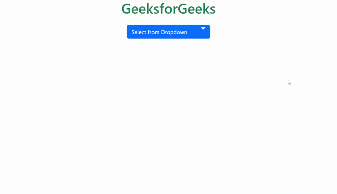
Example 1: In this example, we make use of some of the above sass variables of dropdown.
custom.scss
$dropdown-min-width:17rem;
$dropdown-padding-x:20px;
$dropdown-padding-y:1rem;
$dropdown-font-size:20px;
$dropdown-bg:rgb(156, 230, 156);
$dropdown-border-color:black;
$dropdown-border-radius:1rem;
$dropdown-border-width:5px;
$dropdown-divider-bg:black;
$dropdown-divider-margin-y:2rem;
$dropdown-link-color:black;
$dropdown-link-hover-color:green;
$dropdown-link-hover-bg: white;
$dropdown-link-active-color:white;
$dropdown-link-active-bg:green;
$dropdown-link-disabled-color:green;
$dropdown-item-padding-y:0.6rem;
$dropdown-item-padding-x:1rem;
$dropdown-header-color:green;
$caret-width:0.4em;
$caret-spacing:2.2em;
$caret-vertical-align:0.8em;
@import "./node_modules/bootstrap/scss/bootstrap"
CSS file created after conversion
custom.css
.dropdown-menu {
  --bs-dropdown-zindex: 1000;
  --bs-dropdown-min-width: 17rem;
  --bs-dropdown-padding-x: 20px;
  --bs-dropdown-padding-y: 1rem;
  --bs-dropdown-spacer: 0.125rem;
  --bs-dropdown-font-size: 1.25rem;
  --bs-dropdown-color: #212529;
  --bs-dropdown-bg: rgb(156, 230, 156);
  --bs-dropdown-border-color: black;
  --bs-dropdown-border-radius: 1rem;
  --bs-dropdown-border-width: 5px;
  --bs-dropdown-inner-border-radius: calc(1rem - 5px);
  --bs-dropdown-divider-bg: black;
  --bs-dropdown-divider-margin-y: 2rem;
  --bs-dropdown-box-shadow: 0 0.5rem 1rem rgba(0, 0, 0, 0.15);
  --bs-dropdown-link-color: black;
  --bs-dropdown-link-hover-color: green;
  --bs-dropdown-link-hover-bg: white;
  --bs-dropdown-link-active-color: white;
  --bs-dropdown-link-active-bg: green;
  --bs-dropdown-link-disabled-color: green;
  --bs-dropdown-item-padding-x: 1rem;
  --bs-dropdown-item-padding-y: 0.6rem;
  --bs-dropdown-header-color: green;
  --bs-dropdown-header-padding-x: 1rem;
  --bs-dropdown-header-padding-y: 1rem;
  position: absolute;
  z-index: var(--bs-dropdown-zindex);
  display: none;
  min-width: var(--bs-dropdown-min-width);
  padding: var(--bs-dropdown-padding-y) var(--bs-dropdown-padding-x);
  margin: 0;
  font-size: var(--bs-dropdown-font-size);
  color: var(--bs-dropdown-color);
  text-align: left;
  list-style: none;
  background-color: var(--bs-dropdown-bg);
  background-clip: padding-box;
  border: var(--bs-dropdown-border-width) solid var(--bs-dropdown-border-color);
  border-radius: var(--bs-dropdown-border-radius);
}
HTML Code:
<!DOCTYPE html>
<html lang="en">

<head>
    <meta charset="UTF-8">
    <meta name="viewport" content=
"width=device-width, initial-scale=1.0">
    <title>Bootstrap 5 Dropdown SASS</title>
    <link href=
"https://cdn.jsdelivr.net/npm/bootstrap@5.2.3/dist/css/bootstrap.min.css"
         rel="stylesheet">
    <link rel="stylesheet" href="./custom.css">
   <script src=
"https://cdn.jsdelivr.net/npm/bootstrap@5.2.2/dist/js/bootstrap.min.js">
    </script>
    <script src=
"https://cdn.jsdelivr.net/npm/bootstrap@5.2.3/dist/js/bootstrap.bundle.min.js">
    </script>
</head>

<body class="text-center">
    <div class="container">
        <h1 class="text-success">GeeksforGeeks</h1>
        <div class="dropdown pt-3">
            <button type="button" class=
                "btn btn-primary dropdown-toggle"
                data-bs-toggle="dropdown">
                 Select from Dropdown
            </button>
            <ul class="dropdown-menu">
              <li><h3 class="dropdown-header">
                  Languages</h3></li>
              <li><a class="dropdown-item" href="#">
                    C++</a></li>
              <li><a class="dropdown-item active" href="#">
                    Java</a></li>
              <li><a class="dropdown-item disabled" href="#">
                    Python</a></li>
              <li><hr class="dropdown-divider"></li>
              <li><h3 class="dropdown-header">
                    Data Structures</h3></li>
              <li><a class="dropdown-item" href="#">
                    Array</a></li>
            </ul>
        </div>
    </div>
</body>

</html>
Output:
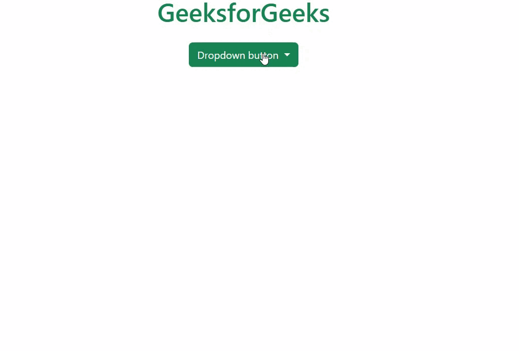
Example 2: In this example, we make use of some of the above sass variables of dark dropdown.
custom1.scss
$dropdown-dark-color:green;
$dropdown-dark-bg:white;
$dropdown-dark-border-color:black;
$dropdown-dark-divider-bg:black;
$dropdown-dark-link-color:green;
$dropdown-dark-link-hover-color:black;
$dropdown-dark-link-hover-bg:rgb(184, 250, 184);
$dropdown-dark-link-active-color:white;
$dropdown-dark-link-active-bg:green;
$dropdown-dark-link-disabled-color:black;
$dropdown-dark-header-color:rgb(122, 250, 122);
@import "./node_modules/bootstrap/scss/bootstrap"
CSS file created after conversion
custom1.css: This is the code used in the above HTML code.
.dropdown-menu {
  --bs-dropdown-zindex: 1000;
  --bs-dropdown-min-width: 10rem;
  --bs-dropdown-padding-x: 0;
  --bs-dropdown-padding-y: 0.5rem;
  --bs-dropdown-spacer: 0.125rem;
  --bs-dropdown-font-size: 1rem;
  --bs-dropdown-color: #212529;
  --bs-dropdown-bg: #fff;
  --bs-dropdown-border-color: var(--bs-border-color-translucent);
  --bs-dropdown-border-radius: 0.375rem;
  --bs-dropdown-border-width: 1px;
  --bs-dropdown-inner-border-radius: calc(0.375rem - 1px);
  --bs-dropdown-divider-bg: var(--bs-border-color-translucent);
  --bs-dropdown-divider-margin-y: 0.5rem;
  --bs-dropdown-box-shadow: 0 0.5rem 1rem rgba(0, 0, 0, 0.15);
  --bs-dropdown-link-color: #212529;
  --bs-dropdown-link-hover-color: #1e2125;
  --bs-dropdown-link-hover-bg: #e9ecef;
  --bs-dropdown-link-active-color: #fff;
  --bs-dropdown-link-active-bg: #0d6efd;
  --bs-dropdown-link-disabled-color: #adb5bd;
  --bs-dropdown-item-padding-x: 1rem;
  --bs-dropdown-item-padding-y: 0.25rem;
  --bs-dropdown-header-color: #6c757d;
  --bs-dropdown-header-padding-x: 1rem;
  --bs-dropdown-header-padding-y: 0.5rem;
  position: absolute;
  z-index: var(--bs-dropdown-zindex);
  display: none;
  min-width: var(--bs-dropdown-min-width);
  padding: var(--bs-dropdown-padding-y) var(--bs-dropdown-padding-x);
  margin: 0;
  font-size: var(--bs-dropdown-font-size);
  color: var(--bs-dropdown-color);
  text-align: left;
  list-style: none;
  background-color: var(--bs-dropdown-bg);
  background-clip: padding-box;
  border: var(--bs-dropdown-border-width) solid var(--bs-dropdown-border-color);
  border-radius: var(--bs-dropdown-border-radius);
}
.dropdown-menu-dark {
  --bs-dropdown-color: green;
  --bs-dropdown-bg: white;
  --bs-dropdown-border-color: black;
  --bs-dropdown-box-shadow: ;
  --bs-dropdown-link-color: green;
  --bs-dropdown-link-hover-color: black;
  --bs-dropdown-divider-bg: black;
  --bs-dropdown-link-hover-bg: rgb(184, 250, 184);
  --bs-dropdown-link-active-color: white;
  --bs-dropdown-link-active-bg: green;
  --bs-dropdown-link-disabled-color: black;
  --bs-dropdown-header-color: rgb(122, 250, 122);
}
HTML Code:
<!DOCTYPE html>
<html lang="en">

<head>
    <meta charset="UTF-8">
    <meta name="viewport" content=
"width=device-width, initial-scale=1.0">
    <title>Bootstrap 5 Dropdown SASS</title>
    <link href=
"https://cdn.jsdelivr.net/npm/bootstrap@5.2.3/dist/css/bootstrap.min.css"
        rel="stylesheet">
    <link rel="stylesheet" href="./custom1.css">
     <script src=
"https://cdn.jsdelivr.net/npm/bootstrap@5.2.2/dist/js/bootstrap.min.js">
    </script>
    <script src=
"https://cdn.jsdelivr.net/npm/bootstrap@5.2.3/dist/js/bootstrap.bundle.min.js">
    </script>
</head>

<body class="text-center">
    <div class="container">
        <h1 class="text-success">GeeksforGeeks</h1>
        <div class="dropdown pt-3">
            <button class="btn btn-success dropdown-toggle"
                type="button" data-bs-toggle="dropdown"
                aria-expanded="false">
                Dropdown button
            </button>
            <ul class="dropdown-menu dropdown-menu-dark">
                <li><h5 class="dropdown-header">
                        Languages</h5></li>
                <li><a class="dropdown-item" href="#">
                        C++</a></li>
                <li><a class="dropdown-item active" href="#">
                        Java</a></li>
                <li><a class="dropdown-item disabled" href="#">
                        Python</a></li>
                <li><a class="dropdown-item" href="#">
                        Golang</a></li>
                <li><a class="dropdown-item" href="#">
                        C</a></li>
                <li><hr class="dropdown-divider"></li>
                <li><h5 class="dropdown-header">
                        Data Structures</h5></li>
                <li><a class="dropdown-item" href="#">
                        Array</a></li>
                <li><a class="dropdown-item" href="#">
                        Stack</a></li>
            </ul>
        </div>
    </div>
</body>

</html>
Output: