Explore My Notes

A mini memory cache function | Andy Bell

I'm really enjoying Andy's coverage of his latest personal site build; it's always super interesting to see inside the development habits of other people, particularly those as thoughtful of the process as Andy is. I also find there's typically at least one light bulb moment 💡 In this latest outing, that moment came with the little cache utility. It's a basic getter/setter combo, formed around a simple JavaScript object, but as a lightweight state-management system and data store, I think it's really nicely done. As Andy puts it:

I also know that I’m going to be integrating Bluesky posts, so in order to keep local development as speedy as possible (and to avoid API round trips) I’m going to need a little memory cache system that stores data temporarily for us.

Which works like this:

const cache = {};

/**
 * Retrieves cached data if it's available and not expired.
 * @param {string} key - The cache key.
 * @returns {*} The cached data or null if expired/not found.
 */
export function getCache(key) {
  const cachedEntry = cache[key];

  if (!cachedEntry) return null;

  if (Date.now() > cachedEntry.expiry) {
    delete cache[key]; // Expired, remove from cache
    return null;
  }

  return cachedEntry.data;
}

/**
 * Stores data in cache with a time-to-live (TTL).
 * @param {string} key - The cache key.
 * @param {*} data - The data to cache.
 * @param {number} ttlSeconds - Time-to-live in seconds.
 */
export function setCache(key, data, ttlSeconds) {
  cache[key] = {
    data,
    expiry: Date.now() + ttlSeconds * 1000,
  };
}

I'd be really fascinated to know how far you can push this pattern using Astro's SSR functionality. Locally, it's a useful way to hold data, but I think I'd shift at least some of this towards Local Storage.

The last quiet thing | Terry Godier

A beautifully argued and designed essay on how modern life has become too full, and how that isn't your fault. It's not your fault that every single thing ‒ from your toaster to your watch to your car ‒ needs constant "upkeep". And not just once-a-year cleaning or maintenance, but the incessant nagging of software updates, ToC requests, notifications, and bug triaging.

Terry correctly points out that not only is likely leading to a large chunk of the general "overwhelm" that people often cite, but that it also used to be someone's job, and yet now you pay to do it.

Honestly, the big takeaway here is: it is worth paying more now to never need to think about something again. I've made those decisions in the past (e.g. refusing to buy headphones that cannot work fully powered down via AUX), but it's something I should do much more.

On the core thesis, that everything is loud and demanding and never shuts up any more:

Nothing you own is finished. Everything exists in a state of permanent incompletion, permanently needing.

The purchase isn't the end of anything. It's the first day of a relationship you didn't agree to, with no clean way out.

On how tools like Screen Time shift the blame to the person (you need to use your phone less!) but don't differentiate between intentional use and all of the time your phone/device forces you to use it:

Most of your screen time isn't leisure. It isn't addiction. It isn't even a choice.

It's maintenance.

On why "digital detoxes" and "minimalist living" aren't the fixes, they're just selling you new problems and more overhead to consider:

The problem was never how many things you own. The problem is that owning means something it never used to. Everything you buy is the beginning of a relationship you'll be maintaining until one of you dies or gets discontinued.

Recapping my political party website transformations (2024) | Andy Clarke

I've thoroughly enjoyed this series of redesigned political party sites ahead of the upcoming UK general election, and a round up is the ideal bookmark of that journey. Politics aside, these are just great before/after references that show off a lot of solid design principles. Worth considering!

Side by side comparison the British Green Party's actual election website, with Andy's redesign. The main differences are larger, clearer, bolder text; more obvious messaging around political objectives and key stats; and a more modern layout.
I actually like Andy's reworked Labour site the most, but this is my website, so I'd rather highlight a political party worthy of that effort.

The artisanal web | Carter Baxter

I quite like the idea of the "artisanal web". I may even prefer it to the "indie web", particularly as a moniker for the kind of thing I want to do and prioritise around here.

On the atmosphere of the early web (and some excellent alliteration 😉):

It was also weirdly, wildly, wonderfully human.

On what happened to the people of the web:

So we learned how to harvest people. Content stopped being something people made because they had something to say. It became something to be endlessly indexed, ranked, and monetized.

You and I mostly exist as inputs: things to be tracked, monetized, and fed into the gears.

On how AI is not solely to blame for the current state of things:

AI has accelerated the trend, but we did this to ourselves. We strip-mined one of the greatest resources humankind has ever created until we were left with little but a barren hole.

On how we can now view the "artisanal web":

But craft traditions didn’t disappear during the industrial revolution either. They just moved to the margins. Small workshops continued alongside the factories.

That’s where the artisanal web lives now.

I am sorry, but everyone is getting syntax highlighting wrong | Nikita Prokopov

How you theme your IDE ‒ the font you choose, the colours you pick, dark vs light mode, speciality glyphs and ligatures ‒ is an incredibly deep well of content. Wars have been fought with less surety than can be found in Hacker News threads on whether your constants and variables should have unique colours, or possibly italics.

But does any of it actually help you write code? Nikita thinks not. In fact, they've put forward a pretty solid argument for how most of this stuff is likely harmful to your ability to do your job (or hobby) well 😬

The problem with [syntax highlighting/themes] is, if everything is highlighted, nothing stands out. Your eye adapts and considers it a new norm: everything is bright and shiny, and instead of getting separated, it all blends together.

On what you should highlight:

That’s why I don’t highlight variables or function calls—they are everywhere, your code is probably 75% variable names and function calls.

I do highlight constants (numbers, strings). These are usually used more sparingly and often are reference points—a lot of logic paths start from constants.

Top-level definitions are another good idea. They give you an idea of a structure quickly.

Punctuation: it helps to separate names from syntax a little bit, and you care about names first, especially when quickly scanning code.

Please, please don’t highlight language keywords. class, function, if, else stuff like this. You rarely look for them: “where’s that if” is a valid question, but you will be looking not at the if keyword, but at the condition after it. The condition is the important, distinguishing part. The keyword is not.

On why the old-fashioned comments defining a bunch of parameters and other nonsense ‒ that no one reads ‒ should be greyed out, but actually useful comments should be highlighted (not sure I 100% agree about the latter, but absolutely agree with the former):

This is bullshit text that doesn’t add anything and was written to be ignored.

But for good comments, the situation is opposite. Good comments ADD to the code. They explain something that couldn’t be expressed directly. They are important.

On one reason why dark themes are often preferred for coding:

Basically, in the dark part of the spectrum, you just get fewer colors to play with. There’s no “dark yellow” or good-looking “dark teal”.

On how you can improve light theme syntax highlighting (actually think this looks way better than most syntax highlighters):

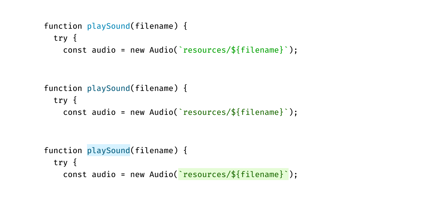
There is one trick you can do, that I don’t see a lot of. Use background colors!

Three versions of a function that creates an "audio" object. Each highlights the function name and the path of the audio file, in blue and green respectively. The third, clearest option, also adds background colours to both, and is much clearer.
I'm not sure if I'd get used to it, but the block colours here really stand out. It feels much easier to scan!

A radical idea | tante

When it comes to GenAI and LLMs, I think a lot of people have this feeling of something not quite adding up. Tante has perfectly summarised that feeling, and done so in an eloquent and frequently humorous way. The gist? If someone is making bold claims, without providing any evidence, maybe don't take them at their word. And certainly don't allow them to being dictating policy and legal oversight!

On the fundamental fault with statements like "GenAI will add 10% to global GDP by the end of the decade":

Here’s the thing: things that do not exist (yet) do not exist. 

Mind. Blown. I know.

OpenAI and others can’t make any money with their machine learning models. But their text and image generators might bring a 10% GDP increase as Meta’s open letter claims? You sure about that? Sounds like that requires a lot of magic thinking between 1) “OpenAI builds stochastic parrots” and 3) “GDP goes up by 10%”. How exactly is 2) shaped in this chain of reasoning and does it actually exist?

On how to approach hype in tech, and elsewhere:

When someone tries to sell their tech (step 1 in the chain of reasoning) with massively large claims (step 3 in the chain) look at whether step 2 actually exists in reality.

And how to respond if they can't even provide the idea of a plan for that second step:

Fuck your visions, come back when you have some proof.

Well said 👏

The anchor element | Heydon Pickering

Another superb breakdown of a common HTML element by Heydon, but this has the added benefit of also being a solid introduction into hypertext, markup structure, and the web in general.

On why the hell the "anchor" element ended up with that name, sewing confusion in its wake (see what I did there):

The “a” stands for “anchor” and we are supposed to think of the <a> element as the anchor at the end of a link connected to the boat that is a resource (something that lives somewhere on the web).

No stars | Jeremy Keith

An interesting look into Jeremy's relationship with star ratings. Lots of valid criticisms!

Personally, I plan to continue using star ratings for the foreseeable future, but I don't tend to worry about them that much.

Having used my system for over a decade, I don't really have to think about a rating any more; I just know what they are and what they mean. Stars are a shortcut to tell if something was good or bad, to me, personally. A quick way to remind myself, just in case anyone asks; like a lot about this site, they're a functional memory bank.

And I really enjoy revisiting my scores, because they change with age, with memory, with nostalgia, and with personal growth.

But though I may not fully agree with Jeremy's thoughts on star ratings overall (it's all personal, of course), the concept of rating humans? Yeah, no, on this we are fully aligned: that's just wrong 😬 And this is a very powerful way of realising just how much of modern life has, basically, become about turning people into data points 🤮

On a core complaint around rating media and other artistic endeavours:

Assigning stars gives a veneer of something measurable, countable, and objective. That’s not how art works.

On the inhumanity of rating people, even service works (who somehow always seem to end up with these systems):

My friend—who was basically showing me how this whole Uber thing worked—explained that he would now give a less than stellar review for the driver, because of that directional snafu.

“Ah, come on”, I said, “he was a nice guy.”

“This is how the app gets accurate data”, he responded.

“But …it’s a person”, I said.

Stop generating, start thinking | Sophie Koonin

An extremely quotable analysis of some of the risks that we are (unwittingly?) courting through increased use of "AI agents" and "vibe-coding".

This isn't an anti-LLM diatribe, but rather a nuanced argument about how LLMs cannot function without humans still in the loop, no matter what the current hype train is arguing.

Where I've seen LLMs do the most damage is where engineers outsource the thinking that should go into software development. LLMs can't reason about what the system architecture because they cannot reason. They do not think. So if we're not thinking and they're not thinking that means nobody is thinking. Nothing good can come from software nobody has thought about.


On how "prompt engineering" can feel bizarrely finicky:

You’re supposed to craft lengthy prompts that massage the AI assistant’s apparently fragile ego by telling it “you are an expert in distributed systems” as if it were an insecure, mediocre software developer.

On how generated code mirrors a lot of the bad parts of the Industrial Revolution, and how we should maybe learn a thing or two from that past trajectory:

Generated code is rather a lot like fast fashion: it looks all right at first glance but it doesn’t hold up over time, and when you look closer it’s full of holes. Just like fast fashion, it’s often ripped off other people’s designs. And it’s a scourge on the environment.

On the concerns that LLMs were largely trained on bad practices and broken, outdated "standards", which are now baked in to these models:

We don't write good enough code as humans to deserve something that writes the same stuff faster.

Instead of wanting to learn and improve as humans, and build better software, we’ve outsourced our mistakes to an unthinking algorithm.

On Sophie's current stance, which basically mirrors my own:

I will continue using my spicy autocomplete, but I’m not outsourcing my thinking any time soon.

There's no king in no kings | Notebook From Jason

A rebuttal of the No Kings organisation, not in terms of refuting their claims and goals, but in pointing out that they don't really have any. We desperately need a strong Civil Rights movement; we don't need another hyper-branded slogan and flashy crowd size statistics.

On how careful branding and attempting to have a "clean image" leaves you standing for nothing and unwilling to fight for that lack of message:

But, at its core, No Kings is a Potemkin Village. There isn't much holding up that logo and color palette. Its messaging doesn't belong to any grander mission.

The No Kings organization operates exclusively within the grooves of political decorum, careful never to spill over onto the laps of those we are protesting. It's this proper behavior that a No Kings march strives to achieve, evident in what it chooses to highlight.

On the real meaning of "non-violent protest" as a real tool for change:

During Jim Crow, the unlawful act of sitting in a “whites only” diner meant patrons, store owners, and police officers would retaliate against you, often violently. Non-violence from the Civil Rights era is a discipline that showed us how to respond after scalding hot coffee was thrown in our faces. Today, it teaches students to remain calm, even after they're assaulted with pepper spray, bottles, and fireworks. Non-violence is a necessity when disrupting the status quo, because doing so invokes violence in others.

The No Kings' declaration of “non-violence,” therefore, is a perversion of the original term, because the movement discourages the inciting incident necessary to enact change.

On how this distillation of Civil Rights tactics results in something that likely goes nowhere, and at best simply replaces the very machine it was created to oppose:

So what we get is a movement content with the cogs of fascism so long as they get to pull the levers. It's the antithesis of activism. It's deactivism.

Sprites on the web | Josh W. Comeau

When I first saw that Josh had written about using sprite sheets on the web, I thought: isn't that a little outdated? Wasn't it pretty much obsoleted by actual animation APIs? But there are some really valid points here, and it honestly looks like a lot of fun.

From modular behaviours (such as reducing an animation-duration during specific events to change the breathing pattern of a small cat) to providing a more accessible approach to GIF-like animations (they're certainly a lot easier to pause!), I can see some genuinely beneficial use-cases.

Josh does warn about interruption states; CSS animations tend to reverse immediately on interruption, which can cause some unusual behaviours. A small amount of JS may help, or there are some linked further reading with easing functions that can be beneficial. But for non-interactive animations, there's a lot to like here.

On what sprite sheets are and how they work:

The basic idea with a sprite is that we create a single image that contains each individual frame of an animation in a long strip. Then, we display each frame for a fraction of a second, like a roll of film sliding through an old school film projector

On how sprite animation works in modern CSS:

We can then use object-fit and object-position to control which part of the sprite is currently visible, flipping through each frame using a CSS keyframe animation.

On how the CSS "timing function" ‒ steps ‒ works to create non-linear animations:

The core idea with steps is that instead of transitioning smoothly using a Bézier curve, the value jumps between a specified number of midpoints. A staircase, instead of a ramp.

On how sprite animations can be better than GIFs, particularly for accessibility and interactivity:

The main benefit of this approach over an animated GIF is that we have a lot more control. We can change how fast the animation runs by tweaking animation-duration. We can also start/stop the animation at precisely the right time using animation-play-state. GIFs don’t have a pause button, and they tend to be a bit inconsistent in terms of their timing.

On the CSS step-position argument, which is used in places like steps(5, jump-none):

The second argument is the “step position”, and it has a default value of jump-end. In this mode, steps() will exclude the final value from its discrete values. For example, if our keyframe definition goes from 0% to 100% and we set steps(5), the levels will be 0%, 20%, 40%, 60%, and 80%. It will never actually reach 100%.

In praise of off-screen menus | Piccalilli

A lovely overview that questions some of the standard "wisdom" around avoiding off-screen menus (think hamburgers and slide outs) whenever possible.

I'm a particular fan of the idea that reducing visual clutter can sometimes be beneficial. I might try to explore something like that here, where you get the full-fat navigation on feed pages and the homepage, but on an actual article this disappears. Different UX for different goals.

On the root understanding of why we shouldn't hide navigation:

When your users are in task mode it’s easy to see why it makes sense to keep navigation front and centre — the easier you can make it to find your way around, the faster and smoother the path to task completion.

... and why that being the default mode may not be all that accurate:

A lot of the time we’re in exploration mode rather than task mode when we’re online — quite literally “browsing” the web.

On the simple yet reasonable point that different pages have different purposes (underlined emphasis mine):

Presenting a nav is presenting a list of decisions. In the quest for great UX, we should never forget that the decision that may prove the most valuable for someone landing on a web page is to stay a while and actually read the thing.

The underlying message I’m putting forward here is that making design and UX decisions should always be based on your project context. There is no right or wrong when it comes to UX, only context and compromise.