Showing posts with label chart. Show all posts

29 March 2020

NZ emissions unit price chart Datawapper style

This is an experiment in embedding a chart created in Data Wrapper. That's Data Wrapper style.

It looks alright.

The Zenodo citation for the data source is "New Zealand emission unit (NZU) monthly prices 2010 to 2016: V1.0.01".

The annotation from the citation is "This data and R code repository provides a reproducible public domain data series of mean monthly spot prices of the New Zealand emission unit (or "NZU"), the domestic emission unit in the New Zealand emissions trading scheme (https://en.wikipedia.org/wiki/New_Zealand_Emissions_Trading_Scheme/). Version 1.0.01".

09 September 2019

In 2018 the 6.7 million NZETS emission units allocated to 76 emitters were worth at least 243 million NZ dollars

All this data tidying and charting. It can lead to not seeing the forest for the trees. In this post I estimate the value of the 2018 free industrial allocation of emissions units to emitting industries. The number is 243 million New Zealand dollars. I find that gob-smacking

Following up from my last post, I wondered what was the market value of the 6.7 million emission units given to eligible emitters under the New Zealand Emissions Trading Scheme 2018 industrial allocation?

We will need market prices for emissions units. There is an online 'open data' Github repository of New Zealand Unit (NZU) prices going back to May 2010.

The NZU repository has it's own citation and DOI:

Theecanmole. (2016). New Zealand emission unit (NZU) monthly prices 2010 to 2016: V1.0.01 [Data set]. Zenodo. http://doi.org/10.5281/zenodo.221328

Under the Section 86 of the Climate Change Response Act 2002, eligible emitters or 'participants' in the ETS, as they are defined, may apply to the Environmental Protection Authority for a 'provisional' or estimated quantity of units for a future compliance year and for a 'final' or actual quantity of units for a past year.

We recall that one of National's 2009 amendments to the NZETS was to make unit allocation proportional to actual production. So that requires an provisional estimate and an actual 'wash-up' calculation once actual production from the regulated 'activity' is known.

The emitters must apply for both provisional and final allocations between 1 January and 30 April of each year. I am assuming that the EPA checks the applications and then transfers the initial allocation to accounts in the NZ Emissions Trading Register in May of each year.

The provisional allocation does not have to be gazetted or published. The final allocation must be gazetted or publicised on the EPA's website under Section 86B(5). But it can't be known until the EPA has received and processed all the historic wash-up applications for the just finished calendar year. That's why in September 2019 the EPA have only the 2018 unit allocations on their website. And not the 2018 final allocations.

It may be the accountant within me, but I think the emitters will want to get their initial application as close to 100% correct as possible. Or to exceed it. Because free units now will always be better than free units in 12 months time.

So let's assume the initial industrial allocation is transferred to emitters' accounts in May. At that point we can make a calculation of market value. We can check our NZU price data for a mid-May price as it's expressed in average monthly prices.

On our graph of of NZU prices, we add a vertical line for the 15th of May and then where that line intersects with the price line we add a horizontal line across to the prices on the Y axis. Or we could have looked up the .csv file of the prices. We get $NZ 21.38 per unit.

Multiplying the 6,743,573 units by $21.38 equals 143,503,233 NZ dollars!

I am gob-smacked by that! $143.5 million! Just gifted to emitters! Deliberately to reduce the effect of the carbon price on these privileged emitters. And as Idiot/Savant noted, the allocations will slowly and incrementally 'phase out' by the minutest of percentages until 2015!

Of the big three, New Zealand Steel received units worth $NZ 37.9 million, New Zealand Aluminium Smelters received units worth $NZ 28 million and Methanex received units worth $NZ 20 million. Here's the pie chart denominated in dollars.

Here is a bar chart which are usually easier to read.

Here is the tidied data of the name of the emitter, the amount of final units and the value at the mid May price of $NZ21.38. The data file is also at Google Drive sheets.

EPA Industrial Allocation Units Value 2018
Name Allocation Value
New Zealand Steel Development Limited 1782366 37928748.48
New Zealand Aluminium Smelters Limited 1324556 28186551.68
Methanex New Zealand Ltd 945210 20114068.8
Fletcher Concrete and Infrastructure Limited 584032 12428200.96
Oji Fibre Solutions (NZ) Limited 484322 10306372.16
Ballance Agri-Nutrients (Kapuni) Limited 325594 6928640.32
Pan Pac Forest Products Limited 210652 4482674.56
Norske Skog Tasman Ltd 200556 4267831.68
Winstone Pulp International Limited 151546 3224898.88
Graymont (NZ) Limited 144405 3072938.4
Whakatane Mill Limited 139690 2972603.2
ACI OPERATIONS NZ LIMITED 59945 1275629.6
Fonterra Limited 50664 1078129.92
Asaleo Care New Zealand Limited 29419 626036.32
Nelson Pine Industries Limited 26569 565388.32
Wallace Group Limited Partnership 26539 564749.92
Pacific Steel (NZ) Limited 19550 416024
EVONIK PEROXIDE LIMITED 18443 392467.04
Daiken New Zealand Limited 17770 378145.6
Dongwha New Zealand Limited 16854 358653.12
Status Produce Limited 15496 329754.88
Taranaki By-Products Ltd 14197 302112.16
Exception Limited 11618 247231.04
Tuakau Proteins Ltd 11393 242443.04
Anchor Ethanol Limited 10784 229483.52
Southern Paprika Limited 10406 221439.68
Alliance Group Limited 10012 213055.36
Affco New Zealand Limited 9465 201415.2
Under Glass (Karaka) Limited 7574 161174.72
Gourmet Mokai Limited 7006 149087.68
Under Glass (Bombay) Ltd 6194 131808.32
Websters Hydrated Lime Company Limited 5999 127658.72
J.S.Ewers Ltd 5853 124551.84
Hawkes Bay Protein Limited 5740 122147.2
CMP Canterbury Limited 5470 116401.6
Juken New Zealand Ltd 5304 112869.12
Gourmet Paprika Limited 4837 102931.36
PVL Proteins Limited 3632 77288.96
Fletcher Building Products Limited 3344 71160.32
Sharma Produce Limited 2677 56966.56
Gourmet Waiuku Limited 2190 46603.2
Kakariki Proteins Limited 2037 43347.36
Shipherd Nurseries Limited 1900 40432
Island Horticulture Limited 1717 36537.76
Tegel Foods Limited 1632 34728.96
Value Proteins Ltd 1581 33643.68
Whakatane Growers Limited 1393 29643.04
P H Kinzett Ltd 1344 28600.32
Moffatts Flower Company Limited 1182 25152.96
Karaka Park Produce Limited 1169 24876.32
Van Lier Nurseries Ltd 1123 23897.44
Taylor Preston Limited 1104 23493.12
Meenakshi Devi Sharma, Raj Kumar Sharma 1080 22982.4
Vege Fresh Growers Limited 1075 22876
Jai Shankar Growers Limited 928 19747.84
Prime Range Meats Limited 928 19747.84
Homestead Produce Ltd 881 18747.68
Sinai Hort Limited 604 12853.12
J.S. Mahey Limited 599 12746.72
Castle Rock Orchard Ltd 564 12001.92
Karamea Tomatoes Limited 526 11193.28
Poppas Peppers 2009 Limited 351 7469.28
Taaza Green Limited 337 7171.36
Harbour Head Growers Ltd 261 5554.08
Ting-Yuan Robert Wu 239 5085.92
Parkgard Growers 2000 Limited 222 4724.16
Antone James Ivicevich, Joanne Elizabeth Gould Ivicevich 210 4468.8
Graeme Lowe Protein Limited 198 4213.44
Mary Jane Fausett, Peter James Fausett 143 3043.04
Pomoana Gardens Limited 100 2128
John Hamilton Charles Falloon, Paul Gregory Whitehead 79 1681.12
Royal Roses Limited 66 1404.48
Kingbridge Ltd 61 1298.08
Eseta Kovati, Reupena Kovati 37 787.36
GELITA NZ Ltd 29 617.12
Wallace Corporation Limited 0 0

02 September 2019

Ten NZ companies were given 6.7 million free emission units in 2018

Have open tidy data; will graph it. I whip up a pie chart of the top ten New Zealand companies rorting the New Zealand Emissions Trading Scheme via free allocation of emissions units.

Of 6.7 million NZ Emissions Trading Scheme emission units allocated by the Environmental Protection Authority (given for free instead of being sold by auction) to industries in 2018, 6.2 million or 91% went to ten well-known New Zealand companies.

Here is the R script.

Here is the data of the emissions units gifted for free to industrial emitters in 2018.

Windfall gifting of emissions units to industry in 2018
Name Allocation
New Zealand Steel Development Limited 1,782,366
New Zealand Aluminium Smelters Limited 1,324,556
Methanex New Zealand Ltd 945,210
Fletcher Concrete and Infrastructure Limited 584,032
Oji Fibre Solutions (NZ) Limited 484,322
Ballance Agri-Nutrients (Kapuni) Limited 325,594
Pan Pac Forest Products Limited 210,652
Norske Skog Tasman Ltd 200,556
Winstone Pulp International Limited 151,546
Graymont (NZ) Limited 144,405
Whakatane Mill Limited 139,690
ACI OPERATIONS NZ LIMITED 59,945
Fonterra Limited 50,664
Asaleo Care New Zealand Limited 29,419
Nelson Pine Industries Limited 26,569
Wallace Group Limited Partnership 26,539
Pacific Steel (NZ) Limited 19,550
EVONIK PEROXIDE LIMITED 18,443
Daiken New Zealand Limited 17,770
Dongwha New Zealand Limited 16,854
Status Produce Limited 15,496
Taranaki By-Products Ltd 14,197
Exception Limited 11,618
Tuakau Proteins Ltd 11,393
Anchor Ethanol Limited 10,784
Southern Paprika Limited 10,406
Alliance Group Limited 10,012
Affco New Zealand Limited 9,465
Under Glass (Karaka) Limited 7,574
Gourmet Mokai Limited 7,006
Under Glass (Bombay) Ltd 6,194
Websters Hydrated Lime Company Limited 5,999
J.S.Ewers Ltd 5,853
Hawkes Bay Protein Limited 5,740
CMP Canterbury Limited 5,470
Juken New Zealand Ltd 5,304
Gourmet Paprika Limited 4,837
PVL Proteins Limited 3,632
Fletcher Building Products Limited 3,344
Sharma Produce Limited 2,677
Gourmet Waiuku Limited 2,190
Kakariki Proteins Limited 2,037
Shipherd Nurseries Limited 1,900
Island Horticulture Limited 1,717
Tegel Foods Limited 1,632
Value Proteins Ltd 1,581
Whakatane Growers Limited 1,393
P H Kinzett Ltd 1,344
Moffatts Flower Company Limited 1,182
Karaka Park Produce Limited 1,169
Van Lier Nurseries Ltd 1,123
Taylor Preston Limited 1,104
Meenakshi Devi Sharma, Raj Kumar Sharma 1,080
Vege Fresh Growers Limited 1,075
Jai Shankar Growers Limited 928
Prime Range Meats Limited 928
Homestead Produce Ltd 881
Sinai Hort Limited 604
J.S. Mahey Limited 599
Castle Rock Orchard Ltd 564
Karamea Tomatoes Limited 526
Poppas Peppers 2009 Limited 351
Taaza Green Limited 337
Harbour Head Growers Ltd 261
Ting-Yuan Robert Wu 239
Parkgard Growers 2000 Limited 222
Antone James Ivicevich, Joanne Elizabeth Gould Ivicevich 210
Graeme Lowe Protein Limited 198
Mary Jane Fausett, Peter James Fausett 143
Pomoana Gardens Limited 100
John Hamilton Charles Falloon, Paul Gregory Whitehead 79
Royal Roses Limited 66
Kingbridge Ltd 61
Eseta Kovati, Reupena Kovati 37
GELITA NZ Ltd 29
Wallace Corporation Limited 0

25 March 2018

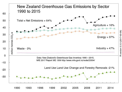
Charting New Zealand Greenhouse Gas Emissions by Sector 1990 to 2015

I have created a revised chart of New Zealand's greenhouse gas emissions analysed by economic sector for the years from 1990 to 2015. Something I have done before. Before that I made a chart of just the gross and net emissions.

This first image is an uploaded .png file at actual size (560 pixels wide) which is the width of the text container in the blog's template.

For a comparison, this second image uses Flickr's embed code to show a larger file (1280 pixels wide) I uploaded to Flickr. It's not a very large file; 128 kilobytes. That seems minute, when I am uploading 4MB or larger photographs to Flickr. If I wanted a larger file, I could output the chart from R as a .tiff format file.

NZ-Net-ghg-sector-2015-1280box

The first smaller image uploaded to Blogger seems slightly clearer.

The data source is of course;

"New Zealand's Greenhouse Gas Inventory 1990–2015", Publication date: May 2017, Publication reference number: ME 1309, Full report - New Zealand’s Greenhouse Gas Inventory 1990-2015, and supporting tables and files. CRF summary data [Excel file, 45.6 KB]

The key difference from previous charts is that I have omitted gross emissions or as the Ministry for the Environment calls them "Gross emissions without Land Use, Land Use Change and Forestry (LULUCF)". Gross emissions frequently if not mostly seem to be the focus of analysis of trends and achievement of targets. Land Use, Land Use Change and Forestry emissions frequently get omitted.

I started with the sector emissions, then I added net emissions. Net emissions are the sum of the sectoral emissions obviously. Net emissions (with a qualification I may address in another post) are what end up in the atmosphere. So from a science-informed viewpoint, analysis of trends should be based on net emissions.

What struck me is that this format highlights a different interpretation of trends. Look how much of NZ's 1990 emissions were 'counter-balanced' by Land Use, Land Use Change and Forestry. In 1990, the land use and forestry sector sequestration (removal) of greenhouse gases was equivalent to the sum of the other sectors excluding agriculture. The 1990 net emissions were the same as the emissions from the agriculture sector. In other words, if you excluded agriculture emissions, NZ's emissions in 1990 would have been 'net zero'.

Since 1990, the land use and forestry sector sequestration has declined by 21%. In 1991, the land use and forestry sector sequestration 'counterbalanced' 100% of non-agriculture emissions. In 2015, the land use and forestry sector sequestration only counterbalanced only 57% of non-agriculture emissions. As long as land use and forestry sequestration is measured consistently over time, this trend can only get worse. A lot of commercial forest planting happened in the 1990s. These forests will soon be due for harvesting. That's why I want to scream each time I hear some pundit say forestry will be a 'get out of jail card' for growing emissions in other sectors, notably agriculture.

Here is the R script (with a couple of Linux Xterminal commands) for obtaining and preparing the data and for creating the chart.

17 June 2017

New Zealand greenhouse gases by sector from the inventory

I have made another chart from the New Zealand's Greenhouse Gas Inventory 1990–2015 released the other week by the Ministry for the Environment.

It shows the greenhouse gas emissions by sectors of the economy. It includes 'negative' emissions, more properly called carbon removals, or carbon sequestration or simply carbon sinks. This is the sum of all the carbon dioxide taken out of the atmosphere by the sector of the economy called Land use, Land use change and Forestry.

Here is the chart.

This time I took a more traditional R approach to getting the the data into R from the Excel file CRF summary data.xlsx.

First, I used opened an X terminal window, and used the Linux wget command to download the spreadsheet "2017 CRF Summary data.xlsx" to a folder called "/nzghg2015".

I then used ssconvert (which is part of Gnumeric) to split the Excel (.xlsx) spreadsheet into comma-separated values files.

The Excel spreadsheet had 3 work sheets, 2 with data, and 1 that was empty. So there's now a .csv file for each sheet, even the empty sheet. And we read in the .csv file for emissions by sector.

The final step is to make the chart.

06 June 2017

The latest inventory of New Zealand's greenhouse gases

On the Friday before last Friday, the 26 of May 2017, Minister for Climate Change Issues, Paula Bennett and the Ministry for the Environment released the latest inventory of New Zealand's greenhouse gases.

Minister Bennett and the Ministry have as their headline Greenhouse gas emissions decline.

I thought would I whip up a quick chart from the new data with R.

I pretty much doubted that there was any discernible decline in New Zealand's greenhouse gas emissions to justify Bennett's statement. We should always look at the data. Here is the chart of emissions from 1990 to 2015.

Although gross emissions (emissions excluding the carbon removals from Land Use Land Use Change and Forestry (LULUCF)) show a plateauing since the mid 2000s, with the actual gross emissions for the last few years sitting just below the linear trend line.

Gross 2015 emissions are still 24% greater than gross 1990 emissions.

For net emissions (emissions including the carbon removals from Land Use Land Use Change and Forestry) the data points for the years since 2012 sit exactly on the linear trend line. Net 2015 emissions are still 64% greater than net 1990 emissions.

There was of course more data wrangling and cleaning than I remembered from when I last made a chart of emissions!

The Ministry for the Environment's webpage for the Greenhouse Gas Inventory 2015 includes a link to a summary Excel spreadsheet. The Excel file includes two work-sheets.

One method of data-cleaning would be to save the two work sheets as two comma-separated values files after removing any formatting. I also like to reformat column headings by either adding double-speech marks or by concatenating the text into one text string with no spaces or by having a one-word header, say 'Gross' or 'Net'.

Of course, that's not what I did in the first instance!

Instead, I copied columns of data from the summary Excel sheet and pasted them into Convert Town's column to comma-separated list online tool. I then pasted the comma-separated lists into my R script file for the very simple step of assigning them into numeric vectors in R. Which looks like this.

Then the script for the chart is:

The result is that the two pieces of R script meet a standard of reproducible research, they contain all the data and code necessary to replicate the chart. Same data + Same script = Same results.

I also uploaded the chart to Wikimedia Commons and included the R script. Wikimedia Commons facilitates the use of R script by providing templates for syntax highlighting. So with the script included, the Wikimedia page for the chart is also reproducible. Here is the Wikimedia Commons version of the same chart.

NZ-ghg-2015

For comparison, here is my equivalent chart of greenhouse gas emissions for 1990 to 2010. Gross emissions up 20% and net emissions up 59%.

What can I say to sum up - other than Plus ça change, plus c'est la même chose.

25 February 2017

Graph of atmospheric carbon dioxide concentrations from another cool data package

I feature another cool self-updating data package, this time of concentrations of atmospheric carbon dioxide recorded from the well-known Mauna Loa Observatory, in Hawaii. Graphs of this data are perhaps the most iconic images of anthropogenic climate change.

This post features the atmospheric carbon dioxide data package. Again, it is one of the Open Knowledge International (OKFN) Frictionless Data core data packages, that is to say it is one of the

"Important, commonly-used datasets in high quality, easy-to-use & open form".

The data is known as the Keeling Curve after the American chemist and oceanographer Charles Keeling. It is an iconic image for anthropogenic climate change.

Like the global temperature data package, the atmospheric carbon dioxide data package is open and tidy and self-updating and resides in an underlying Github data package .

Similarly, the data package can be downloaded as a zip file and unzipped into a folder. That will include the data files in .csv format, an open data licence, a read-me file, a json file and a Bash script that updates the data from source.

I can run the Bash script file on my laptop in an X-terminal window and it goes off and gets the latest data and formats it into 'tidy' csv format files.

Here is a screenshot of the script file updating and formatting the data.

Here is my chart.

Here is the R code for the chart.

13 January 2017

2016 the warmest year on record via a cool self-updating data package of global temperature

Radio New Zealand reports that 2016 was the new record warmest year in the instrumental record, so I will pitch in too. But with an extra touch of open data and reproducible research.

It's been a while since I uploaded a chart of global temperature data. Not since I made this graph in 2011 and then before that was this graph from 2010. So it's about time for some graphs. Especially since 2016 was the world's warmest year as well as New Zealand's warmest year.

When I made those charts, I had to do some 'data cleaning' to convert the raw data to tidy data (Wickham, H. 2014 Sept 12. Tidy Data. Journal of Statistical Software. [Online] 59:10), where each variable is a column, each observation is a row, and each type of observational unit is a table. And to convert that table from text format to comma separated values format.

I would have used a spreadsheet program to manually edit and 'tidy' the data files so I could easily use them with the R language. As Roger Peng says, if there is one rule of reproducible research it is "Don't do things by hand! Editing data manually with a spreadsheet is not reproducible".

There is no 'audit trail' left of how I manipulated the data and created the chart. So after a few years even I can't remember the steps I made back then to clean the data! That then can be a disincentive to update and improve the charts.

However, I have found a couple of cool open and 'tidy' data packages of global temperatures that solve the reproducibility problem. The non-profit Open Knowledge International provides these packages as as part of their core data sets.

One package is the Global Temperature Time Series. From it's web page you can download two temperature data series at monthly or annual intervals in 'tidy' csv format. It's almost up to date with October 2016 the most recent data point. So that's a pretty good head start for my R charts.

But it is better than that. The data is held in a Github repository. From there the data package can be downloaded as a zip file. After unzipping, this includes the csv data files, an open data licence, a read-me file, a .json file and a cool Python script that updates the data from source! I can run the script file on my laptop and it goes off by itself and gets the latest data to November 2016 and formats it into 'tidy' csv format files. This just seems like magic at first! Very cool! No manual data cleaning! Very reproducible!

Here is a screen shot of the Python script running in a an X-terminal window on my Debian Jessie MX-16 operating system on my Dell Inspiron 6000 laptop.

The file "monthly.csv" includes two data series; the NOAA National Climatic Data Center (NCDC), global component of Climate at a Glance (GCAG) and the perhaps more well-known NASA Goddard Institute for Space Studies (GISS) Surface Temperature Analysis, Global Land-Ocean Temperature Index.

I just want to use the NASA GISTEMP data, so there is some R code to separate it out into its own dataframe. The annual data stops at 2015, so I am going to make a new annual data vector with 2016 as the mean of the eleven months to November 2016. And 2016 is surprise surprise the warmest year.

Here is a simple line chart of the annual means.

Here is a another line chart of the annual means with an additional data series, an eleven-year lowess-smoothed data series.

Here is the R code for the two graphs.

09 April 2016

Opening up the data on emissions units in the NZ emissions trading scheme

In this post I include a gratuitous image of Marlon Brandon as the Godfather because all this wonky open data stuff I have been doing lately might be a bit boring. But I do eventually get around to a worked example of how to find out how many free units were given to New Zealand Aluminium Smelters Limited.

Following on from the post about the data on internationally-sourced emission units that have been imported into New Zealand, I have uploaded two more data files to Google Sheets. They are in comma-separated values (CSV) format.

The first sheet is NZETS-2010-2014-final-allocations-for-eligible-activities-csv which is five years of data on the free allocation (gifting) of New Zealand Units (NZUs) to emitting industries under the New Zealand emissions trading scheme (or NZETS).

This file combines into one sheet the numbers of units allocated (which are recorded in separate 'by year' tables) from the 'Industrial allocation decisions' pages on the Ministry for the Environment's climate change website.

The second sheet is Kyoto Unit Holdings by Account 2008 - 2014 which is seven years worth of data listing all account holders in the NZ Emission Unit Register who held a balance of Kyoto Protocol emission units at 31 December of each year. This sheet combines all the seven year by year sheets linked to on the post about Kyoto emission units

The Kyoto units are the Assigned Amount Units (AAUs), the Emission Reduction Units (which are otherwise known as the the dubious Russian or Ukrainian emission units), the Removal Units (RMUs) and the Certified Emission Reduction units (CERs). Oddly, there is no requirement for the Emission Unit Register to disclose the year end balances of New Zealand emission units (NZUs) held by account holders.

How do we use this data? We need a worked example.

Let's assume we are interested in New Zealand Aluminium Smelters Limited, the operator of the Tiwai Point aluminium smelter. I mean, who isn't interested in the Godfather of the New Zealand emissions trading scheme?

All we have to do with our Google sheet is apply a filter to the top row, the column headings, select the third or 'C' column 'Activity', and then open a drop down dialogue box and then hit 'clear selection' then select 'Aluminium smelting'.

That tells us that New Zealand Aluminium Smelters Limited received the following annual allocations of emission units.

2010 210,421 2011 437,681 2012 301,244 2013 1,524,172 2014 755,987

In other words, New Zealand Aluminium Smelters were given millions of NZ emission units for free from 2010 to 2014. A total of 3,229,505 to be exact. A bar plot of the annual allocations looks like this.

So what happened in 2013? The free allocation to New Zealand Aluminium Smelters increased by a factor of five. Maybe that can wait for another post.

Here is the R script/code for the bar chart.

06 March 2016

Charting the surplus emission units in New Zealands Emissions Trading Scheme

The New Zealands Emissions Trading Scheme doesn't work to cap emissions. It has just far too many surplus emission units sloshing around because of the big buy-up of low-priced dodgy Russian-sourced international units.

The New Zealand Emissions Trading Scheme Review discussion document includes this statement about surplus emission units on page 10.

"There is a substantial number of banked NZUs owned by market participants, which combine with current ETS settings to weaken the effectiveness of the NZ ETS to assist New Zealand to meet its international obligations...This stockpile of banked NZUs amounts to around 140 million units. This is several times the total number of units surrendered under current NZ ETS settings each year, which typically amounts to less than 30 million units. Some of these units are held by foresters, who banked the NZUs they received as their trees grew. Other participants banked units they received via one-off allocations when the NZ ETS was first put in place, or accumulated NZUs by surrendering cheaper international units to meet their obligations and banking NZUs they purchased or received from the Government".

Did you notice the specific use of language? The word 'surplus' is not used. The preferred term is 'banked NZUs owned by market participants'. 'Banked units' implies that it's the fault of the market participants. Surplus units implies faulty design. As I have posted previously.

An effective emissions trading scheme with a real cap would never have surplus units. Units would be scarce and realistically priced. A surplus of units is of itself evidence of a failed implementation of cap and trade frameworks such as Kyoto and the EU ETS.

How many surplus units are there? The discussion document says 140 million units. I have doodled away with the R programme and some data from the Environmental Protection Authority's Emissions Units Register and have made a graph of the cumulative total of units held in the NZ Emissions Unit Register at the end of the calendar year, up to 2014.

The key point being that the cumulative total of all types of units, 588 million, at the end of 2014, exceeds the total 'compliance demand', 110 million, the number surrendered by emitters/ market participants from 2009 to 2014 by a factor of almost six.

We need to note that in the final accounting for the 2008 to 2012 Kyoto Protocol commitment period, New Zealand has to cancel some 373 million units to match our emissions.

Here is the R script.

Here is the data.

New Zealand green house gas emissions per capita via Google Data Explorer

Google have a service I did not know about, the Google Data Explorer. Here's an example of per capita greenhouse gases for some countries whose name starts with 'N'. The vertical axis is not labelled, a "good practice no-no", but it is tonnes of greenhouse gases in carbon dioxide equivalents.

Look, New Zealand is at the top, mainly due to our emissions from pastoral agriculture.

Its very similar to my graph from a previous post.

Per capita greenhouse gas emissions

I have used some html mark-up from Wikimedia Commons here and not the Blogger tools.

The data is up to 2012 and is credited (in the footer of the page) to the World Resources Institute CAIT 2.0 climate data explorer. Then oddly, in the next line of the footer, is the annotation "copyright Google 2014". I guess I am surprised not to see a Creative Commons licence.

A little more exploring revealed that someone had asked the question what is the copyright if I want to use a graph on Wikimedia?. The question was asked in 2013 and has never been answered. My answer would be just get the data from CAIT 2.0 climate data explorer, make your own graph and upload to Wikimedia Commons where you of course choose a Creative Commons licence.

That reinforces this comment on the original database of databases discussion.

"Google Public Data Explorer is very limited in scope, rather than the comprehensive catalogue of the world's data that I suggested they might choose to do. GPDE has only 136 datasets, for which they done the manual work of putting into a database, so that they can offer visualizations. I can't see any activity on it since launch in 2010".

So I guess Google starts projects, but sometimes just doesn't maintain them.

30 January 2016

New Zealands gross greenhouse gas emissions per capita compared

Update: 7 February 2016. There was a mistake in the chart. The labels for India and Africa were interposed. So I fixed that and uploaded a new version to Wikimedia Commons. I also changed the type of point used to mark the India data into an upside-down triangle.

I have made another chart and uploaded it to Wikimedia Commons. Today's chart is a comparison of gross per capita greenhouse gas emissions 1990 to 2012 for seven entities: New Zealand, United Kingdom, the European Union, China, India, Africa (the whole continent) and also the world average.

Its my own work of course. So it's by Mrfebruary and following Wikimedia's practice, it's released under a Creative Commons Attribution-ShareAlike 4.0 International licence, via Wikimedia Commons.

Per capita greenhouse gas emissions

I have used some html mark-up from Wikimedia Commons here and not the Blogger tools.

The original source of the data is the CAIT Climate Data Explorer which is provided by the Washington-based World Resources Institute. I selected the countries/entities and the type of data and downloaded it. I have stashed the data I used on Google Sheets.

Look at China's trend in per capita emissions. In 1990 China had more-or-less the same per capita emissions as India or the average for Africa as a continent. Then from the late 1990s onwards, globalisation of trade and China's rapid economic growth, particularly of its export manufacturing, caused per capita emissions to grow until they are now similar to the emissions in the European Union.

The two trends are of course linked; as China becomes the industrial manufacturer for the rest of the world, the developed OECD countries, including New Zealand, become importers of manufactured goods and exporters of the greenhouse gas emissions. The manufacturing industries decline and the developed economies become more reliant on low-emissions service industries.

Here is the R code for the chart.

As an experiment, I am going to insert a large .png of the graph, 1280 pixels wide. One feature of Wikimedia Commons is that once you have uploaded an image in scalable vector graphic format, you can then get portable network graphic (png) format images in different sizes. Blogger calls this 'medium' size. It doesn't reproduce crisply. The Wikimedia Commons html mark-up looks better. Still, double click on this and it looks crisper in it's glorious 1280 pixel width.

27 January 2016

New Zealand emission unit NZU prices 2010 to 2015

I have made a new graph.

Actually its more accurate to say I have collated or perhaps compiled a data set of New Zealand emission unit (NZU) prices from 2010 to 2015.

Although private sector carbon brokers such as OMF and Carbon Forest Services display some current prices and a few historic prices, there is no openly available public data series of the New Zealand carbon price as represented by trading in the domestic New Zealand Unit.

So I decided to make a monthly data series by digitizing images of graphs via the programme G3Data and via the website Web Plot Digitizer.

I took an image of a chart of New Zealand carbon prices, much like this one below, I drew some vertical lines on it and uploaded it to the Web Plot Digitizer webpage, selected some exact points on the horizontal and vertical axes to orientate the chart and then clicked on the intersection of the data series with the axes. That records the data points in the Web Plot Digitizer app.

The values obtained in this way are best thought of as being similar (but certainly not identical) to a monthly mean. The accuracy is perhaps plus or minus 20 or 50 cents. I know that as I did several 'replications' and they varied from each other by 20 to 50 cents. The data file is available as a Google sheet called "NZU-price-data-2010-2015.csv".

NZU-NZ-emission-unit-720by540

The R script for the chart is also available at Ghost Bin and at the Wikimedia Commons page for the graph.

13 January 2016

NZ greenhouse gas emissions march steadily onwards and upwards to 2030

A previous post was about an inaugural press release from the new Minister for Climate Change Paula Bennett.

From a public relations point of view Bennett's release aimed to sow and spread and cultivate 'talking points' that support the Government's preferred climate policy narrative. Which is of course that:

New Zealand is doing enough on reducing anthropogenic greenhouse gas emissions. New Zealand complies with its climate target obligations (via 'carbon credits') under the Kyoto Protocol and the UNFCCC. New Zealand has a moderated balanced emissions trading scheme and is doing research on agriculture and helping out in the Pacific and 'punching above our weight' in the international negotiations. All in all New Zealand is doing enough about climate change!

However, New Zealand (irrespective of who was in Government) has historically always sought to use loopholes to comply with emission reduction targets.

So for the talking point "We are meeting our obligations", the reality is "we used creative carbon accounting to obscure the fact that gross and net emissions of greenhouse gases have increased by 21% and 42% since 1990 respectively".

One of the reports referred to by Paula Bennett was the Second Biennial Report to the UNFCCC. This included a spreadsheet of data on projected New Zealand emissions until 2030. So of course I had to create a graph of it.

NZ greenhouse gases by sector

The creative commons license is CC BY-SA 4.0

I used the R programming language and the script is available on the Wikimedia Commons page. Anyone is free to use the graph, it is licensed under the Creative Commons Attribution-Share Alike 4.0 International licence, via Wikimedia Commons

Categorising the emissions by sectors of the economy makes it very clear that pastoral agriculture by far and away contributes more than any other sector. Emissions from agriculture are twice as large as the second largest sector, energy. I added the projected growth of each industry sector by percent since 1990; agriculture, + 22%; energy, + 19%; transport + 60%; industry + 101%; waste, + 4%.

The upward emissions trend is in stark contrast to the Ministry for the Environment's web page on how New Zealand is meeting the 2020 emissions reduction target.