Showing posts with label design. Show all posts

February 10, 2015

Winnipeg Candy Hearts

Winnipeg candy hearts
A little break from writing… kinda sorta. With Valentine's Day approaching, love – and Loveday, when the wind is right – is in the Winnipeg air. It's a time when lovers of all stripes in my hometown make way for romance – be it skating on the river, sipping together on ruby-red cream soda Slurpees, or cheapskating with some February 13th and 15th dinner reservations.

Click on the image to view the whole thing slightly larger. This exercise in Photoshoppery was partially inspired by my friend Carl Shura's fantastic downtown Winnipeg-themed Valentine's Day cards. 

January 05, 2015

Skills, Set


"Nunchaku skills, bow hunting skills, computer hacking skills… girls only want boyfriends who have great skills." – Napoleon Dynamite (2004)

Are you looking for an ever-evolving career in a fast-paced environment on the vanguard of the creative industry? Great. That's super. Me too… once in a while.

I wage a daily internal battle with my chosen career path. I absolutely adore its bare essentials, its sense of order. Structure. Hierarchy. Common sense, unless not needed. I realize now, sixteen years in, that's never going to go away. Neither is the push/pull of constantly nagging change.

I can accept change, pick and choose morsels of it I can use and enjoy. I wouldn't say I naturally embrace it. I anticipate it, but I have a pace I like to maintain. I'm a clinical thinker; I weigh and consider options before proceeding. I wish that was still perceived more as a benefit, and it may be in some circles. Just not mine, where expediency is fast becoming king and thinking things through can be a luxury. It's only with as much experience as I have, that I manage this balance and produce as quickly as can be required on any given day, from years of learning how the rules can be bent and shortcuts discovered and followed.


Look, I have discernible skills. I can differentiate vocalizations of a red-breasted nuthatch from a white-breasted nuthatch, eight or nine times out of ten. I can make pretty authentic farting noises by squeezing my palms together. I've made French toast. But it took time to learn those skills. Time that today's lifestyle doesn't often wait around for to develop – and that's not always fair.

But I also appreciate consistency, or a semblance of it. That can be the death knell for someone in my field. I think of my sister (the dentist) and brother (the teacher) and think, there's always going to be teeth and students. Probably even roughly the same number of teeth and students, year in and year out. I think, during sourer times, why didn't I think of that. There's so much variability in design, so much flux. Differences of opinion: paper is dying, paper is dead, paper has never been more in demand. Here's the Next Big Th… wait, here's the Next Big… wait, here's the Next Big Thing. 


Technology trickles into all careers. Certainly mine. It's a bitch goddess, giving with one hand and taking away with the other (I can't take credit for that nugget; it's an old Kids in the Hall line). Too much of the change in design is change for the sake of change. Chasing technology, as opposed to using it smartly. It's easy to get swept up. Even I do, on rare occasion. I have a cellular 'I-Phone 5-S' that I like to play the video games on. But I also take comfort in that those bare essentials of design, the skeleton, the nuts and bolts – will never change. And so long as they don't, I'll have a place and relish in it.

May 29, 2014

284: The Phoenix


Following years of smooth sailing/status quo, an opportunity recently arrived to revitalize Conservator, the magazine published by my employer, Ducks Unlimited Canada. For years a dependable quarterly workhorse for the organization – and a staple of my workday routine – Conservator steadily adjusted and adapted over the last few years to accommodate belt-tightening. Most recently, attempts to house the magazine exclusively online eventually resulted in much internal debate to find the means to reintroduce, and reinvent, a print edition for our somewhat non-conventional (older/rural/western) readership – while attracting new readers to the mix.

The magazine has long been a centerpiece of my design career. I've had the responsibility – and the prize – of designing Conservator (and its French-language equivalent) in its entirety since 2002. Fanning out issues from those salad years through to the present day reveals a steady growth in my design abilities and sensibilities – and during the magazine's heyday of photo budgets and freelance writers I strung together spreads that evoked pride and anchored my portfolio. I explored trends, texture, colour and typography. I showed off. Sometimes I flew by the seat of my pants. The stories often inspired me, and in turn I did my best to complement them with an ever-increasing toolbox of skills and intuition.


Above: Been there, done that – the last of the red hot ice cold previous designs.

Even as times became leaner and the budget dried, I've remained engrossed in piecing together each issue. The number of magazines produced each year fluctuated and the situation trundled toward an inevitable online-only presence – a period that commenced in 2013 following one last big score: a plush, 80-page special edition highlighting Ducks' 75th anniversary that featured a cover that, for the first time, featured one of my own photos.

The online issues performed admirably enough, but there was no longer the grand prize of a paper-and-ink/flesh-and-blood printed piece in hand. I missed that, and was not alone in this sentiment. Talk began to swirl of a modest return to print, culminating in an issue released two weeks ago that showcases an new, entirely redesigned Conservator.


Above: Some guts – featuring words, messaging, and all that other non-design-related stuff.

Chief among concerns was the magazine was becoming overly institutional, and it was reflected in the design as articles became more hard-news, straight facts and concise – but less entertaining. My hands became frequently tied, as department pages fell by the wayside, swapped for a deluge of single-page articles and press releases that lent themselves to Macleans-style templating. A primary aim of the new-look Conservator is storytelling, and I couldn't be more in favour: storytelling is a key facet of design as much as it is with writing. And the better-written the magazine is, the more I want to fight for it.

Also paramount is photography. It's been Conservator's bread and butter since I hopped aboard, and I've held firm the belief for ages that for this magazine, pictures are invaluable – and as designer I'm not to stand in their way. (I know, I know, the old adage exists that Content is King and I'll tow that line, but come on: I'm a designer. Design is King.*)

To further the theme of letting the photography do the heavy lifting, I crafted a simple masthead of Garamond, tightly kerned with a custom R-V ligature, to replace the previous one that had held firm on Conservator covers since 1999. Though, only after experimenting in the concept stages with a flashier masthead (below) that I ultimately nixed. The Cabrito family and Intro, an online freebie, were selected for more decorative purposes. Two holdovers, Bembo and Gibson, remain on body copy and shorter-article headline duty, respectively.


Above: An earlier concept, thankfully felled by the wayside.

Now, as is so often the role of the designer, I quietly take a backseat and await the results, and the feedback. Early response has been promising, and if the aim of this issue is to build a renewed sense of excitement around Conservator, generate interest (and advertising dollars) and then springboard to something eventually resembling a standard, quarterly production run once again – I've done my best. 

Time will tell whether this all takes place. For now, I'm just proud of this quiet return to the game, and happy to hold it in my hands.


* OK, fine. They can both be King.

October 10, 2013

A Good Man

I lost a dear friend this week.

My former art director, Tye Gregg, led the life I want to lead. He was a good man to his family, and he was a good boss to his employees. He was very good to me. He fought for me, shielded me, gave me every tool I needed (and a bottle of Valpolicella every Christmas), hand-picked me without a resume or an interview. We shared an affinity for the nature outside our windows, for birds, for optimal light conditions. For travel, weekends, the fall and time spent away. We both held dear a common belief that the most important time was time spent outside the office.

I worked hard for him, under the guise of working hard for myself and my betterment as a designer. I worked for him – and with him – for a dozen years. Formative years, as a hot-headed 23-year-old fresh from college, to an equally headstrong thirty-something who can still bristle when told what to do (stubborn, I think, appeared in every performance evaluation he'd ever given me).

But I became stronger as a designer each year, and Tye was very much the reason why. He held the reigns loose, let me grow up, stumble, figure things out, watching as I increasingly took on larger challenges until eventually we developed a kind of quiet rapport and trust that only comes after years spent together. 

I sometimes wonder whether I effectively returned the many favours he'd given me, that I took advantage of his gentle nature and hands-off approach by so often toiling quietly at my desk, producing work with little input. He'd listen – my God, he'd listen – as I sussed out my mental blocks and creative challenges while seldom reaching out for his take. I'm 38 years old, realizing I had precisely the mentor I needed – and still need – while so rarely seizing the opportunity. This remains one of my biggest professional regrets.

After his retirement, we didn't stay in touch like I sorely wish we had now. We met on a couple of occasions, and they were fun times. I so very much wish that Tye could have met my daughter Scout, that he knew I hope to inspire her with many of the qualities I observed in him. He left a message not long after her birth, containing the last words I received from him:

Just got back from Waikiki to find out about the the great big birth of your daughter. Congratulations to you and Kerry! What an amazing event this is. I hope all goes really well as a new threesome and she will fly like a bird into the future. She certainly has massively creative parents to coach her beginnings. Wow! Poppa Jeope.

September 18, 2013

282: The Cover Story


The organization that I work for, Ducks Unlimited Canada, is celebrating its 75th anniversary this year and I was tasked with the design of a special-edition issue of its members' magazine, Conservator. This in itself was not a surprise; I've handled design of sixty issues of the publication in English and French over the past 14 years. But this edition afforded me to expand beyond its typical 30-40-page length and really establish a solid visual theme and aesthetic over a publication double its normal size. Again, not the biggest whoop in design circles – but a wonderful opportunity for me. It was a great edition to be a part of.

The issue's theme – Our Bold Present, Our Promising Future – required some thought in particular, for a cover concept. Vibrant, busy, collage-based ideas were bandied about, but I was of the mindset from the get-go that the theme should be represented by a single, strong image that could cover several bases: present/future, youth/the next generation, the outdoors, recreation, conservation and of course, ducks and waterfowl. And be iconically Canadian.

(Iconically… is that a word? I'm checking. Yes, I think so. Kind of. Iconically.)

I knew of a candidate image almost immediately, that I took of Kerry's nephew Duncan near his cottage at Lake Athapapuskow, Manitoba, in 2011. He was fishing from a neighbour's dock with his dog on a summer evening at sunset, and I came along to watch and take photos. It was a beautiful time.

For the magazine cover, the image underwent only minor tweaking: cropping, some cloud removal and extension of the sky tones to enable placement of the headline copy and masthead, dodging/burning and most noticeably, the digital addition of a small, silhouetted flock of ducks. I did not reveal that I had taken the photo until after production, lest it sway opinions during the magazine's various stages of editing and approvals. The headline typeface is Gibson Bold.


May 06, 2013

280: Poster Retread Capital Of The World

poster – PechaKucha Night in Winnipeg, Vol. 14
I was hesitant about popping the poster for PechaKucha Night in Winnipeg, Volume 14 here. A vast majority of the design gruntwork had been completed with the collateral put out for Vol. 13 back in March (and discussed previously, here). And the remainder of this year's quartet of posters will be riffs on that initial piece, with some shifts in colour scheme and seasonal touch-ups. To wit, this variation here – no longer featuring the archival alley-way drawings of Volume 13; instead, swapped with a simple Slurpee.

Anyone in Winnipeg knows why there's a Slurpee on this poster. Our city's been dubbed the Slurpee Capital of the Universe for 3,553 consecutive years, and it's become an odd and self-proclaimed symbol of this place. I don't condone this distinction, but ironically, it was during my salad days that I helped play a part. As a teenager I could be seen toting/toking a Slurpee on many occasions. My mix of choice was two parts Dr Pepper, one part cream soda – but since a 7-Eleven in somewhat-nearby River Heights was the only outlet's Slurpee fountain where I could source Dr Pepper, Coca-Cola was often substituted. More often than not, my Slurpee was paired with a Maximiumm brownie – sometimes, two – which I'm not sure are still available.

I don't partake in the Slurpee anymore. Don't partake in 7-Eleven much, period. The place was well-suited to my adolescence, be it for Slurpees, brownies, Old Dutch ripple chips and dill-pickle dip, Cokes upon Cokes upon Cokes, Big Bite hotdogs or fifteen-dollar 7-Eleven fan zone nosebleed section Jets tickets (my first-ever game: the infamous 1990 "Death By Popcorn" playoff date when the Jets had the Cup-champion Oilers by the throat). It was frequently the launching pad for late-night car trips, VHS movie marathons and high school lunchtime junk food runs.

Now – as I sit on my porch with a craft beer in my hand, munching on organic, fair-trade chocolate corn chips or om-nom-nomming on a walnut brownie from the nearby hippie bakery – the distinction of my town as Slurpee Capital of the World disgusts me. Infact, these fat, grubby teenagers and their Slurpee-sticky hands need to get off my lawn.

In a nutshell, that's why I plopped a Slurpee on the next run of PechaKucha Night posters. Well, there's that, but it's also finally warm out – and I had just a whiff of a hint of a glimmer of a craving for one.


-----

PechaKucha Night in Winnipeg, Volume 14 takes place on Thursday, May 16, at the Park Theatre. Doors open at 7:30, first presenter hits the stage at 8:20. And I'll be the emcee. These events are fantastic. Come see why.

February 09, 2013

276: One Last Score

poster - PechaKucha Night in Winnipeg, Vol. 13 
In the midst of my departure from duties with the GDC (see previous post), I volunteered to craft the poster concept for the local chapter's next installment of PechaKucha Night in Winnipeg, an event I have come to know and love – and recruit for, and shoot, and record, and speak at, and MC – since its inception three years ago. Big shoes to fill – last year's quartet of PKN event posters were handled more than adeptly by Kevin Guenther.

When recruiting speakers for PKN events, a broad net is cast. If you're any combination of a) creative and b) passionate, I guarantee you'd do just fine hitting the stage (hit me up if you're interested; we're always on the lookout). As their poster designer, I considered visual connections between Winnipeg and the greater, global PechaKucha 'movement'. We're a city hundreds of kilometres and hours away from the next city and as such we have a unique ability to entertain ourselves, and thrive at doing it. Winnipeg is diverse yet tight-knit, and with winters as long and dark as they are, creative up the wazoo. We take the lemons we're given and make high holy lemonade. This trait has presented itself up on stage, again and again, at each of the dozen PKN events to date.

So, what did I do? I did what I love most in design: mix texture and type.
I'm a texture nut. This background texture is made with help from a 1966 document The Metropolitan Development Plan, by the Winnipeg Planning Division. It's a compilation of four images showing the hypothetical redesign of a back alley (clockwise from top left: a typical downtown lane; lighting is introduced and clutter removed;
conversion to an enclosed pedestrian mall; conversion to pedestrian use). Alleys are quintessential Winnipeg, and I like to think this shows the creativity-is-in-everything motto that PKN abides by.

Rolling almost exclusively with a typographic solution, I decided to play with the forms of the words involved themselves – Winnipeg, Pecha, Kucha – all comprised of interesting characters, and all fun to dicker around with (like the rare situations at work with projects pertaining to Quebec – do you have any idea how much fun it is to get to work with an uppercase Q?). The typeface used is Intro; you can get it here.
February 01, 2013

Exit: Flush Right

096 \\ 11-05-10 \\ mild-mannered designer by day
When I started my job, it came with a perk of membership with the Society of Graphic Designers of Canada (GDC). And I promptly sat on it. It was 1999 and I was still a kid, excited about the work and looking to ditch my festering apartment fit for a festering college student. I was plunked in a position working largely in publication design, my first (and still first) love in the graphic design field. I was making money, and happy – and everything else seemed secondary.

That lasted more than a few years, until seemingly one day I glanced up from my work, looked around and realized the next practicing designer outside of the office was some 40-odd kilometres away. It was the fall of 2006 and as if on cue, I received a message from a friend:

"I'm contacting you wearing my GDC hat. Our communications chair is stepping down this year and I am looking for someone to take over for her. I think that you would be a great candidate. You're very organized and extremely articulate."

It was a nice buttering. I hopped aboard on the cusp of the GDC's 50th anniversary and participated in the local chapter's efforts to mark the occasion (documented here). I saw a well-oiled volunteering machine in action.

The work was decidedly low-tech for the first couple of years. I composed regular text-based e-blasts to chapter membership, and meticulously wrote and designed local newsletters (like this one, and this one) before a smooth and time-saving online function was constructed. I'd lost count, but it would be fair to estimate that I shuttled out roughly 200 pieces of communication over the last six and a half years.

The people I met and volunteered with on the board are fantastic, and deserve high praise for their time and effort put into making the chapter and the GDC stand tall and be noticed. While I saw my role early on as an opportunity to help get my name known in the local industry, it did not take long to realize the real benefit of creating relationships and working alongside like-minded folks. I started to see the bigger picture. I made friends and acquaintances. I was brave enough to hit the stage. I even began to stump for the cause.

A few weeks ago, I was the 'featured designer' and my portfolio was profiled as part of the GDC's national e-news sent to GDC members across the country. I summed things up thusly:

"I’m a member of the GDC because – to be absolutely honest – I inherited a membership. It was a perk of the position I acquired a number of years ago, but there has since become so much more to this story. I especially realized its value when I signed on as part of the local chapter board and began to get my feet wet with the larger design community. I value the GDC’s stature in the business, I value its stand for everything that makes this line of work cherished and satisfying, and I value its stance against practices that threaten to erode what we all work and strive for."

Earlier this week, I resigned my post as communications chair at the chapter's yearly Members' Meeting (a term we copped to avoid using AGM, a touch-of-death acronym if there ever was one). Primarily as part of an effort to declutter my life before our impending and/or bouncing baby, but also because these roles require new blood every now and again. The decision was bittersweet, but also a nice, tight cap on one of the best decisions of my professional life. It's a rewarding experience, and I cannot recommend it highly enough.

November 05, 2012

272: The Good Book

Photobucket
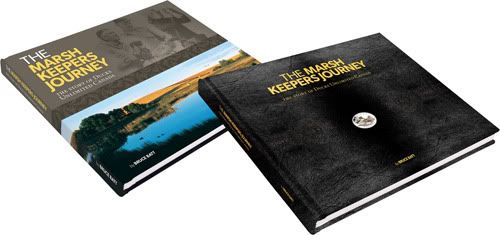
Above: Hardcover (left) and leather-bound edition with inset coin (right).

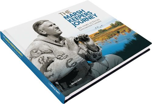
Until our flesh-and-blood baby arrives later in the winter, current "baby" status has been pinned to the commemorative history book I designed to celebrate the 75th anniversary of the company I work for. The 272-page tome is, by far, the single largest project I've tackled in my professional career. The project used solid eight months from conception to completion, roughly 550 man-hours of time, almost 100,000 words, over 20 rounds of revisions and at least a couple decent freakouts to ship one 3.4-gigabyte PDF to the printers in July.

Photobucket
Above: I lobbied hard, but alas, a scrapped cover concept.

Though large in scope, a solid design structure was established early and the book design flowed smoothly after the first hundred pages or so, becoming a fairly efficient operation as the production schedule was ramped up during the later stages. Considerable time was spent in the company library, poring over suitable archival photos and documents, then scanning and cleaning images in every worn-and-torn format used by mankind from the 1930s to present day. It was interesting to see and compare the level of care put into the photography during the first half of those 75 years, versus the hideousness of the Polaroid era and the full-flash, everyone-has-a-camera 1990s (the 1970s and 1980s were particularly hard – as rough shape as those photos were in, the fashion sense of people was far worse).

Photobucket
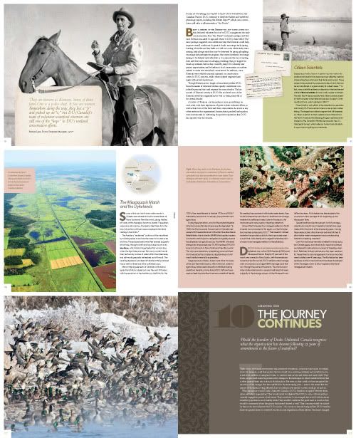
Above: Six of the 272 pages, sized so small you'll need to buy a copy of the book to read 'em.

For such a large project, the crack squad assembled to produce it was thankfully kept quite small: in essence, an author, an editor, a production manager and a designer (not to discredit the multitudes of other contributors involved in providing input and advice). An unfortunate perfect-storm scenario arrived in the spring – when I was gone for a month while the project reached a crucial production point – and I was hard-pressed to consider which outcome was less appealing to me: exhausting the global supply of midnight oil to play catch-up, or handing the book off during my absence. A schedule was crafted that could accommodate the former.

Photobucket
Above: Editor Meg and I squeal, the day the books arrive.

The author is a scientist (and essentially, the client) and we were on board early with the realization this book would be academic, orderly, grid-based (my words) and without too much "designerly fluff" (his words). A muted palette of primary colours (plus green) was matched with shades of warm grey. Typefaces selected were Gibson (gotta support the team) and Bembo, with Pompadour used for chapter numbers. A vector pattern by Von Glitschka was used sparingly for page accents. Colour was also supplied through photography, as selected images gained more and more vibrancy as the chronologically-arranged book neared its present-day wrap-up. But I'm a fan of strict organization on the printed page; I've been at this 14 years and can't deny it now. This book is ultimately a reflection of that.

Photobucket
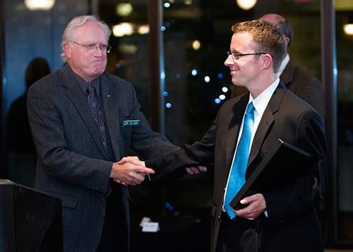
Above: A happy ending in Calgary. Lookit me, I'm wearing the suit.

Now for sale, the book was produced as two editions: a hardcover version with dust-jacket, and a leather-bound issue with inlaid silver coin from the Royal Canadian Mint – which I sorely wished I could have also played a role in, but the government, I figure, doesn't like folks touching their stuff. The book was officially launched late in September at a function in Calgary, where our small and dedicated team was feted.

I'm proud of this book – but it's left me hungry, too. It's hard to return to meat-and-potatoes work. For all its trials and tribulations, I'd do it again in a heartbeat.

March 20, 2012

262: Drawing The Shades

collect all four!
Kerry and I bought ourselves an introductory class in letterpress and bookbinding techniques at Winnipeg's Martha Street Studio for Christmas. The sessions began later in January, just wrapping up last week. It was an invaluable experience for myself – I've always wanted to plant my butt at Martha Street and get dirty doing something decidedly un-digital. That it was something the two of us could share made it all the more sweet. The place kicks ass.

The basic bookbinding stitch techniques we learned bent my brain into a pretzel – always a sure sign that I'm learning something. I'm now unashamed to admit I had never needle-and-stringed anything before, beyond coasting through one term of a junior high home-ec class on charm and procrastination. Though I didn't exactly master the skill, I can at least be a tiny bit pro about it now and say hey, the stab stitch is my favourite stitch.

I was more enamoured with using the ink, chase, quoins and other old-timey tools of my trade with the presses. Again, all very basic stuff in this class – which was ideal. Scrounging through the studio's trays of type I found a face I liked, and set to work making these flash-cards – for lack of a better word – to underline yet-to-be-created illustrations I'd create to hopefully match. These pieces eventually became a quartet of simple, geometric – and above all, hand-made – cards featuring two-toned songbirds, shaded in brown and black for Illustration Friday's current theme of shades.

No computers were consulted/harmed/touched/even thought about, in the creation of these pieces.

thrush
junco
sparrow
towhee

September 06, 2011

249: Sweet One Hundred

house-a-versary
Our house – as well as a huge swath of the neighbourhood – is turning 100 years old this summer. When we bought the place and moved in, it was a sprightly ninety-four. The ensuing half-dozen years have seen one burst pipe (show me a centenarian who doesn't um, dribble, once in awhile), one replaced rotten window (dental work) and one backyard overhaul (a little cosmetic surgery). Other than that, the odd crack here, the odd squeak there, we've little indication this place has even attained a state of mid-life crisis; the house is a solid, slightly uneven, solid, creaking, solid piece of craftsmanship.

Anyone who has sat in their house and contemplated all the goings-on since its inception can attest to the daydreaming I've done of late. Somebody lived here during the Great Depression. Through WWII. A family perhaps, with a giant tail-finned behemoth parked in the back, set up an aluminum Christmas tree. Someone taped shows on their VCR. A spry young couple married under its roof. I have a hard time even considering the street as a shadeless suburbia, complete with spindly, evenly-planted elms and the occasional awoooooga-tooting Model T. But what I wouldn't give for even just a glimpse.

Kerry and I are celebrating the grand palace's 100th birthday. Ordered a cake, even. I spent time yesterday concocting this designerly ode to the house, having much fun in the process. Two weeks from now we'll do our darnedest to tear the roof off… without tearing the roof off.

July 27, 2011

Might As Well Jump (On The Bandwagon)

Photobucket
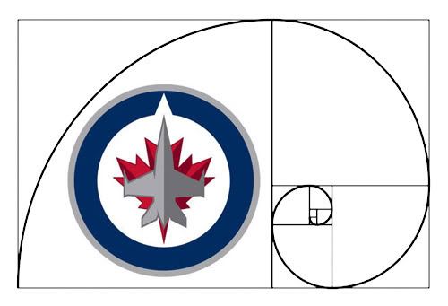
There's been inevitable discussion among designer circles over the identity of the newly-refueled Winnipeg Jets. And for those equally passionate about both design and hockey, it's placed us in an awkward spot. Who do we pledge allegiance to?

My eyes are admittedly clouded somewhat by fandom. I can’t help it. I grew up watching the Jets, while also learning the skills of an artistic and creative trade. Travel back to the mid-90s, and my gangly 15-year-old self could polish off a pitch-perfect hand-drawn facsimile of the Jets' last active emblem. And before I ultimately pass judgment on the reincarnation, I'm willing to wait out the logo's most crucial test: its application on a uniform. But early on, I also can’t help but appreciate our new logo (asterisk at the ready, I pronounce this knowing full well there’s a little matter of the pro-league passable secondary creation, and that tertiary, wince-inducing script monster – we’ve all seen it, I’m not even going to show it, and you’re welcome).

Where this pleasure derives from, I’m not quite sure. The logo takes some of the basic principles of design and tosses them mercilessly off a cliff – and yet, if I passed it in a dark alley I’d probably smile and say hey, new Jets logo, what’s up, and be merrily on my way. Why can’t I just deride it outright, like a good designer should?

Perhaps because I know the baggage that comes with any union of design and sport.

When it comes to design – unfortunately for most of us – pro sport maddeningly abides by its own set of rules. It's frequently an uncomfortable blend of popular taste and crass commercialism, with a healthy dash of Vegas-style pomp. Team crests deemed classics are precisely so, not because there was any greater affinity for design in the good old days, but that there's been time for an entire culture to surround them. Like the BMW roundel or Coca Cola's loopy script, emblems of the Original Six have existed since before most of us were placed on this Earth – and because of this they are widely deemed iconic. Untouchable. The standard from which others are measured.

Consider the New York Yankees – owners of one of the most valuable and storied franchises in all of professional North American sport – represented through the years by an awkward, imbalanced union of N and Y. Then, hypothetically, consider the Yankees starting fresh in 2011. Would the my-kid-could-draw-that amalgamation of N and Y fly with fans and designers alike? Doubtful. But that's also baseball. In a sport symbolized in recent years with an asterisk, Major League Baseball operates – from a design standpoint – in an altogether separate universe (though tell that to the Blue Jays, whose new-ish script puts the Jets' wordmark to certain shame).

Early indications show generally positive reviews from the only folks that, in the eyes of the NHL and True North, ultimately matter – so I shrug my two shoulders and thank high holy bacon the powers that be didn't deliver unto us the next incarnation of the Mighty Ducks logo. On the surface it looks like I’m settling, but I also suspect that many designers in town who know a puck from a hole in a beautifully minimalistic white wall are thankful we didn’t get saddled with a mark that’s out-and-out embarrassing. Hey, the thing’s symmetrical. It’s got a subtle, understated colour scheme. It’s mascot-free. And it’s not awash in flavour-of-the-day gimmickry.

Are we led to believe then, that the line-ups around the block for a first crack at official merchandise equates to an endorsement of the design? Had the emblem been a Lightning-style travesty or nouveau-New York Islanders laughingstock, would the line-ups have contained flaming pitchforks over cash-fattened wallets? Probably not... too much. Any pessimistic bone in me thinks most folks in that line are giddily blind to any aspect of the design. But the fan in me is appeased for now. And the designer in me is glad we’re not stuck with the Coyotes, or the Canucks, or the Penguins, or the Hurricanes, or the Sharks...

April 30, 2011

A True North Font, Glorious And (Nearly) Free

Photobucket
I will be the first to admit, I don't dabble in the procuring of typefaces perhaps nearly as much as I should. But when I heard about the promotions surrounding the offering of Gibson, a swish sans-serif set, for dirt-stinking-cheap – and moreso, the reason why – I plonked down for this great cause. And I encourage you to do so as well.

More, on Gibson:

The Gibson font family is a humanist sans serif typeface designed by eminent Canadian type designer Rod McDonald, and produced by Patrick Griffin and Kevin King of Canada Type, to honour John Gibson, one of the original founders of the Society of Graphic Designers of Canada (GDC).

As well as paying tribute to Mr. Gibson’s productive life and love of the typographic arts, the Gibson family is intended to be a mainstay of the future of Canadian design education. Many Canadian design schools and institutions will be making it part of their larger type piracy education programs. The eight-font family is available at token pricing to make it especially affordable for design students. For less than the price of a design textbook, a student can now have a sturdy and contemporary humanist sans serif family that fits pretty much any design application, and will remain useful long after academic studies and well into a professional career in design.

All revenues from its sale will be donated by Canada Type to the GDC, where they will be allocated to a variety of programs aiming to improve the creative arts and elevate design education in Canada. Each of the eight Gibson fonts comes with 370 characters and feature extended Latin-based language support. The Gibson family ships in cross-platform OpenType format.

Photobucket
The face(s) have come in handy for myself with a quickness; I've already used Gibson to craft labels for maple syrup bottles through work, and for a freelance jobbie, an ad for a company organizing high Arctic tours. And cripes I say, what is more Canadian than that? And that? I urge anyone reading this with a designerly bone in their body, to get on that action. It's a great cause and for 48 loonies, a price that can't be beat.

March 28, 2011

242: Proudest Moment

jacket
One of the pitfalls of having left this blog sit and stew for so long is that I never got the timely and proper opportunity here to crow about quite possibly my proudest achievement in design in a long, long while – the jacket I concocted for Vs., Kerry's second published book of poetry. The book, whose creation and production zipped along at a rapid clip over the course of 2010, was launched with great fanfare (and a three-city cross-country tour) earlier this winter.

We both had much fun collaborating on her first book, The Sleeping Life, in 2008. Admittedly, it can be dangerous territory when married creatives try and combine forces. But for those who hold steadfast to the belief that the customer/client is always right (a belief, I believe, in many cases is absolute hooey) our two jaunts book-jacket-land serve as a shining example. Kerry the Client art-directed her covers to perfection, knowing precisely what she wanted to best wrap her words in. And myself, as the Hands, served humbly and admirably.

books...
For her second book, the base concept was once again hers (she also located the source photo, from the Library of Congress). I provided more this time around, stylistically, building a faux-tattered piece to portray a battered and time-worn feel. Carefully blending together freebie textural elements located across the Great Wide Internet, and capping with a dominant and weathered Helvetica super-duper-ultra-black for the title, I think it's a proud-looking thing.

I'm tooting my horn here, and I don't usually like to do this with such enthusiasm. But I was a happy, happy cat the day the first samples arrived, printed up in all their 5x7 glory – my all-time favourite dimensions – in a fine and fibrous stock.

And I still am. We still are.

March 06, 2011

241: Winning The Typophile Vote

Photobucket
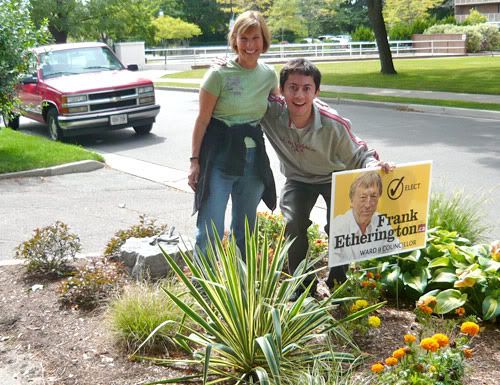
This past fall I applied my design skills to a fantastic cocktail of social betterment and blatant nepotism by crafting the visuals for my dad's first crack at public office, a position on city council in my long-long-ago hometown of Kitchener, Ontario.

We risked the handlebar-moustache-by-Sharpie treatment by the graffiti set and rolled out an array of materials featuring his familiar mug, which, previous to his political career, ran in the city paper week in and week out during his many years as reporter, editor and columnist. Thus, the image was a brand not to be trifled with.

To avoid affiliation with major political parties, many colours were nixed from the get-go. In the end, a combination of yellow and dried-nosebleed red – one of my all-time favourites – was incorporated into brochures, leaflets, leave-behinds and lawn signs (above, and below).

Typographically then, which way to go. Hobo? Too hippie-dippy, wavy-gravy. Impact? Too lock-down conservative. Helvetica? Too Swiss. Comic Sans? Too self-destructive.

Clarendon. It works for Jeopopolis – check the banner, see for yourself. The slab-serif face handles dual roles delicately: its serifs keep things personable, while still conveying the strength and doggedness of a long and well-respected journalistic career. Toss in Fontin Sans, crafted wonderfully by Jos Buivenga's exljbris foundry, to support the cause and I safely feel like I've performed my civic and typographic duty.

Photobucket
I'm pleased to announce, the materials were a huge success. Or, in more accurate terms, success enough that he won the council seat by a single vote, 1689 to 1688 – a margin that ultimately stood up despite disputes, recounts and ensuing court battles. It's lesson enough, that the ages-old credo that every vote counts should remain valid.

Good design wins, by a nose-hair.

September 02, 2009

207: When Pigs And Logos Fly

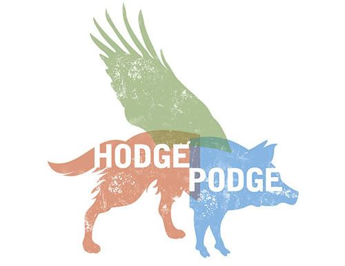
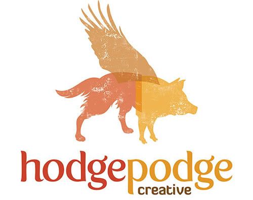
One of the handful of projects that has kept me occupied over the latter half of summer has been a logo design for my good friend's local start-up venture. This assignment simmered slowly and comfortably over much of the summer, and followed a fairly uneventful and standard process for logo development until one fateful night, when it was turned on its ear by a dream. More on that later.

The company – currently being crafted by recent PrairieView School of Photography grad Sarah Hodges-Kolisnyk – is Hodgepodge Creative (site under work, but be sure to check the blog), a one-woman wrecking crew of skills ranging from professional photography to creative and journalistic writing to audio/video production.

The trick then for her logo-designer-in-arms, as per her wishes, was to express this wide-ranging skills set within a single, strong – and simple – all-encompassing visual. And following an initial coffee-house meetup to discuss and peruse her then brand-new portfolio, I sent her on an expedition to gather together visuals that shared common traits with what she had in mind for her own business (not a standard procedure, but between friends one can do this).

Sarah came through in spades; she is a great client (Sarah, if you're reading this, you are a great client). She had a strong built-in sense of what she wanted in terms of look/feel, colour schemes and general aesthetics. And I'm a huge fan of not having to mind-read. Who is?

Photobucket
From her Big List of Inspiring Visuals, I was able to confidently go about building a few options, then submit them for further discussion and refinement. Two concepts (above) played largely on her zeal for the outdoors and knack for nature photography, and utilized compatible tones as such. A third (below) took on a more abstract/typographic form. All were received well and good, and constructive feedback was lent.


Photobucket
“The word ‘hodgepodge’ makes me think of a pig,” Kerry said to me around this point (I’m paraphrasing). “You should do one with a pig.”


And that night, I dreamed of a logo concept – with a pig. The next day, I set to work.

Photobucket
After time, the concept – that of a creative beast of many talents – eventually came to fruition (above). Much tweaking and haranguing was involved, particularly in how the three equal elements would join and/or overlap. It was important that no one element overshadow the other two, and yet a single, blended shape was not achieving the desired outcome. I finally came about with offshoots of red, green and blue – representative of the colour model used in displaying images electronically.


I felt it imperative Sarah remain integral in the development of the final result (below). Throughout the process I included her input on style, colour and typographic decision-making, which eventually resulted in a last handful of tweaks; dropping the bold – yet perhaps overly-industrial – typeface for an earthier, friendlier one, and an automnal colour palette more in tune with her company's character and focus of her work.

Photobucket

June 24, 2009

Zhup Wolf: Quark Superstar

I like checking where visitors to Jeopopolis come from – the free SiteMeter doodad I hitched up helps me do this. Today it earned its keep. Tom Waits and Alphaville may be big in Japan, but apparently I'm a "trusted" and "significant figure in the industry" in Russia – according to a "Quark consultant" who posted links to my Flickr set of magazine page spreads on a Russian design and printing forum yesterday.

I used Google Translate to find out what the Reds are saying about me; posts to the thread are laid out below. It's somewhat encouraging to see the eternal Quark-versus-InDesign debate crossing borders and spanning oceans (I switched to InDesign four years ago, despite the consultant's glowing review and ventriloquistic ability to put words in my mouth).

The consultant seems to be a Jeopopolitan convert; it's iffy whether others in the thread are – but Google's attempt at turning the conversation into English can be pretty amusing.


-----

Poster 1: Creative Good Luck: Conservator Magazine

Conservator, natural log Association Ducks Unlimited Canada, published a quarter century. Since 2000, the editors turned to QuarkXPress.

"Starting with the fifth version of QuarkXPress, we keep pace with the progress and to continuously update the product" says art director magazine Zhup Wolf. "'G' pleased us most of all: easy access to all functions, focus on creativity and, most importantly, almost double the reduction of time on layout."

Wolf can be trusted: as significant figures in the industry, he is also a graphic designer and photographer with nearly half of experience. Is your tape on Flikre and blogs Blogspote.

Fifty of his best turn of the journal Conservator, made in QuarkXPress, you can see here and Flikre. They are really good.

-----

Poster 2: Yes, a good layout. Especially liked the picture 2. It's a good idea.

-----

Poster 3: It is necessary to clarify what exactly the program moved to the wording of the quark C pajamas? Indesit then and Quark was not.

Imposition of coding. If an opportunity like this make up – the dignity of Quarks. Well, well higher number of ducks on the page still does not measure creativity 4 th in my opinion – terrible porn.

-----

Poster 4: Indesit then and Quark was not.

-----

Poster 3: Well, more or less working, he became half of the version. Until then, all vopili "Well what!"

-----

Poster 5: Mr. Duc really lucky – when the 500 characters in turn and cool photos in such circumstances to make ugly – have to postratsya.

June 04, 2009

193: Nothing But Blue Sky

Photobucket
This very month of June comes with it all the pomp and hullabaloo of a newly-released edition of the GDC's Manitoba chapter e-news, cobbled together by me – your friendly neighbourhood chapter communications chairjobbie – and featuring valuable input from a phalanx of local chapter members (and thank you, whole-heartedly, each and every one). This edition features all the stalwarts of a summertime blockbuster: Intrigue! Exotic locales! Hot young things hitting the streets! And most of all, fantabulous miscellanea!


Read on.

April 26, 2009

Cross-Country Checkup

Photobucket
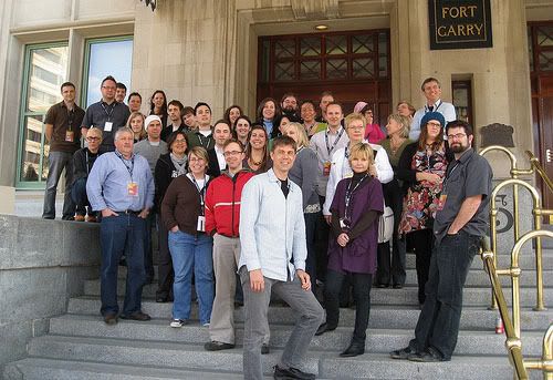
Participants of the 2009 GDC Annual General Meeting (photo courtesy of Adrian)

I spent the larger part of this weekend – plus Friday, plus Thursday evening – partaking in the annual rite of spring that is the
(deep breath) Annual General Meeting of the Society of Graphic Designers of Canada (GDC). I lost out on the 2008 event in Saskatoon, but with the hometown setting there was no missing it this time around. The event took place at the historic – and notoriously haunted – Hotel Fort Garry; no ghosts were on hand at the proceedings however, just some 40-or-so attendees (give or take) and some 39-or-so MacBooks (I was the holdout, it often seemed, opting for a pen-and-Moleskine tandem). I represented as the host chapter's communications chair, a role I've been filling since 2007.

From a personal standpoint, this was a learning experience for me. My work has paid GDC membership dues for years, and only since I joined the local chapter executive did I begin to reconnect with the industry profession I'd chosen, following years practicing in the Manitoba hinterlands (sorta). So the AGM was the next step in branching out, meeting reps from other regional and provincial chapters, the national team, and all the big heads that make this volunteer organization run. Should I be so fortunate to again attend a national AGM – perhaps next year, on the road someplace – I'll have this weekend tucked in my pocket and a stronger taste for bigger-picture thinking and doing.

I wanted to add, one could not meet a nicer, smarter, keener and more dedicated crew of designers and related sympathizers. Even though I was an AGM rookie – on my home soil no less – I was feeling comfortable and included within minutes. Each person in attendance was there on their own clock, away from the comforts of home and the demands of their businesses to partake in the bettering of our profession and its direction in this country. Good on yeh, GDC.

Click here for visual evidence of all the goings-down.

March 22, 2009

184: In Like A Lion

Photobucket
A project that's kept me away from my usual sordid activities here has been building the Society of Graphic Designers of Canada e-newsletter for their Manitoba chapter. Previously I had gone whole hog and constructed an InDesign-based layout file and subsequent PDF for download, but the GDC has since made it significantly easier for area communications reps to get their chapters' words out by supplying a ready-made template and system for regional newsletters. But the task of filling them with content will always exist – and well, that's what I've been up to. The first edition under the new system was emailed out to Manitoba membership this past week. Future editions should be popped out every two or three months, with the next slated after a new crop of design students hit the streets later this spring, post-graduation.

Click here to be whisked away to the newest GDC Manitoba e-news.