Understanding the color wheel is essential for anyone interested in design. Colors play a crucial role in creating visually appealing and effective designs. This article will explore various aspects of color theory, including the color wheel , color schemes , primary, secondary, and tertiary colors , warm and cool colors , shades, tints, and tones , and hue, saturation, and luminance . Additionally, we will introduce a color wheel tool that helps you find hex and RGB codes for colors and match them with specific themes.
What is Color Theory?
Color theory is a guide to understanding how colors interact and how they can be combined to create pleasing visual effects. It involves the study of the color wheel, which shows the relationships between primary, secondary, and tertiary colors. By learning about color theory , designers can choose colors that look good together and evoke specific emotions or reactions from viewers.
Color theory is essential in various fields, including art, design, and marketing, because it helps create visually appealing and effective designs. Understanding concepts like complementary colors, analogous colors, and color harmony can improve the overall aesthetic and impact of a design.
What is a Color Wheel?
A color wheel is a circular diagram that shows the relationships between different colors. It is a fundamental tool in color theory used by artists, designers, and anyone working with colors. The color wheel displays primary colors (red, blue, yellow), secondary colors (green, orange, purple), and tertiary colors, which are combinations of primary and secondary colors.
The color wheel helps you understand how colors mix, match, and contrast with each other. For example, colors opposite each other on the wheel, called complementary colors , create a vibrant look when used together. Similarly, colors next to each other, known as analogous colors , create a harmonious and pleasing effect.
How to Use the Color Wheel?
The color wheel helps designers and artists choose and match colors effectively. Here’s how to use it:
- Primary Colors : Start with red, blue, and yellow, which can’t be made by mixing other colors.
- Secondary Colors : Mix primary colors to get green, orange, and purple.
- Tertiary Colors : Combine primary and secondary colors to get hues like red-orange or blue-green.
- Complementary Colors : Use colors opposite each other on the wheel, like blue and orange, for high contrast.
- Analogous Colors : Select colors next to each other, like blue, blue-green, and green, for harmony.
- Triadic Colors : Choose three evenly spaced colors, like red, yellow, and blue, for balance.
- Tetradic Colors : Use two sets of complementary colors, forming a rectangle on the wheel.
Using these methods helps create visually appealing and balanced designs.
What are Color Combinations?
Understanding color schemes helps you make your designs look great. Here are seven basic color schemes you should know:
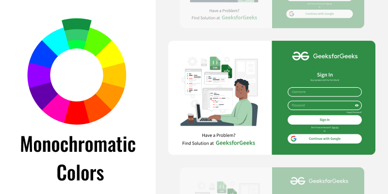
1. Monochromatic Color Scheme
A monochromatic color scheme uses different shades, tints, and tones of one color. It’s simple and clean, making everything look nice and matched.
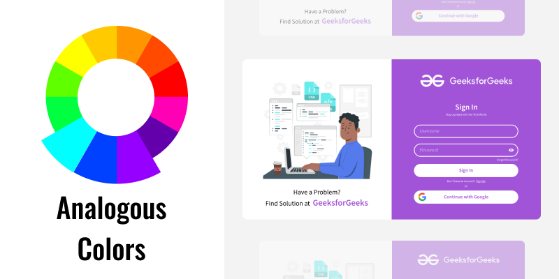
2. Analogous Color Scheme
An analogous color scheme uses colors that are next to each other on the color wheel . These colors naturally go well together and create a calm and comfortable look.
3. Complementary Color Scheme
A complementary color scheme uses colors that are opposite each other on the color wheel . This creates a high-contrast and vibrant look, making things stand out.

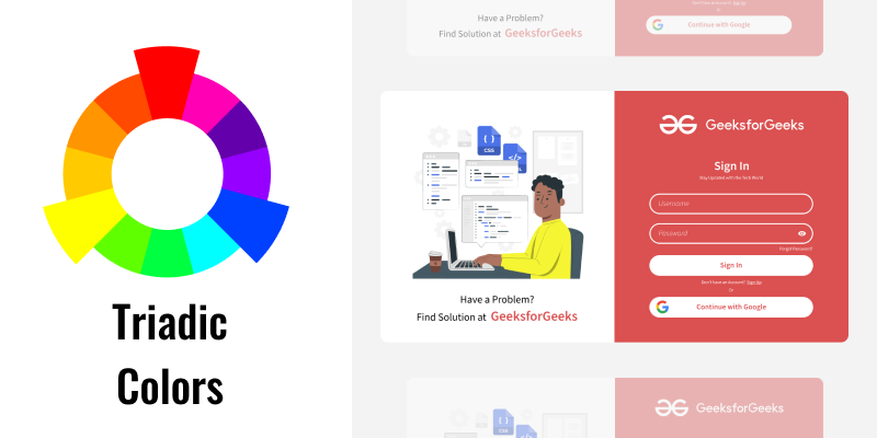
4. Triadic Color Scheme
A triadic color scheme uses three colors that are evenly spaced around the color wheel . This creates a balanced and lively look, making the design eye-catching.
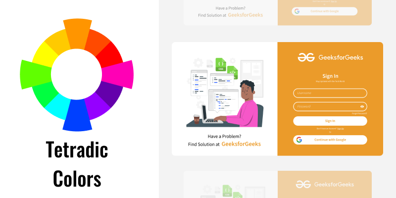
5. Tetradic Color Scheme
A tetradic color scheme uses two pairs of complementary colors. This makes for a vibrant and varied design but can be tricky to balance.
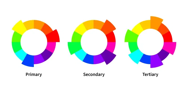
Primary Secondary and Tertiary Colors
Primary Colors
Primary colors are the foundation of all other colors. They are the three basic colors from which all other colors are derived. The primary colors are:
- Red : This color is associated with energy, passion, and excitement. It is often used to grab attention and is a powerful color in design.
- Blue : Blue is known for its calming and peaceful qualities. It is often used in designs to create a sense of reliability and reliability.
- Yellow : Yellow is a bright and cheerful color that evokes happiness and warmth. It is often used to grab attention and convey a sense of positivity.
These primary colors cannot be created by mixing other colors. They are the starting point for creating a full spectrum of colors.
Secondary Colors
Secondary colors are created by mixing two primary colors together in equal parts. The secondary colors are:
- Green : Made by mixing blue and yellow. Green is associated with nature, growth, and harmony. It is often used to create a sense of balance and freshness in design.
- Orange : Made by mixing red and yellow. Orange is a vibrant and energetic color, often associated with enthusiasm and creativity. It is used to draw attention and add warmth.
- Purple : Made by mixing red and blue. Purple is often associated with royalty, luxury, and mystery. It is used in design to convey a sense of sophistication and elegance.
These colors are crucial in expanding the palette and adding depth to design projects.
Tertiary Colors
Tertiary colors are created by mixing a primary color with a secondary color next to it on the color wheel. The tertiary colors are:
- Red-Orange : This color combines the energy of red with the warmth of orange, creating a vibrant and dynamic hue.
- Yellow-Orange : This color is a mix of cheerful yellow and vibrant orange, resulting in a bright and lively color.
- Yellow-Green : Combining yellow and green results in a fresh and natural color, often associated with spring and renewal.
- Blue-Green : This color, a mix of blue and green, evokes a sense of calm and tranquility, reminiscent of the ocean.
- Blue-Purple : A combination of blue and purple, this color is often used to convey a sense of luxury and depth.
- Red-Purple : This color blends the passion of red with the sophistication of purple, resulting in a rich and luxurious hue.
These tertiary colors add more variety and options for creating detailed and vibrant color palettes in design and art.
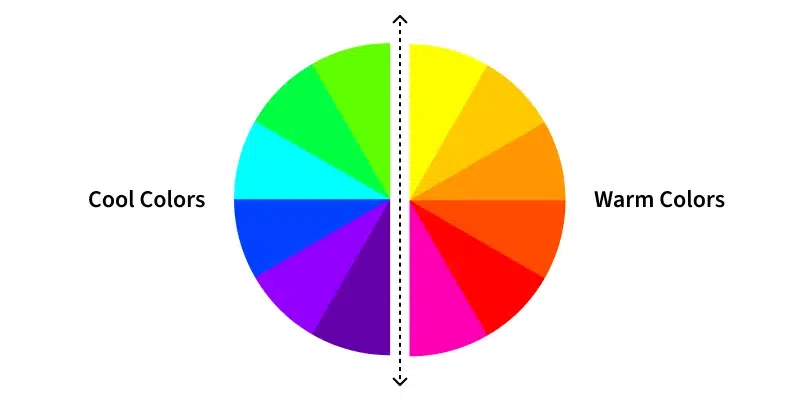
Warm and Cool Colors
Understanding color meaning helps in conveying the right emotions and messages through your design, making it more effective and engaging. Color Meaning important because different colors evoke different responses, impacting user perception and interaction with your design.
Warm Colors
Warm colors are associated with warmth and energy. They evoke feelings of passion, excitement, and comfort. The primary warm colors are red, orange, and yellow, and their various shades and tints can create a sense of warmth and coziness in design. Here are some characteristics of warm colors:
- Red : Red is a powerful and intense color often linked to emotions such as love, passion, and anger. It is a stimulating color that grabs attention and can increase the energy in a design.
- Orange : Orange combines the energy of red and the happiness of yellow. It is associated with enthusiasm, creativity, and success. Orange is a playful and lively color that can add vibrancy to any design.
- Yellow : Yellow is the brightest and most energizing of the warm colors. It symbolizes happiness, positivity, and warmth. Yellow can create a cheerful and inviting atmosphere, making it perfect for capturing attention and spreading joy.
Warm colors are often used in design to create a sense of warmth and to make spaces feel more welcoming. They can stimulate emotions and are effective for drawing attention to important elements in a design.
Cool Colors
Cool colors are calming and soothing. They evoke feelings of tranquility, relaxation, and peace. The primary cool colors are blue, green, and purple, along with their various shades and tints, which can create a sense of calm and serenity in design. Here are some characteristics of cool colors:
- Blue : Blue is often associated with stability, trust, and calmness. It is a soothing color that can create a sense of peace and tranquility. Blue is frequently used in corporate and professional settings to convey reliability and dependability.
- Green : Green symbolizes nature, growth, and renewal. It is a calming color that is easy on the eyes and can create a refreshing and balanced environment. Green is often used in designs related to health, wellness, and the environment.
- Purple : Purple combines the calm stability of blue and the energy of red. It is associated with royalty, luxury, and wisdom. Purple can add a sense of elegance and sophistication to a design, making it ideal for creating a sense of mystery and intrigue.
Cool colors are often used in design to create a sense of calm and relaxation. They can help reduce stress and are effective for creating serene and peaceful environments. Cool colors are ideal for backgrounds and for creating a sense of space and openness in a design.
Shades, Tints, and Tones
Shades
Shades are created when black is added to a base color, making it darker. This results in deeper and more intense versions of the original color, adding depth and richness.
Tints
Tints are created when white is added to a base color, making it lighter. This results in softer and more pastel versions of the original color, creating a sense of lightness and delicacy.
Tones
Tones are created when gray (a mix of black and white) is added to a base color, softening it. This results in more muted and subdued versions of the original color, adding complexity and subtlety.
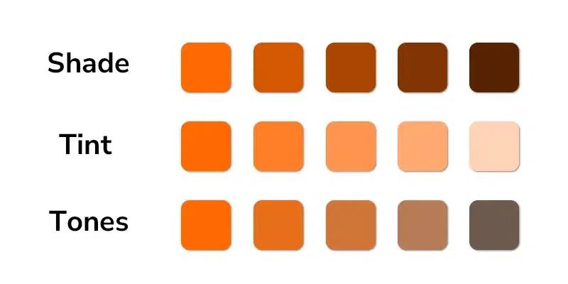
Using Shades, Tints, and Tones in Design
By using shades, tints, and tones, designers can create a dynamic and versatile color palette. They help in creating contrast and depth, a calm atmosphere, and a balanced look.
Hue, Saturation, and Luminance
Hue
Hue refers to the pure color itself, like red, blue, or yellow. It's the aspect that distinguishes one color from another. Hues are the foundation of all colors and are what we usually refer to when naming a color.
Saturation
Saturation describes the intensity or purity of a color. A highly saturated color appears vivid and bright, while a less saturated color looks muted and grayish. Saturation can affect the vibrancy and energy of a design.
Luminance
Luminance (or brightness) refers to how light or dark a color appears. High luminance means the color is closer to white, while low luminance means it is closer to black. Luminance helps in creating contrast and defining the mood of a design.
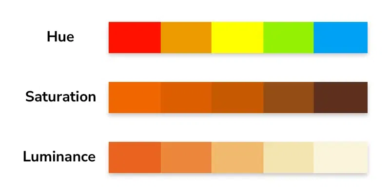
Using Hue, Saturation, and Luminance in Design
Understanding hue, saturation, and luminance helps designers create balanced and appealing visuals. By manipulating these elements, they can emphasize certain areas, create harmony, and convey the right emotions.
Also check out:
CSS Colors
Advanced Color Theory Concepts
Best Color Combinations
How to Select Colors?
Conclusion
Mastering the color wheel and its components, including color schemes , primary, secondary, and tertiary colors , warm and cool colors , shades, tints, and tones , and hue, saturation, and luminance , is essential for creating visually compelling and effective designs. Use the color wheel tool provided in this article to find hex and RGB codes and match colors with specific themes to elevate your design projects. By leveraging these concepts, you can ensure your designs are not only beautiful but also effective in conveying your intended message.