In data visualization, especially when dealing with wide datasets (datasets with many columns), it is often useful to differentiate data series by color, line style, or other visual elements. In this article, we will explore how to plot a wide data frame in Python, with colors and linestyles based on different columns.
Table of Content
Understanding Wide DataFrames
Before we dive into the plotting techniques, let’s briefly discuss what a wide DataFrame is. In a typical data structure, a wide DataFrame contains multiple columns representing different variables for the same set of observations.
For example, you might have a DataFrame containing monthly sales data across several products, where each column represents a product's sales figures for each month.
Creating a Sample Wide DataFrame
To get started, you’ll need to install the necessary Python libraries if you haven't already. First, let's set up the Python environment by importing the necessary libraries.
import pandas as pd
import numpy as np
import matplotlib.pyplot as plt
Ensure you have matplotlib and pandas installed by running:
pip install matplotlib pandasFor demonstration, we'll create a simple dataset. You can replace this with your own wide DataFrame.
# Creating a sample wide DataFrame
dates = pd.date_range('2024-01-01', periods=10)
data = {
    'Series_A': np.random.randint(10, 50, size=10),
    'Series_B': np.random.randint(20, 60, size=10),
    'Series_C': np.random.randint(30, 70, size=10)
}
df = pd.DataFrame(data, index=dates)
print(df)
Output:
            Series_A  Series_B  Series_C
2024-01-01        30        35        41
2024-01-02        35        29        67
2024-01-03        28        47        30
2024-01-04        40        58        62
2024-01-05        10        27        36
2024-01-06        19        38        66
2024-01-07        23        29        33
2024-01-08        29        31        68
2024-01-09        12        34        56
2024-01-10        26        28        38
Plotting the Data with Custom Colors and Linestyles
To make our plot more informative, we will assign unique colors and linestyles to each series. We can use matplotlib's plot function and specify these attributes.
# Define colors and linestyles for each series
colors = ['blue', 'green', 'red']
linestyles = ['-', '--', '-.']

# Plotting the DataFrame
plt.figure(figsize=(10, 6))

for idx, column in enumerate(df.columns):
    plt.plot(df.index, df[column], label=column, color=colors[idx], linestyle=linestyles[idx])

# Adding labels and title
plt.xlabel('Date')
plt.ylabel('Value')
plt.title('Wide DataFrame Plot with Colors and Linestyles')

# Adding a legend
plt.legend()

# Display the plot
plt.show()
Output:

Explanation:
- Colors: We use a list of colors (blue, green, red) for the three series.
- Linestyles: Each series has a different linestyle (- for solid, -- for dashed, and -. for dash-dot).
- The plt.plot() function takes in the index (date in this case) and the data series, with custom color and linestyle attributes.
- Finally, we add labels for the x and y axes, a title, and a legend to explain the color and linestyle mappings.
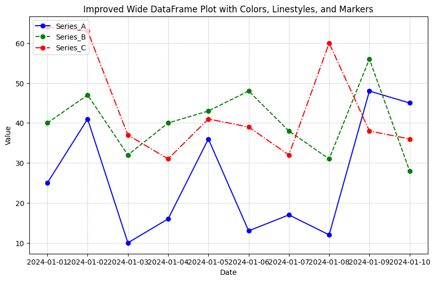
Adding Titles and Legends
The plot created above is functional, but adding some final touches can improve its readability:
- Legend Location: You can adjust the legend's position for better clarity.
- Gridlines: Adding gridlines makes it easier to track values across the x and y axes.
- Custom Markers: Adding markers can highlight specific points in the series.
plt.figure(figsize=(10, 6))

for idx, column in enumerate(df.columns):
    plt.plot(df.index, df[column], label=column, color=colors[idx], linestyle=linestyles[idx], marker='o')

# Adding gridlines
plt.grid(True, which='both', linestyle='--', linewidth=0.5)

# Adding labels, title, and legend
plt.xlabel('Date')
plt.ylabel('Value')
plt.title('Improved Wide DataFrame Plot with Colors, Linestyles, and Markers')
plt.legend(loc='upper left')

# Display the plot
plt.show()
Output:
Conclusion
In this article, we learned how to:
- Plot a wide DataFrame with multiple series.
- Use different colors and linestyles to differentiate between series.
- Add labels, titles, and legends for better clarity.
- Improve the plot with custom markers and gridlines.
By customizing colors and linestyles, you can create visually distinct plots that are easy to interpret, even when dealing with complex datasets.