CSS Flexbox is a layout model that helps create flexible and responsive designs. Setting display: flex makes child elements flexible and easy to align and space.
- Enables efficient alignment, spacing, and distribution of items along a row or column.
- Allows items to grow, shrink, or wrap based on available space.
- Eliminates the need for floats or complex positioning for common layout patterns.
Note: Not all browsers support the flexbox properties, so make sure that the browser you are using supports this property.
Flexbox
Applying display: flex to a parent container makes its child elements flex items, allowing easy control over their alignment, spacing, growth, and shrinking behavior.
- Display: flex: Applies flexbox to the parent container, making child elements flex items.
- Flex Items: Flexible elements that can grow, shrink, and adjust spacing.
- The flex container can change the width, height and order of the child elements.
- Items can grow or shrink to fill the available space or to prevent overflow.
- Available space is distributed among other items.
Axes of Flexbox
The Flexbox layout is based on two axes:
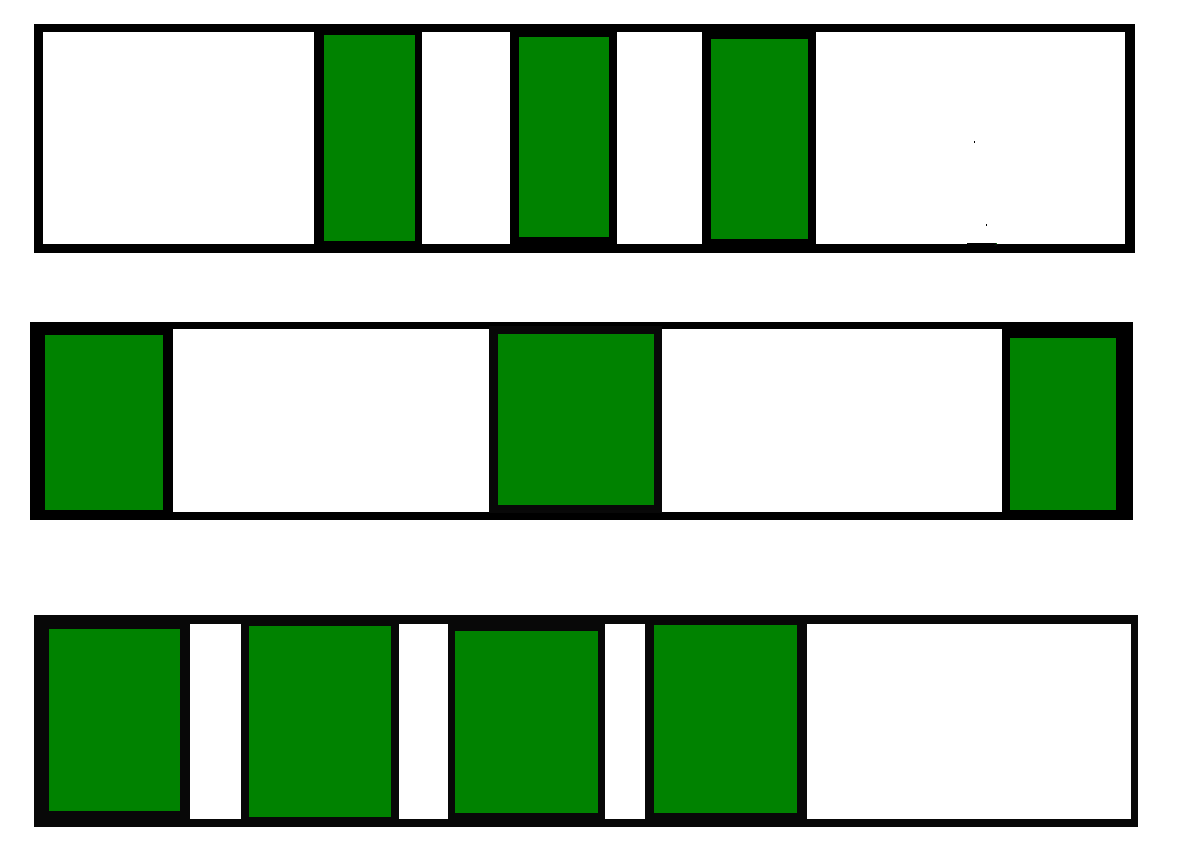
1. Main Axis: Direction of flex items (left-to-right, right-to-left, top-to-bottom, bottom-to-top).
A) left to right
flex-direction: rowB) right to left
flex-direction: row-reverseC) top to bottom
flex-direction: columnD) bottom to top
flex-direction: column-reverse2. Cross Axis: Perpendicular to the main axis.
Flexbox Properties
Flexbox provides properties for both the flex container (parent) and flex items (children) to control layout, alignment, and sizing.
1. Parent Properties
- display: Defines a flex container.
- flex-direction: Defines the main axis direction.
- flex-wrap: Allows items to wrap onto multiple lines.
- flex-flow: Shorthand for flex-direction and flex-wrap .
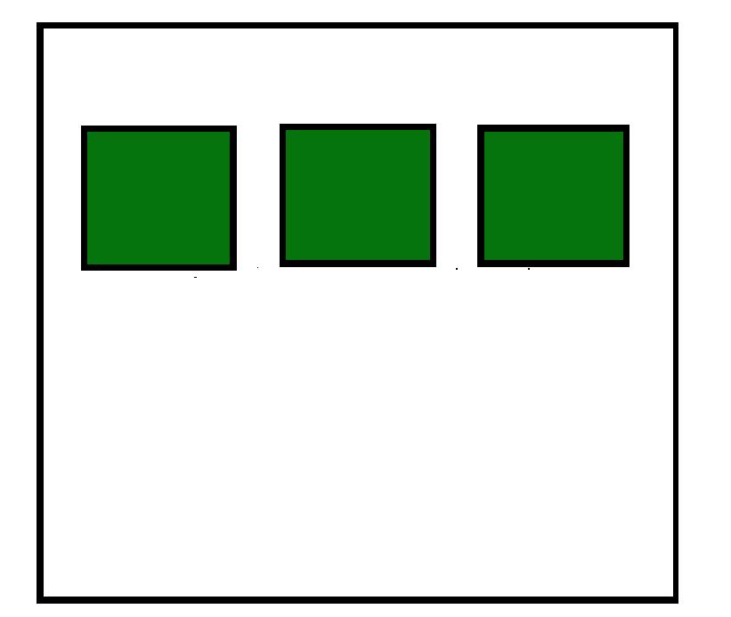
- justify-content: Aligns items along the main axis.
- align-content: Aligns items along the cross axis.
- align-items: Aligns multiple lines of items on the cross axis.
2. Children/Flex-items Properties
- order: Changes the order of items without altering the source order.
- flex-grow: Allows an item to grow to fill available space.
- flex-shrink: Allows an item to shrink if there's insufficient space.
- flex-basis: Defines the initial size of an item.
- flex: Shorthand for flex-grow, flex-shrink, and flex-basis .
- align-self: Aligns a single item within the flex container.
Example:
<!DOCTYPE html>
<html lang="en">

<head>
    <meta charset="UTF-8">
    <meta name="viewport" content=
        "width=device-width, initial-scale=1.0">

    <style>
        body {
      display:flex;
            align-items: center;
            justify-content: center;
            color: green;
            font-size: 50;
        }
        h2 {
            margin: 10px;
        }
    </style>
</head>

<body>
  <h2>CSS Flexbox</h2>
    <h2>and Its Properties</h2>
</body>
</html>