Blog

  • How to Make Square Corners with CSS

    How to Make Square Corners with CSS

    In February 2007 this site published a tutorial called “How to Make Square Corners with CSS.” It promised an “epic journey of compassion and liberty that embodies the semantic markup movement in modern web design,” followed by a “coveted 84 step process.” It was a joke. The real instruction for square corners was, and remains, to write nothing at all.

    The joke worked because the opposite problem was genuinely enormous. Rounded corners in 2007 cost you nested elements, sprite images or a JavaScript library, and the technique that made them possible had arrived only four years earlier: A List Apart published Doug Bowman’s Sliding Doors of CSS on 20 October 2003. Before that, per a later retrospective, “literally no one had figured out how to make rounded tabs using CSS.” Unprefixed `border-radius` did not work across the major browsers until around 2011, when IE9, Firefox 4, Safari 5 and Chrome 4 all supported it. That is an eight-year window in which a curve on a box was an engineering problem and a right angle was free.

    Here is what the joke was actually pointing at, and what happened to it.

    What rounded corners actually cost

    Three approaches dominated, and each one taxed you differently.
    Side by side comparison. Square corners in 2007 required zero elements, zero images and zero lines of CSS. Rounded corners required nested div elements, four corner images or a JavaScript library.
    The same year, the same browsers. One of these was free.

    Corner images. Four small graphics, one per corner, positioned by four extra elements or by multiple backgrounds. Change the box colour and you regenerate all four. Change the radius and you regenerate all four. A member of the SitePoint forums describing their default instinct as late as 2011: “Normally I would make up image upon image and make quite a complex set of tables and images.”

    Sliding doors. Bowman’s technique, and the one that changed things. Two nested elements each carry part of a background image, one anchored left and one right, so the box can stretch with its content instead of breaking. The retrospective on its tenth anniversary is not modest about its importance, calling it the first of a series of articles that “not only pushed the limits of CSS but changed the web as we now know it.” It was also, unavoidably, two elements where the design called for one.

    Nifty Corners. The image-free option, which paid for that with a different currency. As a contemporaneous write-up puts it, the method “uses no images and some clever JavaScript to achieve the effect,” so that “instead of creating various corner images of different colours that are combined with extra mark-up, the corner effect is created by specifying colours in the CSS stylesheet and the JavaScript code does the rest.”

    It is worth being concrete about what the image approach meant in a working day. A designer hands you a panel in a slightly different shade of grey. With border-radius that is a one-character edit. With corner images it is four new PNGs, exported at the right radius, named consistently, uploaded, and referenced. Multiply by every panel style in a design system and you understand why sprite sheets were invented, and why an article promising to abolish all of it for square corners read as a mercy.

    CSS 2 offered nothing better. The CSS Cookbook of the period says so directly: it “didn’t offer many ways of implementing rounded corners without abusing XHTML elements.”

    Abusing. In a reference book. That is the vocabulary of the era.

    Approach What it cost you What broke it
    Four corner images 4 graphics, extra elements to position them, regenerated on any colour or radius change Any design change at all
    Sliding doors, 2003 2 nested elements per box, plus sprite images Nothing, which is why it won
    Nifty Corners A JavaScript dependency Script disabled
    Square corners Nothing Nothing
    Every rounded option cost markup, images or JavaScript. The fourth row is the joke.

    The contradiction the community had already admitted

    This is the part that makes the satire sharper than it first appears, and it is preserved in public with dates and usernames.

    The web standards movement of the 2000s had one central commitment: markup describes meaning, not appearance. Divs added purely to hold a corner graphic are the exact thing that commitment forbids.

    What the movement said What rounded corners required
    Markup describes meaning, not appearance Elements that exist only to hold a corner graphic
    Separate content from presentation Presentation encoded directly into the document structure
    Degrade gracefully without scripting A JavaScript dependency, or four images
    Keep documents lean Markup a member of the period called “bloated with junk un-semantic elements”
    Both columns were sincerely held at the same time, by the same people.

    And practitioners knew. On the SitePoint forums in June 2010, a member arguing for the JavaScript approach states the problem outright: “if you are creating scalable corners you need to include un-semantic markup in your pages.” Their reason for preferring jQuery: “I found it much easier and my markup isnt bloated with junk un-semantic elements.”

    Now read the opening line of the 2007 parody again. It claims square corners “embody the semantic markup movement in modern web design.”

    That is not a random absurdity. It is precisely correct, and it is the joke. Square corners genuinely were the semantically pure choice, because they required no markup at all. The community was simultaneously committed to semantic markup and shipping un-semantic markup to get a curve, and had reached a quiet accommodation with the contradiction. The satire just said it out loud, in the register of a tutorial.

    There is a second layer to it that is easy to miss. The standards movement was not wrong, and neither were the people shipping corner divs. Both were making a reasonable trade under a real constraint: browsers of the period could not do the thing, clients wanted the thing, and something had to give. The satire is not mocking anyone’s competence. It is pointing at the shape of the compromise, which nobody inside it could see clearly because everyone was busy being impressed by the workarounds.

    You cannot parody a craft that is complaining. You can only parody one that has made its peace.

    When did it stop being hard?

    Slowly, then in one year.

    Prefixed support arrived first and unevenly. Firefox took `-moz-border-radius`, while Safari and Chrome took `-webkit-border-radius` from version 3, with the prefix no longer needed from version 5. So for a stretch you wrote the same rule three times and hoped.

    Internet Explorer was the wall. Prior to IE9, these CSS3 properties did not work in Internet Explorer at all. Not badly. At all. Which meant that during the entire prefix period, “supporting rounded corners” still meant maintaining a fallback for the most common browser on earth.
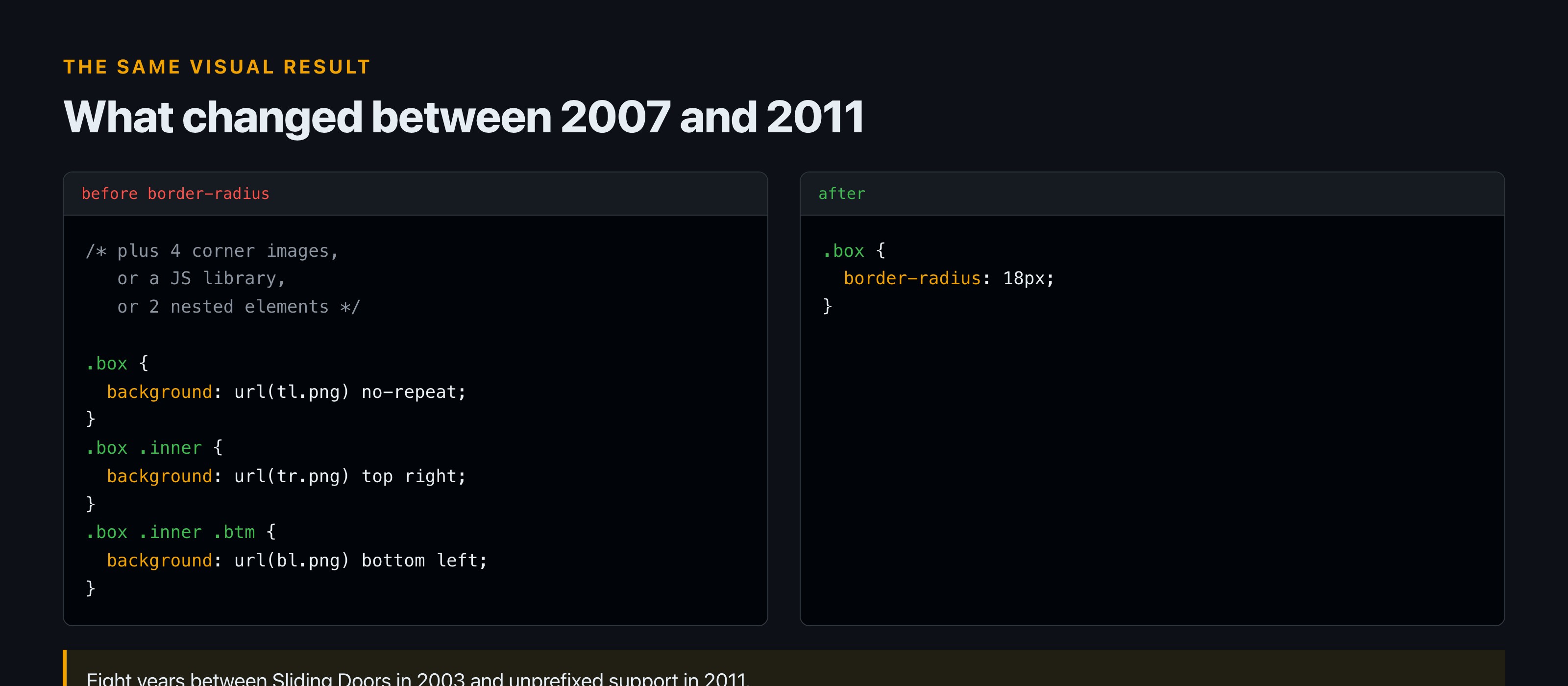
    Two code panes. Before border-radius, a box needed multiple background image declarations across nested elements. After, a single border-radius declaration of 18 pixels.
    Eight years of engineering, replaced by one declaration.

    2011 is the year it ends. IE9, Firefox 4, Safari 5 and Chrome 4 and above all support the standard unprefixed property. Eight years after Sliding Doors, the curve became a single declaration.

    Even then the tail was long. In an April 2011 SitePoint thread, a member is still explaining that “Not all browsers support CSS3 rounded corners. Versions of IE 8 and under don’t,” and pointing at shims: “There are many addon solutions to making CSS rounded corners work in IE, such as this one: CSS3 PIE.” The thread resolves with a line that will make anyone who worked in that era wince: “It turns out that the problem is the doctype.”

    Year What was true
    2003 A List Apart publishes Sliding Doors of CSS on 20 October. Rounded tabs become possible.
    2007 The satire is published on 21 February. Rounded corners still cost markup, images or JavaScript.
    Around 2009 Prefixed support spreading: Firefox via -moz, Safari and Chrome via -webkit from version 3
    2011 IE9, Firefox 4, Safari 5 and Chrome 4 support the unprefixed property. The problem ends.
    Today One declaration, universally. Square is now the deliberate choice.
    Eight years from the technique that made it possible to the property that made it trivial.

    The punchline nobody wrote down

    The best joke in this entire story is not in the satire. It is sitting in the documentation of the technique the satire was mocking.

    Describing why Nifty Corners was a good citizen, the write-up notes: “The technique degrades nicely as well. Users with JavaScript disabled will simply see square corners.”
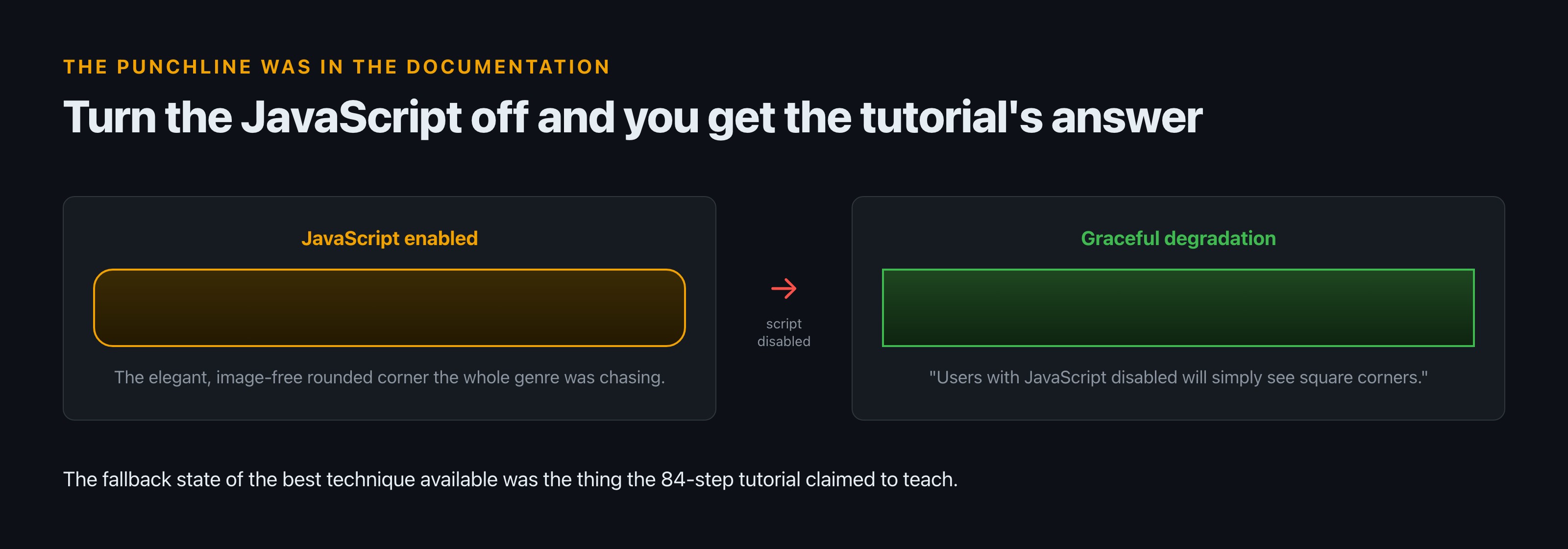
    Two rendered boxes. With JavaScript enabled the technique produces a rounded box. With script disabled it falls back to a plain square box, which is the result the satirical tutorial claimed to teach.
    The fallback nobody remarked on in 2007.

    The graceful degradation of the most elegant rounded-corner solution available was square corners. The same is true of the jQuery approach, as a forum member noted: “with jQuery/javascript the rounded corners would not show if the visitor has javascript disabled.”

    So the fallback state of every sophisticated technique in the genre was the thing the parody was pretending to teach an 84-step process for. Turn the JavaScript off and you get, for free and instantly, the result the tutorial claimed was so elusive that “a simple, elegant solution for creating square corners has yet to emerge.”

    Nobody in 2007 seems to have written that connection down. It was in the docs the whole time.

    It is a good reminder of how craft blindness works. The people who wrote that documentation understood the technique better than anyone, described its failure mode accurately, and shipped the description without noticing it contained a complete refutation of the effort. Not because they were careless, but because the fallback was the boring case and nobody spends attention on the boring case. The satirist’s advantage was never superior knowledge. It was standing far enough back to read the sentence as written.

    Was the effort worth it?

    The forums argued about this in real time and the argument is better than the technique.

    One position, from June 2010: “I personally think it’s time to move out of the ‘what about users without Javascript’ phase.” The counter, from the same thread, is the one that aged best: “My choice: progressive enhancement. Meaning: CSS3: round corners or multiple backgrounds. JS: jQuery (or other).”

    That is the correct answer and it was available at the time. Use the native property where it exists, accept the plainer result where it does not, and stop treating a decorative curve as a requirement. Which is, functionally, agreeing with the joke.

    Position, from the 2010 forum thread How it aged
    “it’s time to move out of the ‘what about users without Javascript’ phase” Broadly won on the modern web, though for reasons unrelated to corners
    “with jQuery/javascript the rounded corners would not show if the visitor has javascript disabled” Accurate, and became irrelevant once the CSS property landed
    “progressive enhancement… CSS3: round corners or multiple backgrounds. JS: jQuery” The correct answer then and the correct answer now
    The argument settled itself when the platform stopped forcing the choice.

    There is a counterargument worth stating. Rounded corners were not purely decorative to the people commissioning them. In the mid 2000s a rounded panel signalled that a site had been designed rather than assembled, in exactly the way a custom typeface does now. Clients were not asking for a curve. They were asking not to look like a template. That the industry answered with four PNGs and a nested div is a story about the tools available, not about anyone’s judgement.

    The honest verdict is that a great deal of skilled work went into a visual effect that carried no information. It produced real advances as a side effect, because Sliding Doors taught a generation how background positioning and stretchable boxes actually behaved, and that knowledge outlived the problem. But the effect itself was decoration, and the craft spent the better part of a decade on it.

    What the joke means now

    Something happened to this piece that its author cannot have intended.

    In 2007, square corners were the default and rounded corners were the achievement, which is why a tutorial for the former was funny. Today the position is reversed in ordinary practice: `border-radius` is one line, it is everywhere, and a genuinely square corner is now a choice somebody made on purpose.

    2007 Now
    Square corners The default. Free. Unremarkable. A deliberate decision somebody has to make
    Rounded corners Nested elements, images or a script One declaration, and often the default
    An article teaching square corners Obviously a joke A reasonable thing to search for
    The positions swapped. The instruction did not.

    I want to be careful here, because that is an observation about what I see rather than a measured trend, and this site does not dress observations up as findings. But if it holds, the satire has quietly become sincere. “How to make square corners with CSS” is no longer an absurd article to want. It is a design decision with a rationale, and the instruction is still the same as it was in 2007:

    Write nothing. That was always the whole technique.

    If you want the companion piece about the gap between what code looks like and what it does, we took that apart in what code doesn’t do in real life, and there is more under developer culture.

    FAQ

    How do you make square corners with CSS?

    You do not write anything. Square corners are the default rendering of a box. If a corner is rounded, something set border-radius on it, and the fix is to remove that declaration or set it to zero.

    Why were rounded corners so hard before CSS3?

    CSS 2 had no property for them. The available approaches were four corner images positioned by extra elements, the sliding doors technique of nesting two elements with left and right background images, or a JavaScript library that drew the corners. A reference book of the period described the alternatives as abusing XHTML elements.

    When did border-radius get proper browser support?

    Prefixed support came earlier, via -moz-border-radius in Firefox and -webkit-border-radius in Safari and Chrome from version 3, with the prefix dropped from version 5. Unprefixed support across the major browsers arrives around 2011 with IE9, Firefox 4, Safari 5 and Chrome 4 and above. Before IE9, Internet Explorer did not support it at all.

    What was the Sliding Doors technique?

    A method published by Doug Bowman on A List Apart on 20 October 2003, nesting two elements so each carries part of a background image, letting a rounded tab stretch with its text. A tenth-anniversary retrospective credits it with changing the web, noting that before it nobody had worked out how to make rounded tabs in CSS.

    Is this article a joke?

    The 2007 original at this address was. This one is not, though it is about the joke. The instruction it parodied is still accurate, which is the interesting part.

    Sources

  • The Worst NCAA Division I College Mascots

    The Worst NCAA Division I College Mascots

    Ask a room full of college sports fans to name the worst Division I mascot and you will get two completely different arguments wearing the same word. One is about craftsmanship: this costume is badly made and the eyes are wrong. The other is about meaning: this name refers to real people and I would rather not explain it. Only the second argument has ever been formally judged. In August 2005 the NCAA declared at least 18 schools’ nicknames “hostile or abusive” and barred them from postseason display starting 1 February 2006. Three schools appealed and won, all three for the same specific reason. Illinois retired an institution in 2007 rather than lose hosting rights. And Stanford had already abolished its own mascot in 1972, then decided in 1981 that a colour was sufficient.

    So this is not a ranking. Rankings of this are worthless, because the word is doing two jobs. This is what happened when someone with authority actually had to decide.

    The word “worst” is doing two jobs

    Two panels comparing the costume argument, which is a matter of taste and has never been adjudicated, against the referent argument about names referring to real people, which the NCAA formally decided in August 2005.
    Two complaints, one word. Only one of them has ever been ruled on.

    You can watch the split happen in real time. The largest recent thread on the question, “What is the current worst Division 1 mascot?”, ran to 376 comments. The top-voted replies are almost entirely photographs of costumes people find unsettling, which is the craftsmanship argument and is entirely a matter of taste.

    But the highest-scoring written comments are not about costumes at all. At 200 points: “And why is it the Ole Miss Rebels?” At 155: “What are yall rebelling against.”

    Scroll far enough and the pattern is consistent. The image replies are affectionate even when they are insulting, because a badly made costume is a shared joke that costs nobody anything. The written replies that climb highest are the ones where somebody is being asked to account for a word, and those are not jokes. The voting behaviour tells you which conversation people actually think is at stake.

    Those are not complaints about a suit. They are complaints about a referent. Nobody has ever convened a committee about a badly sculpted foam head. A committee was convened about the other thing.

    What happened when someone actually judged them

    In August 2005 the NCAA adopted a policy on nicknames and imagery it considered “hostile or abusive,” and it named names. At least 18 schools were on the list, including Florida State’s Seminoles and Illinois’ Illini.

    The mechanism is more interesting than the headline, and it is where most retellings go wrong. The NCAA did not ban the nicknames. It could not. What it did was restrict where they could appear: nicknames and mascots deemed hostile or abusive “would not be allowed on team uniforms or other clothing beginning with any NCAA tournament after Feb. 1.” The ban applied to the association’s own postseason tournaments and to hosting rights. Day to day, on campus, in the regular season, a school could carry on exactly as before.

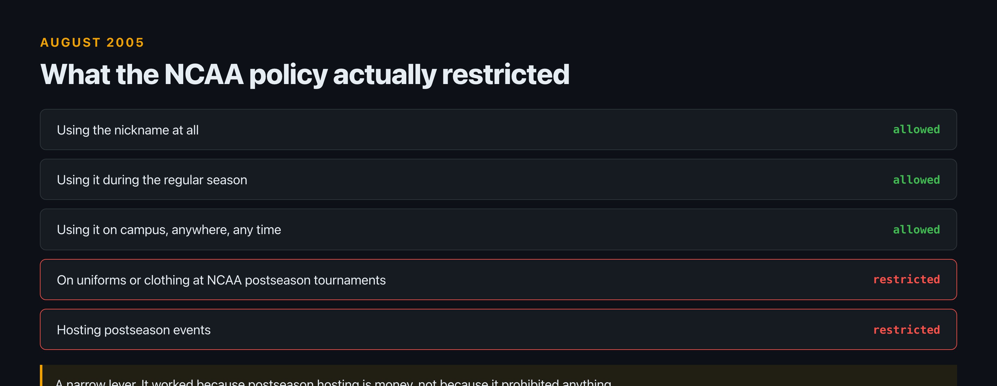
    List of what the 2005 NCAA policy allowed and restricted. Using the nickname, using it in the regular season and using it on campus were all allowed. Display on uniforms at NCAA postseason tournaments and hosting postseason events were restricted.
    The policy prohibited far less than people remember.

    That is a narrow lever, and it worked anyway, because postseason hosting is money and prestige. The NCAA did not need to prohibit anything. It only needed to make the nickname expensive in the specific week that matters most.

    Why did three schools keep theirs?

    Because the people the nickname refers to said yes, in writing.

    Three institutions appealed successfully: Central Michigan, Florida State and Utah. They were not the three with the best lawyers or the most alumni money. What they had in common was structural: they use “nicknames affiliated with individual tribes,” which meant there was a specific body with standing to grant or refuse permission.

    Florida State’s case is the clearest. The Florida Seminole Nation’s Tribal Council endorsed the school’s use of the nickname, and the NCAA removed the Seminoles from the list of 18.

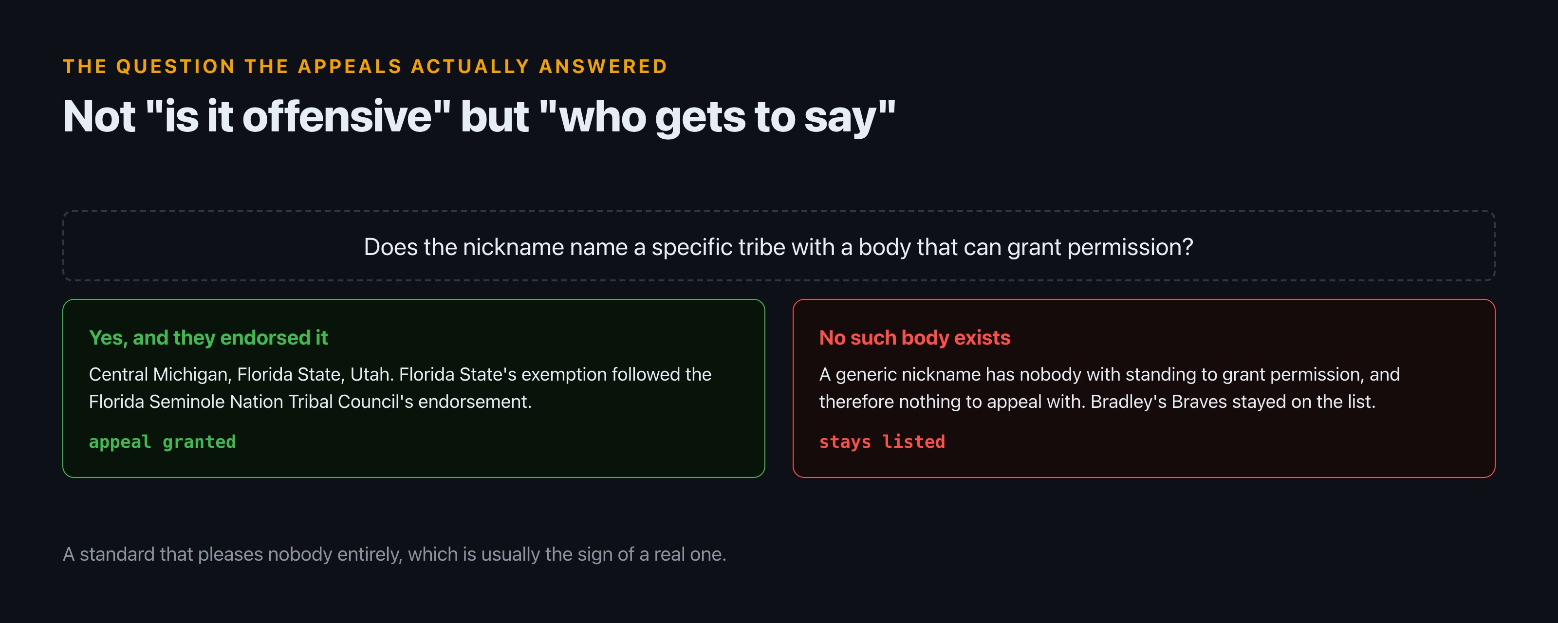
    Decision diagram. If the nickname names a specific tribe with a body that can grant permission and that body endorsed it, the appeal was granted. If no such body exists, the school had nothing to appeal with and stayed on the list.
    The appeals turned on standing, not on offence.

    Read that carefully, because it inverts the usual framing of this argument. The question the NCAA ended up answering was not “is this name offensive.” It was “who gets to decide whether this name is offensive.” And the answer it landed on was: the tribe named in it. Schools with a generic nickname had nobody who could grant permission on their behalf, and so had nothing to appeal with. Bradley’s Braves, for instance, stayed on the hostile list after review.

    It is worth being honest about what that principle costs. It means two schools using visually similar imagery can end up on opposite sides of the line purely because one nickname happens to name a nation that has a council and the other names a category that does not. Critics of the policy have argued exactly that from both directions: that it let some schools buy legitimacy, and that it punished others for a naming choice made a century ago by people long dead. Both objections have force.

    That is a defensible principle and it produced an outcome that pleases nobody entirely, which is usually the sign of a real one.

    The one that got retired

    Illinois had the most famous symbol on the list, and lost it.

    Chief Illiniwek was retired in 2007, after the NCAA ruled the symbol hostile or abusive and threatened the university’s participation in NCAA championship events. The school had already been barred from hosting postseason events. The final performance was on 21 February.

    When What happened
    August 2005 NCAA names the symbol hostile or abusive
    Before the retirement The university is barred from hosting postseason events
    21 February 2007 Final performance
    2007 The symbol is retired
    2026 Students are still pressing the university to move on from it
    A cost calculation with a deadline, not a change of heart. The afterlives differ.

    The thing worth noticing is that this was not a change of heart. It was a cost calculation with a deadline. The university did not conclude the symbol was wrong; it concluded that keeping it was more expensive than losing it. Those produce the same outcome and very different afterlives.

    Which is why, twenty years on, it is not over. Reporting in 2026 finds students still pressing the university to move on from the symbol, which tells you it never fully left. And the fan argument has mutated into something stranger than the original dispute. From a thread this year: “So tired of people reminiscing about the chief. Half of the people I see complain about it are too young to have even been there.”

    The fight is no longer about whether the symbol was defensible. It is about who has standing to be nostalgic for it.

    The school that got there 33 years early

    Stanford settled this in 1972, without a policy, a committee or a deadline.

    From 1930 the teams were the Indians, and from 1951 the official mascot was a figure called Prince Lightfoot. In 1972, per the record, “Native American students and staff members successfully lobbied University President Richard Lyman to abolish the ‘Indian’ name and mascot.” No sanction. No tournament at stake. Students asked, and the president agreed.

    Year What Stanford did
    1930 Teams become the Indians
    1951 Prince Lightfoot becomes the official mascot
    1972 Native American students and staff lobby president Richard Lyman, who abolishes the name and mascot. No sanction, no deadline.
    1975 The marching band proposes replacements, including the Tree, the French Fry and the Steaming Manhole
    1981 President Donald Kennedy declares teams will be represented exclusively by the colour cardinal
    Today No official mascot. The Tree belongs to the band.
    Thirty-three years before the NCAA policy, settled by a request rather than a threat.

    What Stanford did next is the genuinely unusual part. Rather than pick a replacement, it picked nothing. In 1981 president Donald Kennedy declared that all Stanford athletic teams “would be represented exclusively by the color cardinal.” Not the bird. The colour. The team name is a shade of red.

    Stanford has no official mascot to this day. The Tree that turns up at games belongs to the Leland Stanford Junior University Marching Band, and it is the band’s mascot and the university’s unofficial one. It is homemade, deliberately crude, and rebuilt by whoever is wearing it.

    And it had competition. In 1975 the band ran halftime shows proposing several candidates, “including the Tree, French Fry, and Steaming Manhole.”

    A university that abolished a mascot on principle, replaced it with a colour, and then let its marching band spend the intervening years campaigning for a Steaming Manhole is doing something more interesting than any ranking can capture.

    There is a practical argument buried in the Stanford answer that nobody makes out loud. A mascot is a permanent hostage to future opinion. Any character specific enough to be beloved is specific enough to become indefensible, and a university that adopts one is signing up to relitigate it every generation. A colour cannot be caricatured, cannot be appropriated from anyone, and cannot be photographed doing something embarrassing at a road game. It is the only genuinely future-proof choice available, and exactly one major programme took it.

    Stanford is also not alone in having nothing. Michigan has gone without an official mascot for decades, and San Diego State was without one as recently as 2023. It is a more common answer than people assume.

    The genuinely strange ones, and why they are strange

    Now the category everyone actually wants, with one correction first.

    Most “weirdest mascot” lists mix divisions freely and never say so. The Banana Slug belongs to UC Santa Cruz and the Fighting Okra to Delta State, and neither is Division I. The Okra is not even official; it was voted in by students. If you are reading a list that puts them alongside Illinois and Florida State without comment, that list is not checking anything.

    Mascot School Actually Division I? Official?
    Banana Slug UC Santa Cruz No Yes, voted by students in 1986
    Fighting Okra Delta State No No, unofficial
    Blue Hose Presbyterian Yes Yes, formalised in 1954
    The Tree Stanford Yes, the school is No, it belongs to the band
    The two most-cited “weird Division I mascots” are neither Division I nor, in one case, official.

    The genuinely strange Division I cases are usually strange for a boring documented reason, which somehow makes them better.

    Presbyterian College plays as the Blue Hose. It sounds like a joke and it is not one. The college explains it plainly: in the early 1900s sportswriters called the teams the Blue Stockings because of the blue socks they wore. Writers used “stockings” and “hose” interchangeably and shortened it in headlines. The nickname formally became Blue Hose in 1954, “presumably under the assumption that it sounded somewhat fiercer to carry onto the field of athletic battle.”

    That is an institution admitting, in its own words, that it shortened its name to sound tougher and this is what came out. No committee, no controversy, no protest. Just a headline writer’s abbreviation that hardened into an identity over half a century.

    This is the whole affectionate category, and you can tell it apart from the other one instantly by how people argue about it. A thread ranking teams “by their Mascot’s war crime warrants” ran to 77 comments of people cheerfully debating whether Sparty predates the concept of a war crime and whether Achilles has standing to complain about Patroclus. Nobody in it is uncomfortable. Nobody is defending anything. That is what a genuinely fun mascot argument sounds like, and it reads nothing like the Ole Miss replies.

    So what is the worst one?

    I am not going to name one, and the reason is not diplomacy.

    If you mean the ugliest costume, that is a matter of taste and your answer is as good as mine. Foam heads are subjective and nobody has ever been sanctioned over one.

    If you mean the most indefensible name, that question has an actual institutional answer and it is more precise than any ranking: it is a name that refers to a real group of people, where no representative body of those people has endorsed it. That is, almost exactly, the standard the NCAA arrived at in 2005 after landing on tribal endorsement as the deciding factor. It is not a comfortable standard. It produced exemptions that some people find indefensible and sanctions that others find unjust. But it is a standard, applied consistently, by a body that had to live with the outcome.

    Everything else on the list is a costume, and costumes are supposed to be bad. That is the job.

    If you mean Then the answer is Who decided
    The ugliest costume Whichever one you say. There is no standard. Nobody, ever
    The most indefensible name One naming a real group where no representative body has endorsed it The NCAA, in 2005, after landing on tribal endorsement
    One of these questions has an institutional answer. The other never will.

    If you want more of this sort of thing, we keep the arguments that can actually be settled under lists, and there is a related case about what happens when an institution formally rules on a piece of culture in every MythBusters myth on one page.

    FAQ

    Did the NCAA ban Native American mascots?

    Not outright. In August 2005 it barred nicknames and imagery it deemed “hostile or abusive” from appearing on uniforms and clothing at its own postseason tournaments, effective for any tournament after 1 February 2006, and restricted postseason hosting. Schools could keep using them otherwise.

    Why does Florida State still use the Seminoles nickname?

    Because the Florida Seminole Nation’s Tribal Council endorsed the school’s use of it, and the NCAA then removed Florida State from its list. Central Michigan and Utah also won appeals, all three using nicknames affiliated with specific tribes.

    When was Chief Illiniwek retired?

    In 2007, after the NCAA ruled the symbol hostile or abusive and the university had been barred from hosting postseason events. The last appearance was 21 February. Reporting in 2026 shows the argument is still live on campus.

    Does Stanford have a mascot?

    No. Stanford abolished the Indian name and mascot in 1972 after students and staff lobbied the president, and in 1981 declared its teams would be represented exclusively by the colour cardinal. The Tree belongs to the marching band and is unofficial.

    What is a Blue Hose?

    Presbyterian College’s teams were called Blue Stockings in the early 1900s for the blue socks they wore. Sportswriters used “hose” interchangeably and shortened it in headlines, and the nickname formally became Blue Hose in 1954.

    Sources

  • The Seven Phases of Owning an iPod

    The Seven Phases of Owning an iPod

    The joke about owning an iPod used to be that it came in phases, and the joke was correct. The line ran from October 2001 to 10 May 2022, when Apple discontinued the iPod touch and closed a 20-year product family. Along the way each phase turned out to have a paper trail. The battery really did die on a schedule, and it cost $255 to fix on an 18-month-old unit until two brothers with a stencil and a camcorder changed Apple’s policy in two weeks. The music really was locked, and the person who eventually argued hardest against the lock was Steve Jobs, in an open letter dated 6 February 2007. And the last phase, the one nobody wrote into the joke, is that people are still doing this. On forums today the going rate for a replacement cell is about $9.

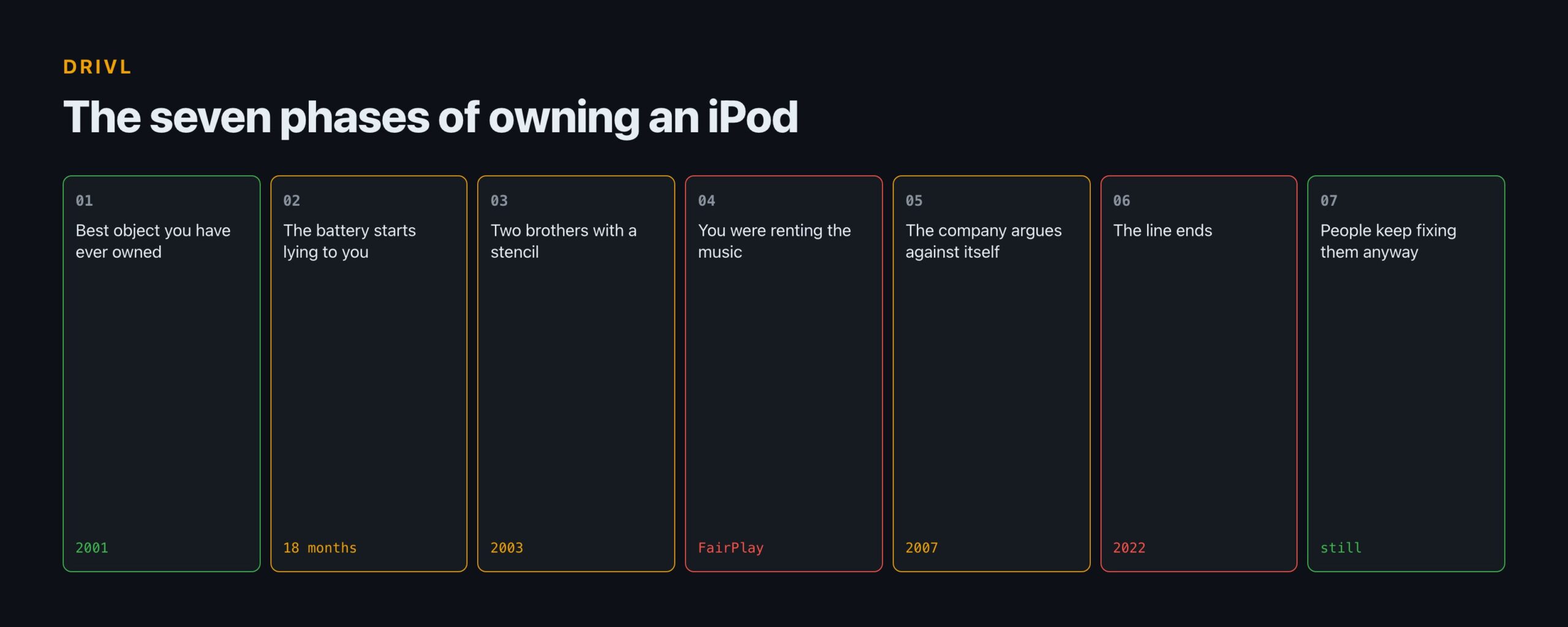
    So here is the arc, phase by phase, with the receipts.

    Phase one: it is the best object you have ever owned

    Date What happened Which phase it belongs to
    October 2001 The product line goes on sale One
    2003 Battery replacement quoted at $255 on an 18-month-old unit Two
    2003 iPod’s Dirty Secret released, over 6 million views in a month Three
    Two weeks later Apple introduces a $99 battery replacement programme Three
    6 February 2007 Steve Jobs publishes “Thoughts on Music” Five
    2007 The iPod touch launches, and will outlive every other model Six
    10 May 2022 The iPod touch is discontinued, ending the line Six
    Today Forum members report third-party cells at around $9 Seven
    Every phase in the old joke turns out to have a date attached to it.

    This phase is short, it is real, and nothing in the record contradicts it.

    The product line went on sale in October 2001. What followed was roughly two decades of a device people carried every day, in a category that barely survived it. The important thing about phase one for the rest of this article is not the delight. It is that the delight was durable enough to make every later phase feel like a betrayal rather than a product ageing normally.

    Nobody gets annoyed when a toaster wears out.

    Phase two: why did the battery always die at 18 months?

    Because it was a consumable part sealed inside a device sold as permanent, and because for a period the official answer to a dead one was to buy another iPod.

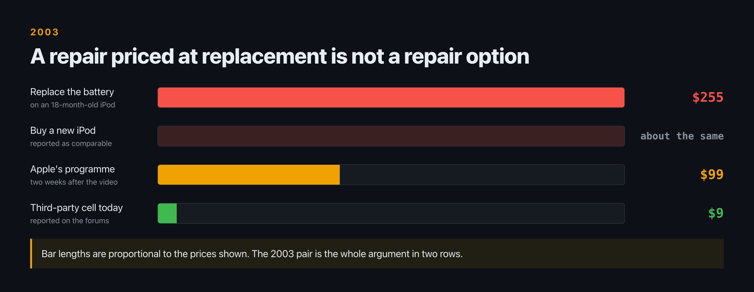
    Bar chart comparing the cost of putting a working battery in an iPod: 255 dollars in 2003 which was comparable to buying a new device, 99 dollars under Apple programme introduced two weeks after the Neistat video, and about 9 dollars for a third party cell today.
    The same repair at three prices across two decades.

    The number that made this a scandal rather than a grumble is specific. Replacing the dead battery in an 18-month-old iPod would cost, in the reporting of the time, “$255 (U.S.), comparable to the cost of a new device.”

    That is the whole problem in one line. A repair priced at replacement is not a repair option. It is a polite way of declining to offer one. When Casey Neistat’s own iPod battery failed, the advice he got was to buy a new one.

    The 18-month figure is worth handling carefully, because it became a slogan and slogans lose their qualifiers. It described the working life of the original cell in normal use, not a hard stop, and it was a claim made by campaigners rather than a specification published by Apple. What made it stick was that it matched what people were seeing. A number is only inflammatory when the audience already suspects it.

    It is also the moment the ownership question first appears in this story. A device you cannot open, running on a part that wears out, priced so that servicing it costs about the same as replacing it, is a device you are renting on a slow schedule. Nobody framed it that way at the time. The stencil did it in eleven words.

    Worth being precise about what was and was not sealed here. The battery was not user-replaceable and the pricing made service unattractive. That is a design and policy decision, not a defect, and plenty of devices since have made the same one. The difference is what happened next.

    Phase three: two brothers with a stencil

    In 2003 Casey and Van Neistat made a short film called iPod’s Dirty Secret and went out into New York with spray paint.

    They stencilled a sentence over Apple’s own street advertising: “iPod’s unreplaceable battery lasts only 18 months.” Not a slogan. A claim with a number in it, placed on the advertising it contradicted.

    The distribution is the part that is hard to convey now. The video was seen over 6 million times in its first month. This was three years before YouTube existed. There was no platform, no algorithm, no share button. It moved by people emailing each other a link.

    Apple introduced a battery replacement programme two weeks later, at $99, with a $59 extended warranty alongside it.

    It is worth pausing on what 6 million views in 2003 actually required. No hosting platform designed for video. No embedded player most people could rely on. Bandwidth that was expensive enough that popularity was a punishment. Anything that spread did so because individual people decided to forward it, one inbox at a time, against real friction. A number that would be unremarkable today represented something much closer to a movement then.

    Step What happened
    The claim “iPod’s unreplaceable battery lasts only 18 months,” stencilled over Apple’s own street advertising
    The reach Over 6 million views in the first month, three years before YouTube launched
    The response A battery replacement programme, two weeks later, at $99
    What is not documented The internal decision. A programme is not built in a fortnight, so something was likely already moving.
    The sequence is on the record. The causation is not, and this page does not assert it.

    Two things are worth holding apart. The sequence is documented: video, then policy, roughly a fortnight. What is not documented, at least not in anything I could find, is the internal decision. A battery programme is not built in two weeks, so something was very likely already in motion. What the campaign did with certainty is make the timing public and give the number a name.

    The coverage also records something people forget: the Neistats were not affiliated with the class action pending against Apple at the time. This was not litigation support. It was two people with a can of paint.

    Phase four: you discover you were renting the music

    This is the phase the original joke could only gesture at, because in 2007 it was still an argument rather than a settled thing.

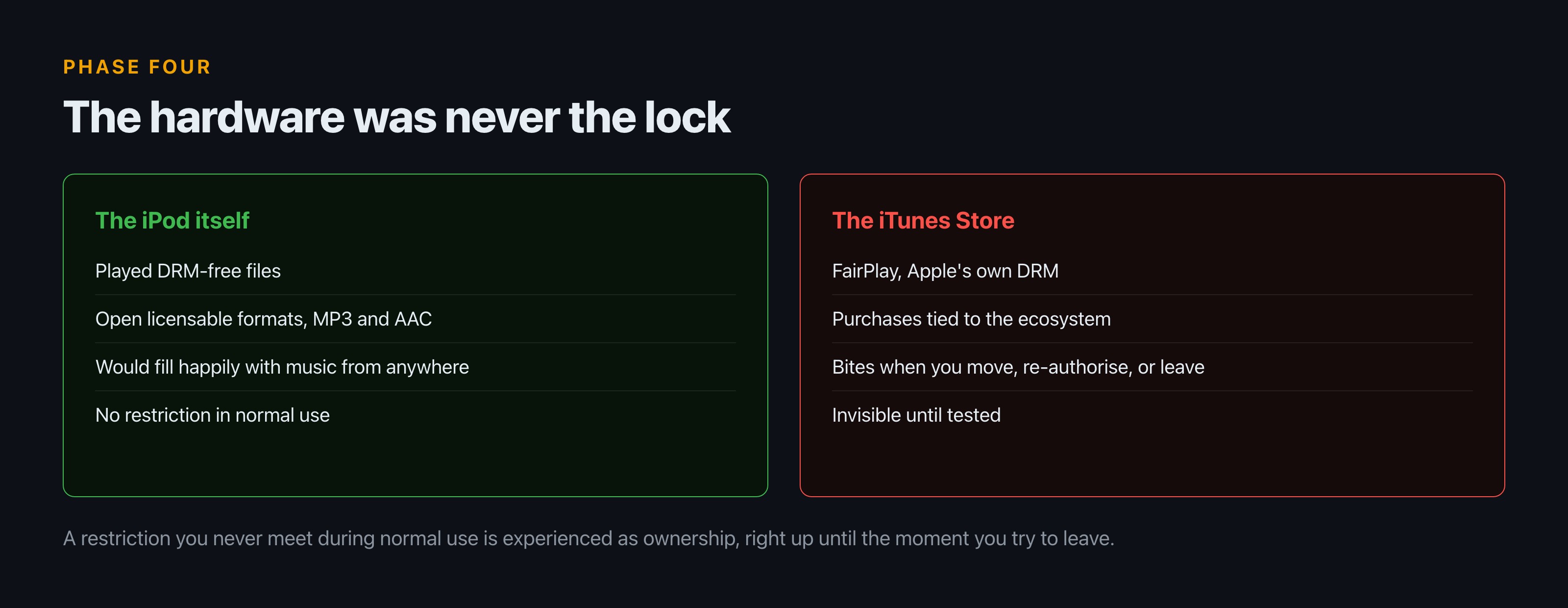
    Music bought from the iTunes Store carried Apple’s own digital rights management, called FairPlay. The practical effect was that a purchase was tied to an ecosystem rather than to you. The subtlety most people missed, then and now, is that the hardware was never the lock. The iPod itself played music free of any DRM, in open licensable formats including MP3 and AAC. You could fill one entirely with files that had no restrictions at all. The restriction lived in the store.

    Two panels. The iPod hardware played DRM-free files in open formats with no restriction in normal use. The iTunes Store applied FairPlay, tying purchases to the ecosystem, which only bit when you moved, re-authorised or left.
    The device was open. The store was not.

    The consequences only showed up at the edges, which is why so few people noticed at the time. You did not run into FairPlay while listening to music. You ran into it when you tried to move a library to a device from another manufacturer, or when a machine you had authorised died, or years later when you wanted files you had paid for to simply be files. The lock was invisible right up until the moment you tried to leave.

    That is a more interesting design than the usual telling allows. A restriction you never encounter during normal use is not experienced as a restriction at all. It is experienced as ownership, until it is tested.

    Which is why the next phase is stranger than it looks.

    Phase five: the company argues against itself

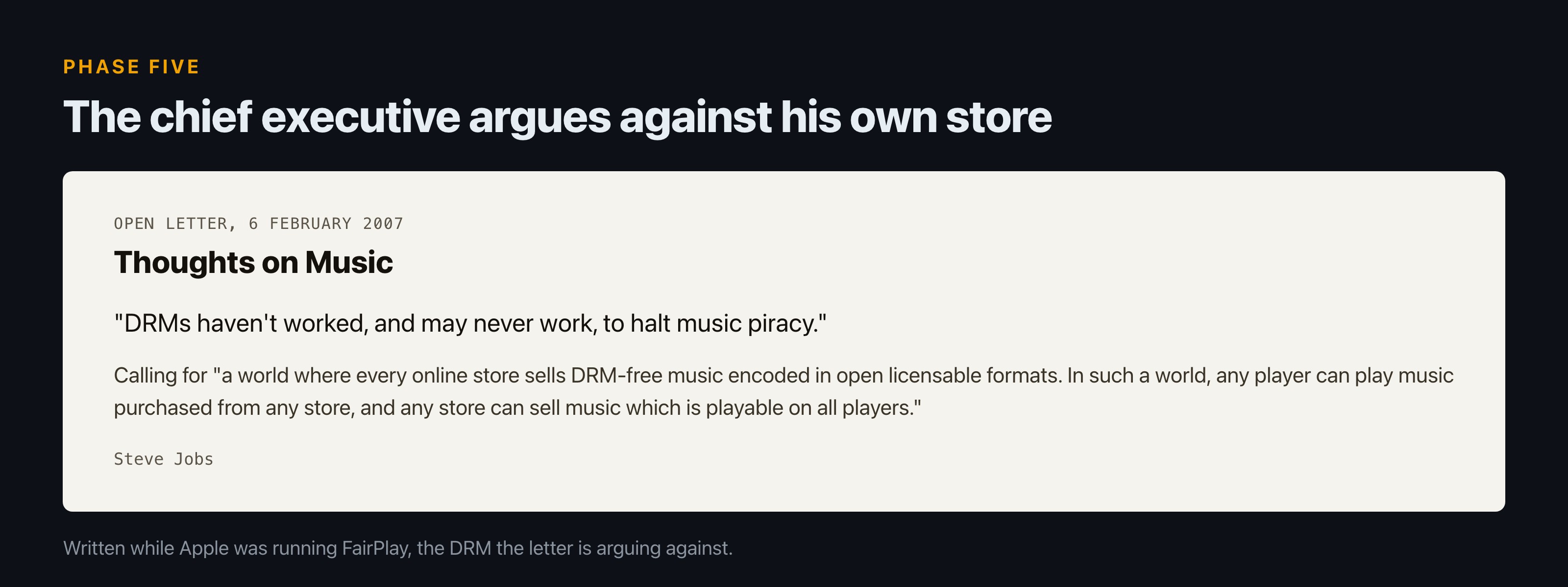
    On 6 February 2007, Steve Jobs published an open letter titled “Thoughts on Music.”

    A rendering of the open letter Thoughts on Music, dated 6 February 2007, quoting Steve Jobs saying DRMs have not worked and may never work to halt music piracy, and calling for every online store to sell DRM-free music in open licensable formats.
    Published while Apple was still running the DRM it argues against.

    Its central claim was blunt: “DRMs haven’t worked, and may never work, to halt music piracy.”

    And it proposed the opposite of the system his own company was running: “a world where every online store sells DRM-free music encoded in open licensable formats. In such a world, any player can play music purchased from any store, and any store can sell music which is playable on all players.”

    Read that from phase four and it is a chief executive publicly arguing that the lock on his own store should be removed, and that customers should be free to leave for a competitor. It was covered the same day as Apple openly supporting the death of DRM, and it was not received quietly by the record industry.

    What happened after the letter is outside what I can source here, so this article stops at the argument rather than narrating the aftermath. The letter itself is the artefact, and it is still worth reading.

    Phase six: the line ends

    On 10 May 2022, Apple announced it was discontinuing the iPod touch, the last remaining iPod.

    Detail
    Announced 10 May 2022
    What ended The iPod touch, the last remaining iPod
    How it ended On sale until supplies ran out, not withdrawn
    Length of the run 20 years, from October 2001
    The company’s line The “spirit of the iPod lives on” in other Apple products, per marketing chief Greg Joswiak
    Four independent outlets reported the same date. The phrasing is Apple’s own.

    It was not cut off. The touch, which had launched in 2007, remained on sale until supplies ran out, which is the quiet way a product line finishes. Marketing chief Greg Joswiak said the “spirit of the iPod lives on” in other Apple products, which is both true and a slightly odd thing to need to say about a device whose whole point was that it did one job.

    Twenty years, start to finish. Long enough that people who bought the first one had children old enough to find the last one baffling.

    Phase seven: is anyone still using one?

    Yes, and this is the phase the original joke never had, because in 2007 there was no way to know the ending.

    The MacRumors forums are still full of people servicing these things. Asked directly whether replacing the battery is worth it, the answers are unsentimental. One member: “If you’re using it, yeah, if not then no.” Another: “Yes, is the short answer.”

    Then, from the same thread, a sentence that is not nostalgia posting and is not a joke: “I could not envisage a life without an iPod, a good quality portable music device.” That is somebody describing their current setup, years after the product line ended.

    The practical knowledge in these threads is specific in a way that only comes from having done it. Which models open cleanly: “the earlier models are relatively easy to open up to replace the batteries,” while “the models Apple actually sold as the iPod classic (with the aluminium faceplate) are a lot more difficult to open.” What to be careful about: one member warns that the battery port “is very loosely attached to the mainboard,” and that pulling it carelessly can require soldering to fix. And the general advice, which applies to most repairs of this class: “just need skill and take your time.”

    What is striking about these threads is how little of the talk is sentimental. It is overwhelmingly procedural: which tool, which seam, which connector, which vendor. People are not preserving a relic. They are maintaining equipment, in the same register a cyclist discusses bottom brackets.

    The economics have also completely inverted. In 2003 the number that started a protest campaign was $255. After the campaign, $99. Today, a forum member reports: “I got a battery for my iPod Video 30GB from idemigods.com for $9.”

    When Cost to put a working battery in an iPod Who set that price
    2003, before the campaign $255, comparable to a new device Apple, effectively declining to offer a repair
    2003, two weeks after the campaign $99, plus a $59 extended warranty Apple, after the video
    Today Around $9 for a third-party cell A parts market that grew up in the gap
    The same repair, three prices, across roughly two decades. The middle one took a fortnight and a can of spray paint.

    And the devices last. From the same threads: “My 8-year-old iPod classic still works.” The 18-month figure that got stencilled on Apple’s posters was true about the original cell and false about the object, once servicing it was possible at all.

    What the seven phases were actually about

    What you thought you bought What you actually bought Phase you find out
    An object you own A sealed device with a consumable part priced out of repair Two
    Music you own A licence tied to one company’s store Four
    A product line that would continue A 20-year run with an end date Six
    A dead platform Hardware people still service for about $9 Seven
    Every phase is the same question asked again: what did you actually buy?

    Not batteries. Ownership.

    Every phase in this arc is a version of the same question: what did you actually buy? In phase two you find out you did not buy a serviceable object. In phase four you find out you did not buy the music, you licensed it into one company’s ecosystem. In phase six you find out the product line itself was never permanent either.

    And in phase seven, a decade after the argument was supposedly settled, people are prying open aluminium cases with spudgers and putting $9 cells into hardware nobody sells any more. That is the actual answer. Ownership was the thing you had to go and take, and a reasonable number of people did.

    If you want the version of this argument aimed at software rather than hardware, we covered a related case in what code doesn’t do in real life, and there is more in the same vein under tech.

    FAQ

    When was the iPod discontinued?

    Apple announced the end of the iPod touch, the last remaining model, on 10 May 2022. The product line had gone on sale in October 2001, so the run lasted 20 years. The final model stayed on sale until stock ran out.

    What was iPod’s Dirty Secret?

    A 2003 short film by Casey and Van Neistat about the iPod’s sealed, unreplaceable battery, accompanied by a stencil campaign over Apple’s street advertising reading “iPod’s unreplaceable battery lasts only 18 months.” It was seen over 6 million times in its first month, three years before YouTube launched.

    How much did an iPod battery replacement cost?

    In 2003, replacing the battery in an 18-month-old iPod was reported at $255, comparable to buying a new device. Two weeks after the Neistat video, Apple introduced a replacement programme at $99, with a $59 extended warranty. Today forum members report third-party cells for around $9.

    Did iPods have DRM?

    The music bought from the iTunes Store did, under Apple’s FairPlay system. The iPod hardware itself played DRM-free files in open formats including MP3 and AAC, so the restriction was in the store rather than the device.

    What was Steve Jobs’ Thoughts on Music letter?

    An open letter published on 6 February 2007 in which Jobs argued that “DRMs haven’t worked, and may never work, to halt music piracy,” and called for a world where any player could play music bought from any store.

    Sources

  • Every MythBusters Myth on One Page (And Where the List Actually Is)

    Every MythBusters Myth on One Page (And Where the List Actually Is)

    Start with the honest answer, because most pages ranking for this question bury it. The complete list of every MythBusters myth is not here. It is at mythresults.com, which has covered all 271 episodes across 291 pages since the show ran, and which states the scale plainly: the team “tested over 1,000 distinct myths in 271 hour-long episodes spanning 14 years.” Go there if you want the database. It is very good and it took someone years.

    What that database cannot tell you is which results actually left the building. Over 14 years, from January 2003 to March 2016, three things happened that no episode list captures: one myth survived three separate attempts to kill it, including one commissioned by a sitting president; one test put a cannonball through a house at 1,000 feet per second; and the word the show stamped on the screen 1,000 times arguably meant the opposite of what everyone thought. This page is about those.

    Where every myth actually lives

    Two resources, and they do different jobs.

    mythresults.com is the results archive. It is organised twice over: once episode by episode, and again thematically, under headings like Hidden Dangers, Counterintuitive Phenomena, Idioms, Movie Myths, Crime and Criminals, Cars and Driving, Guns and Bullets, and Explosives and Explosions. The thematic view is the one to use if you remember a result but not an episode, which is how most people actually arrive at this question.

    The Wikipedia episode list is the ordering authority, and it holds that position for a reason covered in the next section.

    What you are trying to do Go here Why
    Find the result of a specific myth mythresults.com, thematic summary Grouped by subject, so you can find it without knowing the episode
    Read what happened in one episode mythresults.com, episode pages 291 pages, one per episode
    Establish a correct episode number or title Wikipedia episode list The list the fan community defers to when official sources disagree
    Know which cut you are watching Neither, reliably International cuts run about 48 minutes, US about 42
    Four different questions, and only three of them have a good answer.

    This page is curated, not exhaustive. It covers the results that mattered outside the show. If you want all 1,000, the link above is the answer and I would rather send you there than publish a shorter, sloppier copy of somebody else’s finished work.

    Why a definitive list is harder than it sounds

    The reason nobody has produced a clean canonical list is not laziness. The show never made one possible.

    It was not filmed in season blocks. As one long-time viewer put it in a thread about the official uploads being mislabelled: “Mythbusters and a proper season/order has always been a nightmare. They just never filmed the show with proper season breaks like other shows. The episode titles can even differ at times, depending on different sources.” The same commenter falls back to Wikipedia, which is why that list carries the weight it does. Another is blunter: “the numbers are absolutely random, some of the titles are wrong too.”

    Filming order and broadcast order come apart, and you can see it on screen. Viewers have spotted equipment from later-aired episodes sitting in the background of earlier ones, including the Faraday cage from the radio-fillings test visible during the JATO Chevy segment that became the pilot. Community notes place the first myth actually tested as the lawn chair and weather balloons segment, not the rocket car everyone remembers as episode one.

    What breaks the ordering What it means in practice
    No season blocks during filming Episode groupings were imposed afterwards, not planned
    Filming order differs from air order Later-built rigs appear in the background of earlier episodes
    Titles vary between sources DVD, streaming and reference sites disagree with each other
    Regional cuts International around 48 minutes, US around 42, from the same episode
    Four independent reasons there is no single canonical spine to hang a complete list from.

    Then there is the question of which version of an episode you even mean. The original Australian and international cut runs about 48 minutes. The US broadcast version runs roughly 42. A correct episode list still does not describe a single artefact, because two people watching “the same episode” are not necessarily watching the same footage.

    The knock-on effect is that three people can each hold a different, defensible answer to “what was episode 6.” Official uploads have been posted with numbers that do not match the broadcast run. Titles vary between the DVD releases, the streaming versions and the reference sites. None of this is dramatic on its own, and together it means there is no single authoritative spine to hang a complete list from.

    So “every myth on one page” is a harder promise than it looks, and any page making it without qualification is either copying a database or guessing.

    The myth they could not kill

    Archimedes is supposed to have set fire to a Roman fleet using mirrors and sunlight. The MythBusters tested it three times. It lost three times.

    The first two attempts, in episodes titled “Ancient Death Ray” and “Archimedes’ Death Ray,” both ended busted. The array took far too long, and the mock hull only ignited when it was stationary and much closer than the legend describes.

    The third attempt happened because the President of the United States asked for it. Obama challenged the team to go again, and Jamie Hyneman described the meeting in the president’s own framing: the hosts “went to the White House Library and the president explained that he wasn’t quite satisfied with our earlier experiments and so we need to take things full scale.”

    Full scale meant hundreds of mirrors held by hundreds of San Francisco-area students, aimed at a mock trireme. The episode, “President’s Challenge,” aired on 8 December 2010. The result was the same as the two before it.

    Attempt Episode Scale Result
    First Ancient Death Ray Mirror array against a mock hull Busted
    Second Archimedes’ Death Ray Improved array, plus designs submitted by viewers Busted
    Third President’s Challenge, aired 8 December 2010 Hundreds of mirrors, hundreds of students, mock trireme Busted
    Three attempts across the show’s run. The only thing that changed was how many people were holding mirrors.

    There is something worth sitting with in a show being asked by a head of state to re-run an experiment, doing it at the largest scale it ever attempted, and reporting the same negative result. The easy version of that story is a triumphant confirmation for the cameras. They filmed the boring answer instead, for the third time.

    The day a cannonball left the range

    On 6 December 2011, during a test at the Alameda County Bomb Disposal Range in Dublin, California, a cannonball did not go where it was supposed to.

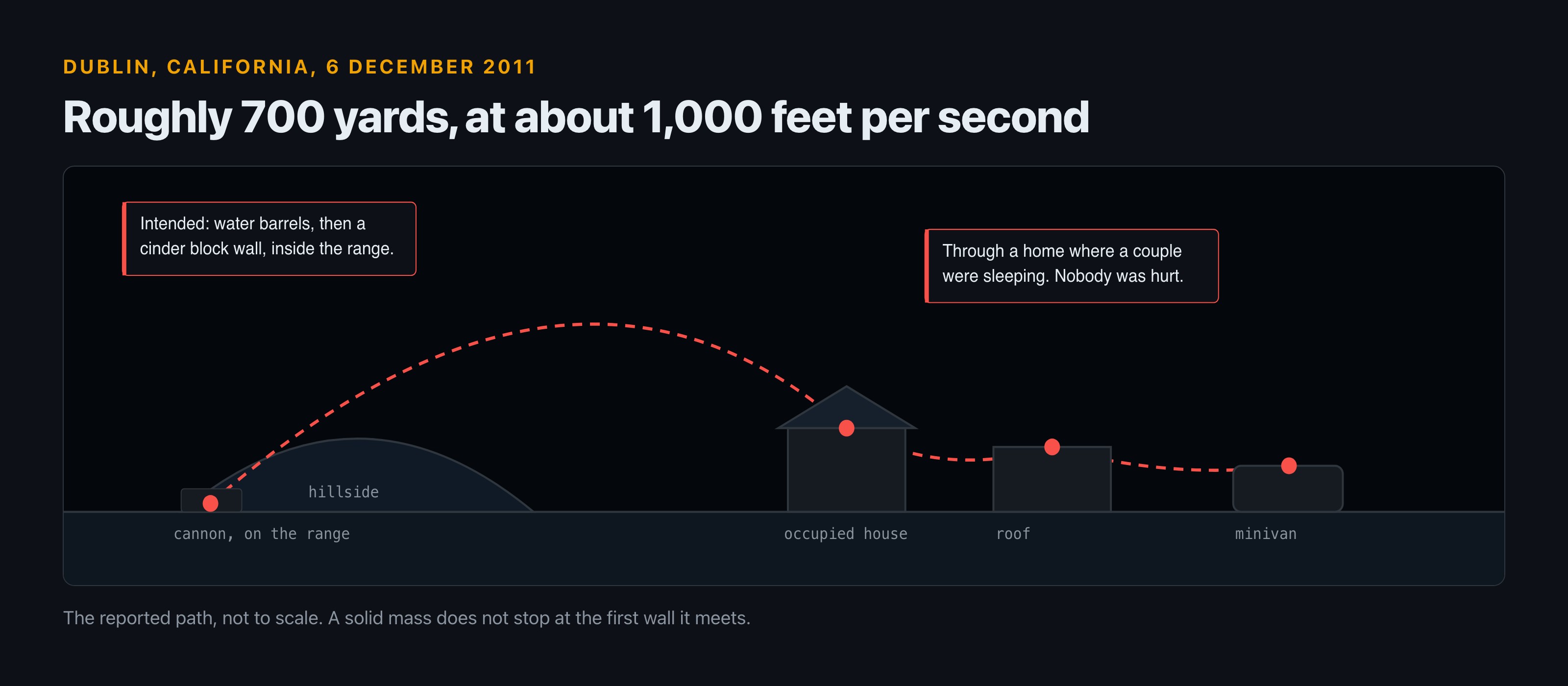
    The intended path was through several barrels of water and into a cinder block wall, all inside the range. Instead it hit something, went over the hillside, and into the neighbourhood below. Travelling at roughly 1,000 feet per second, it covered about 700 yards, passed through a home where a couple were sleeping, bounced across a road, onto a roof, and finished in the window of a minivan.

    Nobody was hurt. The residents were compensated for the damage and for hotel costs. Hyneman and Savage were not at the range when it happened and went to the affected families in person the next day to apologise. Later that month the county sheriff and the production held a public meeting about it.

    Diagram of the cannonball path on 6 December 2011: fired from a cannon on the range, over a hillside, through an occupied house, onto a roof, and finally into a minivan.
    The reported path. Four separate impacts, and energy left over at each one.

    The specifics matter because they are the difference between a stunt gone wrong and a near miss. A cannonball is not an explosive; it is a solid mass, and at 1,000 feet per second it does not stop at the first wall it meets. The recorded path, through an occupied house, across a road, onto a roof and into a vehicle, is the path of an object that still had energy left at every stage. The reason this reads as an anecdote rather than a tragedy is timing and luck, not margin.

    The show then did something unusual for television: it opened an episode with the apology rather than burying it. Viewers still remember the tonal whiplash. One, in a thread from this month: “When it first came out the mid episode apology made me jump because I wasn’t ready for them to just be standing back in the shop.”

    The detail the audience has never quite let go of is who got sent. From the same thread: “Kari and Tory talk about it in their podcast. Sending pregnant Kari to apologize was pure evil genius.”

    There is a small coda. Earlier this month someone found a cast-signed photo in a Hayward thrift shop, addressed to the Alameda County sheriff, signed by the core team including Grant Imahara. A commenter made the connection: that sheriff led the press conference after the cannonball incident. Fourteen years of television, and the artefact that survived into a thrift store bin is from the week it went wrong.

    Was the show’s own verdict word backwards?

    Probably, and it went unfixed for 14 years.

    The first season did not use the vocabulary everyone remembers. Season one, episode four says “True” where later episodes say “Confirmed.” A viewer noticing the change this year drew a reply that is hard to argue with: “True is technically more correct. A ‘confirmed myth’ would mean that you have confirmed it is indeed a myth.”

    Which is exactly right, and slightly maddening once you see it. If a claim is a myth, confirming it confirms that it is false. The show used “Confirmed” to mean the claim turned out to be true, which is the opposite reading of its own noun. “Busted” has the same problem in reverse and gets away with it because busting something sounds like debunking.

    Two verdict cards compared. TRUE, used in season one, is a verdict about the claim. CONFIRMED, used for the next fourteen years, reads literally as confirmation that something is a myth.
    Season one had it right. The replacement says the opposite of what it was used to mean.

    It is worth noticing what the change cost them. “True” is a verdict about a claim. “Confirmed” is a verdict about a process, and it quietly shifts the emphasis from what the world does to what the team managed to demonstrate on the day, with the budget and the range time available. Those are not the same statement. A myth that survived a test in a car park in Alameda is not thereby a fact about the universe, and the show was generally careful about saying so in the narration even as the graphic overstated it.

    This is pedantry, and it is also the entire premise of the programme. A show whose whole method was precision about claims spent 14 years stamping a slightly self-contradictory word on the screen. That the first season got it right and then drifted is the part that stings.

    The myth about the myth show

    Ask around and a surprising number of people are confident MythBusters tested the JFK assassination, specifically the ice bullet theory that would explain a shot leaving no fragment.

    They did not. The ice bullet test happened, but it came from the 1997 film Most Wanted, and had nothing to do with Dallas. When someone raised it in the fan community recently, wondering aloud whether they were “being mandela affect-ed,” the correction was immediate: “They were testing ice bullets because they appeared in the movie ‘Most Wanted’ from 1997. Their tests had nothing to do with the JFK assassination.” A second person reported the same false memory independently, and traced it to a separate JFK special that aired around the same period.

    They did test ballistics with meat and bone. They did examine the moon landing footage, which is closer to the territory we cover in what code doesn’t do in real life. The JFK episode people are certain they watched does not exist.

    What people remember What actually happened
    They tested the JFK assassination They did not. No such episode exists.
    They tested the ice bullet to explain the missing fragment The ice bullet test came from the 1997 film Most Wanted, unrelated to Dallas
    They debunked the magic bullet A separate JFK special aired around the same period, which is the likely source of the confusion
    They took on conspiracy theories generally The moon landing footage is the one most viewers can actually name
    Reported by two people independently in the same thread, each convinced they had watched it.

    A show about false beliefs generating a durable false belief about itself is the most fitting possible epitaph, and it is also a decent argument for why a sourced database beats anyone’s memory, including yours and mine.

    What to take from 14 years of it

    Three things hold up better than any individual result.

    They retested when challenged. The death ray went down three times, and the third attempt happened because someone with standing said the earlier work was not good enough. Redoing an experiment you already answered, at greater expense, and publishing the same negative result is the part of the method that television usually cannot afford.

    What they did Why it is unusual for television
    Retested a myth they had already answered, twice more Re-running a settled experiment costs money and produces no new headline
    Published the same negative result a third time The presidential episode had every incentive to find a triumphant answer
    Opened an episode with an apology Most productions issue a statement and move on
    Sat in a public meeting about their own accident Accountability with no upside for the show
    None of these are experimental results. They are the reason the results were worth watching.

    They reported the failure that embarrassed them. The cannonball could have been handled with a statement. It was handled with an on-camera apology, a house call, and a public meeting.

    And they were not always precise, which is the honest note to end on. The verdict vocabulary was arguably backwards. The episode numbering is a documented mess. Different countries saw different cuts. If you want to know what the show actually found on any given question, look it up in the database rather than trusting the version in your head. That is not a criticism of the programme. It is the thing the programme spent 14 years telling you to do.

    FAQ

    How many myths did MythBusters test?

    Over 1,000 distinct myths across 271 hour-long episodes in 14 years, according to the mythresults.com archive. No verified breakdown of how many were confirmed, plausible or busted appears in any source used here, so treat any precise split you see elsewhere with suspicion.

    Where can I find a complete list of every MythBusters myth?

    mythresults.com, which is organised both by episode and by theme. For episode ordering and titles, the Wikipedia episode list is what the fan community itself defers to.

    Did MythBusters ever prove the Archimedes death ray?

    No. It was tested three times and busted each time, the third at the request of President Obama in an episode that aired on 8 December 2010, using hundreds of mirrors held by students.

    What happened with the MythBusters cannonball?

    On 6 December 2011 a cannonball left the Alameda County bomb range in Dublin, California, travelled roughly 700 yards at about 1,000 feet per second, went through an occupied house, bounced onto a roof and into a minivan. No one was injured, residents were compensated, and the hosts apologised in person.

    Did MythBusters test the JFK assassination?

    No, despite a widely shared memory that they did. They tested ice bullets, but that came from the 1997 film Most Wanted rather than from Dallas.

    Sources

  • Top Hackers in Film History, Ranked by Whether It Could Actually Work

    Top Hackers in Film History, Ranked by Whether It Could Actually Work

    Every ranking of movie hackers is really a ranking of haircuts. This one uses a duller axis: could the thing actually be done? That single question reorders the list badly. Trinity, on screen for maybe 40 seconds in 2003, outranks characters with 90 minutes of plot. Sneakers, released in 1992, hired a co-inventor of RSA to write the maths and then had his slides redrawn by hand because real maths did not look real enough on camera. And WarGames, from 1983, is the only film here that left the cinema and changed federal law: Congress cited it as “a realistic representation of the automatic dialing and access capabilities of the personal computer” on the way to the Computer Fraud and Abuse Act, which Reagan signed on 16 October 1986.

    So the tiers below are not about who is coolest. They are about who did something a competent person could have done that week, with the hardware that existed.

    How this is ranked

    Three questions, in order.

    Was the method real? Not plausible-sounding. Real: a named tool, a documented vulnerability, a technique someone could point at. Was the timeline honest? Almost every film fails here and most fail forgivably, because reconnaissance takes days and cinema does not. Did anyone qualified check? This turns out to be the strongest predictor of all. The films that hold up hired someone, and in two cases the consultant’s name is more interesting than the cast.

    No scores out of ten. Any number I put on this would be invented, and inventing numbers is the exact failure this site is about. Tiers, with reasons.

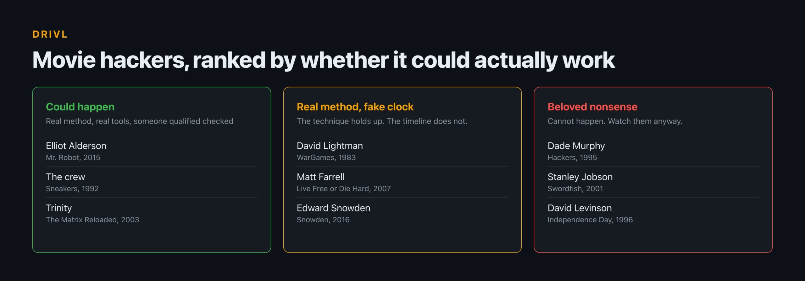
    # Character, film Year Verdict Who checked it
    1 Elliot Alderson, Mr. Robot 2015 Real tools, real attack model, honest about social engineering A former cyber crime detective, roughly 15 years in the field
    2 The crew, Sneakers 1992 Physical and social methods that still work today An RSA co-inventor and a CDC-6600 systems designer
    3 Trinity, The Matrix Reloaded 2003 Correct tool version against a real 2001 vulnerability Nobody credited; the tool’s maintainers approve anyway
    4 David Lightman, WarGames 1983 Period-correct wardialling, then the plot takes over Congress, effectively, in the 1984 record
    5 Matt Farrell, Live Free or Die Hard 2007 Genuinely correct scan targets, then nothing else Someone in the art department, clearly
    6 Edward Snowden, Snowden 2016 Right tools, 38 minutes for a job that takes days Unclear
    7 Dade Murphy, Hackers 1995 Indefensible visuals over a real cultural foundation The publisher of 2600, uncredited
    8 Stanley Jobson, Swordfish 2001 Breaks encryption on a deadline, the genre’s worst trope Nobody, evidently
    9 David Levinson, Independence Day 1996 Skips four separate compatibility problems in one upload Nobody, and a deleted scene tried to fix it later
    Tiers, not scores. Any number out of ten would be invented, which is the failure this whole subject is about.

    Two things fall out of that table. The films that hold up hired someone, and the correlation is close to perfect. And the two entries with the most interesting consultants, Sneakers in 1992 and Hackers in 1995, sit three years and seven places apart, which tells you a consultant only helps when the director is willing to listen.

    Tier one: the ones that could actually happen

    Elliot Alderson, Mr. Robot

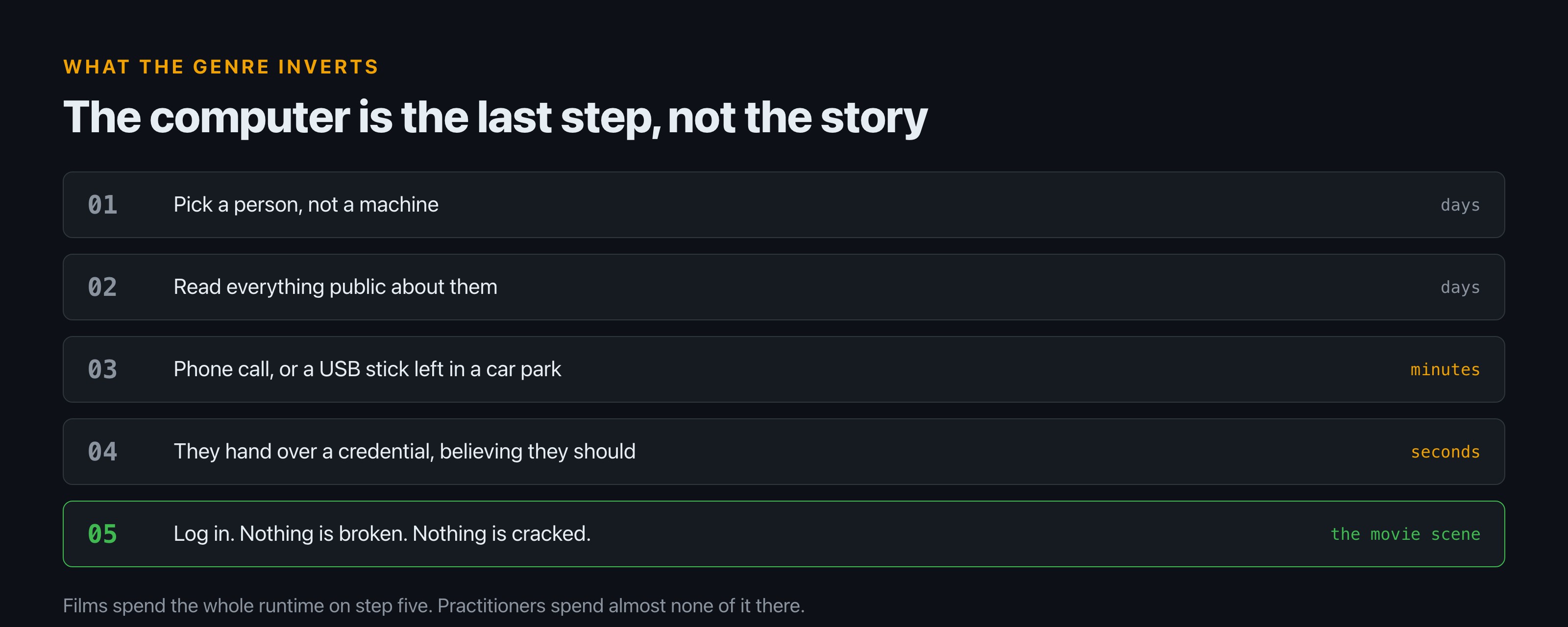
    Five step diagram of a real intrusion: pick a person, read everything public about them, make contact by phone or a dropped USB stick, receive a credential, then log in. The first four steps take days; only the last is the scene a film shows.
    The order films invert. Steps one to four are the work. Step five is the montage.

    The benchmark, and not because of the tooling. Hackaday’s teardown notes that “we see every command the characters type, from netstat to CAN bus dumps.” That alone would only make it accurate set dressing.

    What puts it first is the model of attack. Per the same teardown, social engineering runs through the series, from the dropped USB stick in a car park to a character methodically dismantling an employee’s confidence to reach their manager. The computer is frequently the last step rather than the story. The show also watches the “flu shot” scene from Hackers and makes fun of it, which is a level of self-awareness the genre almost never manages.

    Trinity, The Matrix Reloaded

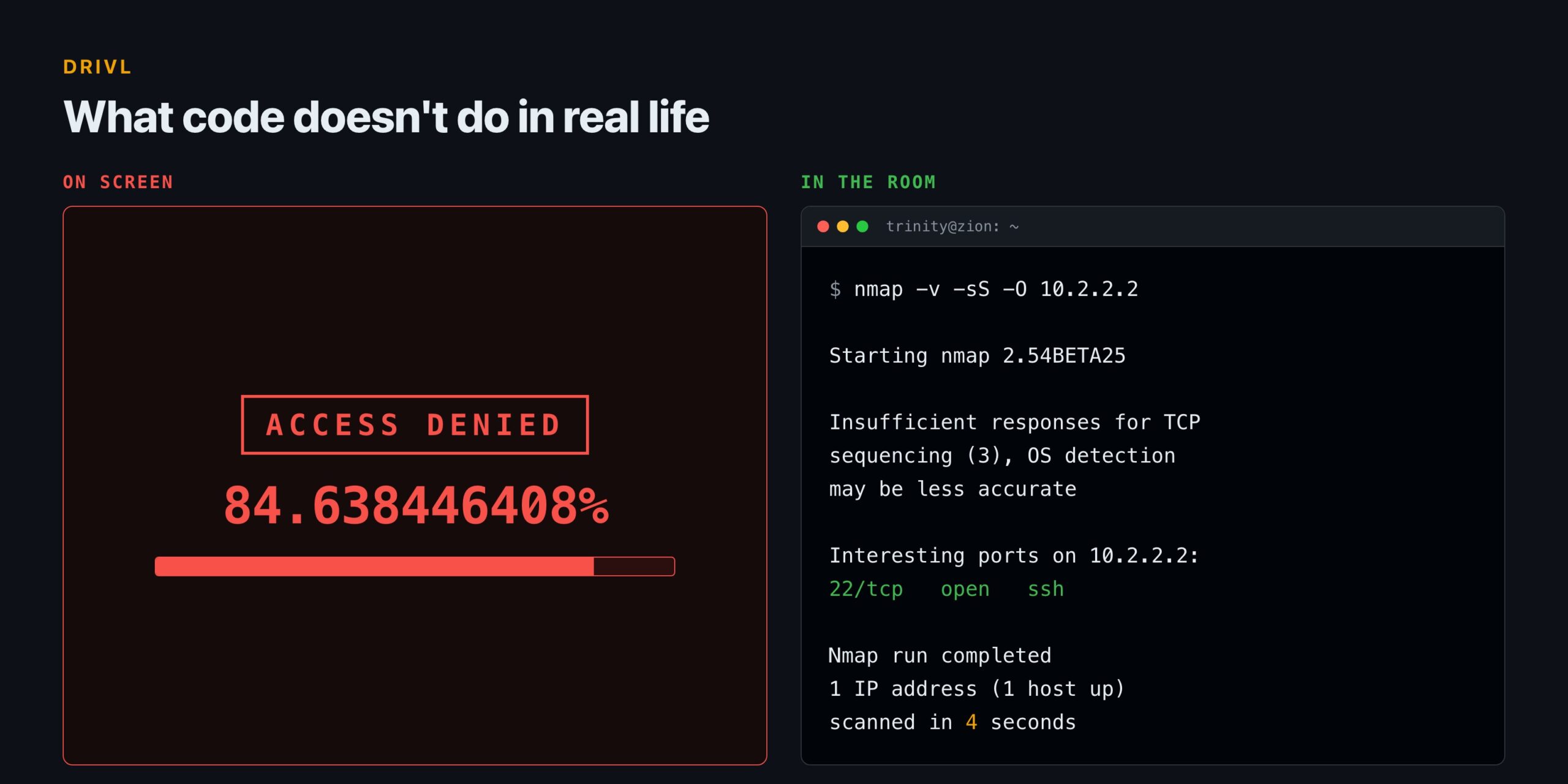
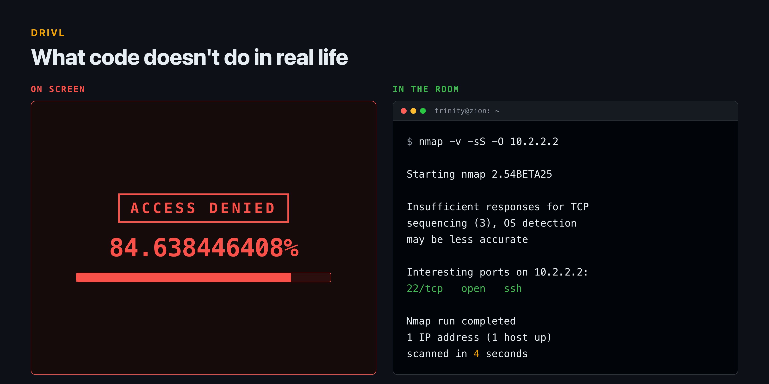
    Roughly 40 seconds of screen time in a 2003 sequel, and it is still the most-cited hacking scene in film. The Nmap project keeps a catalogue of its own screen appearances, and this is the one they are pleased about: “Trinity does it properly in The Matrix Reloaded. Needing to hack the city power grid, she whips out Nmap version 2.54BETA25, uses it to find a vulnerable SSH server, and then proceeds to exploit it using the SSH1 CRC32 exploit from 2001.”

    The version number was current. The vulnerability was real and widely exploited. The port is right and the film shows it. One honest deduction: the tool she runs, sshnuke, never existed. And the maintainers themselves grade on a curve rather than declaring victory, with a verdict that is pure faint praise: “At least it is a lot more realistic than silly 3D animation approach used in many previous movies.”

    The crew in Sneakers

    The most thoroughly consulted film on this list, discussed at length below. Its methods are largely physical and social: impersonation, tailgating, a stolen voice, a rented van. Almost nothing in it depends on a computer doing something impossible, which is why it has aged better than films made twenty years later. More of this sort of thing under film and television.

    It is also the practitioner favourite. In an r/hacking thread asking for the best hacking film, the top reply is one word: “Sneakers.”

    Tier two: real methods, dishonest clocks

    David Lightman, WarGames

    Film What it shows taking minutes What it actually takes
    Snowden A full penetration test, in 38 minutes Days of reconnaissance before anything is attempted
    Live Free or Die Hard Scan, then immediate control The scan is the first hour of a much longer week
    WarGames Wardialling that lands on the right number Correct method, but thousands of numbers and a lot of nothing
    The clock is where nearly every otherwise-careful film gives up, and it is the most forgivable failure on this page.

    In 1983, a teenager wardials a block of numbers looking for a modem, finds something he should not have, and cannot tell a game from a live system. The method is period-correct and it is the reason the film mattered: sequential automated dialling was exactly the capability legislators were worried about.

    The deduction is the ending, not the technique. The film is in tier two because of what happens after the connection, not before it.

    Matt Farrell, Live Free or Die Hard

    The scanning is oddly conscientious. Per the Nmap catalogue, Farrell scans “insecure.org, scanme.nmap.org, and sectools.org with the -A option”, which are hosts that genuinely exist, one of which the Nmap project runs specifically so people have something legal to point a scanner at. Someone on that production did their homework.

    Everything downstream of the scan is a different film entirely.

    Edward Snowden, Snowden

    Correct tooling, compressed clock. The Nmap catalogue notes a custom NSE script and the detail that gives it away: the character “stuns the professor by completing everything in 38 minutes.” The tools are right. The engagement is not a 38-minute job.

    Tier three: beloved, and not remotely possible

    Dade Murphy, Hackers

    The film that every practitioner mocks and most of them own. Released in 1995, it now draws affectionate 826-point threads from the same community that once refused to admit it existed. Its reputation followed a documented arc, described in one of them: “Almost everyone involved in the hacking scene absolutely despised it when it first came out, and it stayed that way for the next decade or so, with people gradually starting to love it ‘ironically’. Eventually enough people started loving it ironically that it became a cult classic, and now everyone loves it.”

    Here is the part that complicates the mockery. The publisher of 2600: The Hacker Quarterly, Eric Corley, who writes under the pen name Emmanuel Goldstein, served as an uncredited technical consultant on it. The film then named a character after him: Cereal Killer’s real name in the story is Emmanuel Goldstein, a name Corley had himself borrowed from Orwell.

    So the most ridiculed hacker film on the list had one of the era’s genuine authorities in the room. Community accounts credit that for the phreaking details buried under the rollerblades, though those specific claims are hedged even by the people making them. The visual language is indefensible. Some of the underlying culture is not.

    Stanley Jobson, Swordfish

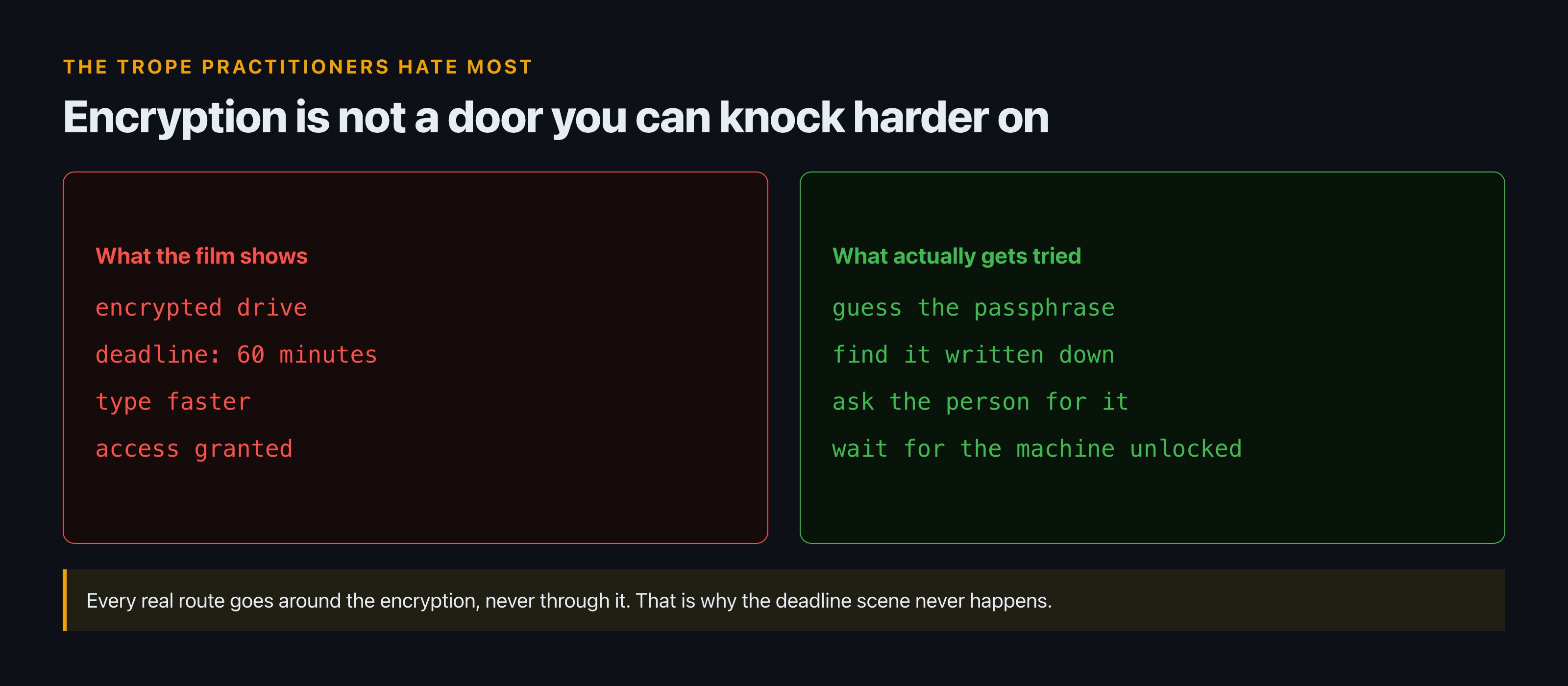
    Two panels contrasting the film version of defeating encryption, a countdown and faster typing, against the real routes, which all go around it: guess the passphrase, find it written down, ask the person, or wait for an unlocked machine.
    Every real route goes around the encryption. None goes through it.

    The scene everyone means when they say movie hacking. It fails the most-hated test in the genre. Asked what irritates them most, an r/hacking commenter put encryption first: “Breaking encryption. We see this a lot. Phone/Computer/HDD is encrypted and hacker has X hrs to get in ‘or else’. Hacker somehow breaks encryption.”

    David Levinson, Independence Day

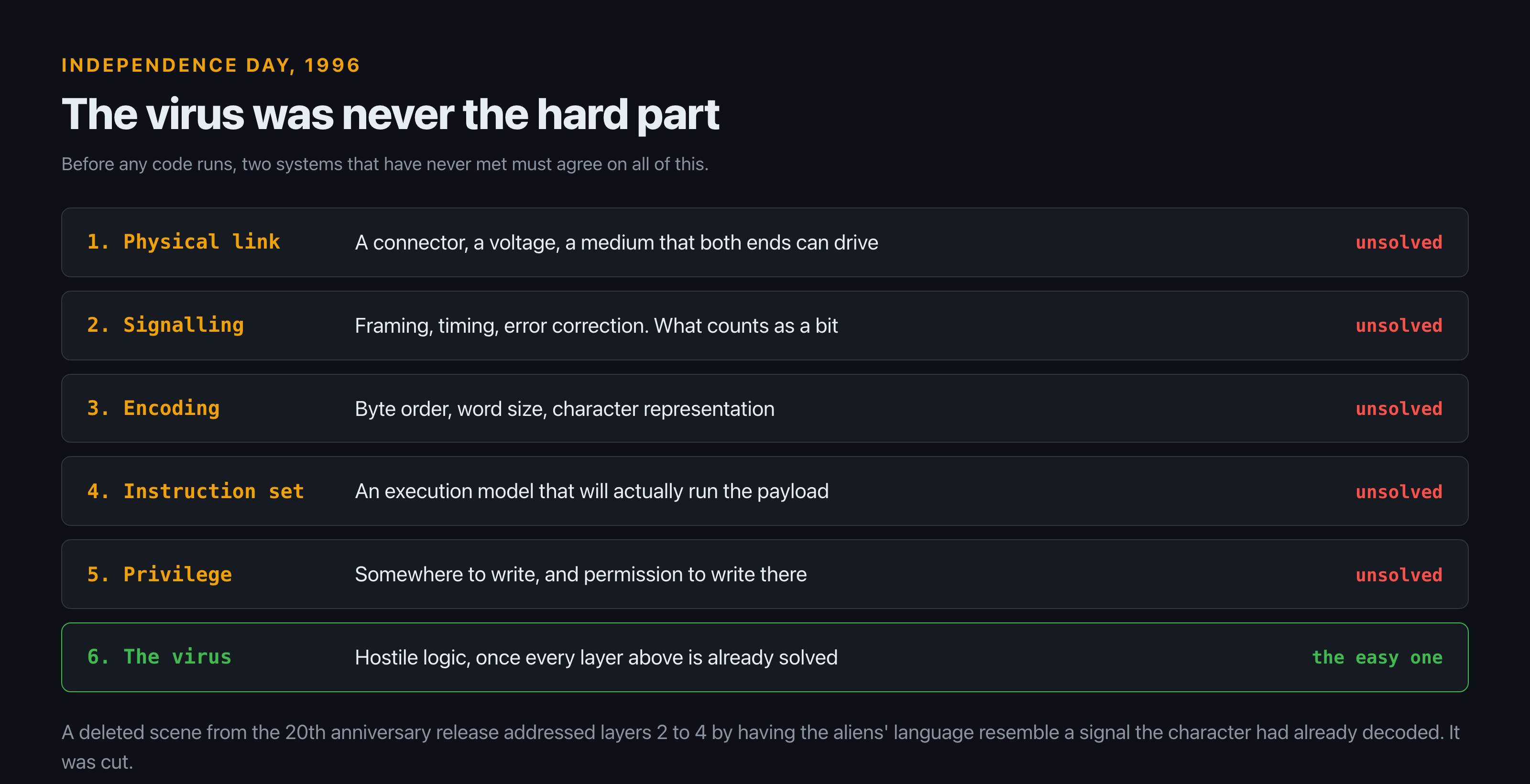
    Included for completeness and because the standard objection is aimed at the wrong thing. The virus is the easy part. Agreeing on a physical connection, a signalling scheme, a byte encoding and an execution model with a system nobody has ever seen is the hard part, and the film skips all four. We took that one apart properly in what code doesn’t do in real life.

    Which film actually changed the world?

    WarGames, and not metaphorically.

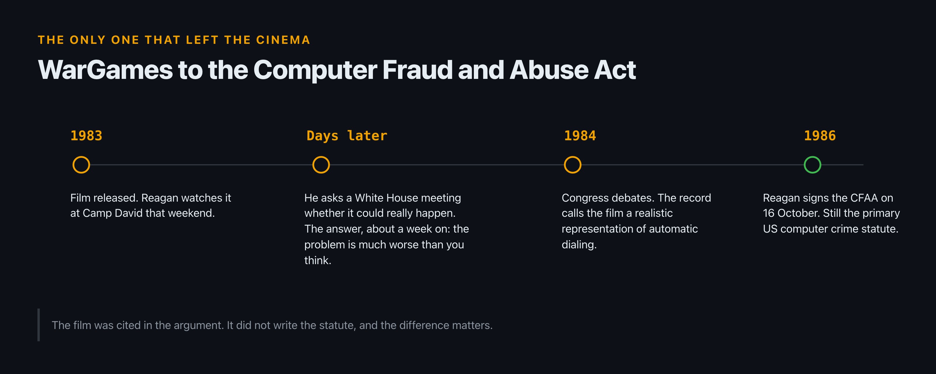
    Timeline from 1983 to 1986: the film is released and Reagan watches it at Camp David, he questions a White House meeting days later, Congress debates in 1984 and the record calls the film realistic, and Reagan signs the Computer Fraud and Abuse Act in October 1986.
    Cited in the argument, not the author of the statute.

    Reagan watched it at Camp David the weekend it opened. At a White House meeting days later, with the chairman of the Joint Chiefs present, he asked whether it could really happen, whether someone could break into the most sensitive systems the country had. According to press accounts of that meeting, the answer came back about a week later: “Mr. President, the problem is much worse than you think.”

    Then it reached Congress. The 1984 bill that preceded the Computer Fraud and Abuse Act was written because lawmakers were worried “that computer-related crimes might go unpunished,” and in the record the film is characterised as “a realistic representation of the automatic dialing and access capabilities of the personal computer.” Reagan signed the CFAA on 16 October 1986. It remains the primary federal computer crime statute in the United States.

    Be careful with the causal claim, because it gets overstated constantly. WarGames did not write the law. It was cited during the argument, and the legislative record calls it realistic. A film talked its way into a statute’s paperwork. That is remarkable enough without inflating it.

    What did Sneakers get that nobody else did?

    An actual cryptographer, and then a decision that says more about cinema than any of the rest of this.

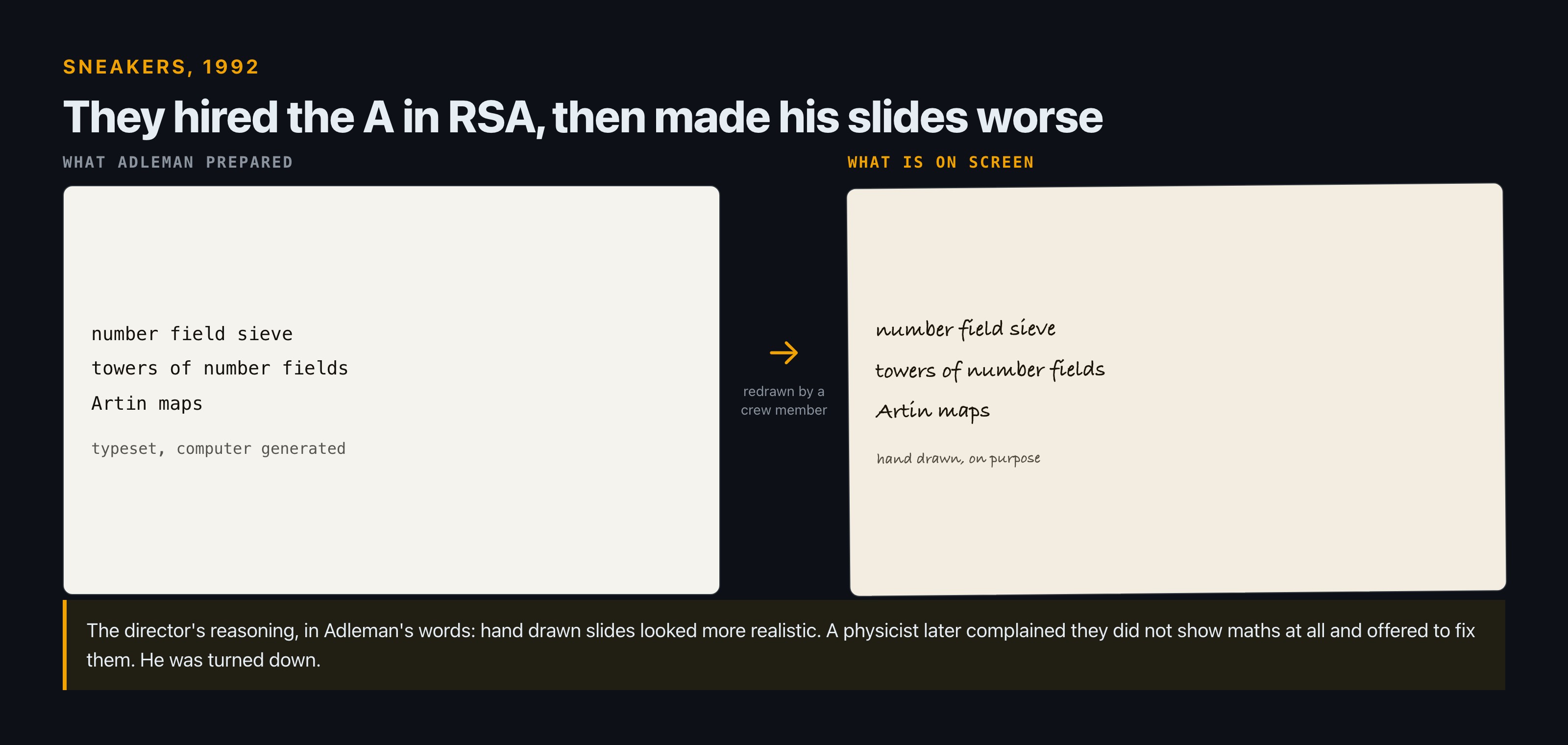
    Side by side comparison of the typeset mathematical slides Len Adleman prepared, naming the number field sieve, towers of number fields and Artin maps, against the hand drawn versions a crew member redrew for the camera.
    Correct maths, deliberately degraded, because handwriting read as more authentic.

    Len Adleman, the A in RSA, was brought in for a scene in which a researcher lectures on a factoring breakthrough. In his own account he was asked to handle a scene “wherein a researcher would lecture on his mathematical work regarding a breakthrough in factoring, and hence in cryptography,” and agreed to “prepare the slides and words for that scene.” What he wrote was real: the number field sieve, described at the time as “the fastest factoring algorithm currently known,” alongside towers of number fields and Artin maps.

    Then this happened. Adleman produced clean computer-generated slides, and, in his words, “Larry had them redrawn by hand by some guy on his crew, he said that hand drawn slides looked more realistic.”

    Read that again. A production hired one of the inventors of public-key cryptography, got correct mathematics, and then degraded it on purpose, because typeset accuracy looked less authentic on camera than a crew member’s handwriting. The postscript is better still: a physics professor who saw the redrawn slides complained that “they did not show math at all” and offered to fix them. He was turned down.

    Sneakers was not carelessly made. Robert Abbott, who designed the first time-sharing operating system for the CDC-6600, consulted throughout. The film simply understood something the accuracy scolds miss, which is that the audience is not reading the slide. It is reading the room.

    What every one of them gets wrong

    The films argue about tools. Practitioners, asked directly, argue about people.

    What films show What practitioners say
    The hacker already knows everything “Have them look stuff up. Nobody knows everything, especially during the reconnaissance phase.”
    Encryption falls to a deadline The single most-cited trope that ruins a scene
    Socially incapable loners with a grudge “Most are just regular computer nerds that wouldn’t be any different than your other engineers and programmers.”
    More typing means more progress Less is more. A few specifics beat a wall of invented commands.
    Quotes from an r/hacking thread in which a writer asked the community directly what to do and avoid.

    The most useful document on this subject is an r/hacking thread in which someone writing fiction asked what to do and avoid. The top answer, at 485 points, is not about capability at all:

    “Have them look stuff up. Nobody knows everything, especially during the reconnaissance phase. This is especially true if you’re showing a hardware teardown, looking up the IC number and getting data sheets etc. is invaluable. Also, if you’re super unfamiliar with hacking, remember that less is more.”

    Look things up. Read the datasheet. Not knowing is the normal state. No film on this list, including the ones in tier one, shows a character stuck on something boring and going to find out.

    The sharper criticism lands on the best of them. From the same community, about the benchmark itself: “the hacking in Mr Robot is realistic but the characters are not. Hackers are not all autistic weirdos who are socially incompetent and low-key malicious or out to overthrow the government/corps/planet. Most are just regular computer nerds that wouldn’t be any different than your other engineers and programmers.”

    That is the genre’s real failure and no ranking of scenes will catch it. A film can get every command right and still be wrong about who types them. Sneakers, made in 1992 by people who consulted a cryptographer and a systems designer, is arguably still the only entry that treats its characters as working professionals with mortgages rather than as symptoms.

    FAQ

    What is the most realistic hacker movie?

    Sneakers for the whole film, since it relies on impersonation and physical access rather than impossible computing, and it used both a cryptographer and a systems designer as consultants. Mr. Robot for a sustained television run. The Matrix Reloaded for a single scene.

    Did WarGames really lead to a law?

    It was cited during the legislative process that produced the Computer Fraud and Abuse Act, and the record characterises it as a realistic representation of automated dialling. Reagan signed the CFAA on 16 October 1986. The film influenced the debate; it did not write the statute.

    Was the maths in Sneakers real?

    Yes. Len Adleman, a co-inventor of RSA, wrote the slides and the dialogue for the lecture scene, referencing the number field sieve. The director then had the slides redrawn by hand because that looked more realistic on camera.

    Who consulted on Hackers (1995)?

    Eric Corley, publisher of 2600: The Hacker Quarterly under the pen name Emmanuel Goldstein, worked on it as an uncredited technical consultant. The film named a character’s alter ego after him.

    Why do movies always show hackers breaking encryption?

    Because it creates a deadline. It is also the single trope working practitioners cite most often as the one that ruins a scene, since correctly implemented encryption is not something you defeat by typing faster.

    Sources

  • What Code Doesn’t Do in Real Life (That It Does in the Movies)

    What Code Doesn’t Do in Real Life (That It Does in the Movies)

    Almost everything you believe about movie code is backwards. The scene programmers have mocked since 1993, the 3D file browser in Jurassic Park, was real shipping software: a Silicon Graphics utility called fsn that ran on IRIX. The scene nobody brings up, Trinity’s break-in in The Matrix Reloaded, runs Nmap version 2.54BETA25 against a genuine SSHv1 CRC32 vulnerability from 2001, and the tool’s own maintainers confirm it on their site. Meanwhile the code filling screens in films that take themselves seriously is often lifted from somewhere absurd. Elysium reboots a space station with text from an Intel CPU manual. The Terminator, sent back from 2029, sees the world through 6502 assembly apparently pulled off an Apple II, a machine from 1977. We know this because a project started in January 2014 has spent years identifying the actual source of code shown on screen, frame by frame.

    So the honest version of this article is not a list of things Hollywood gets wrong. It is a shorter, stranger list of what is actually on those monitors, and why the famous examples are almost all filed under the wrong heading.

    The scene everyone calls fake was real software

    Lex sits down at a workstation, says “It’s a UNIX system! I know this!”, and navigates a green 3D grid to lock the doors. It became shorthand for Hollywood inventing nonsense computers.

    Diagram of the fsn interface showing directory pedestals of varying heights with file blocks on top, connected by wires, with labels explaining that pedestal height is total directory size and block colour is file age.
    How to read the Jurassic Park screen. Pedestal height is directory size, blocks on top are files, wires are the hierarchy.

    It was not invented. The program is fsn, pronounced “fusion”, a file system navigator that Silicon Graphics shipped for IRIX. Wikipedia’s entry on its open source clone puts the relationship plainly: “The 1993 film Jurassic Park has a scene that prominently features SGI’s fsn, the original version of the utility that fsv clones.”

    The visuals were not decoration either. Every element encoded something. Directories became pedestals, and pedestal height was proportional to the total size of files inside. Files sat on top as blocks, where block height meant file size and colour meant age. The wires running between pedestals were the directory hierarchy. A person who understood the mapping could read disk usage across a filesystem at a glance, which is more than can be said for most file managers shipping today.

    The part worth sitting with is what happened next. Audiences decided real software was a Hollywood prop. As the same reference notes, after the film came out some viewers took the visualization as an example of media misrepresentation of computers, calling the game-like display an unrealistic mockup, unaware the program legitimately existed.

    Thirty years of programmers rolling their eyes at the one scene in the film that was documentary footage. There is now a subreddit named after the line, r/itsaunixsystem, largely dedicated to mocking bad screen tech, which is roughly the beat we cover under developer culture. The joke outlived the accuracy it was mocking.

    So what is actually on those screens?

    Someone has been checking. In January 2014 John Graham-Cumming started Source Code in TV and Films, a submission-driven project where readers send in frames and the provenance of the code gets identified. It is the only reason any of the following is knowable rather than guessable.

    The findings are funnier than any invented punchline. A CPU reference document stands in for orbital infrastructure control. A machine intelligence sent from 2029 thinks in the instruction set of a 1977 home computer.

    Production What the code actually is What it is pretending to be
    Elysium Intel Architecture Software Developer’s Manual Space station reboot sequence
    The Terminator 6502 assembly, apparently from an Apple II A machine intelligence’s field of vision
    Stargate JavaScript from a Canadian bank’s website Alien systems
    Doctor Who A Wikipedia page about light waves Working code
    The Girl With the Dragon Tattoo SQL that appears legitimate SQL for researching murders
    The Social Network Possibly written for the film Itself
    Identifications from the Source Code in TV and Films project. It is submission-driven, so this is a sample, not a census.

    This is not laziness so much as it is set dressing. A prop department needs a screenful of plausible text in a hurry, and any dense monospace block reads as “computer” from three metres away. Nobody in the theatre is pausing to parse it. The people who eventually do are on the internet, with a frame grab and too much time.

    The bottom two rows are the ones worth noticing. Some productions did the work, and nobody gives them credit for it, because a correct SQL query looks exactly as boring on screen as an incorrect one.

    Did any movie ever get a hack right?

    One, mostly, and it is not the one you would guess.

    In The Matrix Reloaded, Trinity needs to take down a city power grid. The Nmap project’s own catalogue of its film appearances describes what happens next: “Trinity does it properly in The Matrix Reloaded. Needing to hack the city power grid, she whips out Nmap version 2.54BETA25, uses it to find a vulnerable SSH server, and then proceeds to exploit it using the SSH1 CRC32 exploit from 2001.”

    Every piece of that checks out. The version number was real and current for the period. The scan output is shaped like real scan output. The SSHv1 CRC32 vulnerability was a genuine, widely exploited flaw. The target runs SSH on port 22 and the film shows it.

    Two honest caveats, because the scene gets over-praised. The tool Trinity runs, sshnuke, does not exist and never did; the vulnerability is real but the binary is a prop. And the Nmap maintainers themselves grade on a curve. Their verdict is comparative, not glowing: “At least it is a lot more realistic than silly 3D animation approach used in many previous movies.”

    Film What it gets right What it does not
    The Matrix Reloaded Real version, real SSHv1 CRC32 vulnerability, correct port sshnuke is not a real tool
    The Bourne Ultimatum Uses Nmap and its real GUI, Zenmap Compresses the work
    Live Free or Die Hard Scans hosts that genuinely exist and permit scanning Little else
    Elysium Recognisable tool “Nmap version 13” does not exist
    Snowden Correct tooling, plausible custom NSE script 38 minutes for the whole engagement
    Graded against the Nmap project’s own catalogue of its film appearances.

    Nmap turns up elsewhere with varying dignity. In The Bourne Ultimatum, the CIA uses Nmap and its GUI Zenmap to break into a newspaper’s mail server. In Live Free or Die Hard, the scan targets are insecure.org, scanme.nmap.org and sectools.org, hosts that genuinely exist, one of which the Nmap project maintains specifically so people have something legal to scan. Elysium gets sloppier, running “Nmap version 13” against Matt Damon’s augmented brain, a release number that does not exist. And Snowden keeps the tooling correct while compressing the clock, with a custom NSE script finishing a penetration test in 38 minutes.

    What does real hacking look like when someone bothers?

    Mr. Robot is the answer practitioners give without being asked. In a thread on r/ProgrammerHumor simply titled “Movies”, the top reply is “Not a movie but Mr Robot is quite realistic.” Nobody in the thread argues.

    The show earned that by hiring for it. When it premiered in 2015, its technical advisor was Michael Bazzell, a former cyber crime detective with roughly 15 years in the field including about a decade on the FBI’s cyber crime task force, and the security firm Trail of Bits contributed guidance on specific attack sequences. Hackaday’s teardown of the first season notes the effect on screen: “We see every command the characters type, from netstat to CAN bus dumps.” Elliot runs Kali Linux and spins up a Windows virtual machine when he needs a tool that only exists there.

    But the tooling is the shallow part of the realism. The deeper choice is what the show says an attack actually is. Per the same teardown, social engineering runs through the whole series, from the old dropped-USB-stick-in-the-parking-lot trick to a character methodically dismantling an employee’s self confidence to get to their boss. The computer is often the last step, not the story.

    The genre convention What Mr. Robot does instead
    A 3D flythrough standing in for a tool Shows the actual command, from netstat to CAN bus dumps
    Typing defeats a firewall Social engineering, phishing, a USB stick in a car park
    Invented operating systems Kali Linux, and a Windows VM when a tool only exists there
    The command line hidden as boring The command line as the point
    Accuracy here came from a retained technical advisor and a security research firm, not a single consulting pass.

    The show also knows exactly what it is pushing against. Characters sit and watch the “flu shot” scene from Hackers and make fun of it. There are no virtual reality flybys. As Hackaday put it, in this show the command line is not hidden, it is celebrated.

    The Independence Day problem

    In 1996, Jeff Goldblum uploads a virus from an Apple PowerBook 5300 to an alien mothership and saves the planet. It is the single most mocked technology scene in film, and the mockery is aimed at the wrong target.

    People say the problem is the virus. It is not. Writing hostile code is the easy half. The problem is the interface: to deliver anything, two systems have to agree on a physical connection, a signalling protocol, an instruction encoding and an execution model. The objection that gets repeated is that an alien craft hundreds of kilometres across, built by a civilisation thousands of years ahead of us, would need to be compatible with the operating system on a mid-nineties consumer laptop. And it was a consumer laptop. Catalogues of on-screen hardware identify it as an Apple PowerBook 5300.

    Diagram listing six layers two computer systems must agree on before code can run: physical link, signalling, encoding, instruction set, privilege, and finally the virus itself, with the first five marked unsolved and the virus marked as the easy one.
    Everything that has to be true before a payload can execute. The hostile code is the last and easiest layer.

    The film did eventually answer this, just not in the film. A deleted scene restored for the 20th anniversary release has David realise the aliens’ programming language resembles the signal he had already decoded earlier in the story, which at least establishes prior access and a decipherment step. It was cut. So the version almost everyone has seen contains no explanation, and the objection stands against the movie as released.

    There is also a serious defence of the scene, argued at length by Sam Hughes at qntm.org, resting on the crashed craft the humans had held and studied for decades. That is the fair way to leave it: two defensible readings, neither one settled, which is more interesting than the usual dunk.

    Why Hollywood keeps doing it anyway

    The case against realism is stronger than programmers like to admit, and the sharpest version of it came from a programmer. From r/ProgrammerHumor, on why an accurate hacking scene would fail: “Can you imagine how boring that would be? It would be like a science fiction movie with realistic space battles. Picture it: two space ships are 100 million miles away from each other. Their computers calculate a trajectory and fire.”

    That is correct and it is the whole problem. A real intrusion is mostly waiting. Reconnaissance that takes days. A scan that returns a wall of text. Long silences where nothing renders. The interesting work happens in someone’s head and produces no visual output whatsoever. Film is a visual medium with a runtime, and “man reads output, thinks, types four characters” is not a sequence you can cut to music.

    So the progress bar exists for the audience, not the character. It converts invisible cognition into something with a shape and a deadline. Once you see the 3D flythrough as a narrative device rather than a technical claim, most of the genre stops being offensive and starts being a convention, like characters never saying goodbye before hanging up the phone.

    The convention What it is standing in for
    A progress bar Invisible work, given a shape and a deadline
    A 3D flythrough Reading text output, which does not read on camera
    ACCESS DENIED in red A failure the audience needs to understand in one frame
    Frantic typing Thinking, which produces no picture at all
    Read as narrative devices rather than technical claims, most of the genre stops being wrong and starts being convention.

    Mr. Robot proves the convention is optional, not mandatory. It found a way to make the command line watchable. But it needed a retained advisor, a security firm and a director who cared, and most productions have a prop budget and a Tuesday.

    The detail programmers actually notice

    Ask what gives a fake screen away and you will get answers about firewalls and impossible speeds. In practice the tell is smaller and stupider: unearned precision.

    Side by side comparison. Left, a movie progress readout showing 84.638446408 percent. Right, what real systems report: 84 percent, an ETA, an approximate timing line, and no output at all.
    The giveaway is not impossible speed. It is a number no real system could produce.

    The best example I have seen comes from an r/programming thread posted in 2013, 1,165 points and 174 comments, in which a developer found his own published code in a Hollywood film. Amid the discussion, one reader noticed a progress readout in the frame and posted the whole critique in nine words:

    “Percentage complete: 84.638446408%”

    “that’s one precise measurement..”

    Nine decimal places on a progress bar. No real system reports that, because no real system knows that. It is the same instinct that produces the giant red ACCESS DENIED box, a habit worth watching for across film and television: a machine performing certainty for an audience, when actual machines mostly report ranges, estimates and nothing at all.

    That thread has a second half worth knowing about. The community’s first reaction to a film using a developer’s code was not flattery but paperwork. The top comment is “You should file a dmca takedown notice.” Another commenter set out the actual position: copyright is implicit and automatic, so absent specific permission for that specific redistribution, the production is infringing.

    The developer himself was relaxed, and his reason was specific: he had released the code publicly in 2007 as a free contribution to the infosec community and had never bothered with a licence. Someone else pointed out who really absorbs the consequences of escalation, and it is not the studio. A visual effects artist and a clearance person take the blame, while the production pays a small sum to swap the insert shot.

    Which is a fittingly unglamorous ending. The code on screen came from a real person, was used without asking, and the machinery for fixing that would mostly hurt the two people furthest from the decision.

    What to look for next time

    Four things, in rough order of how reliably they give the game away.

    The tell What you see What it should look like
    Precision nobody could have Percentages past one decimal, exact time-to-completion, a confidence score on a face match A whole number, a rough ETA, or nothing
    Output with no input Text streaming while nobody types, or continuing after the actor stops Request, then response. Then a pause.
    Graphics doing the work of text Rotating wireframes, city flythroughs, pulsing node maps Monospace text on a black background
    Sudden compatibility Two systems that have never met agreeing instantly on a protocol Weeks of work, or a prior sample to study
    Ranked roughly by how reliably each one gives the game away.

    And one counter-instruction. When a film shows a plain terminal, sensible commands and a person waiting, resist the urge to call it lazy. That is what the work looks like. Somebody did the research.

    FAQ

    Was the Jurassic Park computer real?

    Yes. It is fsn, a 3D file system navigator that Silicon Graphics shipped for its IRIX operating system. It was real software running on real hardware, not a prop built for the film.

    Which movie has the most accurate hacking scene?

    For a single scene, The Matrix Reloaded, which uses a correctly versioned Nmap and a real SSHv1 CRC32 vulnerability. For sustained accuracy across a whole production, Mr. Robot, which employed a former FBI cyber crime investigator as technical advisor.

    Is the code shown in movies real code?

    Often it is real code doing something completely unrelated. Documented examples include a CPU manual standing in for space station controls in Elysium, 6502 assembly in the Terminator’s vision, and a Canadian bank’s JavaScript appearing in Stargate.

    Could you really upload a virus to an alien spaceship?

    The virus is not the hard part. Agreeing on a physical connection, a protocol and an instruction set with a system you have never encountered is. A deleted scene from Independence Day addressed this by having the aliens’ language resemble a signal the character had already decoded, but it was cut from the release.

    Why do movies use progress bars for hacking?

    Because the real activity has no visual output. A progress bar turns invisible thinking into something with a shape and a deadline that an audience can follow. It is a storytelling device, not a technical claim.

    Sources