[[include :backrooms-wiki:theme:super-liminal]]
Info
Super Liminal is a Wikidot theme created by  Ambersight. While having a similar layout to Old Liminal Theme, the theme actually has a completely different structure, and is intended to serve as the base of more themes in future. Super Liminal provides multiple presettings, and a huge amount of CSS variables that can be easily changed. Read the following content to know about how to modefy the theme. Comparing to Nuliminal or Old Liminal, Super Liminal features:
- A simpler layout
- Optimized font size and image blocks on mobile devices
- No Pseudo-element animations
- More CSS variables
- A flatter design style
- Many other tiny fixes and moderations
Examples

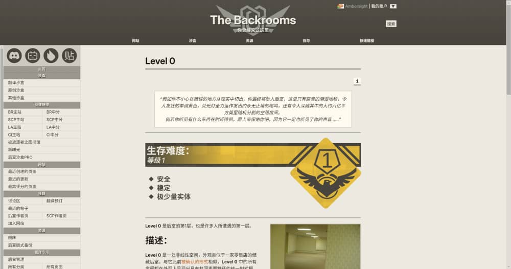
The first picture ever taken of Level 0.
Level 0 is a non-linear space, resembling the back rooms of a retail outlet. Similar to its previous form, all rooms in Level 0 appear uniform and share superficial features such as a yellowish wallpaper, damp carpet, and inconsistently placed fluorescent lighting. However, no two rooms within the level are identical.
Title #1
Title #2
Title #3
- Numberred List
- Number two
This is the second tab. To create a tabview, use:
[[tabview]]
[[tab The first tab]]
content
[[/tab]]
[[tab The second tab]]
content
[[/tab]]
[[/tabview]]
Thank you for using Super Liminal theme (or just spending time reading this XD)! It really took Ambersight a long time to make it.
If you're interested with my other themes, take a look at my Author Page!
(Note: I'm not sure whether I have got an author page when you're reading this.)
This is a long tab. It contains a lot of text.
This is a long tab. It contains a lot of text.
This is a long tab. It contains a lot of text.
This is a long tab. It contains a lot of text.
This is a long tab. It contains a lot of text.
This is a long tab. It contains a lot of text.
This is a long tab. It contains a lot of text.
This is a long tab. It contains a lot of text.
This is a long tab. It contains a lot of text.
This is a long tab. It contains a lot of text.
This is a long tab. It contains a lot of text.
This is a long tab. It contains a lot of text.
| This is a |
table |
|---|
| to make |
these |
| ask a hacker for help |
> blockquote
[[div class="blockquote"]]
[[code]]
[[div class="code"]]
[[div class="lightblock"]]
[[div class="darkblock"]]
[[div class="styled-quote"]]
[[div class="dark-styled-quote"]]
[[note]]
The wall was YELLOW!!!
[[span class="bblock"]]
[[span class="dblock"]]
[[span class="keycap"]]
[[span class="ruby"]][[span class="rt"]]
[[iftags +component]]
This component is from the SCP Wiki, and was uploaded there by  CityToast. It is licensed under CC-BY-SA 3.0. It has been modified for this wiki by scutoid studios.
The license box is an easy way for people to know how to credit you as well as an easy way to properly source images. License boxes are a requirement for all pages on the wiki.
Component Base:
[[include :backrooms-wiki:component:license-box]]
=====
> **Filename: (Optional)**
> **Name:**
> **Author:**
> **License:**
> **Source Link:**
> **Derivative of:** (If applicable)
> **Additional Notes:** (Optional)
> **Filename: (Optional)**
> **Name:**
> **Author:**
> **License:**
> **Source Link:**
> **Derivative of:** (If applicable)
> **Additional Notes:** (Optional)
=====
[[include :backrooms-wiki:component:license-box-end]]
How to Use the License Box
Step 1:
At the bottom of the page, below the wikiwalk footer, put this piece of code:
[[include :backrooms-wiki:component:license-box]]
=====
=====
[[include :backrooms-wiki:component:license-box-end]]
If you have footnotes, add [[footnoteblock]] above the licensebox code like so:
[[footnoteblock]]
----
[[include :backrooms-wiki:component:license-box]]
=====
=====
[[include :backrooms-wiki:component:license-box-end]]
Step 1.5 (optional):
If you have images or other forms of media, put this block of code between the equal signs:
> **Filename: (Optional)**
> **Name:**
> **Author:**
> **License:**
> **Source Link:**
> **Derivative of:** (If applicable)
> **Additional Notes:** (Optional)
If you have more than one piece of media, you'll do this multiple times.
These are required in the license box.
- "Name" is the title of the media.
- "Author" is whoever created it. If you made it, put your wikidot username.
- "License" is the license it's under. Put it exactly as it says. If it says CC BY SA 2.0, then put CC BY SA 2.0.
- "Source Link" is where you found it. If you created it, put the URL of the page it's on.
These are optional in the license box.
- "Filename" is the title of the file as you named it when uploaded on the wikidot, if you used a different name than the source name
- "Derivative of" If you Photoshopped a variety of images to create a new image or did something similar, you would list them all here.
- "Additional Notes" If you cropped an image or edited it somehow, you would list those changes here.
You can also use this handy box-ify-er to make the process simpler:
Notes:
- Once put all together, it should look like the component base.
- You cannot use some modules, including CSS, HTML, and listpages, inside the license section. You also cannot use collapsibles or tables.
- If your footnotes are appearing after the license section, remember to add [[footnoteblock]] above the license template.
- Do not copy or move the ===== elements. Only have one pair, and place that pair below and above the includes.
Step 2
Add the _licensebox tag to the page.
Step 3 (optional):
You can change various aspects of the default message of the component with a few parameters! These are the customizable features:
- author= This allows you to change the name of the author that appears. This is great for co-written pages or translations. This defaults to the person who created the page.
- license= This allows you to change the license of the page if need be. Note that this can only be changed to variants of the CC BY-SA License. This defaults to 3.0.
- url= This allows you to change the url that appears in the message if this page is a derivative of another page. Once again, very useful for translations. This defaults to the page link.
- origin= This is the first part of changing where the message says where the page originates. Again, useful for translations or derivatives of other works. This defaults to “Backrooms Wiki”.
- origin-link= This is the second part of the where the message says where the page originates. This defaults to a link to our site’s homepage.
[[include :backrooms-wiki:component:license-box
|author=Text here
|license=Text here
|url=Text here
|origin=Text here
|origin-link=Text here
]]
Handling Derivatives
An image becomes a derivative once you add something to the original.
- This can range from adding a black square on a face to collages of multiples images.
If you image is a derivative, you must license your image, not the original. This means putting the name of the editor and the License they want to put.
Keep in mind that if the image license has the "SA" ("sharealike") denomination (such as in CC-BY-SA-3.0), it means you should license the derivative with the same license as the original
Derivatives in the Licensebox
>**Name:** Name of the wikidot file (optional)
>**Name:** Name of the derivative file
> **Author:** Name of the person who made the derivative
> **License:** Same license as the original in the case of a SA licensed image
> **Source Link:** Source of the derivative, often the wiki file link
> **Derivative of:** [link of the original Title of the Original] by Author of the original licensed under License of the original
> **Additional Notes:** (Optional)
If there are multiple original images used in the derivative, separate each with a comma.
Example

Original image on the left and derivative image on the right.
In this case, the image on the right is being licensed, with the information of the image of the left, and the image added to it, in the derivative of section.
Name: Balpha Auditorium
Author:  Light_Nate
License: CC BY 2.0
Source Link: https://www.flickr.com/photos/niftyniall/12748036163/
Derivative of: Synergy-2 81-717 interior - computer room (3) by Xenotron licensed under CC 0 1.0, M.E.G. Logo by Kosef licensed under CC-BY-SA-3.0
What if I didn't add anything?
Image modifications, such as changing the color hue, blurring the image, cropping it… are different than derivative images. These changes are listed under Additional notes And the original image has to be the one licensed, as it is not a remix.

Original image on the left and edited image on the right.
In this case, the image on the left is being licensed, with an additional notes line containing the nature of the changes and who did it.
Name: Hotel corridor - Couloir hotel
Author: mkepto
License: CC BY-SA 2.0
Source Link: https://openverse.org/image/d5397b0c-ccc4-431e-b18d-7809432f196a?q=hotel+corridor&p=16
Additional Notes: Color edited by  Praetor3005 on Photomosh
This is the actual component, ignore it:
[[/iftags]]
Cite this page as:
[[iftags +component]]
Colmod was originally created by  Boyu12 and is licensed under CC BY-SA 3.0
The following pages make up the Colmod component
[[/iftags]]
-
"<a href="https://backrooms-wiki.wikidot.com/theme:super-liminal">Super Liminal Theme</a>" by Ambersight, from the <a href="http://backrooms-wiki.wikidot.com/">Backrooms Wiki</a>. Source: <a href="https://backrooms-wiki.wikidot.com/theme:super-liminal">https://backrooms-wiki.wikidot.com/theme:super-liminal</a>. Licensed under <a href="https://creativecommons.org/licenses/by-sa/3.0/">CC-BY-SA-3.0</a>.
[[iftags +component]]
Colmod was originally created by Boyu12 and is licensed under CC BY-SA 3.0
The following pages make up the Colmod component
[[/iftags]]
For more information about on-wiki content, visit the Licensing Master List.
Presettings
Super Liminal provides multiple presettings for you to modify its layout. To apply a presetting, change your include code to:
[[include :backrooms-wiki:theme:super-liminal
|Presetting 1
|Presetting 2
]]

Layout: Wide Page
Make your page wider. Attention: this page itself is an example of wide page.

Layout: Remove the Title
Remove the title of the page. You can still make a fake title via .meta-title.
Layout: Show Sidebar
Always show the sidebar on the left. When the size of browser window is shorter than 1024px, the sidebar will still be folded.
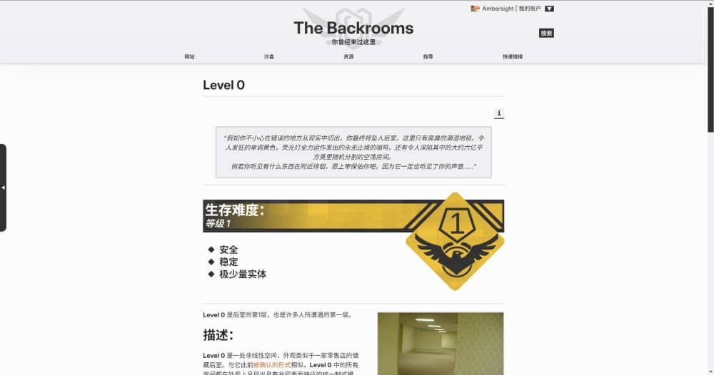
Palette: Daytime
The classic style of black and white.
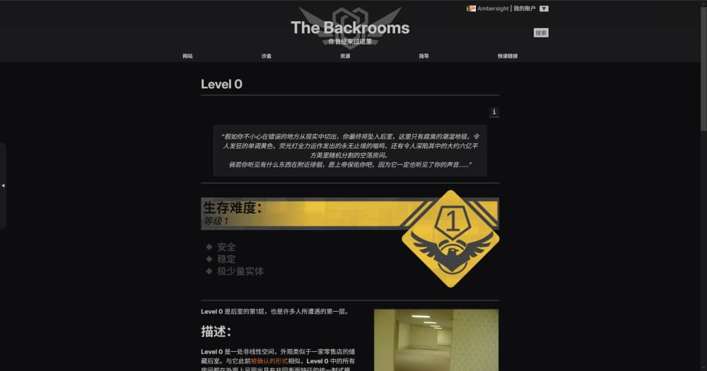
Palette: Nightmare
Who turned off the light?
Customize the Theme
Super Liminal provides plenty of CSS variables that can be changed. If you wish to change some of them, use the following code:
[[module CSS]]
:root {
    --variable 1: value;
    --variable 2: value;
    ...
    --variable n: value;
}
[[/module]]
WARNING: the other tabs are very long.
[[module CSS]]
:root {
    /* Basic Colors */
    --background-color: 237, 233, 223;
    --text-color: 25, 20, 16;

    /* Deco Colors */
    --light-color-1: var(--background-color);
    --light-color-2: 255, 251, 240;
    --dark-color-1: 160, 160, 160;
    --dark-color-2: 140, 136, 126;
    --dark-color-3: 72, 69, 60;
    --dark-color-4: 48, 48, 52;

    /* Special Colors */
    --warning-color: 193, 44, 50;
    --accept-color: 20, 169, 32;
    --neutral-color: 193, 147, 44;
    --warning-text-color: var(--light-color-2);
    --accept-text-color: var(--warning-text-color);
    --neutral-text-color: var(--warning-text-color);

    /* Link Colors */
    --link-color: 230, 23, 68;
    --hover-link-color: 187, 0, 34;
    --visited-link-color: 150, 24, 43;
    --newpage-color: 221, 102, 17;

    /* Select Colors */
    --selected-background-color: 67, 98, 197;
    --selected-text-color: 253, 253, 253;

    /* Scrollbar Colors */
    --scrollbar-color: var(--dark-color-1), 0.75;
    --scrollbar-background-color: var(--dark-color-1), 0.15;

    /* Note Colors */
    --note-background-color: 255, 242, 114;
    --note-text-color: 24, 27, 27;
    --note-border-color: 24, 27, 27, 0.5;
}
[[/module]]
[[module CSS]]
:root {
    /* General Colors */
    --general-light-background-color: var(--light-color-2);
    --general-light-text-color: var(--text-color);
    --general-medium-background-color: var(--dark-color-2);
    --general-medium-text-color: var(--light-color-1);
    --general-dark-background-color: var(--dark-color-3);
    --general-dark-text-color: var(--light-color-1);
    --general-shadow-color: var(--text-color);
    --general-light-border-color: var(--dark-color-3), 0.08;
    --general-medium-border-color: var(--dark-color-3), 0.2;
    --general-strong-border-color: var(--dark-color-3), 0.5;
    --general-dark-border-color: var(--dark-color-3);
    --general-blur: 0.15rem;
    --general-transition-time-fast: 0.2s;
    --general-transition-time-slow: 0.3s;

    /* General Buttons */
    --general-button-text-color: var(--general-medium-text-color);
    --general-button-background-color: var(--general-medium-background-color);
    --general-hover-button-text-color: var(--general-dark-text-color);
    --general-hover-button-background-color: var(--general-dark-background-color);
}
[[/module]]
[[module CSS]]
:root {
    /* Header Colors */
    --header-background-bottom: var(--general-dark-background-color);
    --header-background-top: var(--general-dark-background-color), 0.9;
    --header-background-image: linear-gradient(to top, rgba(var(--header-background-bottom)) var(--topbar-height), rgba(var(--header-background-top)) 100%);
    --header-extra-background-image: radial-gradient(circle, rgba(var(--general-dark-background-color)) 50%, transparent 0);
    --header-text-color: var(--general-dark-text-color);
    --header-text-shadow-color: var(--general-shadow-color);

    /* Topbar Colors */
    --topbar-text-color: var(--light-color-1);
    --topbar-hover-text-color: var(--topbar-text-color);
    --topbar-background-color: 0, 0, 0, 0;
    --topbar-hover-background-color: var(--dark-color-4);
    --topbar-hover-border-color: var(--dark-color-2), 0.5;
    --topbar-drop-text-color: var(--light-color-1);
    --topbar-drop-hover-text-color: var(--general-medium-text-color);
    --topbar-drop-background-color: var(--dark-color-4), 0.93;
    --topbar-drop-hover-background-color: var(--general-medium-background-color);
    --topbar-drop-border-color: var(--text-color);
    --topbar-drop-border-width: calc(4rem / 45);
    --topbar-drop-shadow-color: var(--general-shadow-color), 0.5;

    /* User Account Colors */
    --header-username-color: var(--dark-color-1);
    --account-button-text-color: var(--general-dark-background-color);
    --account-button-hover-text-color: var(--general-medium-text-color);
    --account-button-background-color: var(--general-dark-text-color);
    --account-button-hover-background-color: var(--general-medium-background-color);
    --account-drop-text-color: var(--general-light-text-color);
    --account-drop-hover-text-color: var(--general-medium-text-color);
    --account-drop-background-color: var(--general-light-background-color);
    --account-drop-hover-background-color: var(--general-medium-background-color);
    --account-drop-border-color: var(--general-dark-border-color);

    /* Search Button Colors */
    --search-button-text-color: var(--account-button-text-color);
    --search-button-hover-text-color: var(--account-button-hover-text-color);
    --search-button-background-color: var(--account-button-background-color);
    --search-button-hover-background-color: var(--account-button-hover-background-color);

    /* Page Title Colors */
    --page-title-text-color: var(--text-color);
    --page-title-border-color: var(--general-dark-border-color);

    /* Page Tag Colors */
    --page-tag-border-color: var(--general-medium-background-color);
    --page-tag-title-color: var(--general-medium-text-color);
    --page-tag-text-color: var(--text-color);
    --page-tag-hover-text-color: var(--general-dark-text-color);
    --page-tag-background-color: var(--dark-color-2), 0.2;
    --page-tag-hover-background-color: var(--general-dark-background-color);

    /* Page Option Colors */
    --page-option-text-color: var(--general-button-text-color);
    --page-option-hover-text-color: var(--general-hover-button-text-color);
    --page-option-background-color: var(--general-button-background-color);
    --page-option-hover-background-color: var(--general-hover-button-background-color);

    /* Footer Colors */
    --footer-text-color: var(--general-medium-text-color);
    --footer-background-color: var(--general-medium-background-color);
    --license-background-color: var(--light-color-1);
    --license-text-color: var(--dark-color-3);
    --license-link-color: var(--license-text-color);

    /* Sidebar Colors */
    --sidebar-handle-text-color: var(--general-dark-text-color);
    --sidebar-handle-background-color: var(--general-dark-background-color);
    --sidebar-background-color: var(--light-color-1);
    --sidebar-media-background-color: var(--text-color), 0.15;
    --sidebar-media-icon-color: var(--dark-color-3);
    --sidebar-title-background-color: var(--general-dark-background-color), 0.5;
    --sidebar-title-text-color: var(--general-dark-text-color);
    --sidebar-title-shadow-color: var(--general-shadow-color);
    --sidebar-text-color: var(--text-color);
    --sidebar-hover-text-color: var(--sidebar-text-color);
    --sidebar-border-color: var(--general-light-border-color);
    --sidebar-hover-background-color: var(--text-color), 0.15;

    /* Action Colors */
    --action-area-border-color: var(--general-light-border-color);
    --action-area-subtext-color: var(--text-color), 0.75;
    --action-area-info-background-color: var(--general-medium-background-color);
    --action-area-info-text-color: var(--general-medium-text-color);
    --page-source-background-color: var(--general-light-background-color);
    --page-source-text-color: var(--general-light-text-color);

    /* Edit Area Colors */
    --edit-area-background-color: var(--dark-color-2), 0.15;
    --edit-area-text-color: var(--text-color);
    --edit-area-textarea-text-color: var(--general-light-text-color);
    --edit-area-textarea-background-color: var(--general-light-background-color);
    --edit-area-textarea-border-color: var(--general-dark-border-color);
    --edit-area-info-background-color: var(--action-area-info-background-color);
    --edit-area-info-text-color: var(--action-area-info-text-color);
    --edit-area-button-background-color: var(--general-button-background-color);
    --edit-area-button-text-color: var(--general-button-text-color);
    --edit-area-hover-button-background-color: var(--general-hover-button-background-color);
    --edit-area-hover-button-text-color: var(--general-hover-button-text-color);

    /* Hovertip Colors */
    --hovertip-background-color: var(--general-light-background-color);
    --hovertip-text-color: var(--general-light-text-color);
    --hovertip-border-color: var(--general-dark-border-color);

    /* Image Block Colors */
    --imageblock-caption-background-color: var(--general-light-background-color);
    --imageblcok-caption-text-color: var(--general-light-text-color);
    --imageblock-shaodw-color: 0, 0, 0, 0;
    --imageblock-border-color: var(--general-medium-border-color);

    /* Header & Horizon Colors */
    --h1-color: var(--text-color);
    --h2-color: var(--text-color);
    --h3-color: var(--text-color);
    --h4-color: var(--text-color);
    --h5-color: var(--text-color);
    --h6-color: var(--text-color);
    --hr-color: var(--dark-color-1);

    /* Tabview Colors */
    --tabview-border-color: var(--general-dark-border-color);
    --tabview-button-background-color: var(--general-light-background-color);
    --tabview-button-text-color: var(--general-light-text-color);
    --tabview-hover-button-background-color: var(--general-medium-background-color);
    --tabview-hover-button-text-color: var(--general-medium-text-color);
    --tabview-selected-button-background-color: var(--general-dark-background-color);
    --tabview-selected-button-text-color: var(--general-dark-text-color);
    --tabview-horizon-color: var(--dark-color-3), 0.65;
    --tabview-content-background-color: var(--general-light-background-color), 0.25;
    --tabview-content-text-color: var(--general-light-text-color);

    /* Tabel Colors */
    --table-border-color: var(--general-strong-border-color);
    --table-header-background-color: var(--general-medium-background-color);
    --table-header-text-color: var(--general-medium-text-color);
    --table-background-color: var(--light-color-1);
    --table-text-color: var(--text-color);

    /* Blockquote Colors */
    --blockquote-background-color: var(--general-light-background-color);
    --blockquote-text-color: var(--general-light-text-color);
    --blockquote-shadow-color: 0, 0, 0, 0;
    --blockquote-border-color: var(--general-medium-border-color);

    /* Code Block Colors */
    --code-block-background-color: var(--blockquote-background-color);
    --code-block-text-color: var(--blockquote-text-color);
    --code-block-border-color: var(--general-strong-border-color);

    /* TOC Colors */
    --toc-background-color: var(--general-light-background-color);
    --toc-text-color: var(--general-light-text-color);
    --toc-border-color: var(--dark-color-2);

    /* Note Colors */
    --note-background-color: 255, 242, 114;
    --note-text-color: 24, 27, 27;
    --note-border-color: 24, 27, 27, 0.5;

    /* Footnote Block Colors*/
    --footnote-block-background-color: var(--dark-color-2), 0.18;
    --footnote-block-text-color: var(--text-color);
    --footnote-block-border-color: var(--general-dark-border-color);

    /* Rating Module Colors */
    --rating-background-color: var(--general-light-background-color);
    --rating-text-color: var(--general-light-text-color);
    --rating-rateup-color: var(--accept-color);
    --rating-ratedown-color: var(--warning-color);
    --rating-cancel-color: var(--neutral-color);
    --rating-rateup-text-color: var(--accept-text-color);
    --rating-ratedown-text-color: var(--warning-text-color);
    --rating-cancel-text-color: var(--neutral-text-color);
    --rating-info-color: var(--dark-color-3);
    --rating-info-text-color: var(--light-color-2);
    --rating-border-color: var(--general-dark-border-color);

    /* Popups Colors */
    --popup-fader-color: var(--general-shadow-color), 0.65;
    --popup-background-color: var(--general-light-background-color);
    --popup-text-color: var(--general-light-text-color);
    --popup-title-background-color: var(--general-dark-background-color);
    --popup-title-text-color: var(--general-dark-text-color);
    --popup-border-color: var(--general-strong-border-color);
    --popup-button-text-color: var(--general-button-text-color);
    --popup-button-background-color: var(--general-button-background-color);
    --popup-hover-button-text-color: var(--general-hover-button-text-color);
    --popup-hover-button-background-color: var(--general-hover-button-background-color);
    --popup-tip-color: var(--light-color-2);
    --popup-loading-color: var(--dark-color-2);

    /* The 4 */
    --lightblock-background-color: var(--general-light-background-color);
    --lightblock-text-color: var(--general-light-text-color);
    --darkblock-background-color: var(--general-dark-background-color);
    --darkblock-text-color: var(--general-dark-text-color);
    --styled-quote-background-color: var(--general-light-background-color);
    --styled-quote-text-color: var(--general-light-text-color);
    --styled-quote-border-color: var(--general-dark-border-color);
    --dark-styled-quote-background-color: var(--general-dark-background-color);
    --dark-styled-quote-text-color: var(--general-dark-text-color);
    --dark-styled-quote-border-color: var(--light-color-2);
}
[[/module]]
[[module CSS]]
:root {
    /* Font Set */
    --body-font: Inter, "Noto Sans SC", "Noto Sans TC", Arimo, Verdana, Geneva, sans-serif;
    --header-font: Inter, "Noto Sans SC", "Noto Sans TC", Franklin Gothic Medium, Franklin Gothic, ITC Franklin Gothic, Arial, sans-serif;
    --title-font: var(--header-font);
    --mono-font: "JetBrains Mono", "Noto Serif SC", "Noto Serif TC", Consolas, monaco, monospace;

    /* Header Vs */
    --main-header-height: 8rem;
    --main-header-height-on-mobile: 8rem;
    --header-height: calc(var(--main-header-height) + var(--topbar-height));
    --header-width: 65rem;
    --header-margin: max(calc((100% - var(--header-width)) / 2), 0px);
    --logo-image: url("../../logo_nomargin.svg");
    --header-title: "The Backrooms";
    --header-title-font-size: 2.65rem;
    --header-title-font-size-on-mobile: 1.6rem;
    --header-subtitle: "You've been here before.";
    --header-subtitle-font-size: 1rem;
    --header-subtitle-font-size-on-mobile: 0.6rem;
    --search-icon-width-on-mobile: 2.5rem;

    /* Topbar Vs */
    --topbar-height: 2rem;
    --topbar-height-on-mobile: 3.2rem;
    --topbar-font-size: 0.8rem;
    --topbar-font-size-on-mobile: 1rem;

    /* Account Vs */
    --account-drop-border-width: var(--topbar-drop-border-width);

    /* Content Vs */
    --body-width: 48rem;
    --body-margin: max(calc((100% - var(--body-width)) / 2), 1rem);
    --content-font-size: clamp(0.87rem, calc(0.83rem + 0.195vw), 1rem);

    /* Sidebar Vs */
    --sidebar-width: 18rem;
    --sidebar-width-on-mobile: 17rem;

    /* Page Tag Vs */
    --page-tag-title: "TAGS \0021b4";

    /* Image Block Vs */
    --imageblock-border-width: 0.15rem;

    /* Tabview Vs */
    --tabview-border-width: calc(1rem / 15);

    /* Tabel Vs */
    --table-border-width: calc(2rem / 15);

    /* Blockquote Vs */
    --blockquote-border-width: calc(2rem / 15);

    /* Popup Vs */
    --popup-tip-content: "(Click anywhere to close)";
    --popup-loading-content: "Saving Page...";
}
[[/module]]
Body font is Inter.
Monospace font is JetBrains Mono.

.jpg)